How do browsers render web pages?
Don’t believe your eyes
When you watch an animation or video, you’re not really seeing movement. Instead, you’re actually seeing one still image after another in rapid succession. Your brain interprets the images as a motion. The more you can squeeze in, the smoother the motion will feel.
In this chapter, we’re going to look at the journey animations take, from code to rendered website, and what you can do to ensure that your animations look as smooth as silk.
Smooth as silk: ideal frame rate
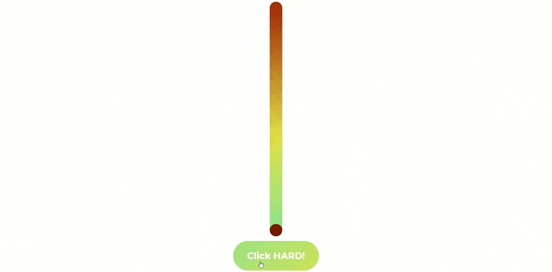
Let’s take a look at an animation of a ball, bouncing back and forth at 50 frames per second (or 50fps):

It looks nice and smooth. Now, let’s look at the same animation, but instead of 50fps, it has a frame rate of 10fps:

The motion of the ball looks decidedly less fluid at 10fps than 50fps. In fact, you can even make out the individual images that comprise the animation itself. Rather than feeling like genuine motion, it comes across more as an attempt to recreate or portray motion. The stuttering nature of the frame doesn’t fool your brain; instead, it distracts from the animation.
So, what are the frame rates for the transitions that we’ve built so far? With traditional animation, the frame rate is fixed, and all of the frames are created before the animation is played back. But CSS animations are rendered on the fly by the browser, which will update the animation with the new frames as quickly as it can calculate them.
That means that the frame rates of our animations are variable. Let’s say that it takes the browser .04 seconds to complete a calculation of one frame of an animation, and then .03 seconds to complete the next. To determine the frame rate of a calculation, divide 1 second by the duration of the calculation in seconds. So 1/.04=25fps.
That means that the animation had a frame rate of 25fps for the first frame, and then 30fps for the second.
The question isn’t so much what the frame rate of our animation is, but, instead, what we want the frame rate to be. And that magical number is 60fps.
And why 60fps?
Most screens refresh at a rate of 60hz, or 60 times per second. If we create an animation that plays back at 75fps, the viewer would still only see 60 of those frames per second due to the monitor not refreshing fast enough to see those extra frames. Therefore, 60fps is the smoothest frame rate that we can expect the viewer to see. That means that we want to keep the calculation time of our animation frames beneath 1/60th of a second, or .016 seconds (16 milliseconds).
And just how do you go about keeping animation calculations at no more than 16 milliseconds? The secret can be found in the process of going from CSS code to a rendered web page in your browser.
How the sausage gets made: rendering CSS
To go from CSS & HTML...
| |
...to a rendered web page:
The browser goes through four steps:
Style: The browser goes through the CSS and figures out which rules to apply to which elements.
Layout: Now that the browser knows how to style everything, it figures out how big to make the elements and where to put them.
Paint: The browser renders the elements to pixels using the calculated styles from step 1, and the positions and sizes derived from the layout calculations from step 2.
Composite: The browser layers all of the elements together into the rendered page you see in the browser.
Let’s say you decide to build your dream house. You visit an architect and tell them exactly what you want the house to look like while they take notes. This is the style stage of your journey from idea to dream house.
Then the architect takes his notes and draws up detailed blueprints. This is the layout stage of the process.
Now that you have your plans, you send them off to a factory to be built as modules before being delivered to the work site. This is the paint stage, which leaves the composite stage, where the modules are assembled into your dream home!
Different CSS properties are applied at different stages of the rendering process. Properties such as width and height are applied during the layout stage, while ones like color and box-shadow are part of the paint stage.
That means that if you animate a color value, the browser needs to repaint and composite the element for each calculation. An animation that affects an element of the layout, such as width, means the browser needs to recalculate the layout of the entire page and then repaint for each calculation! The more the browser needs to calculate, the longer it will take to process, which means a lower frame rate or even… 😱 JANK!!! 😱
When the frame rate dips low enough to see individual frames and the motion becomes halting, we call that jank, and it’s an animator's worst enemy. The key to avoiding it is to restrict yourself to animating properties that don’t trigger layout or paint calculations.
In other words, you only want to animate properties that are part of the composite stage of the render. And, in terms of properties that are well suited to animation, there are two to chose from: The transform and opacity properties.
Think back to our button that grew the ball using the transform property’s scale() function:
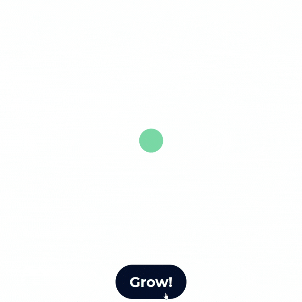
You can see that as the ball changes size, it doesn’t affect the position of the button. That’s because the transform property performs its operations in the composite stage, so it doesn’t create any layout or paint changes, which means less to calculate and more frames per second.
Coming up next, we'll dive into the transform property and its plethora of functions you can harness to create smooth animations.
Let's recap!
Higher frame rates create smoother animation.
The ideal frame rate for animations is 60fps.
The four stages of rendering a web page are:
Styles
Layout
Paint
Composite
To ensure smooth animations, only animate properties that are part of the composite stage:
transformandopacity.
