Use the transform CSS property to ensure smooth animations
It slices! It dices!
You’ve just seen that if you want smooth animations, you have a whopping two properties to choose from. And, on the surface, that might seem a bit...stifling.
I mean, how much can you really do with just the transform and opacity properties?
But, really, the question isn't what you can do with just those two properties, but what can't you do with them?!
No, really!
You see, the transform property packs a lot of punch for a single property. In fact, it has more than 20 different functions that you can use to move, scale, rotate, and distort elements.
In previous chapters, we used transform to change the scale of a button and circle. So, you’re familiar with its syntax and basic functionality.
.btn {
    &:hover + .ball{
        transform: scale(1);
    }
}
To harness the full power of the transform property, we’re going to use more than a single function. Things can get tricky with multiple functions.
In this chapter, we’ll take a look at our go-to transform functions and the ins and outs of chaining them together to create animations that are more complex in nature, while still playing back at a smooth 60 frames per second.
Scale
To use the transform property on an element, you need to supply it with the function (or functions, as you’ll see shortly) that perform the desired transformations. For example, to scale an object to 200% of its original size, use the scale() function with an argument of 2:
.btn {
    &:hover + .box {
        transform: scale(2);
    }
}

.box {
    transition: transform 330ms ease-in-out;
}
Rather than supply scale() with percentages, pass it numbers, where 0 is equal to 0%, and 1 is equal to 100%. So scale(2) scales the element to 200% of its original size:

Passing a single argument to the scale() function changes the size of an element uniformly, scaling both the height and width by the same amount. But you can also pass two arguments, one to scale the width, or X dimension, and one to scale the height, or Y dimension, individually.
Let’s say that we wanted to stretch the box, width-wise, and make it shorter at the same time to preserve its volume. Let’s change the X scale to 300% and Y scale to 50%:
.btn {
    &:hover + .box {
        transform: scale(3, 0.5);
    }
}

.box {
    transition: transform 330ms ease-in-out;
}
Now the box stretches out horizontally: 
What if I only wanted to scale the box in one direction?
You could do something like:
.btn {
    &:hover + .box {
        transform: scale(2, 1);
    }
}

.box {
    transition: transform 330ms ease-in-out;
}
Which works… it’ll scale the X-axis by 200% and the Y-axis by 100%... But there’s a cleaner and more explicit way to do the same thing. When you only want to scale in one direction, make use of the scaleX() and scaleY() functions. As you might have guessed, scaleX() scales an object horizontally, and scaleY() scales vertically.
So, to scale the button by 200% horizontally, use scaleX(2):
.btn {
    &:hover + .box {
        transform: scaleX(2);
    }
}

.box {
    transition: transform 330ms ease-in-out;
}
But, like I said earlier, scaling is just one of transform’s many talents. Animation is dominated by three main types of transformations – position, scale, and rotation. You have scale down cold, so let’s take a look at position.
Position
Changing an object’s position can be done using transform ’s translate() function. translate() accepts two arguments, the first being how far you want to move it in the X-axis, and the second is the distance to translate on the Y-axis. The values can be real units, such as px or vh, so you can move the box 150px to the right and up 7vh like so:
.btn {
    &:hover + .box {
        transform: translate(150px, -7vh);
    }
}

.box {
    transition: transform 330ms ease-in-out;
}
But translates are also assigned by percentage. Where other properties use percentages in relation to their parent element, such as width: 50% being half of the width of its parent:
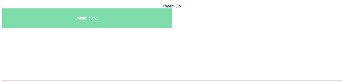
When you use percentages with translate(), they are in relation to the element itself. Let’s say that you have an element that is 100px wide:
.btn {
    &:hover + .box {
        transform: translate(100px, 0);
    }
}

.box {
    width: 100px;
    height: 100px;
    transition: transform 330ms ease-in-out;
}
If you translate it by 100% on the x-axis, it will move 100px to the right:
Just like scale(), you can transform elements in the x-axis and y-axis individually, using the translateX() and translateY() functions respectively. Let's add some text to the box and have it scroll into view:
<div class="container">
    <button class="btn">Transform!</button>
    <div class="box">
        Boop!
    </div>
</div>
Structurally, the markup is fine, but to animate the text separate from its parent element, you need to wrap it in some sort of element. So lets put it in a <span>:
<div class="container">
    <button class="btn">Transform!</button>
    <div class="box">
        <span>Boop!</span>
    </div>
</div>
<span> gives the transform property something it can grab onto and manipulate. Now let’s set up our transform to use translateY() so the text starts outside of the box and scrolls in:
.btn {
    &:hover + .box {
        transform: scale(1);
        span {
            transform: translateY(0);
        }
    }
}

.box {
    transform: scale(0.1);
    transition: transform 330ms ease-in-out;
    overflow: hidden;
    span {
        display: inline-block;
        transform: translateY(250%);
        transition: transform 280ms ease-out 50ms;
    }
}
Notice that we’ve changed the display mode to inline-block? Transform can’t manipulate inline elements, like <span> , so you need to change their display mode to block or inline-block before you will see any results. We've also given the span transition a small delay and shortened its duration so it acts as a secondary animation (principle of animation #8 FTW! 🤘).
We've also added the overflow property to the span's parent, .box, and set it to hidden so you don't see the text before it has scrolled into view.
Rotation
Now that we’ve covered animating position and scale, all that’s left of the big-three is rotation, which transform performs with the aptly titled rotate() function.
You can supply values to rotate() in a few different units, but only two of them are user-friendly/comprehensible by humans. And since we're humans, let's stick with those two.
The most obvious and straightforward is to use degrees, annotated with deg: rotate(360deg). You can also use turns, where one turn is equal to 360 degrees:rotate(1turn). To demonstrate, we have two boxes, each with their own modifiers for the rotation units used:
<div class="container">
    <button class="btn">Transform!</button>
    <div class="boxes">
        <div class="boxes__base boxes--rotDegrees">rotate(360deg)</div>
        <div class="boxes__base boxes--rotTurns">rotate(1turn)</div>
    </div>
</div>
Notice how the two boxes are nested within the .boxes div? Remember that to animate the properties of other objects in CSS they need to be the next sibling in the hierarchy. Now let's select the individual boxes and animate them independently:
.btn {
    &:hover + .boxes {
        & > .boxes--rotDegrees {
            transform: rotate(0deg);
        }
        & > .boxes--rotTurns {
            transform: rotate(0turn);
        }
    }
}

.boxes {
    &--rotDegrees {
        transform: rotate(-360deg);
        transition: transform 500ms ease-in-out;
    }
    &--rotTurns {
        background: pink;
        transform: rotate(-1turn);
        transition: transform 500ms ease-in-out;
    }
}
Start with each box rotated negative 360deg/1turn and, upon triggering the transition with the button, rotate back to 0deg/0turn over the course of one half of a second using the ease-in-out timing function.

The end result is the exact same, and using degrees or turns comes entirely down to personal preference.
C-C-C-combo
Let’s give the animation a twist as it transitions by adding a transform property with the rotation() function to the box:
.btn {
    &:hover + .box {
        transform: scale(1);
        transform: rotate(0deg);
        span {
            transform: translateY(0);
        }
    }
}

.box {
    overflow: hidden;
    transform: scale(.1);
    transform: rotate(-90deg);
    transition: transform 330ms ease-in-out;
    span {
        transform: translateY(250%);
        transition: transform 280ms ease-out 50ms;
        display: block;
    }
}
Now the circle should twist a quarter of a turn, from -90deg to 0deg, as it scales up and the text slides in. Check it out:
 Gah! 😱 We broke it!
It’s twisting, but the scale animations have disappeared. It looks like the rotate() transform is overriding the scale() transform.
Let’s comment out the rotate() transform and make sure we didn’t accidentally mess up the scale():
.btn {
    &:hover + .box {
        transform: scale(1);
        // transform: rotate(0deg);
        span {
            transform: translateY(0);
        }
    }
}

.box {
    overflow: hidden;
    transform: scale(.1);
    // transform: rotate(-90deg);
    transition: transform 330ms ease-in-out;
    span {
        transform: translateY(250%);
        transition: transform 280ms ease-out 50ms;
        display: block;
    }
}
Okay, scale() still works just fine. So that must mean that only one transform property can be assigned to an element. Good to know! 😉
How do you perform multiple transformations within a single transform property then?
Simple. Just list out all of the transform functions that you want to use within the transform property.
To add the twist to the scaling transform, append the rotate() function to the transform property after the scale() function:
.btn {
    &:hover + .box {
        transform: scale(1) rotate(0deg);
        span {
            transform: translateY(0);
        }
    }
}

.box {
    overflow: hidden;
    transform: scale(.1) rotate(-90deg);
    transition: transform 330ms ease-in-out;
    span {
        transform: translateY(250%);
        transition: transform 280ms ease-out 50ms;
        display: block;
    }
}
Now the box should twist as it scales up:

Success! Virtual high-five! 🤚
The order of rotation and scale won’t set off any alarms because they don’t directly affect each other. A 90-degree turn, then scaling to 200%, versus scaling to 200% and then rotating 90 degrees, will produce the same result.
Scale and translate, on the other hand? That’s a whole different story. Moving an element 200% and then scaling it up 200% produces a very different effect than scaling and then translating:
.btn {
&:active + .box {
& > .box__base--tranxScale {
transform: translateX(200%) scale(2);
}
& > .box__base--scaleTranx {
transform: scale(2) translateX(200%);
}
}
}
.box {
&__base {
&--tranxScale {
background-color: #15dea5;
transition: transform 330ms ease-in-out;
}
&--scaleTranx {
background-color: pink;
transition: transform 330ms ease-in-out;
}
}
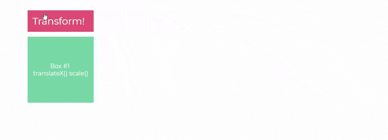
}Box #1 has the .box__base-tranxScale modifier applied, and when triggered will apply the scale() transformation, followed by translateX().
Box #2 has .box__base--scaleTranx() assigned and will apply the translateX() transformation, followed by the scale():
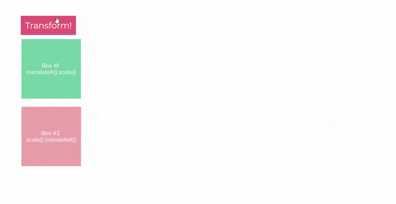
Box #2 moves way further to the right than box #1. Twice as far, in fact. That’s because not only is the browser executing the transform functions in order, it’s using the original layout as the origin for the transformations.
If you were to break down transform’s order of operations into separate animations, you would see box #1 scale up to 200% and then move right 200% of the original dimension of the box:
But with box #2, the box moves the same distance of 200%, but rather than scaling up from the center of the box’s new position, it scales outward from the box’s original center, before translateX() was applied:
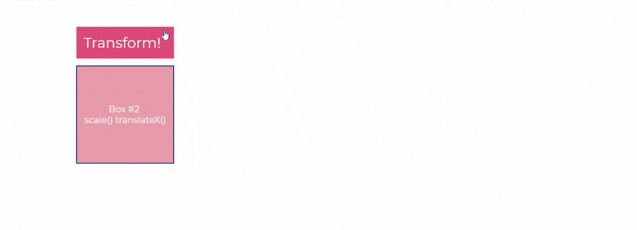
Box #2 moved to the right 200%, and then that translate was effectively doubled by the scale, making it appear to have moved 400% to the right.
Skew you
Position, scale, and rotation. Transform packs are a pretty decent arsenal.
But wait, there’s more! That’s right. If you order now, we’ll throw in the skew() function as well! Call now!
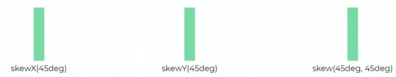
Just like position and scale, you can choose to skew objects horizontally or vertically by tilting the horizontal or vertical edges, or both, by using the skewX(), skewY(), and skew() functions respectively:
.box {
    &--skewX {
        transform: skewX(45deg);
    }
    &--skewY {
        transform: skewY(45deg);
    }
    &--skew {
        transform: skew(45deg, 45deg);
    }
}
A whole other dimension
And that’s about it for transforms abilities… in 2D.
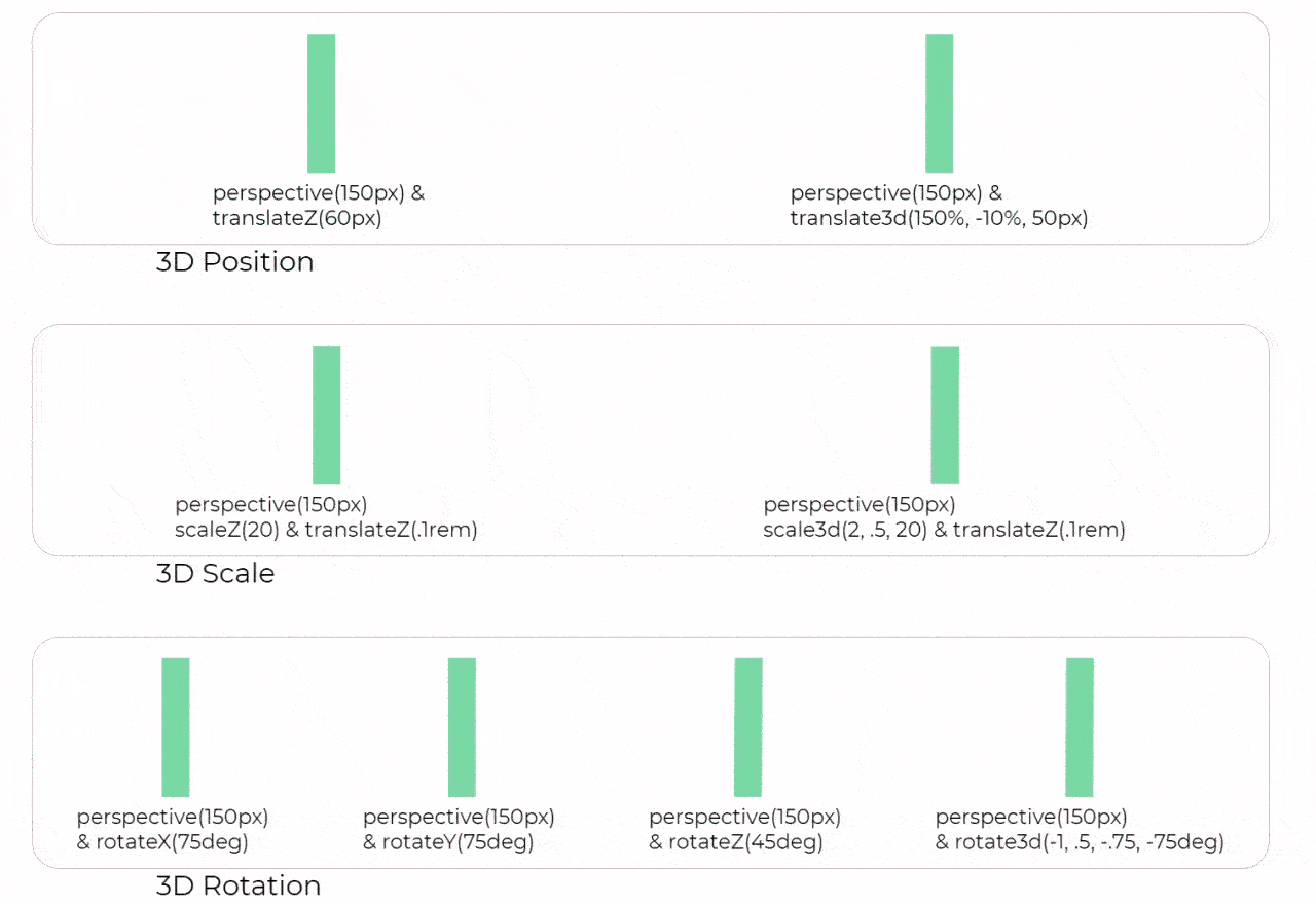
Yup! There’s a whole other dimension to play with! 😄 The functions for three dimensional transformations are quite similar to their 2D counterparts, only with the ability to transform along the z-axis as well. Here’s a quick rundown of the 3D functions in transform's arsenal:
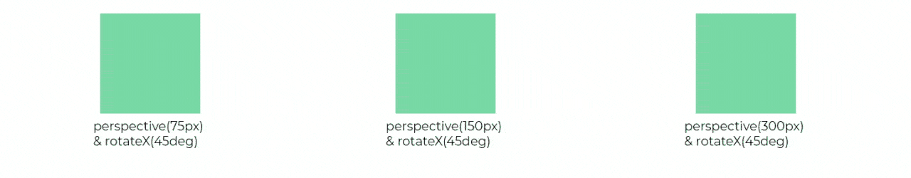
While the 3D functions look a lot like their 2D counterparts, you might have noticed a new function used throughout the 3D transforms: perspective().
The set value for perspective() tells the browser how far away the viewer is from the action. Just like in the physical world, the closer an object is, the more drastic motion will seem, while further away objects will seem more static.
.box {
    &--perspective75px {
        transform: perspective(75px) rotateX(45deg);
    }
    &--perspective150px {
        transform: perspective(150px) rotateX(45deg);
    }
    &--perspective300px {
        transform: perspective(300px) rotateX(45deg);
    }
}
With a perspective of 75px, you are far closer to the box than with 150px or 300px. Thus, the 3D rotation appears far more drastic than the ones with more distant transforms.
You can use perspective and 3D transforms to add depth and visual effects to animations, such as parallax or even Hitchcock’s Vertigo dolly-zoom:
Having the transform property in your toolbox lets you manipulate and animate your sites in nearly any way you could hope for, and, because it all takes place in the composite stage, you can be confident that they’ll playback smoothly, no matter the device.
Coming up next, we’ll take a look at a complimentary property that lets you expand the diversity of your transformations by moving their origin points.
Let's recap!
The
transformproperty accepts functions with arguments as values.You can move elements with the translate functions:
translate(),translateX(),translateY(), andtranslate3d().You can scale them with the scale functions:
scale(),scaleX(),scaleY(), andscale3d().And you can rotate them with the rotate functions:
rotate(),rotateX(),rotateY(), androtateZ().A selector can only have one
transformproperty.If you add a second
transformproperty, it will cancel the first.A transform property with multiple functions will execute the functions in order from right to left.
