Table of contents
- Part 1
Get started with CSS Animations
- 1
Get the most out of this course
- 2
Get acquainted with animation for the web
- 3
Use CSS transitions for simple animations
- 4
Use pseudo-selectors to trigger CSS transitions
- 5
Apply the 12 principles of animation to the web
- 6
Create multi-property CSS transitions
- 7
Use timing functions to create more natural animations
Quiz: Have you built a strong foundation in CSS animations?
- Part 2
Translations, rotations, and opacity, oh my!
- Part 3
Make your animations dynamic
Analyze animation performance with Chrome DevTools
How are we doing?
You’ve spent a considerable amount of time learning to optimize animations, but…
How do you know it’s actually working?
Everything looks peachy on your computer...but it’s a decent machine, with a modern graphics card. How do you know that the animations are playing smoothly on Aunt Sue’s bargain tablet that she picked up on Black Friday?
Luckily, Chrome has a built-in suite of tools. You’ve likely run across it when inspecting the source code of a website. But that’s just the tip of the DevTools iceberg.
It’s loaded with other tools that let you do things like throttle the CPU so you can simulate your animations on a wheezing old smartphone and then dig in to perform a detailed analysis. This can help pinpoint troublesome areas and let you investigate how to fix them.
In this chapter, we’ll be diving into Chrome DevTools and learn how to use them to ensure that our animations are as smooth as possible.
Show us what you're hiding
We have an app with a series of cards, each sporting a photo and a few blocks of text, as well as a button that reveals a hidden card:
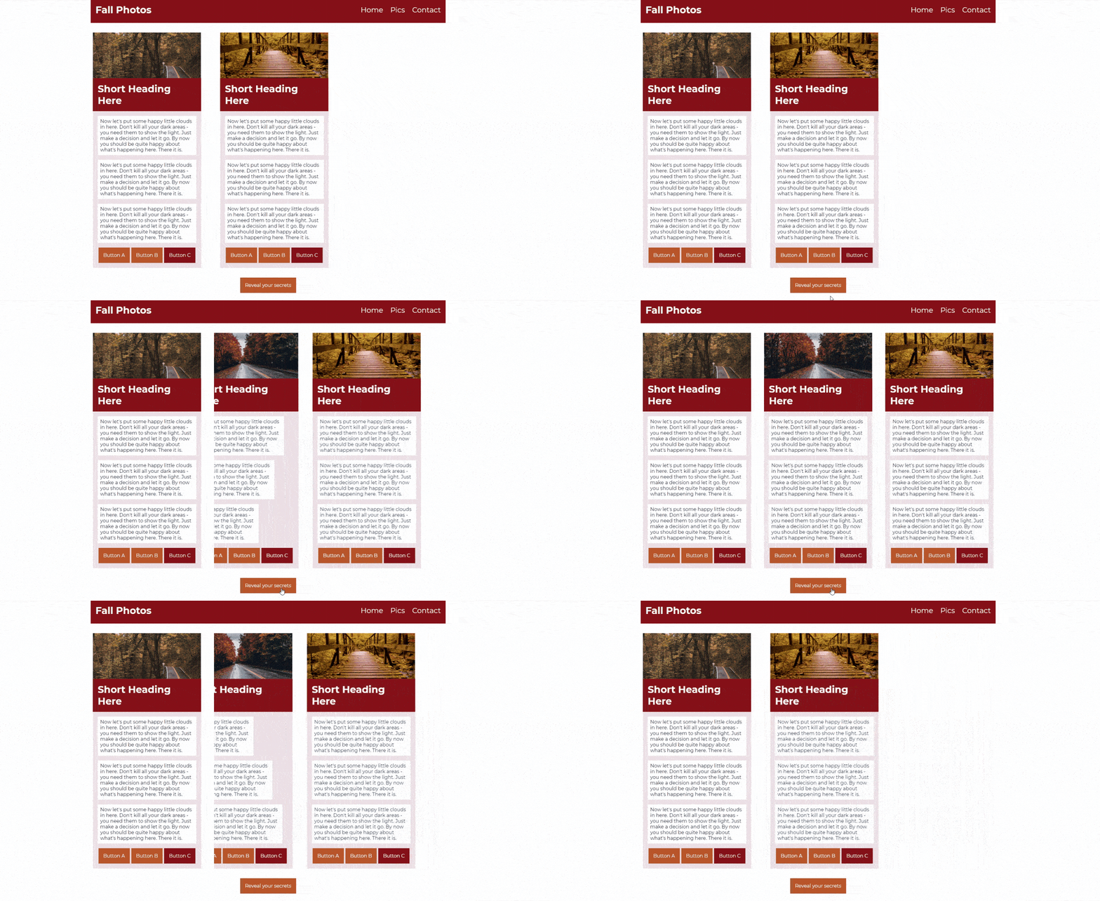
The hidden card is revealed through several layers of transitions. One transition reveals the card itself while another pushes the second card out of the way:
$easing: cubic-bezier(.49,.18,.23,1);
$width: 33vh;
$height: 72vh;
$margin-right: 4vh;
$wid-marg: $width + $margin-right;

.card {
    width: $width;
    height: $height;
    overflow: hidden;
    &:not(:last-child){
        margin-right: $margin-right;
    }
    &--anim {
        transform: translateX($width-marg);
        transition: transform 700ms $easing;
    }
    &__contents {
        width: $width;
        overflow: hidden;
        &--anim {
            transform: translateX($wid-marg*-1);
            transition: transform 700ms $easing;
        }
    }
}

.btn {
    &--reveal {
        &:hover {
            & + .card {
                &--anim {
                    transform: translateX(0);
                }
                .card__contents--anim {
                    transform: translateX(0);
                }
            }
        }
    }
}
We’ve also added in some secondary motion with multiple, staggered transitions revealing the individual text blocks within the card:
</>

$easing: cubic-bezier(.49,.18,.23,1);
$width: 33vh;
$height: 72vh;
$margin-right: 4vh;
$wid-marg: $width + $margin-right;

.card {
    width: $width;
    height: $height;
    overflow: hidden;
    &:not(:last-child){
        margin-right: $margin-right;
    }
    &--anim {
        transform: translateX($width-marg);
        transition: transform 700ms $easing;
    }
    &__contents {
        width: $width;
        overflow: hidden;
        &--anim {
            transform: translateX($wid-marg*-1);
            transition: transform 700ms $easing;
        }
    }
    &__block {
        overflow: hidden;
        // a sass loop that iterates from 1 to 3, using the index
        // as a postfix for the --anim mod name
        // as well multiplier for the transition delay value
        @for $i from 1 through 3 {
            &--anim-#{$i} {
                transform: translateX(-108%);
                transition: transform 500ms $easing 50ms*$i;
            }
        }
        &:not(:first-child) {
            margin-top: 1rem;
        }
    }
}

.btn {
    &--reveal {
        &:hover {
            & + .card {
                &--anim {
                    transform: translateX(0);
                }
                .card__contents--anim {
                    transform: translateX(0);
                }
                .card__block--anim {
                    transform: translateX(0);
                }
            }
        }
    }
}
The card reveal may look nice on your machine, but that's not enough. You want it to look smooth on everyone’s devices, including old or inexpensive ones. In all, the hidden card reveal has five separate transitions. How can you be sure it’s going to play nicely for everyone?
You could run down to the local electronics store and buy the cheapest tablet you find and use it to test your animations. Which would be thorough, if nothing else. But there’s an easier - and cheaper - way to test and analyze animations.
Ladies and gentlemen, allow me to introduce you to Chrome DevTools! That’s right, that thing that pops up when you click ‘inspect element’ on a page does a whole lot more than help you figure out how pages are put together.
Beyond the Elements panel, DevTools has a whole slew of other panels to help you inspect, debug, and analyze different aspects of your sites. The Performance panel is one such tool, which you can use to record and analyze how a page loads, responds, idles, and animates.
That last one seems like it might be relevant to gauging the performance of animations, right? So let’s open up DevTools and check it out!
Opening the DevTool-box
Before we can begin exploring the Performance panel, we need to first open DevTools.
You’re probably familiar with right-clicking on an element of the page and selecting Inspect.
Next to Inspect, you see that you can also open DevTools via the keyboard shortcut Ctrl+Shift+Ion Windows, or Cmd+Opt+Ion Mac.
Once DevTools is open, there are a series of buttons across the top of the window for various panels. If the Performance tab isn’t visible to the right of the Element panel, you can open it by clicking the double right-arrow to the far-right and selecting Performance from the drop-down list:
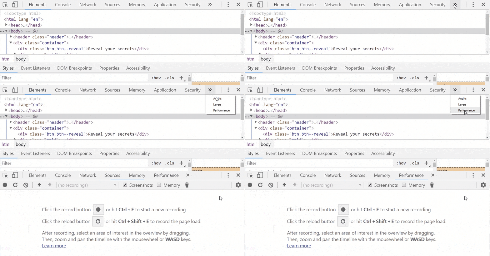
Now that the Performance panel is open, you can see a fairly spartan window, populated with a few buttons and some instructions saying that you can click the traditional record button, or the refresh-looking button to record the page load.

But before clicking either of those buttons, let’s refine the setup. Near the top of the pane, there’s a checkbox for a Screenshots option. If you enable it, Chrome will capture an image of your site for each frame of the recording, allowing you to see what was happening during any trouble spots you may encounter. While not always necessary when analyzing a site's performance, such as with network performance, the animation is decidedly visual, and having screenshots could come in handy. So, let's check the Screenshots option:
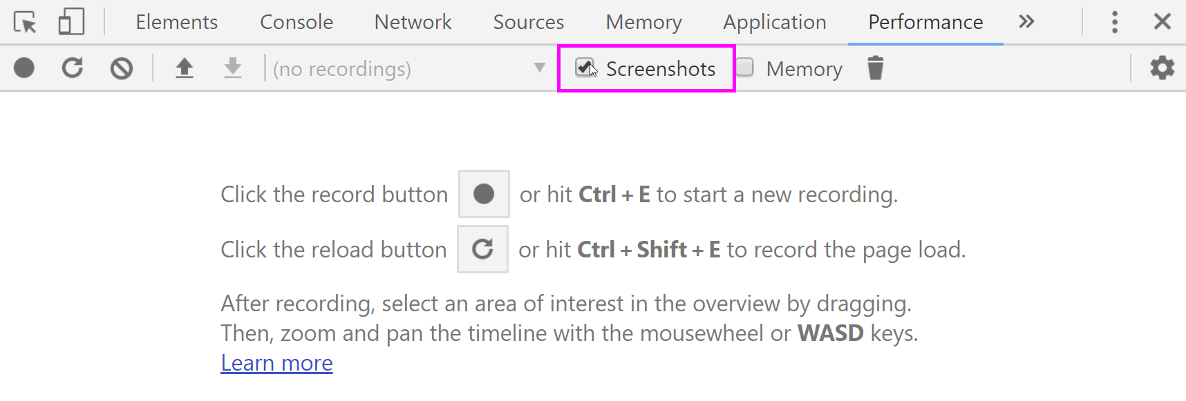
There's one more matter to attend to before we hit record. Remember, we want to see how our animations perform on slower devices; however, if we hit record now, we’d only see how the site performs on a more powerful machine. To remedy this, the Performance tab lets us throttle the speed of our CPU.
Clicking on the gear in the upper right corner of the panel reveals a drawer with four options, including the CPU throttling menu. Let’s simulate the slowest device possible by choosing 6X, which will throttle the CPU to six times slower than its original clock speed:

Enhance... enhance... enhance!
Now we’re all set to begin profiling our animations! We’re not worried about the performance of our page loading at the moment, so we can go ahead and press the record button. Upon clicking the button, a dialog box will pop up letting us know that is has begun recording the site, which, at the moment, is just sitting there. So, let’s interact with our button to trigger transitions. Once the animations have run their courses, we can click the Stop button in the profiling dialog box:
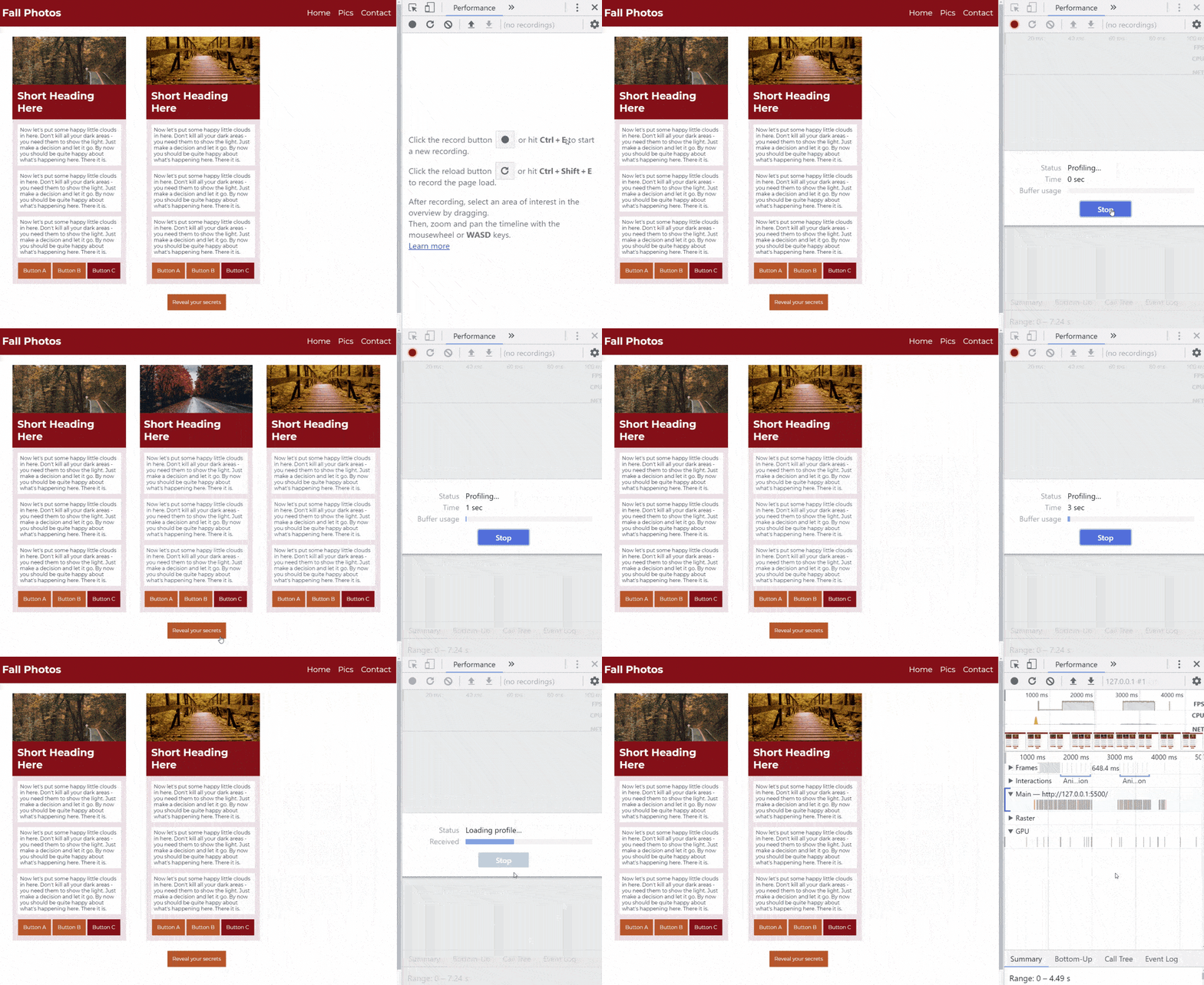
And that’s it! DevTools takes a moment to process the data it has collected and then populates the Performance panel with a whole bunch of data.
Let’s break it down. At the very top, we have the timeline of our recording, denoted in milliseconds. There is a green chart within the timeline that tracks the fps of our site; the plateaus are indicative of the animation events that we’ll dig into in a second. And, just below the timeline is a montage of the images that DevTools captured during our recording:

If we hover over a thumbnail, it enlarges, showing exactly what our site looked like at that point in time:
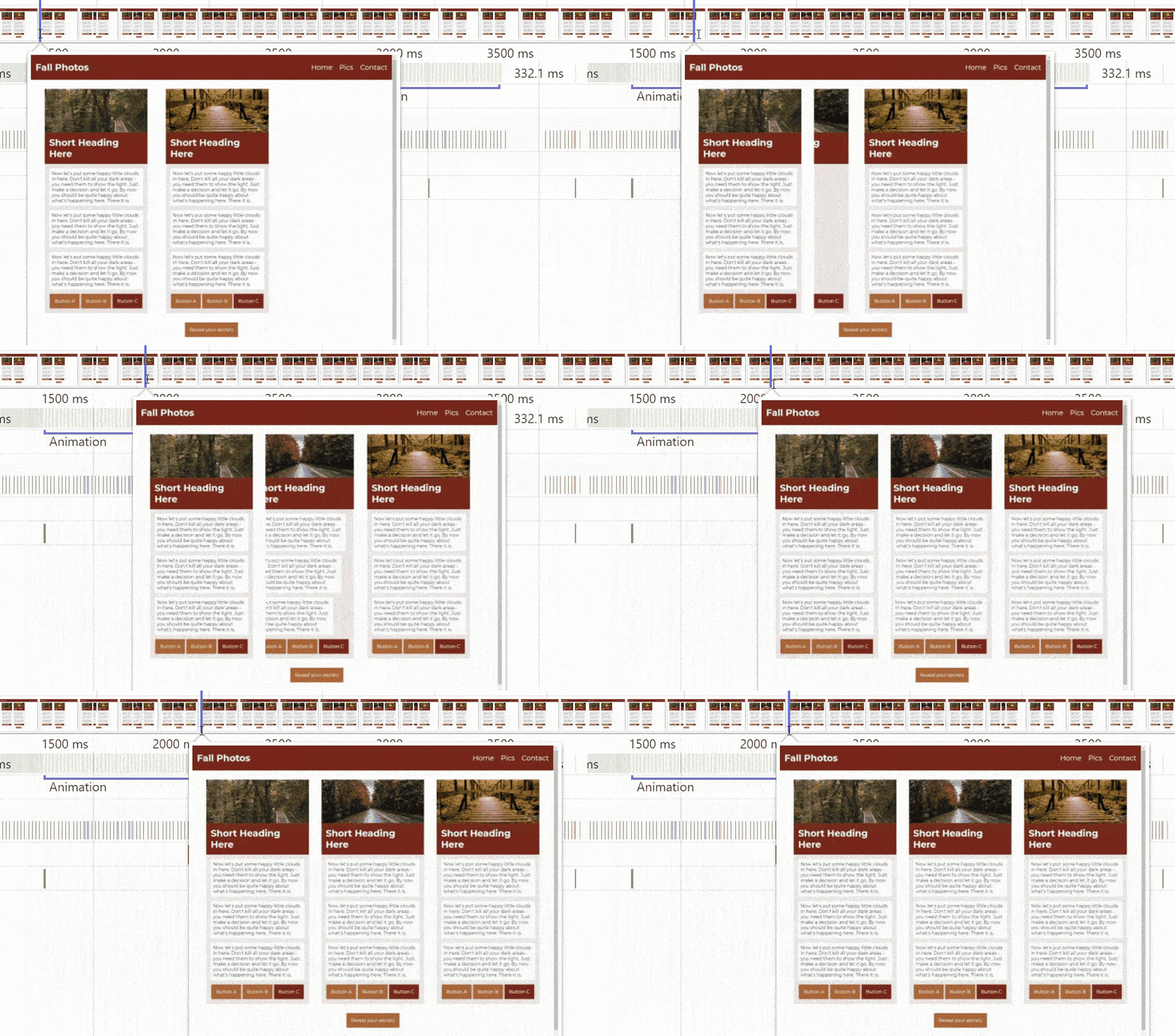
Let’s take a closer look at our animation by zooming in one of those green plateaus in the timeline, which we can do by clicking and dragging over the area of interest, or using the scroll wheel of our mouse to zoom in or out:
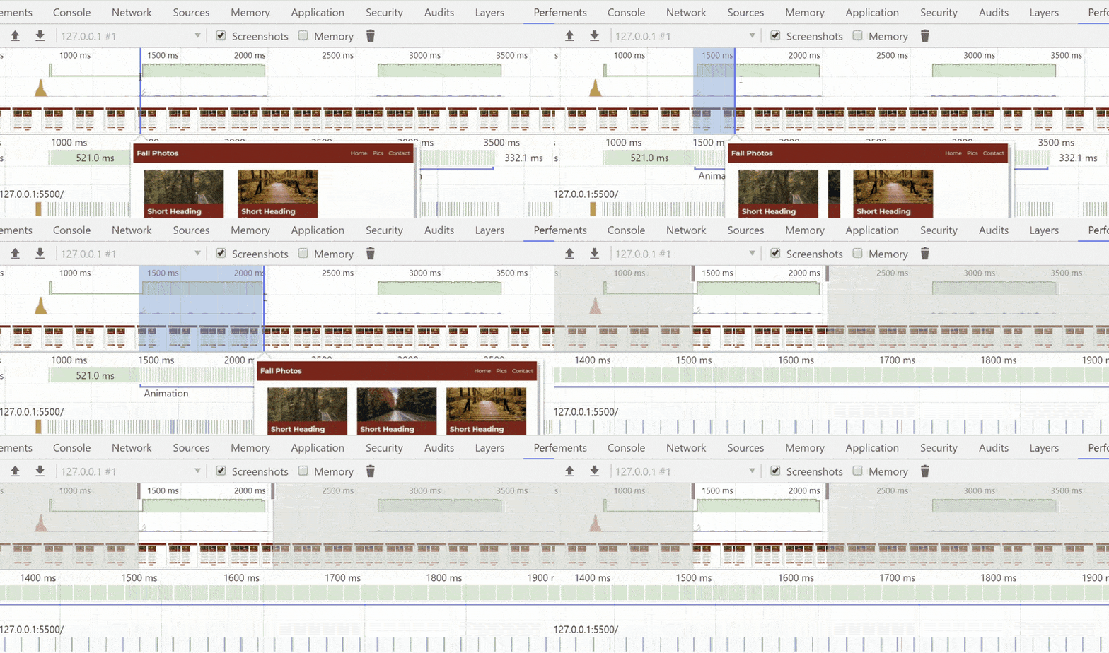
Now that we’re up close with the animation portion of our recording, let’s focus on those green boxes below the timeline. Those are the individual frames of our animation. If we hover over any of them, we can see what the calculation time for that frame was, as well as its fps equivalent:
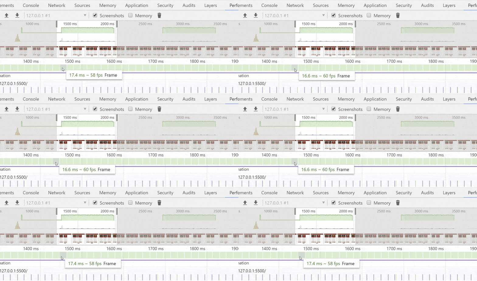
There are some minor fluctuations between frames, and that’s perfectly normal, but they’re all coming in around our target frame rate of 60fps, which is perfect. Now we can confidently say that our transitions will playback smoothly, even on devices six times slower than our machine.
Anatomy of a frame
Let's inspect the guts of an animation frame and look at the calculations that go into making one by choosing a frame and zooming way in on it:

Now that we’ve isolated a single frame of animation, let’s look at the Main section of the Performance panel where we can see the calculations that have gone into turning our code into a rendered and animated web page. The calculations are lumped into color-coded categories.
Purple blocks are the baseline calculations that go into rendering a web page, such as parsing the CSS and calculating styles based on specificity.

Yellow blocks can indicate layout calculations, but there aren’t any! By animating the transform property, we’ve avoided any frame rate-wrecking layout calculations.
While our animation frame doesn’t contain any layout calculations, it does have a green box, which represents a paint or composite calculation. If we hover over the green block we see that it was a composite calculation, meaning that not only did our animation not trigger any layout calculations, it also didn’t need to perform any paint calculations either:

By animating with the transform property, you can create movement that appears identical to animation done via layout-altering properties, such as width or absolute positions, while avoiding costly calculations. And less calculation time means more frames per second, which means smoother motion!
Coming up next, we’ll dive into the second of our high-frame rate properties at your disposal and learn to create color animations that don’t trigger repaints via the opacity property.
Let's recap!
Chrome DevTools has a panel for profiling the performance of a page, including animation frame rates, called the Performance panel.
You can use the Performance panel to analyze your animations, allowing you to find any troublesome sections that might not play smoothly across all devices.
To simulate the performance of the site on a slower device, enable CPU throttling.
Zooming into a frame of animation can help reveal unexpected calculations.
Ever considered an OpenClassrooms diploma?
- Up to 100% of your training program funded
- Flexible start date
- Career-focused projects
- Individual mentoring
Find the training program and funding option that suits you best
