Create more peformant color animations using the CSS opacity property
How big is your crayon box?
While the transform property has your back for most of your animation needs, there is a glaring hole in its coverage: color.
Changing the color of elements is an essential part of animating, but the transform property leaves you high and dry. And the only other choice you have, if you want to ensure that you have smooth animation is the opacity property.
So… are color animations off the table then?
No.
No, no, no.
You can totally create high-performance color animations, but you have to approach your code a little differently than we’ve been doing.
Up until now, we’ve written our HTML structurally, creating elements as part of the layout.
You can also approach writing your markup with functionality in mind, where you create elements, not for the layout, but rather to serve as pieces of your animations themselves.
In this chapter, we’re going to look at how you can organize your code so you can perform color animations using only the opacity property.
Pesky painting
Let’s say that you have a button that changes color when it is hovered over:

The change in color provides the user feedback that it is an element that they can interact with, which helps improve the user’s experience on your site. But rather than an instantaneous change between colors, adding a brief transition to blend between them could help the :hover state feel smoother and more natural.
Taking a look at the code, you can see that the button is a <button> element with the .btn class assigned to it:
<button class="btn">Hover over me!</button>And .btn has a background-color of #15DEA5 via the $clr-btn variable, and a:hover state that darkens the $clr-btn by 5% using Sass’ darken() function:
$border-rad: 2rem;
$clr-btn: #15DEA5;

.btn {
    border-radius: $border-rad;
    background-color: $clr-btn;
    &:hover {
        background-color: darken($clr-btn, 5);
    }
}
We want to animate the background-color of our button, so let's add a transition to .btn with a duration of 250 milliseconds:
$border-rad: 2rem;
$clr-btn: #15DEA5;

.btn {
    border-radius: $border-rad;
    background-color: $clr-btn;
    transition: background-color 250ms;
    &:hover {
        background-color: darken($clr-btn, 5);
    }
}
Now the button’s color blends to a darker shade when hovered over:
 Perfect! Job done. Moving on. Except…
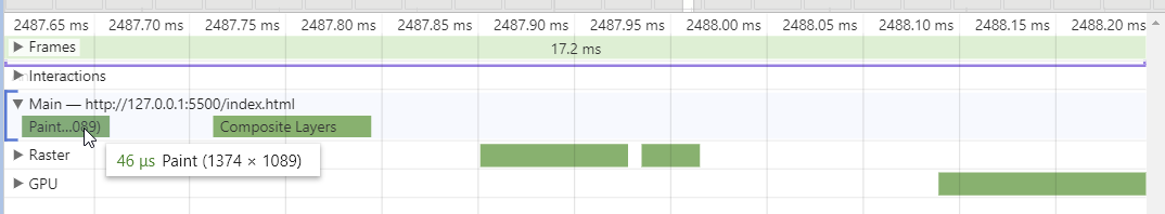 Repaints!!! 😱
Animating the background-color property triggers a new paint calculation of the button for each frame of the transition. Granted, this is a basic scenario, and the performance is still acceptable. However, if this were a more complicated page and animation, jank would creep in.
So, animating background-color isn’t the best practice for color-changing animations. You’re supposed to use the opacity property for that.
But the opacity property changes the transparency of an element and its children on a scale from 0 to 1, where a value of 0 will make the element completely transparent, and a value of 1 will be completely solid.
We want a darker button, not a transparent one. How are we supposed to change the color by changing its opacity?
Remember earlier when I talked about structuring your HTML to serve an element’s functionality, rather than just layout? What if we structured our button so that there are two separate backgrounds stacked on top of one another?
The bottom layer would have the normal, inactive color, and the top layer would have the darker color of the :hover state. Then we could fade the top layer on and off with the opacity property, creating an animation between the two colors.
Let's add a<div> after the button's text with the darker background-color and its opacity set to 0, and the opacity set to 1 in the button’s :hover state. So the HTML would look something like this:
<button class="btn">
    Hover over me!
    <div class="btn__bg"></div>
</button>
And the CSS like this:
$border-rad: 2rem;
$clr-btn: #15DEA5;

.btn {
    border-radius: $border-rad;
    background-color: $clr-btn;
    position: relative;
    z-index: 1;
    &:hover {
        & .btn__bg {
            opacity: 1;
        }
    }
    &__bg {
        position: absolute;
        top: 0;
        right: 0;
        bottom: 0;
        left: 0;
        background-color: darken($clr-btn, 5);
        opacity: 0;
        z-index: -1;
        transition: opacity 250ms;
    }
}
We’ve created a .btn__bg selector with absolute position and the background-color set to a darkened version of $clr-btn. We’ve also added a z-index of -1, as well as a z-index of 1 to .btn to create a new stacking order, where the button’s text sits on top of our new background element.
And when we take it for a spin, we see that it works!
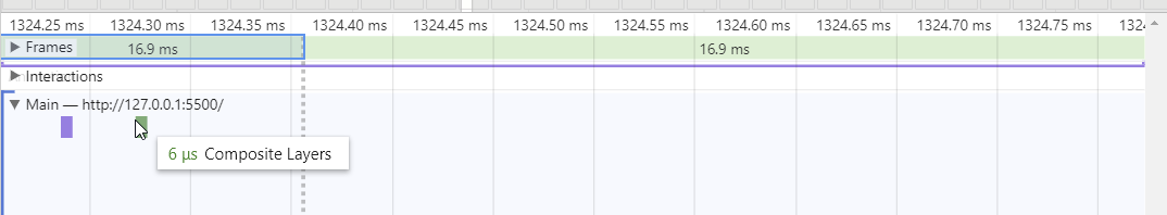
It appears identical to animating the background color while being faster to render. Look Ma! No repaints!
OK. Now the job is done. So...moving on?
Well, we could. We have a button that changes color by taking advantage of the high-performance opacity property, which is what we set out to do. But we can do better.
Right now, each added button also means adding the internal <div> for the background with the .btn__bg class assigned to it. And that’s a bunch of extra, tedious markup to write for each instance of a button, or, worse, a bunch of opportunities to make mistakes.
If it walks like a duck, and talks like a duck....
Rather than relying on manual labor to insert the background div into buttons, you can harness the power of CSS to magically create the background elements through the splendor of pseudo-elements! Or more specifically, the ::after pseudo-element.
Of course! So...um…what are pseudo-elements, exactly?
Well, let’s take look at the name: used as a prefix, pseudo means that something appears to be one thing, but in reality, is something else. So, a pseudo-element looks like an element, such as a <div> that was hand-coded into the HTML, but in fact, was generated by CSS and rendered as part of the web page. And, since a pseudo-element is still an element, you can style them in the same manner.
Adding the ::before or ::after pseudo-element creates a child element wherever its selector has been assigned on a website. The element created by ::before will be the first child of the element, and those created using ::after will be the element’s last child. In the case of our button, the background element comes after the text content, so the ::after pseudo-element would be the perfect replacement for our background <div>.
Creating a pseudo-element is just like creating pseudo-selector, where you append the pseudo-element to a selector, but rather than using a single colon ( : ), pseudo-elements use a pair of colons ( :: ) as a prefix:
$border-rad: 2rem;
$clr-btn: #15DEA5;

.btn {
    border-radius: $border-rad;
    background-color: $clr-btn;
    position: relative;
    z-index: 1;
    &:hover {
        & .btn__bg {
            opacity: 1;
        }
    }
    &::after {
        //style the ::after pseudo selector here
    }
    &__bg {
        position: absolute;
        top: 0;
        right: 0;
        bottom: 0;
        left: 0;
        background-color: darken($clr-btn, 5);
        opacity: 0;
        z-index: -1;
        transition: opacity 250ms;
    }
}And, just like any other CSS element, you need to give it some styling. We want ::after to have the same appearance as .btn__bg, so let’s move its styling from .btn__bg to the ::after pseudo-element, and then delete the .btn__bg selector, since we won't be needing it anymore:
$border-rad: 2rem;
$clr-btn: #15DEA5;

.btn {
    border-radius: $border-rad;
    background-color: $clr-btn;
    position: relative;
    z-index: 1;
    &:hover {
        & .btn__bg {
            opacity: 1;
        }
    }
    &::after {
        position: absolute;
        top: 0;
        right: 0;
        bottom: 0;
        left: 0;
        background-color: darken($clr-btn, 5);
        opacity: 0;
        z-index: -1;
        transition: opacity 250ms;
    }
}
Now we have a styled ::after pseudo-element, but hovering over the button won't yet produce any sort of color change because the button's :hover pseudo-selector is still selecting .btn__bg and changing its opacity to 1. Instead, let's update it to use the ::after pseudo-element instead:
$border-rad: 2rem;
$clr-btn: #15DEA5;

.btn {
    border-radius: $border-rad;
    background-color: $clr-btn;
    position: relative;
    z-index: 1;
    &:hover {
        &::after {
            opacity: 1;
        }
    }
    &::after {
        position: absolute;
        top: 0;
        right: 0;
        bottom: 0;
        left: 0;
        background-color: darken($clr-btn, 5);
        opacity: 0;
        z-index: -1;
        transition: opacity 250ms;
    }
}
Our button won't be needing the background <div> anymore, so let's remove it from our markup while we're at it:
<button class="btn">
    Hover over me!
</button>
And now when we refresh the page and interact with our button, it should act just like it did before:

And that’s a big fat no. There’s no color change at all! Let’s open DevTools and inspect our button:
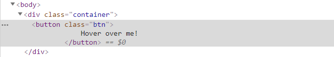
We should be seeing an ::after element where our background <div> had been, but there’s nothing there. So, what gives?
Existential crisis
Forgive me father, for I have sinned. I have told a half-truth. Remember when I said:
since a pseudo-element is still and element, we can style them in the same manner
That wasn't entirely true...
In my defense, that statement was 99.9% true, but the devil is in the details. Pseudo-elements require this one little property that normal ones do not. With a normal element, you code its content when you write the markup. However, since ::after is effectively injecting an element into the markup after the fact, CSS needs to tell the browser what that element contains. Enter the content property, which pseudo-elements require to function properly.
You can use the content property to fill a pseudo-element with things like text or images, but in the case of our button, we don’t want it to have any contents. Instead, we want ::after to act as a color canvas. We also need to give content some sort of value, so let’s assign it an empty string by using a pair of empty quotes:
$border-rad: 2rem;
$clr-btn: #15DEA5;

.btn {
    border-radius: $border-rad;
    background-color: $clr-btn;
    position: relative;
    z-index: 1;
    &:hover {
        &::after {
            opacity: 1;
        }
    }
    &::after {
        content: "";
        position: absolute;
        top: 0;
        right: 0;
        bottom: 0;
        left: 0;
        background-color: darken($clr-btn, 5);
        opacity: 0;
        z-index: -1;
        transition: opacity 250ms;
    }
}
And let’s take our button for a spin again and see how it’s behaving:
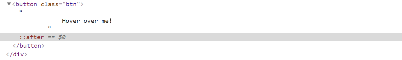
That’s more like it! If you take a look at things in DevTools, you'll see that there’s an ::after element where our background <div> had been:
It slices and dices
Animating with the opacity property isn’t strictly limited to color changes, by the way. You can do things like animating gradients, rather than solid colors:

The only thing that has changed is that you are using a gradient for the background of the ::after pseudo-element, rather than a solid color:
$border-rad: 2rem;
$clr-btn: #15DEA5;

.btn {
    border-radius: $border-rad;
    background-color: $clr-btn;
    position: relative;
    z-index: 1;
    &:hover {
        &::after {
            opacity: 1;
        }
    }
    &::after {
        content: "";
        position: absolute;
        top: 0;
        right: 0;
        bottom: 0;
        left: 0;
        background: radial-gradient(circle, lighten($clr-btn, 5) 0%, darken($clr-btn, 10) 100%);
        opacity: 0;
        z-index: -1;
        transition: opacity 250ms;
    }
}
You can also create color overlays for images:

$border-rad: 2rem;
$clr-primary: #15DEA5;

@mixin peudo-pos {
    content: "";
    position: absolute;
    top: 0;
    right: 0;
    bottom: 0;
    left: 0;
}

.btn {
    border-radius: $border-rad;
    background-color: $clr-primary;
    position: relative;
    z-index: 1;
    &:hover {
        &::after {
            opacity: 1;
        }
        & + .img {
            &::before {
                opacity: 0;
            }
        }
    }
    &::after {
        @include pseudo-elem;
        background: radial-gradient(circle, lighten($clr-primary, 5) 0%, darken($clr-primary, 10) 100%);
        opacity: 0;
        z-index: -1;
        transition: opacity 250ms;
    }
}

.img {
    z-index: -1;
    &::before {
        @include pseudo-elem;
        border-radius: $border-rad;
        background: $clr-primary;
        z-index: 1;
    }
}
The bottom line is that the opacity property will let you transition the appearance of elements without needing the browser to calculate repaints, helping to ensure that your animations have a high frame rate. And pseudo-elements save you from the tedium of writing repetitive HTML, which makes them all kinds of awesome.
And that brings us to the end of Part 2! Next we’ll dive into Part 3, where we will take everything you’ve learned and dial it up a notch with keyframes. So buckle up, this is going to be good!
Let's recap!
Animating the color value of a property will trigger repaints.
To avoid repaints, use the opacity property to transition between colors, producing the same result, without the repaints.
The opacity property receives a value between 0 and 1, where 0 is completely transparent and 1 is completely solid.
To avoid hard-coding the elements to perform color changes via the opacity property, use the
::afterpseudo-element.To create a pseudo-element, append the name of the pseudo-element to a selector, using two colons as a prefix: .selector::after{...}
The
::beforeand::afterpseudo-elements create an element that is the first or last child of the selected element, respectively.
