Construct CSS animations using the CSS animation properties
Transitions vs. animations
On the surface, keyframes seem a lot like transitions, only with extra points along the way. But keyframes are much more than just a bunch of values.
You can also assign timing functions on a keyframe-by-keyframe basis, allowing you to hone the velocities of your animations. And, while transitions only exist within the selector where they’ve been declared, keyframes are available globally, so any selector can make use of them.
As you’ve just seen with our progress bar, keyframed CSS animations don’t behave like transitions. And that’s because transitions and animations are very different things that serve different purposes.
Transitions are meant to blend back and forth between a set of values, such as different scale() values on a button and its :hover pseudo-selector:

The button scales up as you hover over it, and then shrinks back down when the mouse moves off of it, even if it hasn’t finished the transition yet. Applying the same scale() values via @keyrames produces a totally different user experience:

When you create a transition, you are telling the browser to go back and forth between a selector’s assigned values and it’s pseudo-selector’s assigned values. On the other hand, @keyframes playback a series of set values. Once triggered, a keyframed animation advances until it’s finished, or until it is interrupted.
When we assign our progress bar animation to the :active state of our button, the animation only exists when the :active state is triggered. When we let up our mouse, the :active state disappears from the element, and with it, the assigned animation. That’s why the animation disappears so abruptly when we break from the triggered state.
Transitions are tied to the state of an element, and the differences in their assigned values. But, since @keyframes have their own properties and values hard-coded within them, they only require an event to trigger them. Pseudo-selectors are one of the options to do so. In this chapter, we’ll take a look at a different way to deploy animations and additional available properties to build more complex animations and user experiences.
From the get-go
Up until now, we’ve been limited to using pseudo-selectors to trigger our animations. And that’s because we don't have any other options with transitions. But with keyframes, we can also use the event of an element loading itself to set things in motion.
In other words, when you assign a keyframed animation to an element, it will trigger the animation upon loading in the browser. Rather than applying our progress-bar animation to the :active pseudo-selector on .btn, let’s apply it to .progress__bar itself:
.progress {
	&__bar {
		animation: progress-bar 1000ms;

	}
}

@keyframes progress-bar{
    0% {
        transform: scaleX(0);
        opacity: .1;
    }
    17% {
        transform: scaleX(.18);
    }
    24% {
        transform: scaleX(.4);
    }
    46% {
        transform: scaleX(.81);
    }
    85%,100% {
        opacity: 1;
    }
    100% {
        transform: scaleX(1);
    }
}
Now our progress bar will load as soon as the web page is loaded. There’s no need to interact with the button, or any other element for that matter. The loading of the page, and thus the progress bar, is the event that triggers the animation. That means we can ditch the button altogether:
<div class="container">
    <div class="progress">
         <div class="progress__bar"></div>
    </div>
</div>
Let’s take our solo progress bar for a spin! We’ve inserted a brief reloading graphic to indicate the moment the elements are loaded onto the page and avoid any looping-gif-based confusion:

Booyah! Our animation just… goes! Rather than needing to rely on the user to trigger animations, you can add motion to your website to introduce elements as they load.
Let’s wait and see
The downside to having an animation start when the page loads - is that it happens when the page loads. This means that your animation starts before visitors have had a chance to absorb the site, and your keyframes could be lost in the loading of the page itself.
You know what would be perfect? If you could use transition-delay to have your animation wait a breath before kicking off. Unfortunately, that’s not an option; the transition-delay property is for delaying transitions. Luckily, CSS also has the animation-delay property!
Sorry for the emotional rollercoaster. First it was like, yes, there's a solution, then it was like, womp, nope, then it was like, yes, there is!
If you need to take a break and compose yourself, I’ll understand.
All set? Let’s get back to the exciting world of animation-delays then!
animation-delay works just like transition-delay, only it delays animations built with @keyframes. It still accepts values in either seconds or milliseconds:
.delay-seconds {
	animation-delay: 1s;
}

.delay-seconds {
	animation-delay: 1000ms;
}
And, just like transition-delay, you can add a delay to the shorthand animation property by adding the amount of delay to its list of values. Let’s add a short 150ms delay to the progress bar animation that we’ve assigned to .progress__bar:
.progress {
	&__bar {
		animation: progress-bar 1000ms 150ms;
	}
}
Now our progress bar will wait .15 seconds before it begins loading, giving visitors a moment to differentiate it from the general page load:

It works! Only it’s not actually loading anything. The bar fills up, and then...nothing.
Let’s create some content to display after the progress bar animation has finished. We are on the internet, so we should probably use a photo of a cat.
We waited 1.15 seconds and all we got is this picture of a cat
Let’s jump on unsplash and see what we can find:

Yessss… that will do nicely.
Let’s add a div for our cat pic after our .progress div with a few paragraphs of text:
<p>Thank you for waiting</p>
<p>Here’s your cat</p>
And use the background-image property to fill the div with our newfound cat photo, as well as a few other properties to scale and crop the pic and make the text legible:
.cat {
    width: 50vw;
    height: 30vw;
    position: absolute;
    overflow: hidden;
    background-image: url("https://bit.ly/2XJJLKn");
    background-size: cover;
    background-position: -20%;
    z-index: 1;
    display: flex;
    flex-direction: column;
    justify-content: space-between;
    align-items: center;
    padding: .1rem;
    font-size: 4vw;
    font-weight: 900;
    color: white;
}If you look at it in the browser, you’ll see our cat photo...and not much else:

Right now, our .cat div is covering up our progress bar, which is fine, except we don’t want to see it until the bar has finished loading. Let’s make a new set of @keyframes to move our cat content off screen until the bar has finished loading.
@keyframes cat{
    0% {
        transform: translateX(-9999px);
    }
    100% {
        transform: translateX(0);
    }
}
Using the transform property with a translateX() function, we moved the cat offscreen at the start of the animation and set the value to 0 at the end, which brings it to its final resting spot. We’ve also moved the durations for the progress bar animation and delay into variables, making timing the cat animation easier and less error-prone.
So, let’s add the cat animation to our .cat div. We don’t want the cat to move; we simply want it to appear when the bar is fully loaded. Let’s set the animation duration to 0, and the delay to the combination of the progress bar duration and delay:
$prog-bar-dur: 1000ms;
$prog-bar-delay: 150ms;

$cat-delay: $prog-bar-dur + $prog-bar-delay;

.cat {
    animation: cat 0ms $cat-delay;
}


@keyframes cat {
    0% {
        transform: translateX(-9999px);
    }
    100% {
        transform: translateX(0);
    }
}
And when we check it out in the browser:

It looks the same. The cat is covering things up from the get-go. Let’s add some duration to the animation and see if we can figure out where things are going awry:
$prog-bar-dur: 1000ms;
$prog-bar-delay: 150ms;

$cat-delay: $prog-bar-dur + $prog-bar-delay;

.cat {
    animation: cat 1000ms $cat-delay;
}


@keyframes cat {
    0% {
        transform: translateX(-9999px);
    }
    100% {
        transform: translateX(0);
    }
}
Now the cat will slide into place over the course of a second. Let’s see if we can pinpoint where things go wrong:

Well, the cat sits there for about a second, then abruptly disappears before sliding into place like we’d expected. Not quite what we were going for. But! Something very similar happens with our progress bar, only it disappears after the animation has completed.
What’s happening is that when our animation isn’t in progress, the elements revert back to their assigned property values. Which is why our progress bar disappears at the end of it’s animation; It is animating the horizontal scale from 0 to 1, but it has an assigned scaleX() value of 0:
$prog-bar-dur: 1000ms;
$prog-bar-delay: 150ms;

.progress {
        &__bar {
        transform-origin: left;
        transform: scaleX(0);
        animation: progress-bar $prog-bar-dur $prog-bar-delay;
    }
}
So, when the animation finishes, the bar returns to its assigned value for scaleX(), which is also 0, thus disappearing from site:

The same is true for the appearance of elements that have animations with assigned delays. While the element is waiting to start its animation, it will use the assigned property values. To see what that means, let’s set the the scaleX() value of .progress__bar to 0.5 and increase the delay to something more noticeable, like 1000ms:
$prog-bar-dur: 1000ms;
$prog-bar-delay: 1000ms;

.progress {
    &__bar {
        transform-origin: left;
        transform: scaleX(0.5);
        animation: progress-bar $prog-bar-dur $prog-bar-delay;
    }
}
Let’s comment out .cat div so that we can focus on the progress bar for the moment:
<div class="container">
    <div class="progress">
        <div class="progress__bar"></div>
    </div>
    <!-- <div class="cat">
        <p>Thank you for waiting</p>
        <p>Here's your cat</p>
   </div> -->
</div>
Now let’s see how our bar behaves:

Our progress bar animation has a one second delay before it begins, and, during that time, it sits at a scale of 50% on the X-axis and 100% opacity. Then it suddenly jumps to a scaleX() of 0 and opacity of .1 and begins animating until the bar is full and fully opaque. Then, with the animation complete, the bar returns to its assigned values.
Prologue/epilogue
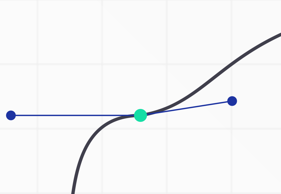
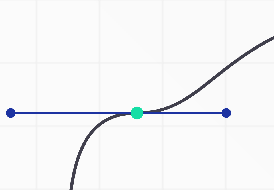
What we want is for our animation to extend outwards from its beginning and ending, filling in the space before it begins and after it ends with the animations starting and ending values. Let’s imagine that our animation is a color gradient, blending from mint to navy blue:

Rather than the color beginning and ending at the start of the color ramp, we want the start color to fill the space to the left of the gradient, and the end color to extend to the right of the gradient:

To fill the spaces before and after keyframed animations, you can use the animation-fill-mode property, which will extend the starting values of an animation, its ending values, or both.
Animation-fill-mode accepts three different keywords as its value. The first is backwards which extends the starting values for the period of time before the animation starts:

Because it is extending backwards, it is only of use when you have a delay applied to your animations. If there’s no delay, there’s no gap before the animation for animation-fill-mode to fill in.
Let’s add the animation-fill-mode to .progress__bar with the backwards keyword:
$prog-bar-dur: 1000ms;
$prog-bar-delay: 1000ms;

.progress {
    &__bar {
        transform-origin: left;
        transform: scaleX(0.5);
        animation: progress-bar $prog-bar-dur $prog-bar-delay;
        animation-fill-mode: backwards;
    }
}
Now, rather than starting half-filled, our progress bar stays empty for the duration of its animation-delay. At the end of the delay, the animation proceeds normally, and upon conclusion, goes back to the assigned value of scaleX(.5):

The second keyword for animation-fill-mode is forwards. The opposite of backwards, forwards extends the ending values of an animation onwards, forever:

Forwards tells the browser to hit pause on the very last frame of the animation and hold it there, rather than jumping back to the default or assigned values. Let’s change .progress__bar’s animation-fill-mode to forwards and take it for a spin:
$prog-bar-dur: 1000ms;
$prog-bar-delay: 1000ms;

.progress {
    &__bar {
        transform-origin: left;
        transform: scaleX(0.5);
        animation: progress-bar $prog-bar-dur $prog-bar-delay;
        animation-fill-mode: forwards;
    }
}
Now our progress bar is back to sitting at 50% until the animation begins. Then returning to 0 and animating from there. But rather than going back to 50%, the bar stays full:

And then, of course, there are times where you want an animation to extend, or fill, in both directions, like that of our progress bar. The aptly named both keyword for animation-fill-mode fills the animation in both directions:

Let’s set .progress__bar’s animation-fill-mode to both:
$prog-bar-dur: 1000ms;
$prog-bar-delay: 1000ms;

.progress {
    &__bar {
        transform-origin: left;
        transform: scaleX(0.5);
        animation: progress-bar $prog-bar-dur $prog-bar-delay;
        animation-fill-mode: both;
    }
}
And now, when you check the browser, you should see it sitting at 0% until the animation begins, then fill in normally, and then stay at 100%:

Aaaaaand we have a functioning, keyframed progress bar! Nice! Let’s reduce the delay back to our original 100ms, and, just like with our other animation properties, we don’t have to write out animation-fill-mode and its value, long form. Instead, we can include its keyword in the short-hand animation property:
$prog-bar-dur: 1000ms;
$prog-bar-delay: 1000ms;

.progress {
    &__bar {
        transform-origin: left;
        transform: scaleX(0.5);
        animation: progress-bar $prog-bar-dur $prog-bar-delay both;
    }
}
Now that we have a functioning progress bar, let’s go back and use animation-fill-mode to finish integrating the cat content into the page. We want the animation to extend in both directions, so it stays invisible until the delay has finished, and remain visible afterward. So let’s add the both keyword to .cat’s animation property:
$prog-bar-dur: 1000ms;
$prog-bar-delay: 150ms;
$cat-delay: $prog-bar-dur + $prog-bar-delay;

.progress {
    &__bar {
        transform-origin: left;
        transform: scaleX(0.5);
        animation: progress-bar $prog-bar-dur $prog-bar-delay both;
    }
}

.cat {
    animation: cat 0ms $cat-delay both;
}
Let’s take it for a spin and hopefully see a fully cohesive set of animations for the progress bar and cat content loading directly afterward:

wOOOOT! We’ve successfully done our part in filling the internet with more cat content. Everything is working like we wanted it to. Now that we have things up and running as we’d like, we can do some tweaking and refining.
As a viewer, you almost miss the progress bar being full because the cat content loads exactly when the bar is full, leaving no time to register that the loading process has completed. Let’s add in a slight delay between the finish of the progress bar animation and the start of the cat animation. We can multiply the $prog-delay variable by two in the delay for cat animation, which will give an additional 150ms before the cat animation begins:
$prog-bar-dur: 1000ms;
$prog-bar-delay: 150ms;
$cat-delay: $prog-bar-dur + $prog-bar-delay*2;

.progress {
    &__bar {
        transform-origin: left;
        transform: scaleX(0.5);
        animation: progress-bar $prog-bar-dur $prog-bar-delay both;
    }
}

.cat {
    animation: cat 0ms $cat-delay both;
}
And let’s give things another look in the browser:

That’s nicer. It’s not a huge pause, but that extra delay between the two animations lets you register that the bar has finished loading, which helps the jump feel more anticipated and less jarring.
Variety is the spice of life
Now that we have the content loading the way we want, let’s turn our attention back to the progress bar animation and the pauses and surges it creates as the bar fills:

They add a nice bit of texture to our animation, but they’re completely uniform in nature. Right now, each keyframe is using the timing-function assigned to the animation, which, since we haven’t assigned a timing-function, is the default ease timing function, which we could also write out as cubic-bezier(.25,.1,.25,1).
So, each keyframe in progress bar has cubic-bezier values assigned to it, as if the span between each keyframe is its own animation with its own ease in and ease out. If we added the cubic-bezier handles to each of the keyframes in our graph of the animation, it would look so:
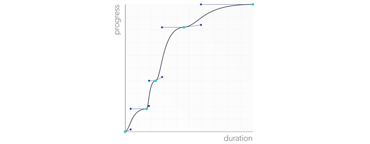
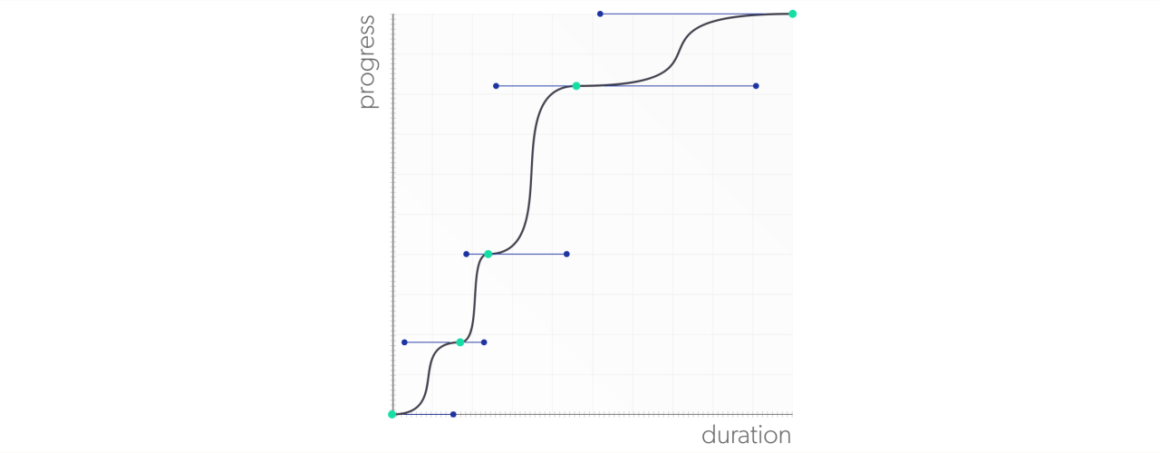
You can see how each keyframe has its own acceleration curve, dictated by the animation-timing-function. To make this clearer, let’s assign our own, more extreme, timing function to our progress bar animation. We'll use something with a lot of easing, which will create more drastic contrast in velocities over the course of the animation. Something like cubic-bezier(.9,0,.1,1):
To assign our cubic-bezier() acceleration curve to progress-bar, we can use the animation-timing-function property with the cubic-bezier function as its value:
$prog-bar-dur: 1000ms;
$prog-bar-delay: 150ms;
$cat-delay: $prog-bar-dur + $prog-bar-delay*2;

.progress {
    &__bar {
        transform-origin: left;
        transform: scaleX(0.5);
        animation: progress-bar $prog-bar-dur $prog-bar-delay both;
        animation-timing-function: cubic-bezier(.9,0,.1,1);
    }
}
Or we can shorten things up and add the cubic-bezier function to our shorthand animation property:
$prog-bar-dur: 1000ms;
$prog-bar-delay: 150ms;
$cat-delay: $prog-bar-dur + $prog-bar-delay*2;

.progress {
    &__bar {
        transform-origin: left;
        transform: scaleX(0.5);
        animation: progress-bar $prog-bar-dur $prog-bar-delay both cubic-bezier(.9,0,.1,1);
    }
}
Now our keyframes have much more exaggerated eases, giving our animation curve larger flat spots at the keyframes, and steeper velocity slopes between them. When you watch our progress bar in the browser, you see much more deliberate pauses and surges in the bar’s motion:

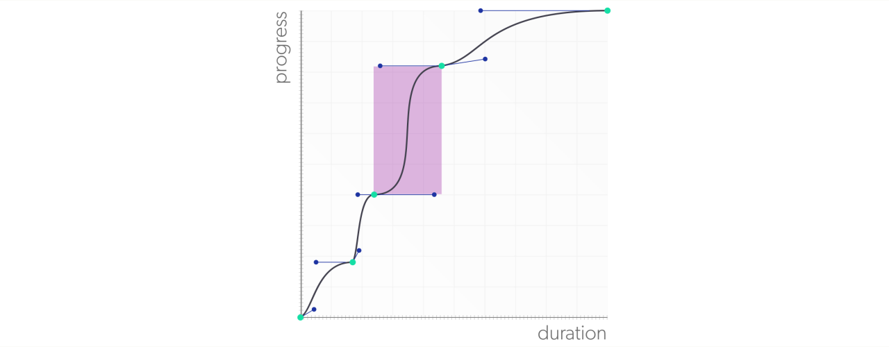
While the surging is definitely more visible with the cubic-bezier timing function, it’s probably overkill. Generally, the default ease timing function works pretty well. The problem is coming in at the 24% keyframe. It sits in close proximity to the previous keyframe, which, at 17%, is only separated by 7%. The closeness of the two keyframes, combined with the uniformity of the acceleration curves, results in the second keyframe’s pause/surge getting a little lost.
A keyframe will inherit the timing function on the selector where the animation has been assigned unless a specific timing function has been assigned. And to assign a timing function to a specific keyframe, assign the animation-timing-function property to the keyframe in question. Let’s move the cubic-bezier timing function from the .progress_bar’s animation property to the 24% keyframe on the progress bar:
$prog-bar-dur: 1000ms;
$prog-bar-delay: 150ms;
$cat-delay: $prog-bar-dur + $prog-bar-delay*2;

.progress {
    &__bar {
        transform-origin: left;
        transform: scaleX(0.5);
        animation: progress-bar $prog-bar-dur $prog-bar-delay both;
    }
}

@keyframes progress-bar{
    0% {
        transform: scaleX(0);
        opacity: .1;
    }
    17% {
        transform: scaleX(.18);

    }
    24% {
        transform: scaleX(.40);
        animation-timing-function: cubic-bezier(.9,0,.1,1);
    }
    46% {
        transform: scaleX(.81);
    }
    85%,100% {
        opacity: 1;

    }
    100% {
        transform: scaleX(1);
    }
}
When you assign a timing function to a keyframe, you are controlling the acceleration curve of the values between that keyframe and the next. That means you are controlling the ease into motion at 24%, and ease out of motion at 46%:
Let’s take a look at how our progress bar plays back in the browser with its new keyframe timing function:

Now the 24% keyframes acceleration is much more pronounced, while the others remain at the smoother ease values. Which is almost perfect. Almost. But since we’re putting all of this effort into it, we might as well nitpick.
There is a tiny hitch as the 46% keyframe eases into motion. This is because the timing function on the 24% has a long, flat ease-out, while the 46% keyframe’s ease timing function of cubic-bezier(.25,.1,.25,1) has a shorter, steeper ease-in, creating a break in the flow of motion:
Let’s give 46% its own timing function and use it to smooth out that transition by flattening out the ease in to motion to match the previous keyframe’s ease out. Right now we have an ease in with a Y-coordinate of .1. If we reduce it to 0, we’ll get a cubic-bezier(.25,0,.25,1) and a flat ease in:
Let’s plug our new timing-function into the 46% keyframe, and, while we’re at it, the opacity animation is a bit distracting, so let’s strip it out and simplify things:
@keyframes progress-bar{
    0% {
        transform: scaleX(0);
    }
    17% {
        transform: scaleX(.18);

    }
    24% {
        transform: scaleX(.40);
        animation-timing-function: cubic-bezier(.9,0,.1,1);
    }
    46% {
        transform: scaleX(.81);
        animation-timing-function: cubic-bezier(.25,0.25,1);
    }
    100% {
        transform: scaleX(1);
    }
}
And take things for a spin:

Much better! Now we’re all set! We have a progress bar that feels more authentic through the use of @keyframes and the animation-timing-function property. And we’re able to add pauses in the animation, as well as simulate the loading of content through the use of the animation-delay and animation-fill-mode properties.
Coming up next, we’ll take a look at ways to use a few more CSS animation properties to write more concise, reusable, and stateful keyframes and animations
Let's recap!
CSS @keyframes animations can be triggered using pseudo-selectors, such as :hover, just like transitions.
CSS @keyframes can also be triggered by assigning the loading of the assigned elements, such as through a page load or refresh.
You can delay the start of keyframed animations using the animation-delay property, with a delay denoted either in seconds or milliseconds, just like transitions.
You can extend the values from the start and end of animations using the animation-fill-mode property:
The backwards keyword will extend the starting values of an animation backwards, covering the duration of the assigned delay before the animation itself begins.
The forwards keyword will extend the ending values of an animation onwards until the page is reloaded or navigated away from.
The both keyword will extend the animation in both directions.
You can set the timing function for @keyframes using the animation-timing-function on the selector where the animation has been assigned.
You can also set timing functions on a keyframe-by-keyframe basis by assigning the animation-timing-function property to the desired keyframes.
