Manipulate and reuse CSS animations
Taking stock of our keyframes superpowers
You’ve just spent two chapters getting good at creating and polishing @keyframes. And I mean good. Delays, fill-modes, keyframe-by-keyframe timing functions, you name it. You have the tools to create and refine most any animation you could think of. But not necessarily in the most efficient way possible.
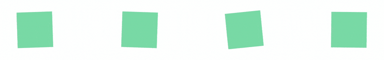
Like, what if you wanted to make an animation of something bouncing back and forth?

You could create an animation with a LOT of keyframes.
Or what if you wanted to have different elements spinning in opposite directions? Or at different speeds?
Right now, you wouldn’t have much of a choice. That said, you don’t have to go through all that extra work. You can add a few more CSS animation properties to your bag of tricks that will help you get more out of keyframes.
So, instead of writing a ton of extra keyframes, you’ll be able to make a small set and then have the browser repeat them; have it play them backward, or pause and play them on command.
This chapter is all about squeezing as much as you can out of a set of keyframes, keeping your code base tidier and more maintainable while lessening the amount of code you need to write.
Revisiting input validation - out with the old
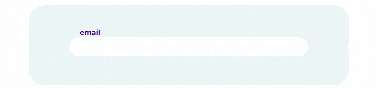
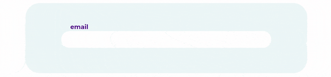
Let’s hop in the way-back machine and return to Part 1, Chapter 3 and the world of transitions and pseudo-selectors. We built an email input that gave the user visual feedback when they entered an invalid address:

It’s nice. It gives the user a sharp, visual cue that something is amiss. But the fade between the valid and invalid states might be soft. Let’s write some @keyframes and create a more immediate and visceral response to an invalid input.
As a quick refresher, our email input is a standard, run-of-the-mill input with the type set to email:
<div class="container">
    <div class="form">
        <div class="form__group">
            <label for="email-input">email</label>
            <input type="email" name=”email-input>
        </div>
    </div>
</div>
And it is currently transitioning the background-color to a deep red over 500ms when the input is invalid while also not being focused:
$cd-txt: #6300a0;
$cd-txt--invalid: #fff;
$cd-danger: #b20a37;

.form {
    &__group {
        & input {
            border: 2px solid $cd-box;
            border-radius: 100rem;
            color: $cd-txt;
            font-family: 'Montserrat', sans-serif;
            font-size: 2.5rem;
            outline: none;
            padding: .5rem 1.5rem;
            width: 100%;
            transition: background-color 500ms;
            &:focus {
                border: 2px solid $cd-txt;
            }
            &:not(:focus):invalid {
                background-color: $cd-danger;
                border: 2px solid $cd-danger;
                color: $cd-txt--invalid;
            }
        }
    }
}
The base styling is totally okay, so we’re not going to mess with any of that. Instead, we’re going to throw all of our hard work in the dumpster and remove the transition from the input selector. It can be infuriating to throw work in the trash and proceed in a different direction, but it’s part of the creative process. Sometimes something doesn't work as well as you’d like, and you have to leave it behind. So… goodbye transition: background-color.
$cd-txt: #6300a0;
$cd-txt--invalid: #fff;
$cd-danger: #b20a37;

.form {
    &__group {
        & input {
            border: 2px solid $cd-box;
            border-radius: 100rem;
            color: $cd-txt;
            font-family: 'Montserrat', sans-serif;
            font-size: 2.5rem;
            outline: none;
            padding: .5rem 1.5rem;
            width: 100%;
            &:focus {
                border: 2px solid $cd-txt;
            }
            &:not(:focus):invalid {
                background-color: $cd-danger;
                border: 2px solid $cd-danger;
                color: $cd-txt--invalid;
            }
        }
    }
}
Now we have an email input that turns red upon an invalid and not-focused state:
Now what? What’s so great that we’ve tossed out a perfectly usable transition to make way for it?
Form validation - don’t you shake your head at me
What if we made the input shake its head? It’s a universal sign that nearly all users are hard-wired to interpret as “no.” As humans, we absorb and process body language on the subconscious level, so even subtle movements can impart meaning. A quick, but firm, shake of the head is all that we’ll need.
So, let’s create our headshake @keyframes:
@keyframes headshake {

}
We want our input to start and end in it’s normal resting place, so we don’t need to create keyframes for them. By leaving them out, our animation will make use of the default values on the selector. But what we do need are keyframes for the motion in between.
From its resting place, we want the input to move a little to the right, then left, before returning back to its resting place. So, at 0% we are at the default position. Then, at a quarter of the way into the animation, we want the input to be all-the-way right. At 75% into the animation, we need to be far left, before finally returning to the resting position:
@keyframes headshake {
    25% {
        // far -right
        transform: translateX();
    }
    75% {
        // far-left
        transform: translateX();
    }
}
Now, all we need to do is decide how hard we want our input to shake its head. It shouldn’t be overly dramatic; just a curt, crisp shake. A percent or two should do it. Let’s create a variable named $shake-intensity and go big with a value of 2% and plug it into our translateX() functions:
$shake-intensity: 2%;

@keyframes headshake {
    25% {
        // far -right
        transform: translateX($shake-intensity);
    }
    75% {
        // far-left
        transform: translateX(-$shake-intensity);
    }
}
We want the far-left position of our email input to be the inverse of the right, so we’ve just prefixed the variable with a negative symbol. Now we add headshake @keyframes to the input:not(:focus):invalid selector. We’re going for a brisk shake of the head, so let’s give it something short and sweet for a duration. Something in the neighborhood of 100ms should be a good start:
$cd-danger: #b20a37;
$cd-txt: #6300a0;
$shake-intensity: 2%;

.form {
    &__group {
        & input {
            &:active, &:focus {
                border: 2px solid $cd-txt;
            }
            &:not(:focus):invalid {
                color: white;
                border: 2px solid $cd-danger;
                background: $cd-danger;
                animation: headshake 100ms cubic-bezier(.4,.1,.6,.9);
            }
        }
    }
}

@keyframes headshake {
    25% {
        // far-right
        transform: translateX($shake-intensity);
    }
    75% {
        // far-left
        transform: translateX($shake-intensity * -1);
    }
}
We’ve also set the animation-timing-function for headshake to cubic-bezier(.4,.1,.6,.9), which is a fairly undramatic acceleration curve:

Now let’s go type in something blatantly inaccurate into our email input and see how it reacts!
Now that is some nice, anthropomorphized head shaking! It’s so nice that we need more of it.
Okay! So, that means we need to squeeze more keyframes in there. To get two headshakes in there, the far right would need to be at 12.5% and 62.5%, and the left would need to be at 37.5% and 87.5%, right? But what if that still isn’t enough head shaking? What if we need three shakes? That would mean the far-right would fall at…. just a sec… carry the one… um… you know what? There’s gotta be a better way. Because there’s always a better way!
And that better is called the animation-iteration-count property. It lets you write the keyframes for a single cycle of an animation and have the browser repeat it as many times as you’d like. That means we can have our input shake its head two times, or two hundred times, with just a few characters of code:
$cd-danger: #b20a37;
$cd-txt: #6300a0;
$shake-intensity: 2%;

.form {
    &__group {
        & input {
            &:active, &:focus {
                border: 2px solid $cd-txt;
            }
            &:not(:focus):invalid {
                color: white;
                border: 2px solid $cd-danger;
                background: $cd-danger;
                animation: headshake 100ms cubic-bezier(.4,.1,.6,.9);
                animation-iteration-count: 3;
            }
        }
    }
}

@keyframes headshake {
    25% {
        // far-right
        transform: translateX($shake-intensity);
    }
    75% {
        // far-left
        transform: translateX($shake-intensity * -1);
    }
}
There’s a writing principle called the rule of three that states having something happen three times makes it more effective. That can mean dramatic, funny, or impactful. So we’ve given animation-iteration-count a value of three.
Now it’s time for more typos!
You know what? They say that two’s company, but three’s a crowd. That might be one shake too many. Let’s knock the iteration count down to two and give it another whirl. And when we see them chained together like that, 2% for $shake-intensity might too much as well. Let’s take it down to 1% while we’re at it:
$cd-danger: #b20a37;
$cd-txt: #6300a0;
$shake-intensity: 1%;

.form {
    &__group {
        & input {
            &:active, &:focus {
                border: 2px solid $cd-txt;
            }
            &:not(:focus):invalid {
                color: white;
                border: 2px solid $cd-danger;
                background: $cd-danger;
                // animation-iteration-count integrated into the animation property:
                animation: headshake 100ms cubic-bezier(.4,.1,.6,.9) 2;
            }
        }
    }
}

@keyframes headshake {
    25% {
        // far-right
        transform: translateX($shake-intensity);
    }
    75% {
        // far-left
        transform: translateX($shake-intensity * -1);
    }
}
Where’d animation-iteration-count go? Well, it’s just like the other animation properties, in that we can include it the shorthand animation property, rather than writing the whole thing out. So we’ve added the number 2 to the list of values for animation, and now our input should shake its head twice.
The value for animation-duration applies to the length of a single cycle of animation. That means that our headshake animation, with an assigned duration of 100ms and iteration count of 2 will take a total of 200ms to complete:
Now that is just the right amount of head shaking! With a nimation-iteration-count, you can save yourself from a lot of math and complicated keyframes by writing a single cycle of animation, and have the browser play it back as many times as you want. Much cleaner, and a lot easier to tweak and refine. But what if you wanted an animation to play on loop forever?
Loading animations - being put on hold
In the modern world of web development, websites often call to the server in the background to request some sort of data, such as an image, or text. While the page waits for the response back from the server, it will show a placeholder.
The response from a server may only take a fraction of a second, or much longer, depending on the complexity of the request, size of data being transferred, and speed of the connection. The point is, you may never know how long you’ll need a loading animation to play. So, rather than something specific, like the progress bar from the previous chapter, we’re going to build something a bit more generic: loading bars!
To get started, let’s create a <div> with a class of load assigned, and nest five children divs within it, each with a class of .load__bar assigned:
<div class="container">
    <div class="load">
        <div class="load__bar"></div>
        <div class="load__bar"></div>
        <div class="load__bar"></div>
        <div class="load__bar"></div>
        <div class="load__bar"></div>
    </div>
</div>
Now that our bars are built, we need to style them so they look like… well, bars! Let’s style out .load with the appropriate layout properties, and set up the dimensions for .load__bar while giving them a nice, minty-green background:
$cd-bars: #15DEA5;
$size: 3vh;

.load {
    width: $size*10;
    height: $size*7.5;
    display: flex;
    justify-content: space-evenly;
    &__bar {
        background-color: #15DEA5;
        height: 100%;
        width: $size;
    }
}
And when we check our browser, we’re greeted with a row of five, mint-green bars!

Cool. But they’re just sitting there. We want to give users some motion to keep their interest while they wait. This is an animation course, after all. So let’s create a set of @keyframes called bars and use the scaleY() transform function to animate the vertical scale the bars over time, starting at 50%, and ending at 100%:
@keyframes bars {
    0% {
        transform: scaleY(0.5);
    }
    100% {
        transform: scaleY(1.0);
    }
}
And, of course, for our keyframes to have an effect on the bars and animate their scale, we first need to apply them to the .bars selector. So let’s set up an animation using the bars keyframes and a duration of 1000ms:
$cd-bars: #15DEA5;
$size: 3vh;
$anim-dur: 1000ms;

.load {
    width: $size*10;
    height: $size*7.5;
    display: flex;
    justify-content: space-evenly;
    &__bar {
        background-color: $cd-bars;
        height: 100%;
        width: $size;
        animation: bars $anim-dur;
    }
}

@keyframes bars {
    0% {
        transform: scaleY(0.5);
    }
    100% {
        transform: scaleY(1.0);
    }
}
We’ve placed our animation duration into a variable named $anim-dur, allowing us to tweak it more easily if needed. Now our bars should go from half of their vertical size to their full height over the course of one second:

Things are mostly working as we’d expect, but it’s still a ways from what we want. Having them all scale at the same time is a little dry. Remember, adding some complexity to our animations goes a long way in making them engaging for visitors. Let’s stagger their growths so that their increases in height sweep across the bars in a wave.
And what better way to stagger the growth of our bars than to use the animation-delay property? We can create a set of modifiers, each with an incrementally increased delay amount. We have five bars, so we need to make five modifying selectors, each with a slightly longer animation-delay assigned to it.
We could write each out manually. We could do a lot of things. But why should we, when we can harness the power of Sass to take care of this repetitive and incremental task for us? Let’s set up a Sass @for loop to iterate through a set of numbers, from one to five, incrementing the selector’s name and animation-delay:
$cd-bars: #15DEA5;
$size: 3vh;
$num-bars: 5
$anim-dur: 1000ms;
$anim-delay: $anim-dur / $num-bars;

.load {
    width: $size*10;
    height: $size*7.5;
    display: flex;
    justify-content: space-evenly;
    &__bar {
        background-color: $cd-bars;
        height: 100%;
        width: $size;
        animation: bars $anim-dur;
        @for $i from 1 through $num-bars {
            &--#{$i} {
                animation-delay: $anim-delay * $i;
            }
        }
    }
}
Each iteration through the loop will yield a new selector, with that iteration’s index number used in its name, as well as to multiply the $anim-delay and create an incremented delay. $anim-delay is set to the duration of the animation divided by the number of bars.
So, on the first iteration, the modifier will be named .load__bar--1 and have a delay of 200ms. The second will be .load__bar--2 with a delay of 400ms, and so on. When you check out the compiled CSS, you’ll see these newly created modifying selectors:
.load__bar--1 {
  animation-delay: 200ms;
}
.load__bar--2 {
  animation-delay: 400ms;
}
.load__bar--3 {
  animation-delay: 600ms;
}
.load__bar--4 {
  animation-delay: 800ms;
}
.load__bar--5 {
  animation-delay: 1000ms;
}
Now all that’s left is to do is to apply our newly-minted modifiers to the appropriate divs in our HTML:
<div class="container">
    <div class="load">
        <div class="load__bar load__bar--1"></div>
        <div class="load__bar load__bar--2"></div>
        <div class="load__bar load__bar--3"></div>
        <div class="load__bar load__bar--4"></div>
        <div class="load__bar load__bar--5"></div>
    </div>
</div>
And behold the majesty of our undulating bars in the browser:

Ooof. We added all those delays in there, but forgot to set the fill-mode to prevent that popping.
So, let’s set animation-fill-mode to backwards to extend the starting values of the animation backwards to the loading of the page:
$cd-bars: #15DEA5;
$size: 3vh;
$anim-dur: 1000ms;
$anim-delay: $anim-dur / 5;

.load {
    width: $size*10;
    height: $size*7.5;
    display: flex;
    justify-content: space-evenly;
    &__bar {
        background-color: $cd-bars;
        height: 100%;
        width: $size;
        animation: bars $anim-dur backwards;
        @for $i from 1 through 5 {
            &--#{$i} {
                animation-delay: $anim-delay * $i;
            }
        }
    }
}
Now behold the glory of our undulating bars!

Well, at least behold the glory of a single cycle of our undulating bars. Now we need to set that cycle to repeat and animation-iteration-count is exactly what this situation calls for. But how many cycles should we set for the iteration count?
Looping animations - to infinity and beyond
We don’t know how long it will be between our browser sending its request to the server and receiving the payload that the server sends in response. And that means we never really know just how many iterations our bars will need.
We could just give it a huge number, like 9999, but that’s a messy workaround. This feels like one of those times where we’re about to have a better way dropped on us…
And here it is: rather than specifying a number for iteration count, we can also tell the browser to play the animation back for all of eternity by assigning the infinite keyword:
$cd-bars: #15DEA5;
$size: 3vh;
$anim-dur: 1000ms;
$anim-delay: $anim-dur / 5;

.load {
    width: $size*10;
    height: $size*7.5;
    display: flex;
    justify-content: space-evenly;
    &__bar {
        background-color: $cd-bars;
        height: 100%;
        width: $size;
        animation: bars $anim-dur backwards infinite;
        @for $i from 1 through 5 {
            &--#{$i} {
                animation-delay: $anim-delay * $i;
            }
        }
    }
}
Behold our infinitely repeating animation of a series of scaling bars!

Now that they’re looping, we have a very similar problem to the one that we had before we added the backwards fill-mode to our animation: the bars are jumping in size from their ending size to their starting size. Only this time it’s because the starting and ending values of the loop are different. Our cycle should have the bars start smaller, then grow to full size at the midpoint, before shrinking back to their starting size at the end.
We could add an extra keyframe to the middle of our bars animation to do just that. Again, we could, but we’re not going to. There is a better way. What if we wanted to use our bars @keyframes elsewhere on our page, but rather than looping, we’d just want them to grow once? If we were to add that extra keyframe to our bars animation, we'd alter our original animation in the service of a use-case and potentially inhibit our ability to use it in other places on our site.
Instead, we can use the animation-direction property to turn our @keyframes into a seamless loop, even though the starting and ending values of the keyframes are different!
The default value for animation-direction is normal. It, as you might have surmised, plays an animation back normally, as in from start to end:
$cd-bars: #15DEA5;
$size: 3vh;
$anim-dur: 1000ms;
$anim-delay: $anim-dur / 5;

.load {
    width: $size*10;
    height: $size*7.5;
    display: flex;
    justify-content: space-evenly;
    &__bar {
        background-color: $cd-bars;
        height: 100%;
        width: $size;
        animation: bars $anim-dur backwards infinite;
        animation-direction: normal;
        @for $i from 1 through 5 {
            &--#{$i} {
                animation-delay: $anim-delay * $i;
            }
        }
    }
}
Typically, animation-direction isn’t often seen in the wild with the normal value attached to it, as it is extra code that performs the same task as not typing it at all:

Where using animation-direction starts becoming handy is with the reverse keyword. And what does assigning reverse to animation-direction do? Yup. It plays the animation in reverse, starting at the end, and playing it backwards to the start:
$cd-bars: #15DEA5;
$size: 3vh;
$anim-dur: 1000ms;
$anim-delay: $anim-dur / 5;

.load {
    width: $size*10;
    height: $size*7.5;
    display: flex;
    justify-content: space-evenly;
    &__bar {
        background-color: $cd-bars;
        height: 100%;
        width: $size;
        animation: bars $anim-dur backwards infinite;
        animation-direction: reverse;
        @for $i from 1 through 5 {
            &--#{$i} {
                animation-delay: $anim-delay * $i;
            }
        }
    }
}
And now our animation will play back in reverse, which isn’t exactly what we’re going for:

Aside from playing animations forwards and backwards, animation-direction will also let you play animations back and forth, so that the animation direction alternates with each iteration, first playing from the start to the end, then switching and playing from the end to the start. Which is pretty much exactly what we need to do with our animation.
And just what is the name of this magical keyword? I’m glad you asked! It’s alternate:
$cd-bars: #15DEA5;
$size: 3vh;
$anim-dur: 1000ms;
$anim-delay: $anim-dur / 5;

.load {
    width: $size*10;
    height: $size*7.5;
    display: flex;
    justify-content: space-evenly;
    &__bar {
        background-color: $cd-bars;
        height: 100%;
        width: $size;
        animation: bars $anim-dur backwards infinite;
        animation-direction: alternate;
        @for $i from 1 through 5 {
            &--#{$i} {
                animation-delay: $anim-delay * $i;
            }
        }
    }
}
And now we have an infinitely, and seamlessly, looping animation!

We’re on our way! The default timing-function of ease has different slopes to its acceleration and deceleration profiles, which creates a bit of a hiccup between the cycles:

Instead of sticking with the defaults for animation-timing-function, let’s assign it something more symmetrical, like the ease in/out profile:

And while we’re busy added the timing-function to the animation, let’s do the obligatory move-the-value-from-the-longhand-css-property-to-the-shorthand-animation-property thing and get rid of the longhand animation-direction and add the alternate keyword to the animation property’s list of values:
$cd-bars: #15DEA5;
$size: 3vh;
$anim-dur: 1000ms;
$anim-delay: $anim-dur / 5;

.load {
    &__bar {
        background-color: $cd-bars;
        animation: bars $anim-dur backwards infinite ease-in-out alternate;
        @for $i from 1 through 5 {
            &--#{$i} {
                animation-delay: $anim-delay * $i;
            }
        }
    }
}
Now our loop should be much smoother and fluid:

Nice! So, should we call it a day? While the bars are doing exactly what we’d like, it’s still boring. Let’s try to make it more engaging by adding visual complexity, by stacking another set of bars below our original set. We can just duplicate the .load div and its contents:
<div class="container">
    <div class="load">
        <div class="load__bar load__bar--1"></div>
        <div class="load__bar load__bar--2"></div>
        <div class="load__bar load__bar--3"></div>
        <div class="load__bar load__bar--4"></div>
        <div class="load__bar load__bar--5"></div>
    </div>
    <div class="load">
        <div class="load__bar load__bar--1"></div>
        <div class="load__bar load__bar--2"></div>
        <div class="load__bar load__bar--3"></div>
        <div class="load__bar load__bar--4"></div>
        <div class="load__bar load__bar--5"></div>
    </div>
</div>
Let’s see where that gets us:

Meh…it’s kinda cool, but it’s not really doing much to make things more interesting. It just looks like a reflection of the original bars. Rather than mirror the top set, let’s try to get the bottom one to mesh with its overhead counterpart, so as the top bar is grows, the bottom shrinks. Sort of in an inverted sync. What we need is for the animation to continue to loop, only in reverse.
Gosh, wouldn’t it be swell if there were a keyword for the animation-direction property that played animations in alternating directions, but in reverse?
Well, wouldn’t you know? There is! And it’s called alternate-reverse. How convenient. To apply the alternate-reverse animation-direction to our second set of bars, we’ll need to create a new set of modifiers, which we can do within a @for loop.
Within each loop, we’ll have it create a second selector, using the same base naming structure, but add in a suffix to indicate that it is inverted in direction. While we’re at it, let’s also give things a bit more visual contrast and add a different color to our inverted bars:
$cd-bars: #15DEA5;
$cd-bars-inv: #0E397F;
$size: 3vh;
$anim-dur: 1000ms;
$anim-delay: $anim-dur / 5;

.load {
    &__bar {
         animation: bars $anim-dur backwards infinite ease-in-out alternate;
        @for $i from 1 through 5 {
            &--#{$i} {
                animation-delay: $anim-delay * $i;
            }
            &--#{$i}-inv {
                animation-delay: $anim-delay * $i;
                animation-direction: alternate-reverse;
                background-color: $cd-bars-inv;
            }
        }
    }
}
Now our compiled CSS will have two sets of modifiers; one for the top row, another for the bottom:
.load__bar--1 {
  animation-delay: 200ms;
}
.load__bar--1-inv {
  animation-delay: 200ms;
  animation-direction: alternate-reverse;
  animation-fill-mode: forwards;
  background: #0E397F;
}
.load__bar--2 {
  animation-delay: 400ms;
}
.load__bar--2-inv {
  animation-delay: 400ms;
  animation-direction: alternate-reverse;
  animation-fill-mode: forwards;
  background: #0E397F;
}
.load__bar--3 {
  animation-delay: 600ms;
}
.load__bar--3-inv {
  animation-delay: 600ms;
  animation-direction: alternate-reverse;
  animation-fill-mode: forwards;
  background: #0E397F;
}
.load__bar--4 {
  animation-delay: 800ms;
}
.load__bar--4-inv {
  animation-delay: 800ms;
  animation-direction: alternate-reverse;
  animation-fill-mode: forwards;
  background: #0E397F;
}
.load__bar--5 {
  animation-delay: 1000ms;
}
.load__bar--5-inv {
  animation-delay: 1000ms;
  animation-direction: alternate-reverse;
  animation-fill-mode: forwards;
  background: #0E397F;
}
Let’s replace the modifiers for our second set of bars in the HTML:
<div class="container">
    <div class="load">
        <div class="load__bar load__bar--1"></div>
        <div class="load__bar load__bar--2"></div>
        <div class="load__bar load__bar--3"></div>
        <div class="load__bar load__bar--4"></div>
        <div class="load__bar load__bar--5"></div>
    </div>
    <div class="load">
        <div class="load__bar load__bar--1-inv"></div>
        <div class="load__bar load__bar--2-inv"></div>
        <div class="load__bar load__bar--3-inv"></div>
        <div class="load__bar load__bar--4-inv"></div>
        <div class="load__bar load__bar--5-inv"></div>
    </div>
</div>
And now to check how our inversely-synchronized bars look in a browser:

Much better! We’ve added a sort of secondary motion to our animation by complimenting the motion of the two sets of bars.
Play state - playing and pausing animations
Our loading bars are great. We could call it good and move on, but what about those poor souls without broadband? Who knows how long they’ll have to stare at those bars while they wait for their response from the server to arrive via carrier pigeon. Let’s take pity on them and do something to make the animation a bit more interactive and entertain the user while they wait.
There’s that old crank call: “Is your refrigerator running? Yes? Then you’d better go catch it!” Right now we could swap animation with refrigerator, because all our animations do is run. They either run until they are done or run forever. Either way, they run. But we there is one, single, solitary CSS animation property we haven’t touched upon yet. Rather than controlling the direction or delay of animation, it controls if they are playing at all or not. The animation-play-state property lets us pause or play animations by using the paused or running keywords respectively.
Let’s say that we have a plain old div with the class .spin assigned to it:
<div class="container">
    <div class="spin"></div>
</div>
And, via a few @keyframes and animation properties, we’ve set it to spin infinitely, with each rotation taking three seconds to complete:
.spin {
    background-color: #15DEA5;
    width: 30vh;
    height: 30vh;
    animation: spin 3s linear infinite;
}

@keyframes spin {
    from {
        transform: rotate(0deg);
    }
    to {
        transform: rotate(360deg);
    }
}
It just spins and spins and spins. There’s nothing you can do to stop it, speed it up, or anything, really. So far you’ve seen how to set animations in motion, but once they’re going, you have to wait for them to finish. But the animation-play-state property gives you a remote control to play and pause them.
Let’s set up our box so that it starts paused, but plays when it is hovered over. To pause our spinning box, we need to set the animation-play-state to paused, or simply add the paused keyword to the shorthand animation property:
.spin {
    background-color: #15DEA5;
    width: 30vh;
    height: 30vh;
    animation: spin 3s linear infinite paused;
}

@keyframes spin {
    from {
        transform: rotate(0deg);
    }
    to {
        transform: rotate(360deg);
    }
}
Now our box just sits there, despite having a spin animation applied to it:

We’ve started our animation but immediately hit the pause button. To get it moving, we need to add a play button, which we’ll do by adding a :hover pseudo-selector to our .spin selector and setting the animation-play-state to running:
.spin {
    background-color: #15DEA5;
    width: 30vh;
    height: 30vh;
    animation: spin 3s linear infinite paused;
    &:hover {
        animation-play-state: running;
    }
}

@keyframes spin {
    from {
        transform: rotate(0deg);
    }
    to {
        transform: rotate(360deg);
    }
}
Now, whenever we hover over our box, it’ll resume the spinning where it left off; and once we stop hovering, it’ll pause where it’s at, only to begin running again if we hover over it::

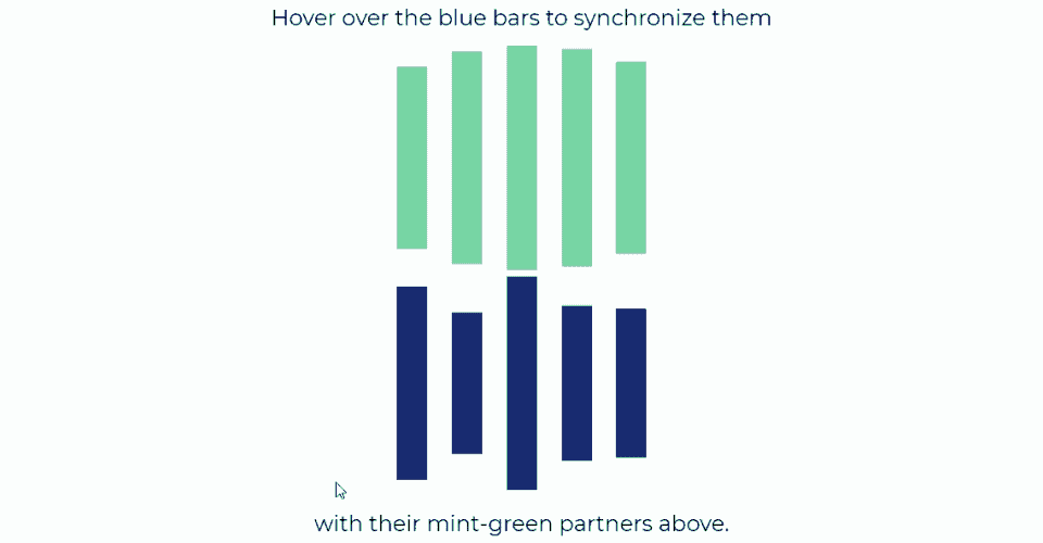
Animation-play-state gives users the ability to interact with animations, and therefore create their own experience on your site which could be pretty cool, as long as you don’t over-do it. Let’s use animation-play-state to turn our loading bars into a little game to help users pass the time while they wait for a response from the server.
Right now, our two sets of bars are locked in a sort of dance with one another:

What if we changed the delays on the second set of bars, so each had a random starting time?

Now things are out of whack, but it gives us an opportunity to build in some interactivity for users and entertain them while they wait for things to load.
We could use a :hover pseudo-selector to act as a pause button, allowing the user to resync the two bar sets by hovering over each until it is in sync with its partner. Step one is to randomize the delays on the inverted bars, which we can do using Sass’ random() function:
$cd-bars: #15DEA5;
$cd-bars-inv: #0E397F;
$size: 3vh;
$anim-dur: 1000ms;
$anim-delay: $anim-dur / 5;

.load {
    &__bar {
        animation: bars $anim-dur backwards infinite ease-in-out alternate;
        @for $i from 1 through 5 {
            &--#{$i} {
                animation-delay: $anim-delay * $i;
            }
            &--#{$i}-inv {
                animation-delay: $anim-delay * $i + random(100)*15ms;
                animation-direction: alternate-reverse;
                animation-fill-mode: forwards;
                background-color: $cd-bars-inv;
            }
        }
    }
}
The random function will generate an integer between 1 and whatever number we pass as an argument, which in this case is 100. So we are generating a random number between 1 and 100, and then multiplying it by 15ms and adding that to our incremental delay, creating a randomized animation-delay for each of the inverted bars:

Now all we need to do is add our pause button by assigning .load__bar a :hover pseudo-selector with the animation-play-state set to paused:
$cd-bars: #15DEA5;
$cd-bars-inv: #0E397F;
$size: 3vh;
$anim-dur: 1000ms;
$anim-delay: $anim-dur / 5;

.load {
    &__bar {
        animation: bars $anim-dur backwards infinite ease-in-out alternate;
        @for $i from 1 through 5 {
            &--#{$i} {
                animation-delay: $anim-delay * $i;
            }
            &--#{$i}-inv {
                animation-delay: $anim-delay * $i + random(100)*15ms;
                animation-direction: alternate-reverse;
                animation-fill-mode: forwards;
                background-color: $cd-bars-inv;
                &:hover {
                    animation-play-state: paused;
                }
            }
        }
    }
}
Let’s also add a quick set of instructions to our HTML while we’re at it:
<div class="container">
        <span>Hover over the blue bars to synchronize them</span>
    <div class="load">
        <div class="load__bar load__bar--1"></div>
        <div class="load__bar load__bar--2"></div>
        <div class="load__bar load__bar--3"></div>
        <div class="load__bar load__bar--4"></div>
        <div class="load__bar load__bar--5"></div>
    </div>
    <div class="load">
        <div class="load__bar load__bar--1-inv"></div>
        <div class="load__bar load__bar--2-inv"></div>
        <div class="load__bar load__bar--3-inv"></div>
        <div class="load__bar load__bar--4-inv"></div>
        <div class="load__bar load__bar--5-inv"></div>
    </div>
    <span>with their mint-green partners above.</span>
</div>
That’s it! Now our bars will start randomly out of sync, and it’s up to the user to put them into sync:
And that’s not just it for our little mini-game. That’s it for CSS animation and transition properties! You now have all of the properties that CSS has to offer in your animation toolkit, and are ready to go out and bring your pages to life. But before we wrap things up, you’re going to learn a new tool that will help you build and refine animations more quickly as we return to DevTools.
Let's recap!
You can repeat a set of keyframes as many times as you’d like using the animation-iteration-count property with the number of cycles as its value:
Animation-iteration-count: 6; //will replay the animation six times.
You can set keyframes to repeat infinitely using the animation-iteration-count property with the infinite keyword:
Animation-iteration-count: infinite; //will replay the animation forever.
The animation-direction property let’s you play back a set of keyframes normally with the normal keyword:
Animation-direction: normal; //will playback from beginning to end.
The animation-direction property lets you play a set of keyframes backwards with the reverse keyword:
Animation-direction: reverse; //will playback from the end to the beginning.
The animation-direction property lets you play a set of keyframes back and forth with the alternate keyword:
Animation-direction: alternate; //will playback from beginning to end, and then end to beginning.
The animation-direction property lets you play a set of keyframes back and forth, but starts at the end first with the alternate-reverse keyword:
Animation-direction: alternate-reverse; //will playback from end to beginning, then beginning to end.
You can pause a keyframed animation by assigning the animation-play-state property with the value set to paused:
Animation-play-state: paused.
You can resume the playback of a keyframed animation by assigning the animation-play-state property with the value set to running:
Animation-play-state: running.
