Calculate Correlation
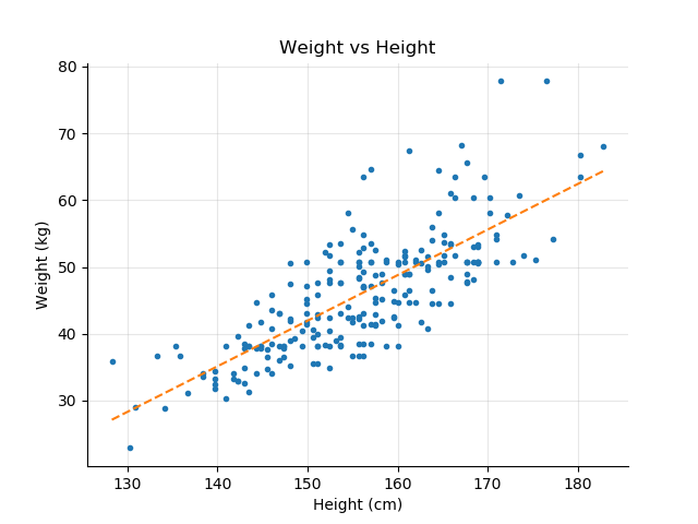
In the previous chapter, we looked at different plots of one variable versus another: Weight vs. Height or Age for the school dataset, and Mpg vs. Acceleration or Weight for the auto-mpg dataset. As can be expected, the Weight vs. Height graph shows that as children grow taller, their weight increases.
In that case, they change in the same direction, both increasing at the same time.
Correlation is an important concept which is at the core of data modeling. Similar to linearity, correlation is a common concept used in everyday conversation. When we say that two things are correlated, we usually mean that as one changes, the other also changes.
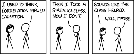
You have probably heard the phrase correlation is not causation. Two variables, A and B, changing at the same time does not imply that A causes B to change.
In this chapter, we look more closely at what correlation truly means, how it is calculated, and its limits. You will learn how to calculate and visualize the correlation between two variables in different ways, how to choose the right type of correlation (Yes, there are different ways to calculate correlation), and how to interpret correlation results.
Let's get started!
What Is Correlation?
In general terms, correlation is a measure of the degree to which two variables change simultaneously. The correlation coefficient describes the strength and direction of the relationship.
You can calculate the correlation between two variables in a pandas DataFrame with the corr() function. Let's look at the correlation between the height and the weight in the school dataset.
import pandas as pd

# Load the School dataset
df = pd.read_csv('school.csv')
# Apply the corr() function to the dataframe
# and select the weight and height correlation
r = df.corr()['height']['weight']
print("Correlation between height and weight is {:.2f}".format( r ))
Correlation between height and weight is 0.77
The result is a string positive correlation r = 0.77.
If you look at the relation between fuel efficiency and the weight of the car from the auto-mpg dataset, you see that as cars become heavier, fuel efficiency decreases. To calculate the correlation between these two variables, use the same code as above, and the result is a negative correlation of r = -0.83.
df = pd.read_csv('auto-mpg.csv')
r = df.corr()['mpg']['weight']
print("Correlation between mpg and weight is {:.2f}".format( r ))
Correlation between mpg and weight is -0.83And two properties:
Use a Correlation Matrix
To calculate the correlation of two of the variables, we loaded the dataset into a pandas DataFrame, and applied the corr() method to the df DataFrame itself. The corr() method returns the correlation coefficients for all the numerical variables. The correlation matrix is symmetric with diagonal 1.
Let's look at the whole correlation matrix for the school dataset.
df = pd.read_csv('school.csv')
# Apply the corr() function to the dataframe
print(df.corr())
             age    height    weight
age     1.000000  0.648857  0.634636
height  0.648857  1.000000  0.774876
weight  0.634636  0.774876  1.000000
You can see that all the variables (age, weight, and height) are positively correlated; as one increases, the other two variables also increase. You also see that weight is more correlated with height than it is with age (r = 0.77 vs r = 0.63), which makes sense, as physical growth is a more important factor of weight gain than age.
The Auto-mpg dataset shows a different type of result. Let's look at which variables are correlated with the mpg fuel efficiency variable.
df = pd.read_csv('auto-mpg.csv')
print(df.corr()['mpg'])

mpg 1.000000
cylinders -0.777618
displacement -0.805127
horsepower -0.778427
weight -0.832244
acceleration 0.423329
year 0.580541
origin 0.565209
As you can see, there are four variables negatively correlated with mpg, and three positively correlated to a lesser degree. Also, notice that the weight of the car is the worst characteristic for its fuel efficiency (r = -0.83), and that fuel efficiency increased over the years from 1970 to 1982 with r = 0.58.
Use the Pearson Correlation
There are several ways to calculate the correlation between two variables. So far, we have used the Pearson correlation, invented in the 1880s by Karl Pearson. It is the most frequent type of correlation, and often the default one in scripting libraries such as pandas or NumPy.
Math Time!
Mathematically speaking, and just to illustrate how the correlation is calculated, the Pearson correlation between two variables and of samples each, is defined as:
Where: (resp. ) is the mean of :
The formula above can be interpreted as the ratio between:
How the variables vary together (the covariance between and ).
How each variable varies individually (the variance of x multiplied by the variance of y).
Assumptions
To be precise, the Pearson correlation is a measure of the linear correlation between two continuous variables, and it relies on the two following assumptions:
There is a linear relationship between the two variables i.e. y=ax+b.
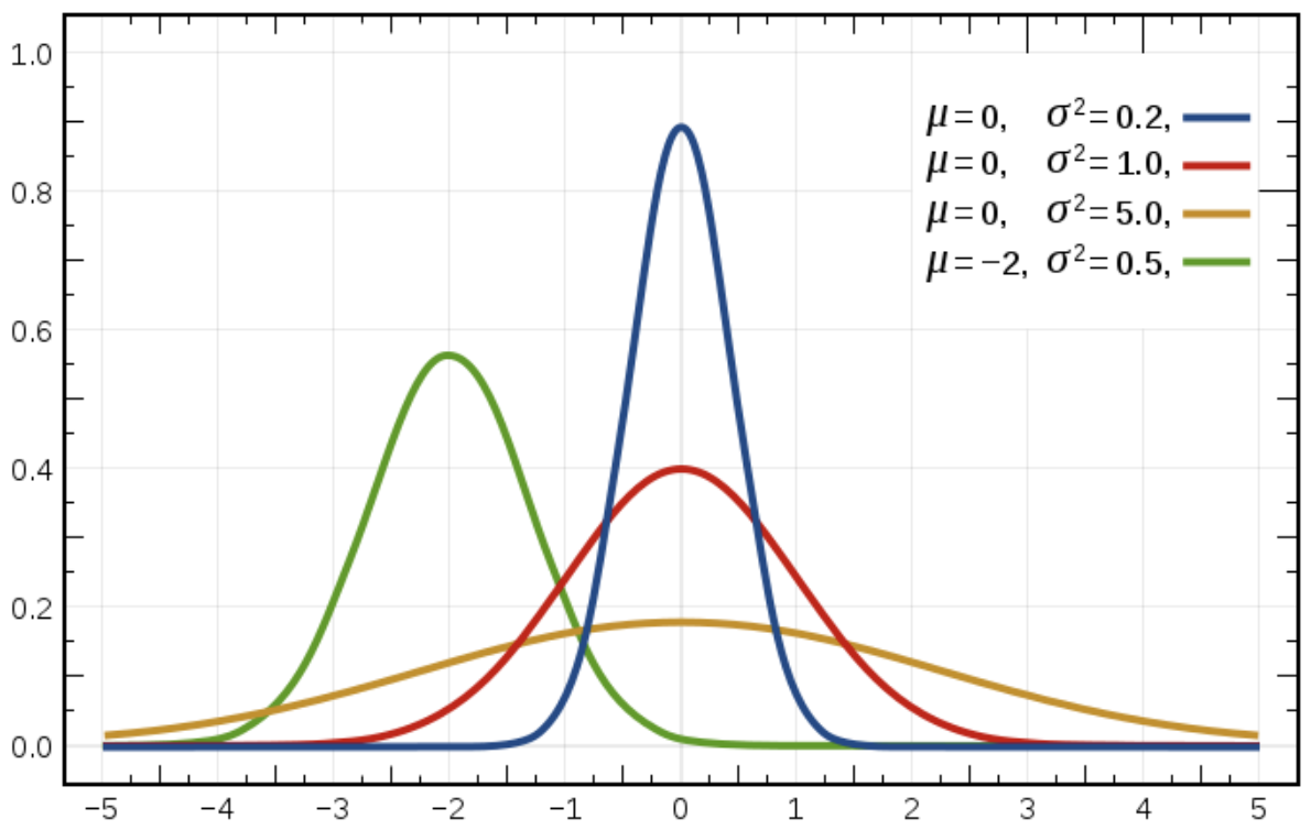
x and y both follow a normal distribution.
We will come back to the normal distribution in the next chapter. For now, just remember it as being the bell curve.
It is often the case that you must calculate the correlation of variables that do not follow these assumptions. So you need other ways of calculating the correlation of two variables.
Different Types of Correlations (And How to Choose!)
If you look at the pandas documentation for the corr() method, you can see that there are three types of correlation available: Pearson (the default), Spearman, and Kendall.
df.corr(method='pearson')df.corr(method='spearman')df.corr(method='kendall')
We won't go in the detail of how each of these correlations is defined. Suffice to say that depending on the type of data you are working with, choosing Spearman over Pearson is more appropriate. The Kendall correlation can be seen as a variant of Spearman, and we'll leave it aside.
Pearson is the default correlation. It is relevant when there is a linear relationship between the variables, and the variables follow a normal distribution. The good news is that the Pearson correlation is very robust concerning these two assumptions. If your variables are not strictly linearly related or if their distribution does not exactly follow a normal distribution, the Pearson correlation coefficient is still very often reliable.
However, if your data is nonlinear, as the variables in the two plots below, then it makes more sense to use the Spearman correlation.
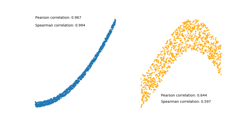
The Spearman correlation doesn't make any assumptions on the distribution of the variables or their relative linearity. It is calculated solely based on the order of the values of the two variables, aka ranking the values. We won't go into details here, you can learn how to compute the Spearman correlation on the Spearman correlation Wikipedia page.
What About Categorical Values?
So far, we have looked at the correlation between continuous variables.
Can we calculate the correlation between a categorical variable and a continuous one? Yes, we absolutely can! :p
When the categorical variable displays an inherent order (called ordinal), then calculating the Spearman correlation coefficient will give you a correlation estimation with which you can work.
When the categorical variable does not have an inherent order (animals, colors, brands, etc.), then you should use a one-way ANOVA test to estimate the strength of association between a categorical and a continuous variable. You'll learn about this method in Part 3 of the course.
The Anscombe Quartet
You can't fully understand the relationship between two variables using just correlation. For that matter, any other statistic or measure taken by itself does not give the true picture of some dataset.
The classic example of this is illustrated by the Anscombe quartet, a set of four artificial datasets designed by the statistician Francis Anscombe in 1973 to demonstrate the importance of visual exploration of the data.
All four datasets have only 11 points each. They look very different, but share the same statistical properties:
Mean and variance of x and y.
Correlation between x and y : r = 0.816.
Similar regression lines: y = 0.5 x + 3.
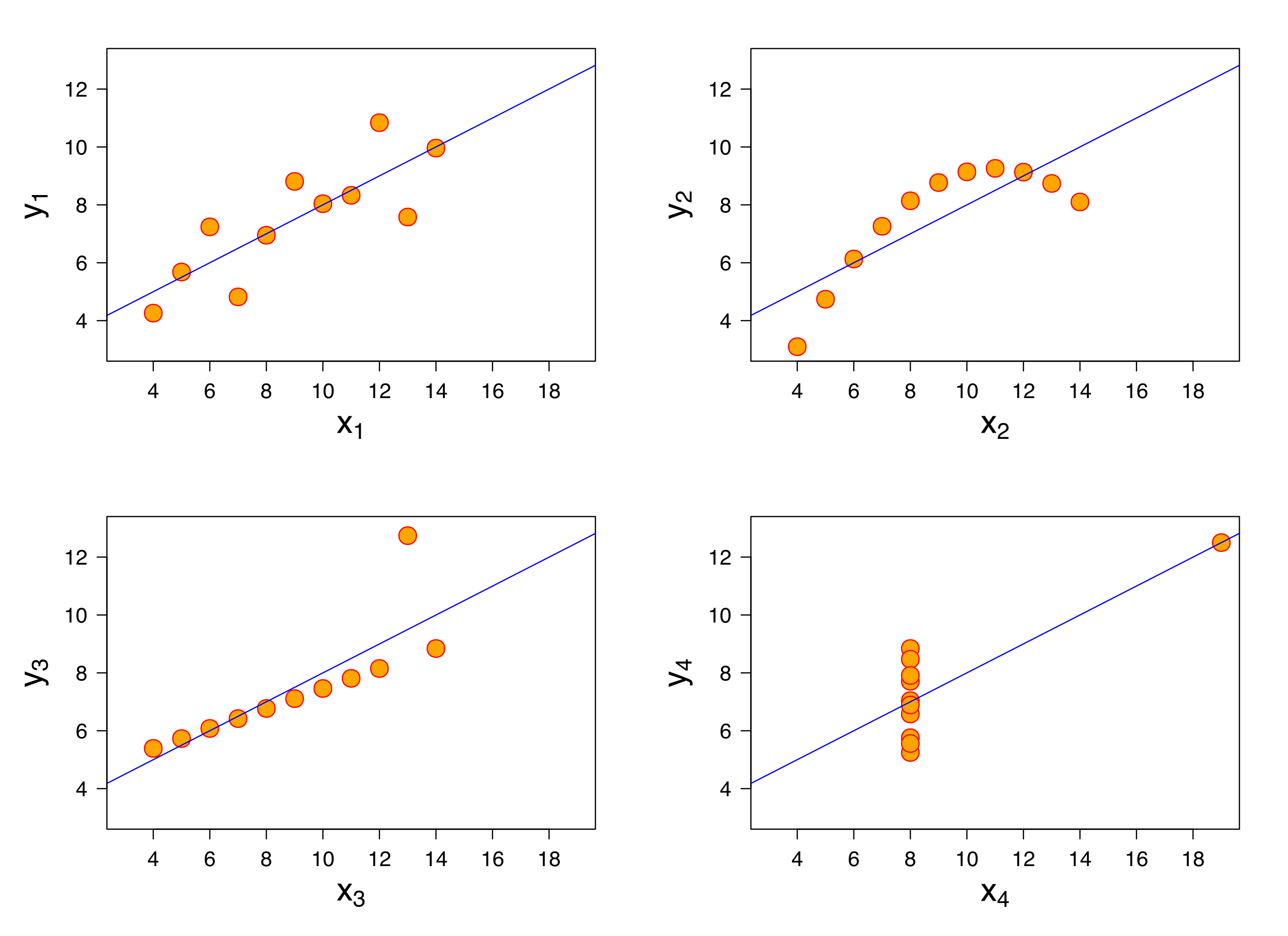
No one knows how the Anscombe quartet was formed. These datasets not only share the same statistical properties but are also strikingly different visually.
This motivated Alberto Cairo to create the Datasaurus Dozen dataset and publish the data generation process. It comprises 12 very visually different datasets, including a dinosaur and a star that share the same statistical properties (correlation, regression line, mean, etc.).
A Word About Causality
Correlation does not imply causation means that because two variables are correlated, it does not imply that one causes the other. On that topic, the blog, Spurious Correlations, shows several entertaining examples of variables moving in unison, although not in any causal relationship. For instance, the divorce rate in the state of Maine and the consumption of margarine in the U.S. has a correlation coefficient of r = 0.99, :p but it is doubtful that one is actually causing the other.
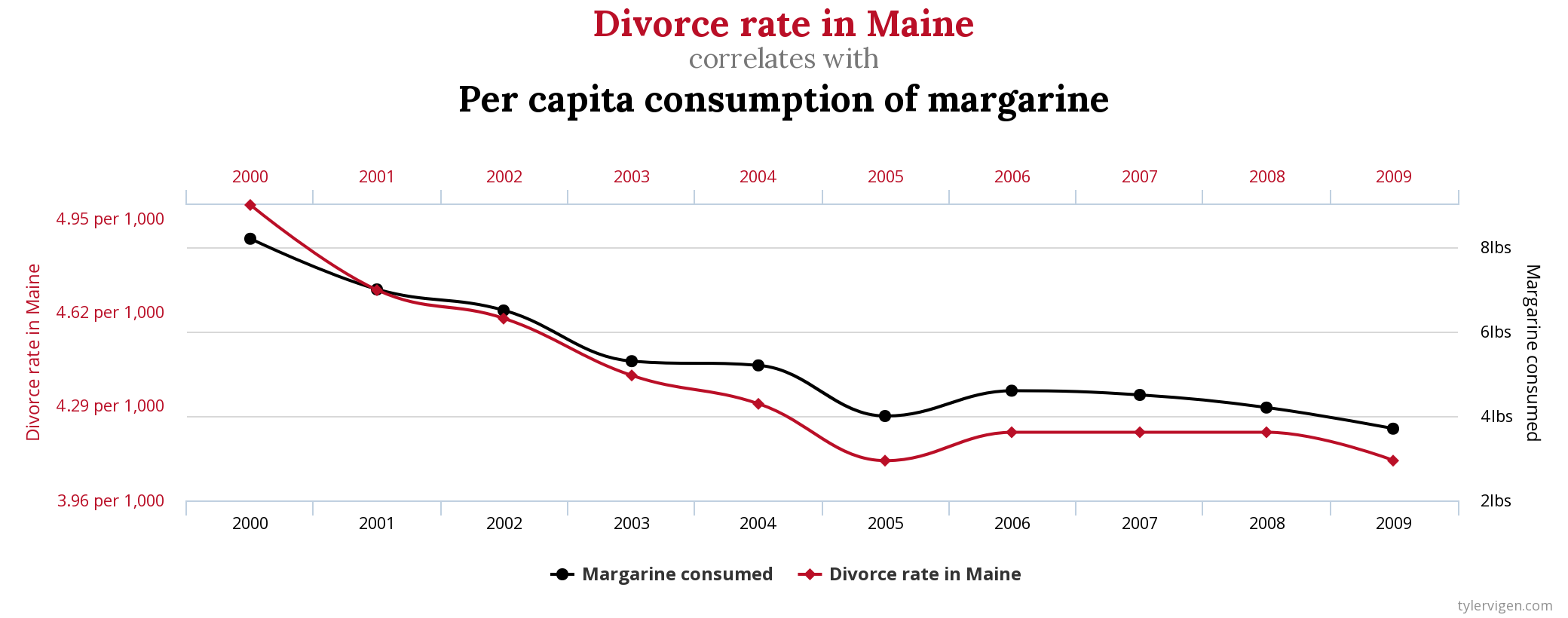 Maine divorce rate vs. U.S. margarine consumption from the blog Spurious Correlations
Summary
Correlation is another understood key concept that needs a bit of explanation to be put to good use. The key takeaways from this chapter are:
You can calculate correlation coefficients in Python using different libraries such as pandas or NumPy and others.
The Pearson correlation is the default. It's robust with respect to the assumptions on the variables (linearity, normality).
Use the Spearman correlation instead of Pearson when:
The data is truly nonlinear.
The data is non-normally distributed.
One of the variable is categorical and ordered (ordinal).
Correlation does not imply causation (but you knew that already, didn't you?)
In the next chapter, we dive into the third core concept behind linear regression with hypothesis testing and focus on normal distribution.
