Create a Blueprint of the Requested Dashboard
Now that you have gathered the information you need to design a dashboard, let's put that information to use in this chapter! :D
Remember, a dashboard tool is meant to deliver information at a glance. Often, stakeholders want to include everything they can think of. As the designer, it's up to you to determine what to include and how to display it.
By this point in the design process, you have a firm understanding of the client's needs and requirements. Based on that information, the next step is to create a blueprint. The purpose of the blueprint is to prioritize the business questions that the dashboard needs to answer and list the specific metrics (or data breakdowns and drill-downs) that will be used.
Create a Blueprint
So how do you create a blueprint? Well, there is no one singular method, but what you see below is a template that has worked in my practice.
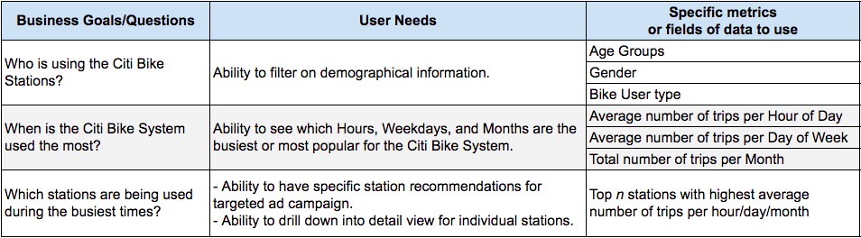
My blueprint has three columns: Business Questions, User Needs, and Specific Metrics. I start by writing down the business questions in descending order of priority. Then, for each row, I fill in the user needs (identified in previous meetings), and specific metrics needed to answer those business questions.
Let's consider an example. For the first business question: "Who is using the Citi Bike Stations?", the client expressed the need to filter on demographic information. What type of demographics should be considered? Well, in the follow-up meeting, the client noted that they collect information about age, gender, and bike user type. These are specific metrics that will help answer the question, "Who is using the Citi Bike stations?".
Choose the Right Visualizations
As you review the list of specific metrics you need to include in the dashboard, think about what they need to show.
A distribution? Compositions? Trends? A comparison? Relationships?
Wait, hold on a second, what? :euh:
Allow me to elaborate.
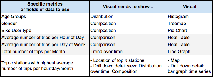
In the above table, we need to determine the ages of the Citi Bike riders and how many are in each age group. In other words, we want to see the distribution of riders by age group. That is how the dashboard needs to visualize the age group metric.
For the metric average number of trips per hour of day, the dashboard needs to show this data as a trend over time. Do you get the gist?
Understand the Basic Types of Visualizations
Here is a description of the basic types of visualizations you may need to include in your dashboards:
Distribution—shows all the possible values (or intervals) of the data and how often they occur. A bell-curve is an example of a normal distribution.
Composition—quantitative descriptions of the parts of some whole, conveying relative information, such as a pie chart.
Trend—displaying a change in a dataset over time. A time-series, or line chart with time data on the x-axis, is an example of a trend visual.
Comparison—the item-by-item comparison of two or more comparable variables of interest. For example, a chart showing sales, where each line represents a different product, is a comparison visual.
Relationship—shows the change of one variable (x) in relation to the change of another variable (y). A scatterplot is an example of a visual that shows the relationship between two variables.
Use a Chart Chooser
Once you have a firm idea of the visualization that best describes each metric, you can use various chart-choosers (cheat sheets) that are publicly available to help you determine the best way to display your data and insights.
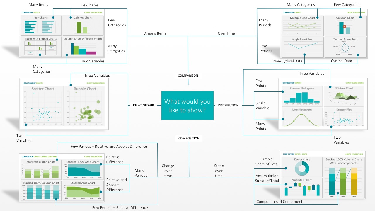
There are various types of available chart-choosers: ones for survey data, ones for qualitative data, and ones for interactive data. Below are some links to a few resources for chart choosers.
Our Mission
Take a moment and reflect: Based on the specific metrics we want to use and what the visuals need to show, what are some visuals that you would include?
Below are the visuals that I came up with. However, there is more than one right answer!
Better yet, let me show you an example of a finished deliverable that fulfills the requirements of the dashboard we were tasked with earlier. This way, you will get an even better idea of the visuals that I chose!
Question after watching the video above:
What questions do you think the last section of the dashboard is trying to answer?
Perhaps it is trying to answer the question: "Where, or which, are the busiest Citi Bike stations?"
Summary
Once you have a firm understanding of the client's needs and dashboard requirements, it is a good idea to create a blueprint.
The purpose of the blueprint is to prioritize the business questions that the dashboard needs to answer and list the specific metrics (or data breakdowns and drill-downs) that will be used.
You will need to choose a specific visualization to display each metric. The basic types of visualizations are:
Distribution
Composition
Trend
Comparison
Relationship
Chart choosers (cheat sheets) are publicly available and will help you determine the best way to display your data and insights.
You may have noticed that we skipped the discussion on how to create a dashboard using Tableau.. Hold your horses, and keep your cool (like Zorro)! :zorro: That discussion is the focus of Parts 2 and 3 of this course. I must say, I appreciate your enthusiasm to learn!
