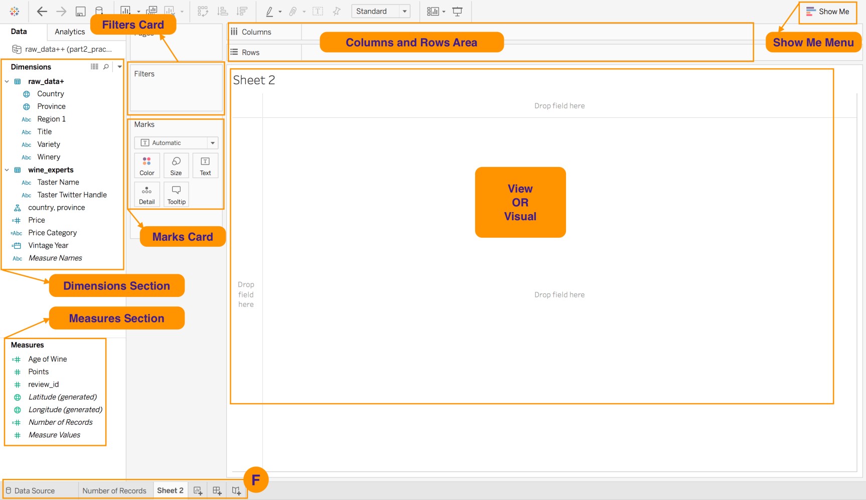
Create Visuals in the Worksheet
This chapter is going to be a good one, and especially important if you are on Project 9 of the Data Analyst Path on OpenClassrooms! We are going to create visuals using the dataset that we have loaded, cleaned, and prepped. Along the way, you will discover the interface of the sheet!
Create a Table Visual
Discover the Dimensions and Measures Section
Let's start with an overview of Dimensions and Measures in Tableau. There is a Tableau tutorial article that provides a great explanation of the difference between Dimensions and Measures in the software. I highly recommend you take some time to check it out. ^^
For now, I'll just mention a few key notes.
Tableau categorizes data fields, which are the columns in your dataset, as either a dimension or a measure, and they are grouped accordingly in the left-hand side of the worksheet.
DIMENSIONS... | MEASURES... |
contain qualitative values, such as names, dates, and location data. | contain quantitative values, or in other words, numerical data. |
are used to categorize and segment your data in the visual. | are fields that can be measured. |
add the levels of detail in the view. | are fields that can be aggregated. |
Tableau also categorizes fields as either Discrete or Continuous. They are color-coded blue and green, respectively.
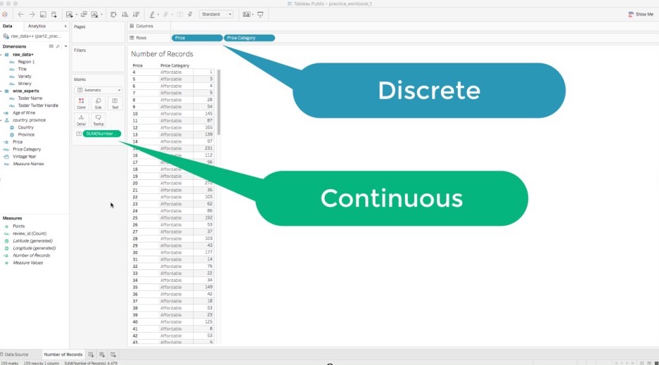
Green measures and dimensions are continuous fields, meaning they are treated as having an infinite range. Generally, continuous fields add axes to the view.
Blue measures and dimensions are discrete fields, meaning they are treated as having a finite range. Generally, discrete fields add headers to the view.
Let's look at an example of this in the screencast below, as we create a table visual!
Create a Map Visual
Now, let's create a map visual!
Take some time to hover over the different charts to see what types of fields they require. Why do you think the different types of data fields (i.e., dimension, measure, continuous, and discrete) determine which types of charts are available? Do you notice any similarities between the Show Me menu in Tableau and the chart chooser cheatsheets introduced in Part 1?
Now, navigate to the Map 2 sheet. Then, go back to the Show Me menu and select the second map chart option (i.e., the choropleth map). Take some time to explore, compare, and contrast the map visuals. We will review the Marks card soon. For now, observe the different icons next to the fields listed in the Marks card for Map 1 and Map 2.
Advanced Feature: Geocode a Territory Field
Sometimes, you may have custom territories that you need to use in your map visualizations. Many companies and organizations have specific regions that they track that are not necessarily considered geographical data. For example, a retail company may have custom sales regions (such as North, East, South, and West), or a non-profit agency may need to use U.S. Census Tracts in their analysis. These custom regions, or territories, are not recognized by Tableau, and therefore, won't be available when creating map visualizations.
When you find yourself in this situation, use Tableau's advanced features for geocoding custom territories (e.g., regions). :ninja:
In Tableau, there are three main ways to create territories:
Select and group locations on a map.
Create a territory from a geographic field.
Geocode a territory field using another geographic field.
Follow Along With Me!
You have been given a new dataset--a reference table to be exact-- named countries_world_type.xlsx. It has a list of countries and their World Wine Type classification. In case you didn't know, wines can be categorized as Old World or New World, depending on where they are from. You need to create a map chart using the new dataset.
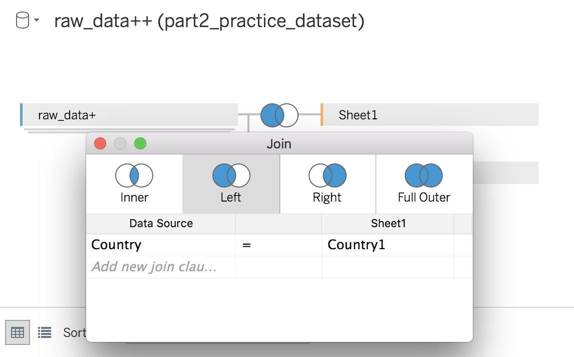
To do so, you need to bring in and combine the information from the new dataset. First, download the dataset if you have not done so already. Use a left join to combine the data from the countries_world_type.xlsx file.
Remember, to execute a JOIN, you need a common column. What is the common column here?
...the Country column!
Remember the steps to combine data from Chapter 5:
Go to the Data Source page, click on the Add link in the Connections area (Section B), and select Microsoft Excel, as shown below.
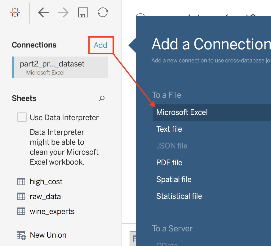
In the window that opens up, navigate to where you downloaded the countries_world_type.xlsx file, and select it.
Once you click Open, Tableau should automatically add the Sheet 1 data table from the Excel file that you just connected to. If not, go ahead and drag the table into the visual workspace.
Click on the JOIN icon, and select a Left Join. Make sure to set which columns to base the join on (i.e., Country = Country1), as shown below.
Now, create a map using the custom regions, Old World and New World, which are the values found in the new field that you just loaded into the Tableau workbook.
Add a new worksheet and rename it Map 3.
In this new sheet, locate the new field World Wine Type in the Dimensions section, and drag it into the Rows area. You should see a table visual. Then drag and drop the Price field into the Columns area as a continuous measure. Change the aggregation function to Median. You should see a bar graph visual.
Now, go to the Show Me menu, and try to select either of the map chart options.
....:o....:-°....o_O....:'(
:waw:
Don't stress! All you need to do is geocode your World Wine Type data using the Country field!
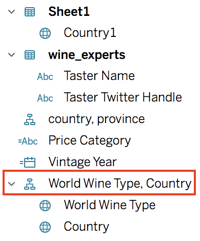
If you completed the steps correctly, you should the new field named World Wine Type, Country, as shown below.
Now, go to the Show Me menu, and select the choropleth map option (i.e., the second map option listed).
Look at you, applying advanced features in Tableau to get the job done nicely! :soleil:
Customize Your Visuals using Marks Card
Now, I will introduce you to the Marks card.
Color
Go to Map 1.To color-code a visual based on a field, drag and drop it into the Colors icon in the Marks card. For example, let's say we wanted to color-code the circles on the map based on their world wine type.
Drag the field that we geocoded (World Wine Type, Country) onto the color icon in the Marks card.
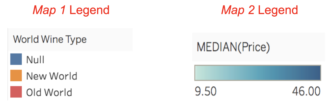
Because we are using a discrete dimension to color-code the circle symbols on the map, Tableau is using a palette of discrete color choices. Whereas the visual in the Map 2 sheet is using a spectrum of colors as a color scheme because the color-coding field, MEDIAN(Price), is a continuous measure.
For a better understanding, select the Edit Colors... option from the drop-down menu for the legends.
Take some time to explore both types of color schemes in each of the legends for Map 1 and Map 2.
What are the differences in the color-coding options for a discrete dimension versus a continuous measure?
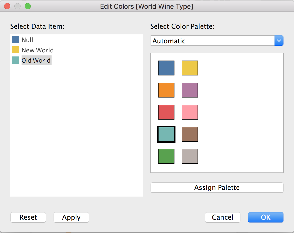
Let's go back to Map 1, and change the colors used in the legend. Select the Edit Colors... option from the legend's drop-down menu. To change the color-code of a value, select the label value from the list, and then select the desired color. Choose whichever colors you want, or match my choices shown below.
Size
The Size icon sets the size of marks (or symbols) in the view (regardless of the type of visual/chart).
Right now, the size of the symbols are based on the MEDIAN(Price) field.
If you click on Size icon, you can coarsely adjust the size of the symbols, in this case, filled-circles, as needed. If you need a more fine-tuned way of adjusting the size of the symbols in your view, select the Edit sizes... option in the drop-down menu for the size legend.
Shapes
While we are on the topic of symbols, turn your attention the Shapes icon. When you created the map visual by clicking on the Symbol Map chart in the Show Me menu, Tableau defaulted to using a circle symbol to represent the MEDIAN(Price) values for each country (and using the size of the symbols to represent the value amounts relative to other data points).
When you want to change the shape of the symbols used in the view, select the Shape option from the drop-down menu available inside of the Marks card.
Once you select Shape, a couple of things happen at once. The symbols in the view change to circle outlines. Also, you now see the Shape icon appear in the Marks card. Click on it and navigate to the Edit Shape dialogue window, as shown below.
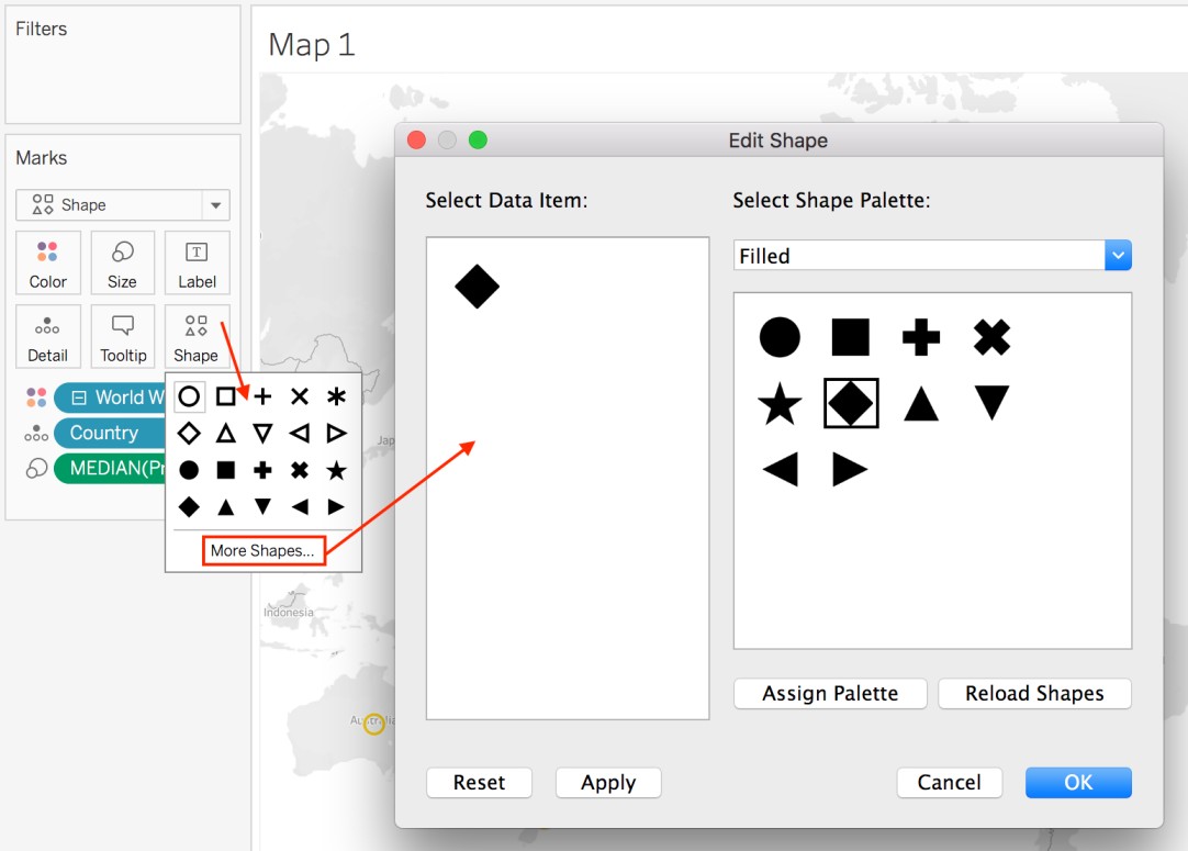
Take some time to explore this window. Then select a shape of your choice for the Map 1 symbols.
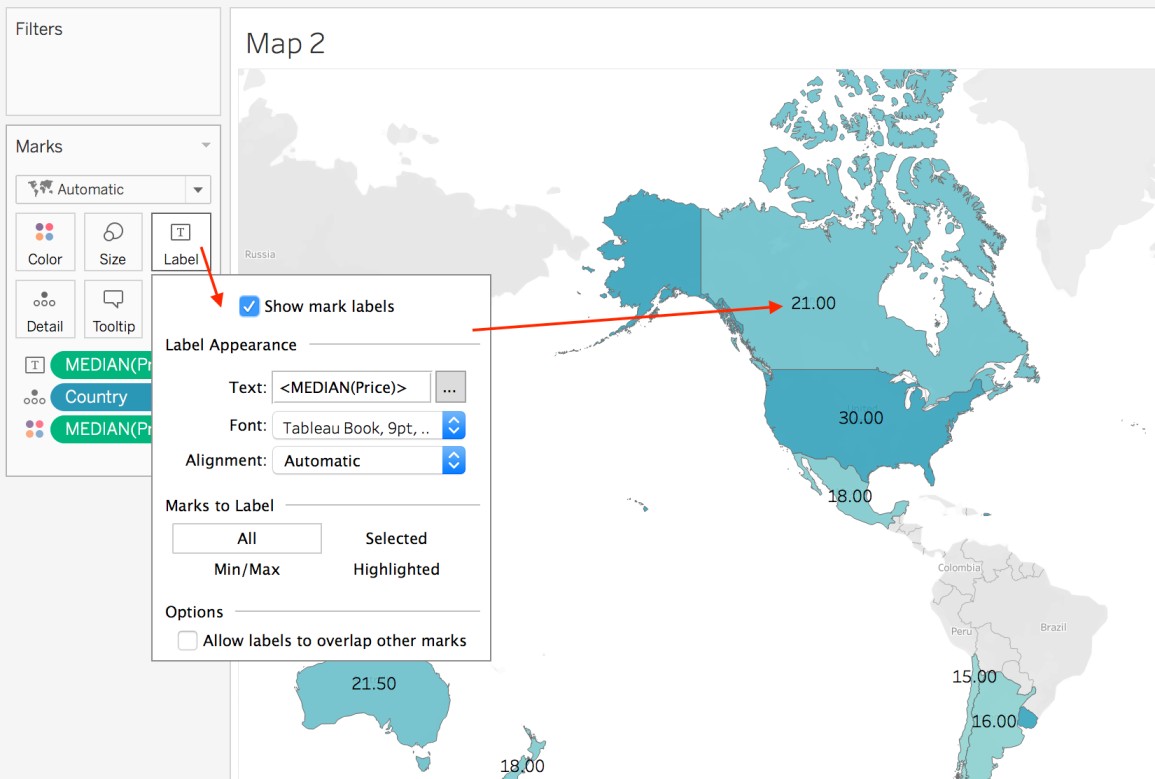
Text Labels
Go to the Map 2 visual.
When you want to add labels to your visuals, drag the fields that you want to add as data labels to the Label icon in the Marks card. Go ahead and drag the Price field from the Measures section, and drop it onto the Label icon. Then, locate the SUM(Price) field listed in the Marks card (not the Measures section), and change the aggregation to Median. You should now see the median price value for every country in the dataset as a data label in the visual. If you want to format the style of the data labels, then click on the Label icon to see the label format dialogue window, as shown below.
Tooltip
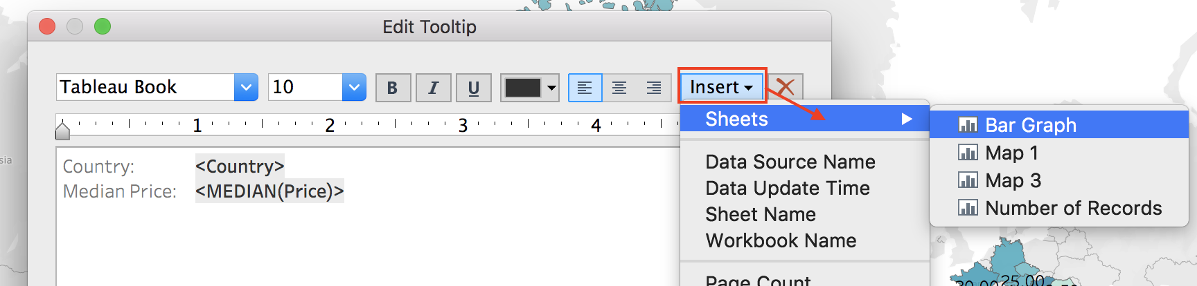
When you hover over data points in your visuals, Tableau provides a tooltip feature. To change or format the information displayed in the view, click on the Tooltip icon in the Marks card, and you should see the Edit Tooltip dialogue window. You can also drag and drop fields onto the Tooltip icon to add them as displayed information.
The Insert option, found in the upper-right corner of the window, is even more powerful. If you click on the Insert drop-down menu, you will see many options available to add into the tooltip, including other sheets (i.e., visuals) that you have created! This allows you to easily add drill-down capabilities to any visual.
To see what I mean, add a new line in the Edit Tooltip dialogue window. Then, go ahead and select the Bar Graph sheet from the Insert > Sheets options, as shown below.
Your Edit Tooltip dialogue window should look like mine, shown below:
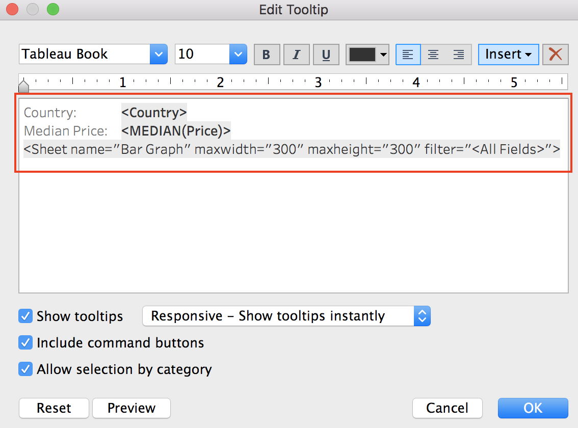
Now, hover over the different countries in the map, and you should see a bar graph for every country that displays the number of records for each wine variety from that country.
That is so neat! :zorro:
Detail
Go to the Map 3 visual.
When you drop a dimension field onto the Detail icon on the Marks card, you separate the marks in a data view according to the members of that dimension. For example, drag the Province field onto the Detail icon in the Marks card. Do you see how the marks (in this case, shaded areas) change in the visual? Unlike dropping a dimension into the Rows or Columns area, dropping it on the Detail icon on the Marks card is a way to show more data without changing the table structure.
Dropping a measure field onto the Detail icon has no effect because measures do not contain distinct values. Remember, measures are treated as having an infinite range. However, you can place measures on the Detail icon if you want to show it in the tooltip, and not anywhere else in the view.
Apply Filters to Your Visuals
The filters that you can create in Tableau are powerful features. Understanding, the different types of available filters allows you to take full advantage of the filtering capabilities that Tableau provides.
Remember when we created a view with the Age of Wine field in a previous chapter? In the table, you saw that there were a few negative values present in the Age of Wine field.
How would you create a filter to exclude those negative values? :-°
Create a new sheet and try out your approach!
Summary
You were introduced to the main sections of the Worksheet page in Tableau, including the Data pane (Dimensions and Measures sections), the Columns and Rows areas, and the view.
You created a table visual. In doing so, you reviewed the differences between Continuous and Discrete data fields, and learned how they impact visuals in Tableau
As you created visuals, you learned how to:
Sort data in the view.
Use the Show Me menu
Use the Marks Card
Create filters for the views
You created a map visualization using geographical data fields, including a custom region field that you created by geocoding (an advanced feature in Tableau).
