Create Graphs
First thing's first, great job on the Part 2 evaluation! How do I know you rocked it? Well, you are here in Part 3 of the course! Now that you know how to use Tableau, let’s use the software to create the requested dashboard.
Before we create the visuals that will appear on our dashboard, we need to make sure the dataset has been cleaned and prepped. Most of these steps were covered in the Part 2 evaluation.
Once you have loaded the dataset and made sure that you have completed all the necessary data cleaning and data preparation steps, you should see the screen shown below.
Now, we need to complete a few other data preparation steps for our requested dashboard, such as changing the current filters into global ones.
You can have an error, when you create a calculated field for “Avg Trips per Day”. Indeed, you may will see an error message that calls out using ‘Distinct Day’, another calculated field they have been told to create.
The error message says that you are trying to create an aggregated value from an aggregated value and this cannot be done. The solution is to remove ‘Distinct Day’ from the brackets in the “SUM()” expression.
The Final Steps of Data Preparation
Global Filters and Calculated Field for Metric
In many projects, you may need to apply filters to all the visuals you are creating. For example, filters that use the inclusion/exclusion criteria for your data analysis projects, referred to as global filters, need to be applied for the whole project. Having to create the same filter for every worksheet you add to your Tableau workbook is tedious. :'(
Luckily, Tableau makes it easy to convert any filter you create into a global one. Let's see how in the screencast below! For a comprehensive overview on how to create global filters, check out the Tableau Documentation.
Create the Visuals
The time has come to create the visuals for the dashboard! It’s been some time since we last reviewed the project details and requirements. Right? So, let’s do that now.
Now, remember this table from Part 1?
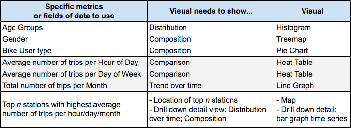
As a quick reminder, the first column, Specific Metrics lists the metrics associated with each business requirement and user need. For example; one business requirement is to show who is using the Citi Bike stations. The user needs to be able to filter by Age Group. In other words, to see how many riders are in each age group. In Part 1, we decided that the best way to represent this visual is through a distribution, as you see in the second column of the table above. Thanks to our handy-dandy chart chooser, we also decided that the best way to represent a distribution is through a histogram, as you see in the third column. We are going to focus on this column, Visuals, in this chapter.
You are going to learn how to create the visuals needed for the dashboard requirements: Histograms, Treemaps, Pie Charts, Heat Tables, Line Graphs, and Maps! Ready? Let's go!
Histogram: Age Groups
In this section, you are going to learn how to make a histogram. Follow along in Tableau with these step-by-step instructions.
Add a new worksheet.
Drag User Age to the view.
Open the Show Me menu and select the histogram option.
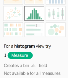
Tableau generates a new field, User Age (bin), to create the histogram, using the formula below to calculate an optimal bin size for your data automatically:
Number of Bins = 3 + log2(n) * log(n)
From the source:
"In the formula, n is the number of distinct rows in the table. The size of each bin is determined by dividing the difference between the smallest and the largest values by the number of bins."
However, you can easily change the bin size by:
Finding the new User Age (bin) field in the dimensions section.
Opening the drop-down menu for the field.
Selecting the Edit... option.
You will see the suggested bin size, which is calculated from the formula mentioned above.
Change the value 8.1 to 5, so that the bins are 5 year groups. Click OK.
Customize Your Histogram
Right-click on the x-axis, and select the Edit axis... option in the menu.
In the Axis Titles section, change the Title to Age Groups.
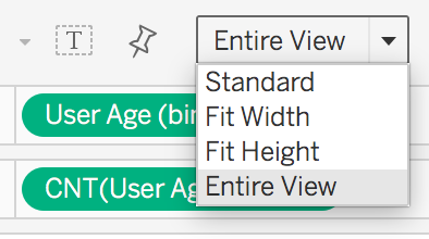
Make sure the Entire View option is selected in the Fit menu, as shown below.
For the dashboard layout that you will eventually implement for this project, you will not be using the title for this particular visual. So, you need to hide the title for this sheet. To do that:
Right-click on the title of the view, and select the Hide Title option.
Rename the sheet: Histogram.
And voilà!
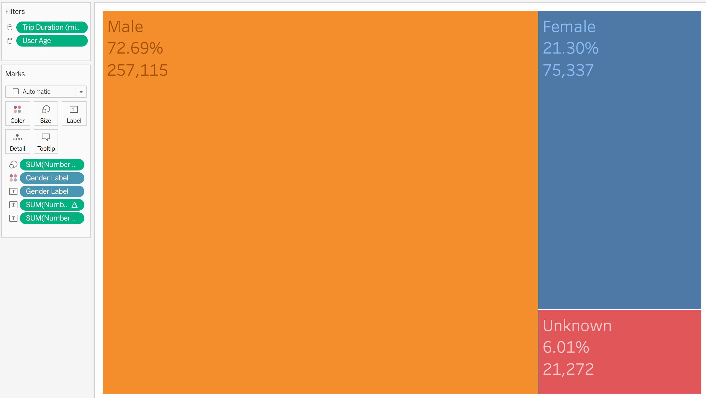
Treemap: Gender
To create the visual shown below, complete the steps in this section.
Add a new sheet.
Drag the Gender Label field to the Columns area.
Drag the Number of Records field to the Text icon in the Marks card.
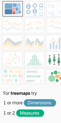
Select the tree map option in the Show Me menu, as shown below:
Drag the Gender Label field from the Dimensions section again, but this time drop it onto the Color icon in the Marks card.
Drag the Number of Records field to the Label icon in the Marks card.
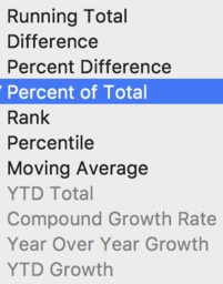
Add Table Calculations to Your Views in Tableau
Tableau allows you to add the following table calculations to the fields in your views:
Locate the Number of Records field in the Marks card (the one with the text icon next to it).
Open the field's drop-down menu and select the Quick Table Calculation > Percent of Total option.
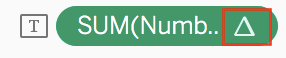
You should see a new delta icon next to the field in the Marks card, as shown below. This icon informs you that this field has a table calculation.
Drag the Number of Records field from the Measures section to the Label icon again. But this time, leave the measure as the SUM (and no table calculation) in the Marks Card.
Customize Labels
To customize labels on your Treemap, follow these steps:
Click on the Label icon in the Marks card, and select the options in the Font drop-down menu, as shown below.
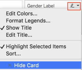
Because the gender labels are displayed with the color in the visual, having a legend is going to add more clutter to a dashboard rather than helpful information. Hide it from the visual in the view:
Go to the drop-down menu for the legend, and select the option to Hide Card, as shown below.
Fit: Entire View.
Hide title for visual.
Rename the sheet: Gender Treemap.
Boom!
Pie Chart: User Type
To create the visual shown below, complete the steps in this section.
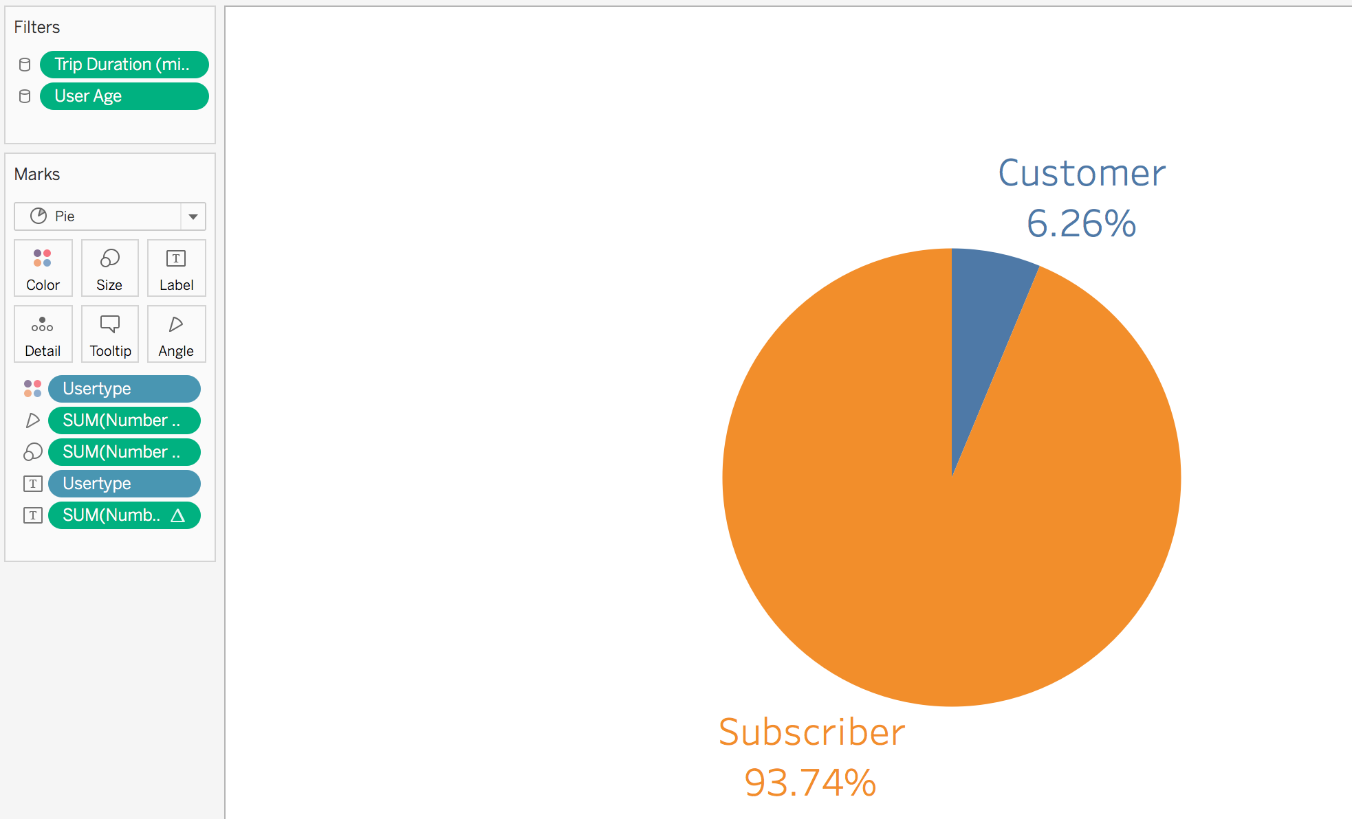
Add a new sheet and drag the User Type field to the Columns area.
Drag the Number of Records field to the Text icon in the Marks card.
Select the pie chart option in the Show Me menu.
Drag the User Type field to the Label icon in the Marks card.
Drag the Number of Records field to the Label icon in the Marks card.
Locate the Number of Records field in the Marks card (the one with the text icon next to it).
Open the field's drop-down menu, and select the Quick Table Calculation > Percent of Total option.
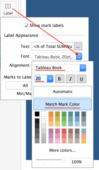
To customize the labels in the visual:
Click on the Label icon in the Marks card, and select the following options in the Font drop-down menu: Tableau Book, 20 pt, Match Mark color
Fit: Entire View.
Hide the legends.
Hide title for visual.
Rename the sheet: User Type Pie Chart.
Heat/Highlight Table: Average Number of Trips Per Hour and Day
At this point, you should have a histogram for user age groups, a treemap for gender breakdown of Citi Bike users, and a pie chart for user type breakdown.
Now, let’s create a heat table that displays a table of numerical information, segmented by two dimensions. Tableau refers to these visuals as highlight tables, while others (including myself) refer to them as heat map tables. Regardless of the name you use for these visuals, the main concept is the same: a heat table uses colors to represent--or visualize--the numerical information in the table.
Follow the video below to see how to create a heat table:
Line Graph: Total Number of Trips Per Month
To create the visual shown below, complete the steps in this section.
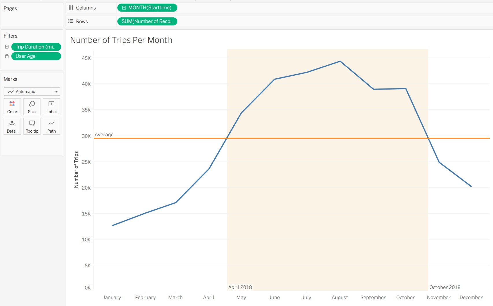
To create the base visual for a line graph that displays the total number of trips per month in chronological order:
Drag the Starttime field from the Dimensions section to the Columns area.
Open the drop-down menu for the field, and select the second Month option, as shown below. Choosing the second option ensures that you see the names of the months (e.g., January, February, etc.) instead of the month numbers (i.e., 1 - 12.).
Select the second Month option in the date field's drop-down menu.
Drag the Number of Records field from the Measures section to the Rows area.
Customizing Our Visual: Adding Reference Lines
Let’s customize the visual! Although you can clearly see that some months have a higher sum of trips than others, it is difficult to determine which months are above average and which are below. So, let’s add a reference line to the y-axis that indicates the average number of trips per month in 2018. Remember, this was a project requirement. ;)
To add a reference line to the y-axis, right-click on the y-axis and select the Add Reference Line option. The Add Reference Line, Band, or Box dialogue window should open up, as shown below:
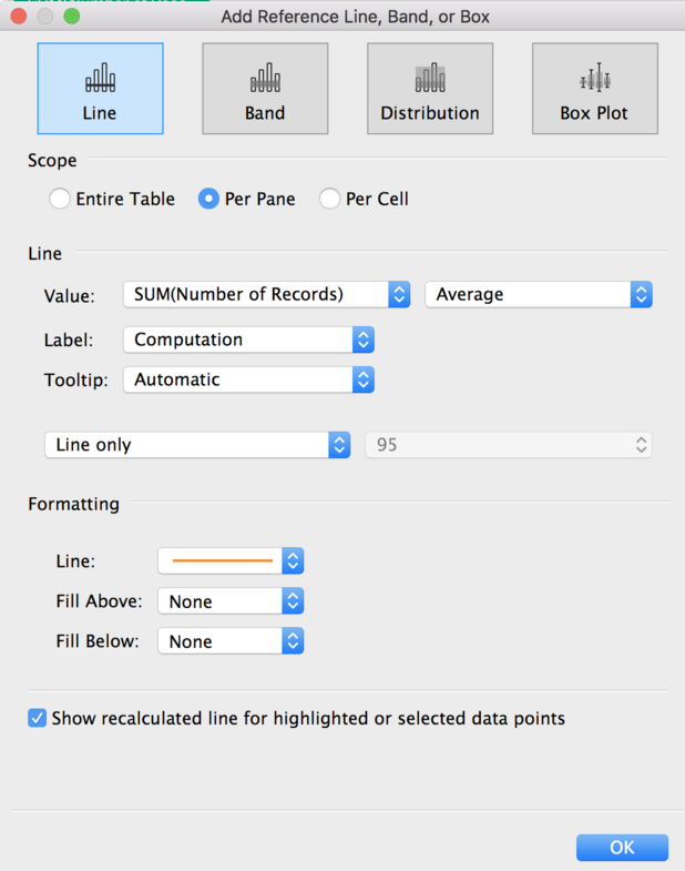
Looking at the options for the line, you can see that the Average aggregation has already been set for the SUM(Number of Records) measure.
In the Formatting section of this window, change the color of the line to orange, to match the color scheme used in the heat table for the Avg Trips Per Day values. The last thing to do in this window is to make sure that the checkbox for Show recalculated the line for the highlighted or selected data points is checked.
Customizing Your Visual: Adding Highlight Reference Bands
We can even add a highlight reference band to make our visual even more clear. As you may be able to see in the line graph above, the highlight reference band highlights which months are above the average. In fact, we asked Tableau to highlight that information based on the project requirements!
To add a reference band that highlights which months are above the average, right-click on the x-axis and select the Add Reference Line option, just like you did for the y-axis reference line.
When the Add Reference Line, Band, or Box dialogue window opens up, select the Band option, as shown below. In both the Band From and Band To sections, change the aggregation from Minimum/Maximum to Constant.
Why Constant?
When you set up a band, you need to tell Tableau where to start and end it based on the values in the x-axis (in this case, it's the Start Time field). When choosing the values on the x-axis for where to start and end, you have three choices in the dialogue window: Constant, Minimum, and Maximum. Constant allows us to set the exact values that we want. Minimum will automatically highlight everything from the minimal value to your desired end point, and Maximum will highlight everything from your desired start point to the maximal value.
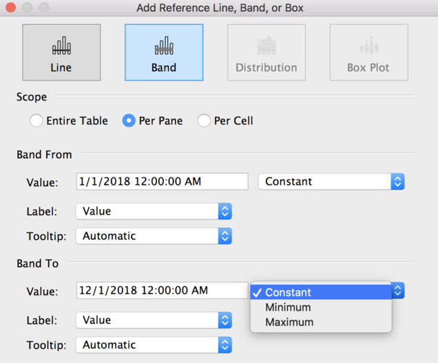
Once you have (wisely ;)) clicked Constant, click into the Value input area, and select the dates that line up at the intersection of the blue line graph and the average reference line. I selected 4/18/2018 for the Band From section, and 10/22/2018 in the Band To section.
Finally, change the Fill color of band to yellow (or whichever color you prefer).
For the last bit of customization, right-click on the x-axis and select the Edit Axis… option from the menu. Then, remove any titles in the Axis Titles section of the dialogue window. Change the y-axis title to Number of Trips, then go ahead and change the title of the visual to: Number of Trips Per Month.
Finally, rename the sheet: Line Graph Months.
Done!
Map With Drill-Down Detail
We still need to tackle this requirement as shown in the table at the beginning of the chapter: a map that displays the top n busiest Citi Bike station locations (or in other words, stations that have a high average number of trips).
We are going to create one map visual that will focus on displaying stations based on the Start Station fields (i.e., longitude, latitude, and ID fields). After the course, feel free to go back and add a second map visual for stations based on the End Station fields.
To create the visual shown below, complete the steps in this section:
Add a new sheet.
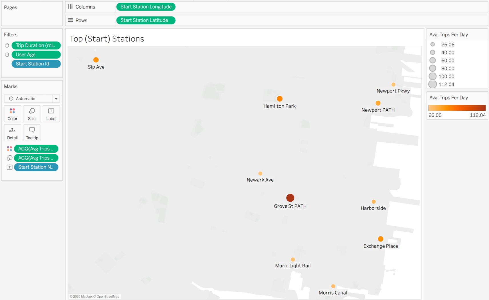
Drag the Start Station Longitude to the Columns area.
Drag the Start Station Latitude to the Rows area.
Drag Avg Trips Per Day to the Size and color icons in the Marks card.
Change the color scheme to orange (to keep it the same as the other visuals).
Drag the Start Station Name to Label icon in the Marks card.
Change the title of the visual to: Top (Start) Stations.
Rename the legends to: Avg. Trips Per Day (to rename, open the drop-down menu for the Legend, and select the Edit Title... option.
Add a Top 10 Filter
Drag Start Station Id to the Filters card.
Select the Top tab in the dialogue window and the By Field option. Make sure Avg Trips Per Day field is used. Click OK.
Rename the sheet: Top Stations Map.
And there you have it! A map that displays the top 10 Citi Bike stations that have a high average number of trips.
Remember that you need to add a drill-down detail to the map visual that shows average trip information for each individual Citi Bike station.
Let's see how to do this!
Summary
You created specific visuals for the requested dashboard design:
Age group histogram
Gender Treemap
User Type Pie Chart
Line Graph showing trips/month
Heat Table
Map with drill downs
You created a few calculated fields to create some of those visuals.
You also learned how to create other elements in a dashboard, such as reference lines and bands.
Well done, that was a lot of information, but you did great! You can always come back to this chapter in the future when you need to create specific visuals. In fact, use this chapter as a handy cheat-sheet for future projects. In the meantime, let's use everything we have just built to create the first draft of our dashboard!
Bonus: Other Metrics
Let’s say the project team lead followed up with you and requested the following metrics to be displayed at the top:
Total number of trips in 2018 in Jersey City.
Average number of trips per day in 2018 in Jersey City.
Total number of active Citi Bike stations in 2018 in Jersey City.
Total number of bikes in Citi Bike fleet in 2018 in Jersey City.
When creating a dashboard in Tableau, you need to create a worksheet for every individual visual to be included. Therefore, these four metrics to be displayed at the top of the dashboard need to be created in four different sheets. Let’s do that!
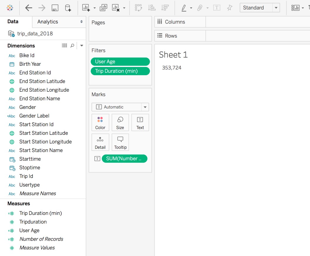
Total Number of Trips in 2018 in Jersey City
Go to Number of Records sheet.
Hide the title of the visual.
Click on Text icon in Marks card.
Set the alignment to: center, center
Select the Edit Text menu (click on the ellipsis):
Highlight all of the SUM(Number of Records) text.
Select these font options: Tableau Semibold, 48 size, Bold selected, color: top-right most gray option.
To change the worksheet’s background color, right-click on the text in the view, and select the Format.. option.
Click on the paint can icon and select Sheet pane as shown below. Click on the drop-down menu for Worksheet, and select desired color. I chose the option directly below the WHITE color box.
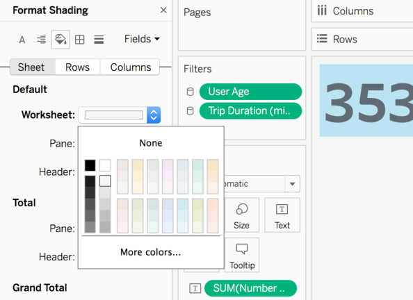
Sheet pane and paint can icon selected in the Format menu for the sheet.
Average Number of Trips Per Day in 2018 in Jersey City
Add a new sheet.
Change the title of the visual to Average Trips Per Day.
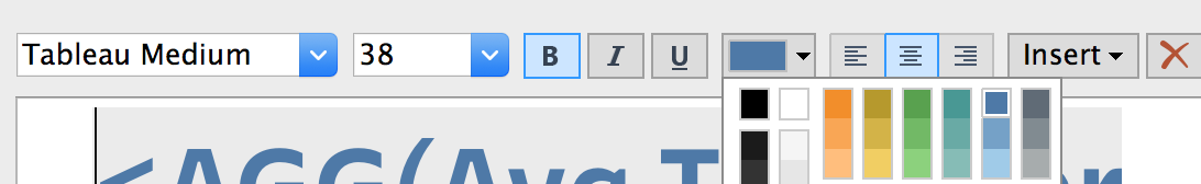
Double-click on the title to format it. Set the options as shown below.
Click on the Text icon in the Marks card.
Set the alignment to: center, center
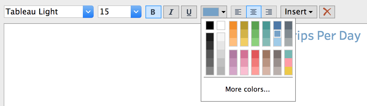
Select the Edit Text menu (click on the ellipsis):
Highlight all of the text. Set the options as shown below.
Rename the sheet: Avg trips per day in 2018.
Total Number of Active Citi Bike Stations in 2018 in Jersey City/ Total Number of Bikes in Citi Bike Fleet in 2018 in Jersey City
There are a few extra steps for the remaining two metrics (since the Start Station ID and Bike ID fields start off as discrete dimensions).
For the remaining two metrics, use the same formatting settings as you did for the Avg trips per day in 2018.
