Choose the Right Layout
In this chapter, we’re going to look at a few rules of composition. The advice in this chapter comes from the legendary book: Zen Presentation by Garr Reynolds.
Apply the "Less is More" Principle
Design is about making objects and their use simple. Be careful: simple does not mean simplistic.
"Simplicity of shape does not necessarily equate with simplicity of experience." - Robert Morris
It's more difficult to make something simple than to make it complicated because:
It's easy to add things in every direction.
It's hard to choose what to remove to keep the essentials.
To make it simple, you have to:
Understand the essence of a message, intention, or use.
Remove anything that isn't relevant to the topic (i.e., does not help you to understand the essential) and adds visual noise (i.e., distracting and manipulating attention).
Make the essential stand out by allowing it to be immediately visible/readable.
Leave Space
To leave room for the essential, you have to make room.
When designing a slide (or other types of graphic document), don't be afraid to leave space between objects/images or text, for example, as Apple does on its website.
A line of text is not supposed to be the full width of a page, even if it's long: cut out the period, and leave what is called padding, or margin, border, spacing.
Space in graphic design is a good thing! 😇
The visual design must be allowed to breathe a little.
Doing too much, adding frills here and there to make it look pretty, is pointless, and it diverts people's attention towards small, unimportant details, which prevent them from seeing the essential. I recommend putting only one idea per slide.
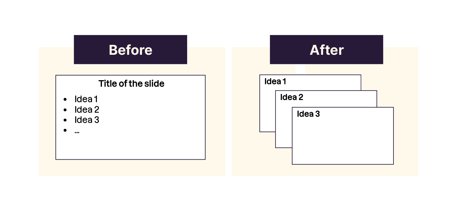
You don't need to put everything in one slide. Instead:
Ask yourself what the main message of the slide is, and erase everything that doesn't need to be there.
Use an image to make the slide's design easy to understand without reading. We'll talk more about that in the next chapter of the course. 👍
Drop as Much Text as You Can
What qualifies as too much text on a slide?
There is no standard rule for this, but I suggest holding back.
You want people to focus on what you are saying and not reading. If they read, you’ll lose them! Apply these rules:
Never write everything you’re going to say on your slides.
Don’t overdo it with bullet points - list five items maximum in a list. If you have more, it may require another list - or some items are probably similar.
Add small captions instead of paragraphs or long lists.
Cutting back on text relies on your ability to edit. Some of us can do this naturally, while others struggle and are convinced that every word and idea is essential.
So how do we fix this?
Keep going over your work to simplify your points. Try rephrasing and making shorter sentences, or seeing if you can join two similar ideas together. Your goal is to get to the bare minimum.
Only the key idea should be left on your slides; like a sentence, a short paragraph, an image, or a statistic. As the presenter, you explain the idea. That sounds easy, but it relies on your memory as well as your public speaking skills.
Pay Attention to Alignment
A slide's graphic element shouldn't appear random.
Imagine that your canvas (your creation/design space) has invisible lines, i.e., a grid (like you can add in Photoshop, Illustrator, or InDesign).
This allows you to do two things:
Align the elements with each other: either center or align on one side, but don't do both, as this can break the effect of unity and harmony.
Equalize spacing and respect symmetry.
Use the Rule of Thirds
Take inspiration from photography! The rule of thirds in photography can also apply to slide design.
It involves breaking your photograph into thirds, both horizontally and vertically, making nine equal rectangles. The rule of thirds allows you to compose an image, placing important elements along vertical and/or horizontal lines, or even at their intersections. The nine rectangles leave you with four intersecting points. This is where you should place the main subjects of your slide.
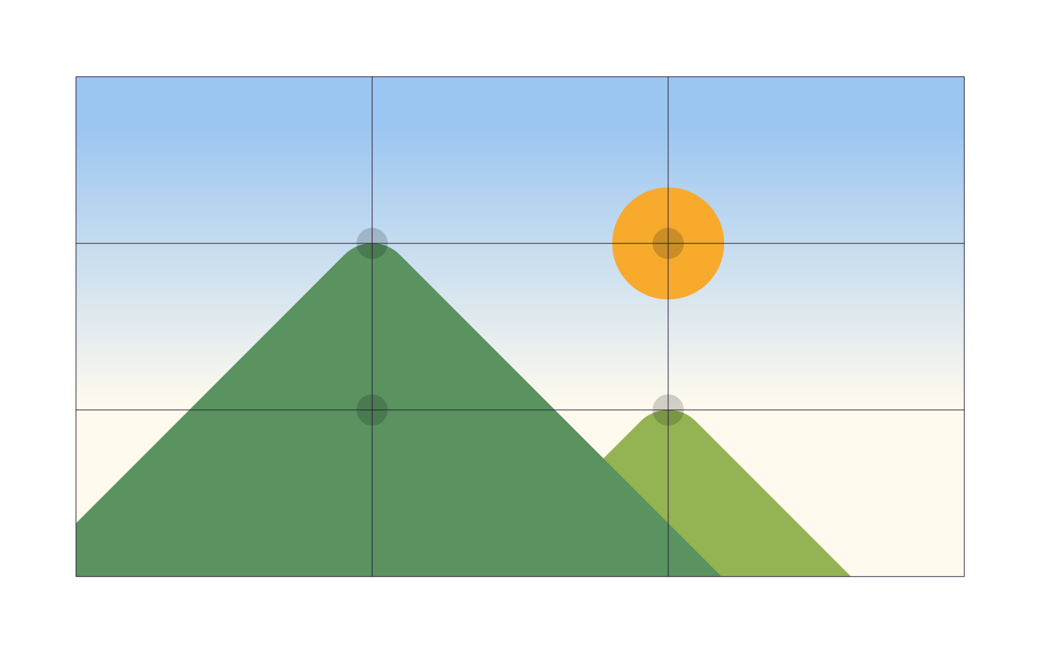
As you can see in this picture, the photographer made sure they placed the strong point of the image on the intersection of a horizontal line and a vertical line.
If you want more details on composition rules, check out this article from the website expertphotography.com.
Applying this rule, you should place content on your slides in a similar fashion.
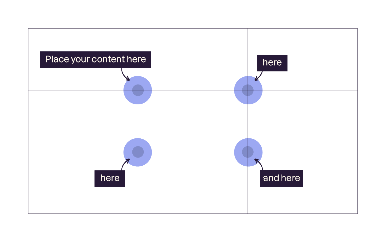
Take Things up a Notch, With More Complex Grids
However, grids can become more complex, like this.
Use the Benefits of Contrast
Contrast in visual design is very important because it highlights information and makes it readable from a distance.
Someone in the back of the audience should see your presentation, even when using a poor-quality projector.
Consider the IKEA logo with their interplay of contrast using dark and light as well as opposing colors.
"Contrast is one of the composition concepts with the most potential because any element can contrast with another. You can establish all kinds of contrasts: By the manipulation of space (empty and full), by the choice of colors (dark and light, hot and cold), by the formatting of text (bold or normal), by the position of elements (top and bottom), etc." - Garr Reynolds
Indeed, contrast allows you to give relief to elements in your composition.
In addition, for the external eye, it makes it possible to understand and find information more quickly.
Get Inspired by Print and the Web
I look at the print or web creations around me: Magazines, posters, advertisements, blogs, posters, etc.
When I like something, I ask myself these questions:
What is the focus of my attention in this image?
How does its composition get me to concentrate on it?
Why do I find it visually appealing?
Or, when I look at an advertisement, the first page of a magazine, or a blog illustration, I wonder:
What makes me want to read more?
Why am I drawn to this image?
I am regularly inspired by visual montages, the distribution of graphic elements, colors, fonts, designs that appeal to me! 🤔
You can learn how to compose well by observing and trying to reproduce what you've seen.
Let's Recap!
Remember that less is more.
Try and use one idea per slide and ask yourself what your message is.
Allow space so your design can breathe. Take out anything that isn't necessary, and make the important stuff stand out.
Pay attention to spacing and alignment.
Use contrast as much as you can.
Look for inspiration around you!
So now we've looked at advice for creating the perfect layout, let's move on to selecting the right images!
