Table of contents
- Part 1
Design Your Presentation Slides
- Part 2
Deliver a Successful Presentation to an Audience
Table of contents
- Part 1
Design Your Presentation Slides
- Part 2
Deliver a Successful Presentation to an Audience
Select the Right Images
To evoke emotions and create a memorable presentation, you have to put yourself in your audience's shoes and create something you would enjoy.
Find Great Images
A slide needs good imagery so the message can hit home as soon as possible. If you don’t have images, use stock photography.
There are a variety of places including Flickr and the Noun Project (a great resource library of small illustrated icons and illustrations). Here are a list of others:
There are many image banks where you can access beautiful high-quality images, far superior to what you can create yourself unless you are a photographer and spend your free time taking pictures.
Insert Images Following Composition Rules
There are several other image-related principles Garr Reynolds highlights in his book Presentation Zen.
Place Text Within an Image
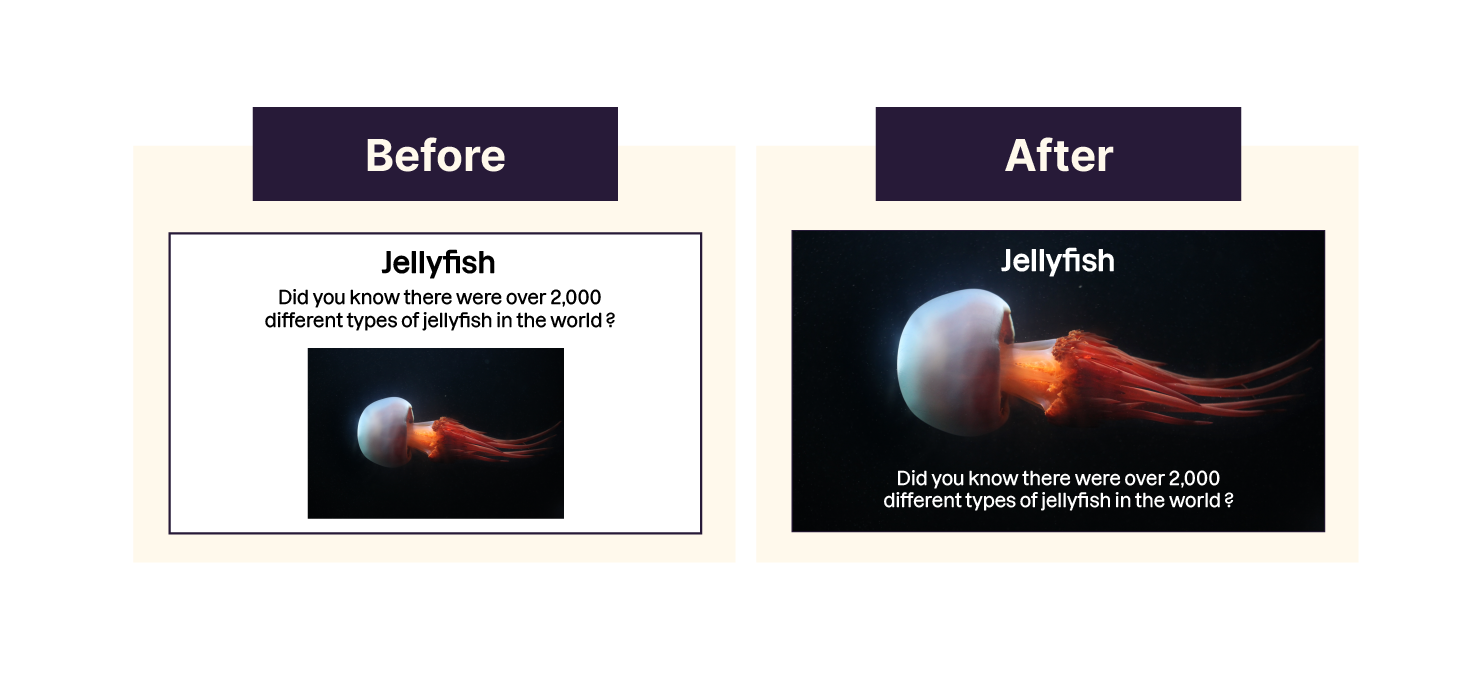
Putting an image on an entire slide (covering it entirely) allows the audience to dive into a universe with you and be caught up in what you say!
Feel free to completely take over, even if the image is not the same scale and ratio as your slide (4:3 or 16:9).
Don't put text around images; put it inside.

Eliminate Anything Unnecessary
Busy visuals will draw your audience’s attention away from your actual message. This happens with graphs, which don’t need to be too detailed. If they are, you may be tempted to describe them verbally. The audience will have a difficult time reading the information and may stop listening to you.
When you use a graph in your presentation, you usually have an idea in mind; an important key fact you want to share. Find the main information and highlight it!
For example, the annual sunshine record shows the number of sunny days per month. We don’t need to know how many days were sunny per month. The important information is the months that had the most and least amount of sun.

Translate Data Into Something Meaningful
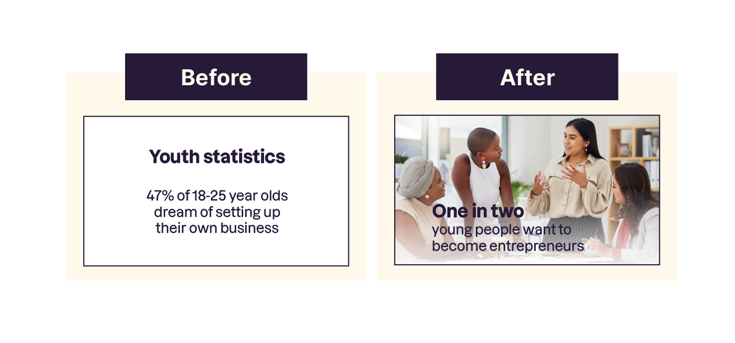
Infographics have become more popular in recent years can make a boring number seem meaningful.
Turn numbers, ratios, and percentages, into something that applies to the audience; it will be easier to remember and share.
You don’t need to make an infographic for each slide, but here is an example of a statistic enriched with images.

Avoid Artificial Images
Be careful when selecting your images. You may miss the point by being too enthusiastic. Avoid corporate photos showing people overly excited to be working at their company. It gives a false and artificial look.
If you show something that looks fake, you give the impression of being false, hypocritical, and unreliable yourself.
Use Humor and Irony
We tend to remember things/people that we find pleasant and fun. Making references to things that are familiar to your audience is a great way to get them on your side.
It is a good strategy to get your audience to smile or even laugh from time to time.
Unfortunately, it's not easy to be funny; especially in public. Trying to make jokes if you are not a comedian can fail. 😪
Here are some ideas to help you make your audience smile:
Animals can be touching and funny.
Taking an offbeat tone works as does irony, euphemisms, or self-deprecation.
You don't have to be too serious. Honest and direct writing appeals to people. For example, if 90% of PowerPoint presentations are of poor quality, say: "They suck in 90% of cases."
Let's Recap!
Remember to credit images that are not your own.
Let the image take up all the space and eliminate anything unnecessary.
If using data, make sure it's meaningful and relevant.
Only use humor if you feel comfortable with it.
That's the first part of the course done! Time to take a quiz to see what you've learned. Feel free to go back and review the chapters. In the upcoming chapters, we'll look at how to deliver a presentation to an audience and tools like storytelling to grab and keep their attention.
Ever considered an OpenClassrooms diploma?
- Up to 100% of your training program funded
- Flexible start date
- Career-focused projects
- Individual mentoring
Find the training program and funding option that suits you best
