Annotate Mock-ups and Wireframes With Accessibility Information

Communicate Accessibility Information Across Teams
You’ve reached the final chapter and the final frontier of accessibility: accessibility annotation. OK, maybe not the final frontier, that’s a bit dramatic. I’m trying to say that this particular area of implementing accessibility in the real world is quite new, and there is still a lot more work that needs to be done. In reality, designers still don’t think enough about accessibility. Developers implement patterns based on visual designs without necessarily having enough information about the intended behavior. Product owners don’t always know what to look for to determine whether they have something accessible.
Ideally, you will think about accessibility from the beginning of the design process and communicate it across teams. You know by now that a lot goes into making content accessible. Some of the considerations are on content, visual, and technical levels. Thinking about accessibility needs to happen across several different roles and departments, so communication is key!
We’re still figuring out the best ways to do it. Take this chapter as a starting point, and don’t be afraid to do your own exploration. The best solutions will vary depending on the project, organization, and amount of collaboration between departments. As much as possible, try to integrate this work with processes and practices that are already in place.
Map Out the Most Important Regions on the Page
To make the page easier to navigate for assistive technology users, you should define the main regions of your page using either structural HTML elements, ARIA landmark roles, or both. It will allow users to quickly understand how the page is organized and what regions are available. It will also help them move around the content quickly and efficiently.
There are several types of landmarks you can use; some are available through HTML, ARIA, and both. Here is a summary:
Functionality | HTML | ARIA |
Navigation | <nav> | role=”navigation” Note: this landmark role requires an accessible name using aria-label or aria-labelledby. This is especially important when there are several navigation regions on a page. |
Main content | <main> | role=”main” |
Header | <header> | role=”banner” |
Supplementary content | <aside> | role=”complimentary” |
Footer | <footer> | role=”contentinfo” |
Form | <form> | role=”form” |
Section | <section> | role=”region” Note: this landmark role requires an accessible name using aria-label or aria-labelledby. |
Search | N/A | role=”search” |
Give It a Try!
Look at the following mock-up of a homepage. What are the main regions on this page? Use the table above if you need a hint.
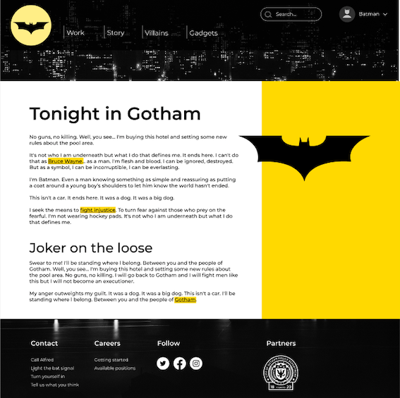
There is a header region with navigation and a search, the main area, and a footer with some additional navigation links. You can map it out as follows:
Note that there are two navigation regions, so each has a unique label.
Identify Reading Order and Focus Order
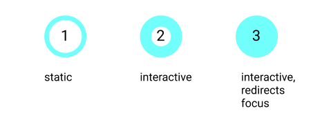
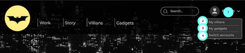
You can include annotations for the order in which a screen reader will go through the content for both static content (reading order) and interactive content (focus order). The two are related and generally should match up. You can use different icons for static elements, interactive elements, and interactive elements that redirect focus order if activated, such as drop-down navigation.
For example, in the following mock-up, most of the elements in the header are interactive. The profile menu redirects focus order to the pop-up content when opened, and the content in the main sections, such as the heading, text, and image, is static.
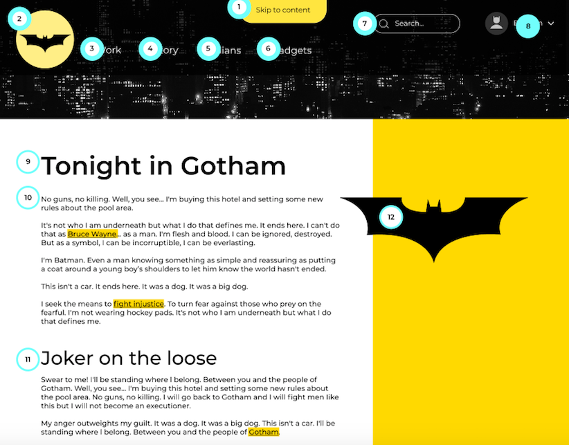
If an element redirects focus, the interaction should have its own frame. In this example, the profile settings open new content, so an additional mock-up frame explains the order of interaction once the content is expanded.
You can now use the reading and focus order numbering to organize information about all of the elements in an annotation table. In the next few sections, we’ll add a few layers of accessibility information into this table.
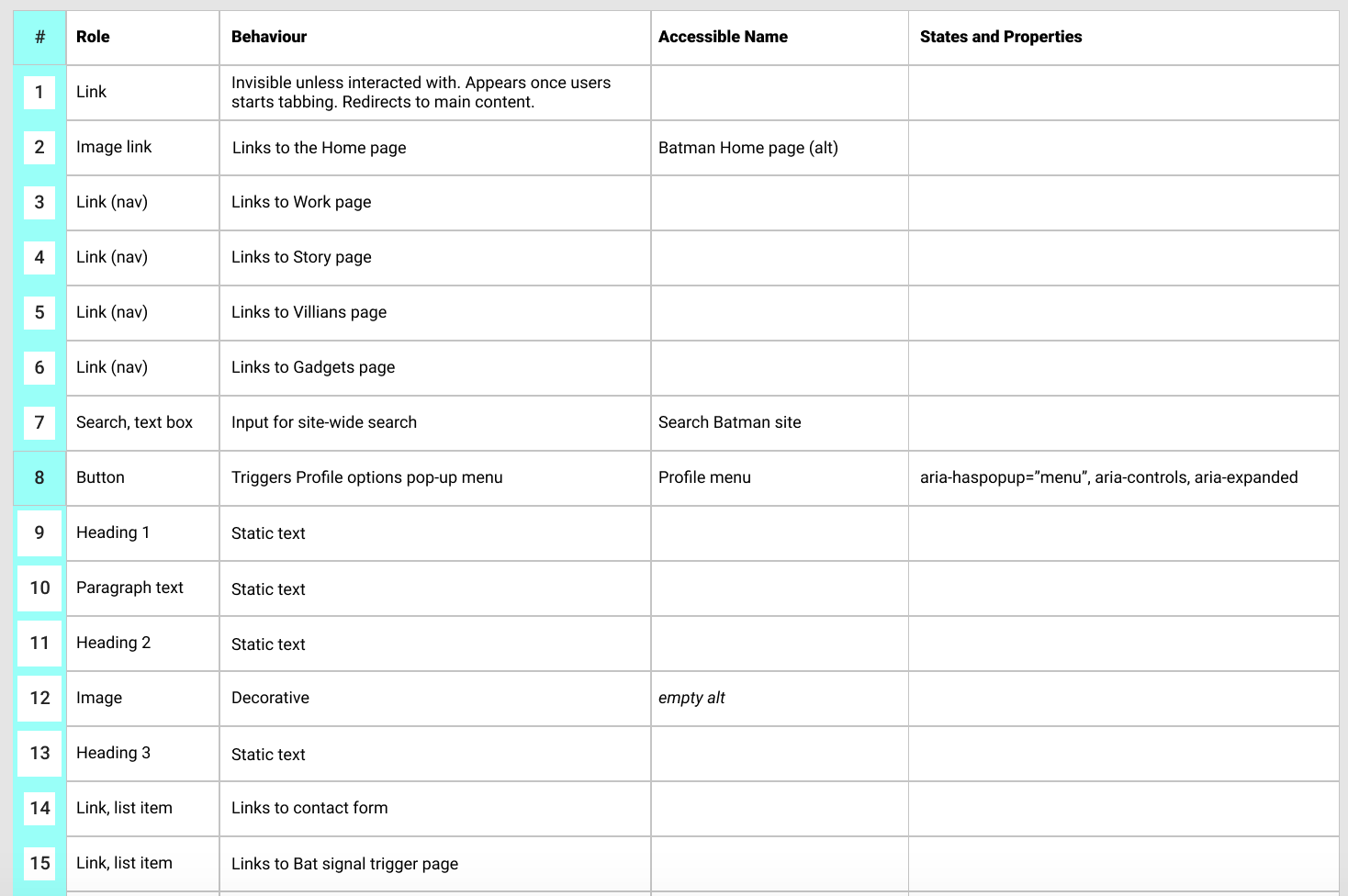
Note Roles, States, and Properties
This layer of accessibility information requires the most research, especially if you’re still learning the ARIA roles. I find it’s helpful to break this process down into two stages.
Identify the role of each element.
Specify the relevant states and properties that are crucial for understanding the control.
First, define the role, such as button, link, tab, etc. Whenever possible, communicate these roles through native HTML controls. If you’re using a checkbox, the checkbox role will be inherent in the HTML element. As I’ve discussed in the accessible interactions chapter, some components, such as tabs, cannot be communicated with only HTML. In these cases, you will need to define your roles through ARIA.
Once you know what the roles are, think about what additional information you need to communicate so that the user can understand the interaction without relying on visual information.
If you don’t know where to start, have a look at the ARIA 1.1 specification document and the ARIA Authoring practices document. Look through the list of supported and inherited states and properties in the spec to see which may be relevant for the control of each role. Browse through the authoring practices document to see if you can find examples similar to the pattern you are working with. Over time you’ll get to know which states and properties are typically required for which roles.
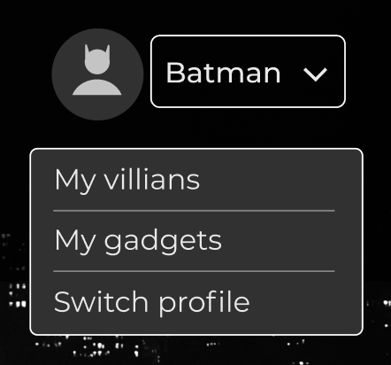
The example site’s profile menu is a button that opens a menu with links to other pages. The first thing we can specify is that this element is a button. There are lots of attributes listed in the supported and inherited section for this element. If you’re familiar with these attributes, you may be able to quickly scan through the list and see which ones are relevant. If you’re less familiar with ARIA, try to find some examples of interactions that work similarly. If you search the authoring practices document, you’ll find an example of a navigation menu button. From there you’ll see that this interaction requires:
An aria-haspopup attribute, that can be set to either "true" or "menu."
An aria-controls attribute that establishes a programmatic relationship between the trigger and the content it expands.
An aria-expanded attribute that indicates whether the content is currently collapsed or expanded.

Have a look at a few examples, especially if you’re working with a new pattern. Test them out with a keyboard and screen reader, and gather any feedback through blogs, a11y communities, sites like WebAIM to help you guide your decisions about which roles, states, and properties to include.
Include Accessible Descriptions and Names
Similar to alternative text descriptions for images, include accessible names and descriptions for all interactive controls, like buttons and links. In some cases, the accessible name will match what’s displayed visually (e.g., a submit button). In other cases, buttons and links can be associated with image-based indicators and may not have visible text descriptions. For example, you could have a + icon to indicate a collapsible section or a profile icon to hint at a user preferences menu. In these cases, the accessible names need to provide a description equivalent to the image cue.
Exercise: Give Accessibility Annotation a Try!
Take the mock-up you created in the previous chapter and add accessibility information to it.
Break your mock-up into sections. Which landmarks would help identify the regions of your page?
Number all elements to indicate the reading and focus order. Remember to differentiate between static content, interactive content, and elements that redirect focus.
Create a table with the numbers you used in the previous step as a reference. Indicate the role of each element.
Go through the more complex roles and interactions, and indicate any relevant states and properties. This step might require you to do some extra leg work to research examples and dig through documentation.
Let’s Recap!
Think through and communicate accessibility information from the start of the design process.
Indicate the focus order and reading order of elements.
Specify the role of each element
Mention any states and properties that are needed to clarify the interaction.
Add accessible names to both images and interactive visual elements such as buttons and links.
And that’s a wrap! You’ve come a long way, so let’s recap everything you’ve learned in the course summary.
