Help Users Navigate on Your Site
Navigation allows users to browse a site and move between pages. Even the most complex dashboards use this system.
In other words, navigation menus are critical to all users. As a result, menus must be:
Usable with a mouse, keyboard, and mobile phone.
Understandable. It should be clear which page the user is currently on and which other pages they can navigate to. If there is a secondary navigation menu, such as a dropdown, the behavior and functionality should be clear.
In this chapter, you will:
Build robust navigation for all types of users.
Manage the interaction and the possible status changes of a navigation menu.
Build a Robust Navigation System
The proper use of HTML5, compliance with acceptable development practices, and the use of ARIA attributes allows the creation of fluid, complete, and intelligible navigation for a wide variety of users.
Use Proper Tags for Navigation
First, let’s take a look at some good and bad practices and their impacts on navigation.
Structuring Navigation With HTML
Building accessible navigation requires the use of the following tags:
The
navtag, which will declare this block of elements a navigation menu.The
atag, which will declare the element as a navigation link.The
ulorlitags, which declare a list and are included in thenavtag.
Navigating on Mobile Devices
For mobile navigation, there are two things to remember for now.
First, the hitbox must be large enough to allow navigation.
In other words, the clickable surface (or pressable surface if you are on a mobile device) must be large enough to be used by a diverse range of users to be accessible. For example, older adults, users with motor difficulties (e.g., stroke victims), and people with vision loss need a larger area than the average user.
The second thing to remember is the famous hamburger menu. This type of menu is very popular in mobile navigation. We will return to this a little later in this chapter.
Use ARIA to Improve the Navigation's Accessibility
In the previous chapter, we discussed the construction of semantic navigation using HTML. Let's now add ARIA attributes to make the interaction more precise when using assistive technologies.
The Navigation Role
As you saw earlier, role ="navigation" can be used in addition to a nav tag. The advantage of adding it is to increase compatibility with assistive technologies, especially older ones.
The "aria-label" and "aria-labelledby" Attributes
If you have several navigation sections, you can use the aria-label and aria-labelledby attributes to label your navigation menus, clarifying each navigation region's specific purpose on the page for assistive technology users.
The "menubar" and "menuitem" Roles
If you are working on a complex interface, such as a dashboard, you might need to create a menu bar.
To build it in an accessible manner, you need to use the menubar and menuitem attributes. The first allows you to declare the block (or container) as a menu and then define options within the menu as menu items.
Manage Your Different Navigation States
Once you have your navigation structure, make sure that you clearly communicate the menu's state to assistive technologies, including:
Providing feedback to the user regarding the current page, which is sometimes only evident through visual cues. This information should also be available to assistive technology users.
Managing the states of collapsible content, such as dropdown and hamburger menus.
Supporting keyboard interaction of all navigation content, including dropdown menus.
Provide Feedback on the Selected Item and the Current Page
Identify the Current Page
The first method for identifying the current page uses the ARIA attribute aria-current. In the example below, the current page is always a pull request page. Note the aria-current="page" attribute, which indicates to assistive technologies that this page is the one the user is currently on.
<nav aria-label="Global">
    <a aria-label="Pull requests you created" aria-current="page" href="/pulls">
        Pull requests
    </a>
    <a aria-label="Issues you created" href="/issues">
        Issues
    </a>
    <div class="mr-3">
        <a href="/marketplace">
            Marketplace
        </a>
    </div>
    <a href="/explore">
        Explore
    </a>
</nav>
The second method to describe the current page is to transform the a tag of the current page into a span and add invisible text (hidden using CSS) to indicate this. It’s more of a workaround than using aria-current , but it can be useful in cases where the aria-current attribute isn’t supported.
In the example below, the current page is a pull request.
<nav aria-label="Global">
    <span class="current">
        <span class="hidden">Current page:</span>
            Pull requests
    </span>
    <a aria-label="Issues you created" href="/issues">
        Issues
    </a>
    <div class="mr-3">
        <a href="/marketplace">
            Marketplace
        </a>
    </div>
    <a href="/explore">
        Explore
    </a>
</nav>Change Visual States on Hover and Focus
It is also essential to give visual feedback for interactions. To do this, use CSS and its pseudo-class.
The pseudo-classes that you need for navigation links are:
:active, which allows an element to be targeted when activated by the user (i.e., the user clicks on it). (Documentation on the :active CSS pseudo-class.):hover, which controls the appearance of an element when the user hovers over it with the pointer, without necessarily activating it. (Documentation on the :hover CSS pseudo-class.):link, which targets all links that have not yet been visited. (Documentation on the :link CSS pseudo-class.):visited, which controls the appearance of all the visited links. (Documentation on the :visited CSS pseudo-class.):focus, which changes the appearance of an element when it receives focus (element selected with the keyboard or the mouse). (Documentation on the :focus CSS pseudo-class.)
Manage the Dynamic Elements of Your Page
Navigation menus can be simple, such as the one above, but they can become complex as your site grows. Let’s work through a more complex example, with different levels of navigation nested in dropdown menus.
Once again, we’ll use ARIA attributes to communicate the functionality and state of the navigation.
The "aria-haspopup" Attribute
This attribute notes that a particular control reveals additional pop-up content. It can indicate that the navigation menu contains a submenu.
The "aria-expanded" Attribute
The aria-expanded attribute is often used with the aria-haspopup attribute. In the example below, the aria-expanded attribute lets the user know whether the navigation menu is open or closed.
<ul>
    <li>
        <a aria-haspopup="true"  aria-expanded="false" id="bd-versions">
            v4.4
        </a>
        <div aria-labelledby="bd-versions">
            <a href="/docs/4.4/">Latest (4.4.x)</a>
            <a href="https://getbootstrap.com/docs/4.3/">v4.3.1</a>
            <a href="https://getbootstrap.com/docs/4.2/">v4.2.1</a>
            <a href="https://getbootstrap.com/docs/4.0/">v4.0.0</a>
        </div>
    </li>
    <!-- new li tag with other links goes here -->
</ul>
Whenever you use aria-expanded , you should also use the aria-controls attribute, which allows the element to control its state with the same ID. It essentially establishes a programmatic relationship between the control (in this case, the navigation item) that opens additional content and the content it controls (in this case, the other pop-up content).
Let’s see an example of these two attributes together in the hamburger menu example.
The Case of Hamburger Menus

You would use this on mobile devices, but not exclusively. You may also find it in desktop navigation, for example, when users enlarge content to make it easier to see.
Like any control, this button should be accessible with a keyboard, have visible focus, and communicate its states to assistive technologies. Because it collapses and expands content, which typically slides from the side of the screen, you need to add an aria-expanded attribute to it, as we did with dropdown navigation, and an aria-controls attribute to establish the connection between the hamburger menu button and the menu content.
In the example below, the button controls the block of elements with the toggleNavbar ID. Note that there is an aria-label used to give the button an accessible name.
<div>
    <div id="toggleNavbar">
        <div>
        <!-- content of the navigation menu goes here -->
        </div>
    </div>
    <nav>
        <button aria-controls="toggleNavbar" aria-expanded="false" aria-label="Toggle navigation">
            <span></span>
        </button>
    </nav>
</div>
Use Breadcrumb Navigation
Before moving to practice, let’s look at breadcrumbs.
To create accessible breadcrumb navigation, you will need:
A
navtag or ARIA role=”navigation” to indicate that the region is a kind of navigation block.An
aria-labelattribute to define the block as a breadcrumb.An
aria-currentattribute to specify the current page.
<nav aria-label="breadcrumb">
    <ol>
        <li class="breadcrumb-item"><a href="#">Home</a></li>
        <li class="breadcrumb-item"><a href="#">Library</a></li>
        <li class="breadcrumb-item active" aria-current="page">Data</li>
    </ol>
</nav>
Also, notice that the use of an ordered list (ol) enables the nesting elements.
Now it's the time to practice and complete our navigation menu!
Tonight in Gotham: Implement a Navigation Menu
As you saw in the previous part, our project includes several navigation menus. Two in the header, and one in the footer.
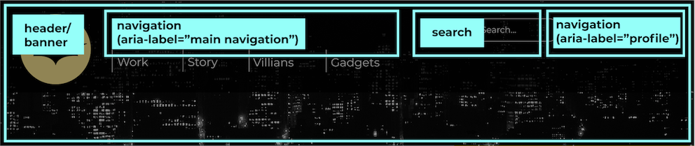
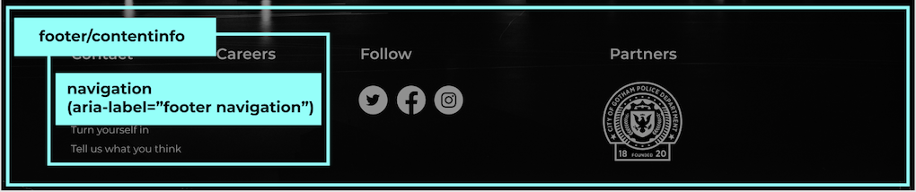
In the project code, you will see that the regions are identified with aria-label attributes: aria-label="main navigation", aria-label="profile", a ria-label=""footer navigation". Also, all links use a tags.
Now, look at the main navigation menu. The first item is the Batman icon. We'll take a closer look at the accessibility of images and icons a little later in the course.
The icon is embedded in an a tag. To communicate the destination of the link, use the aria-label attribute.
Lastly, remember to give visual feedback to the user about the interaction.
If you look at the CSS file associated with this project, you'll see the following rules:
In the first code snippet, the SVG of the Batman icon changes color on focus and hover.
In the second snippet, the text in the navigation menu changes to a heavier
font-weightindicating that the user is on a navigation item by making it bold.
.header-svg:hover {
    background-color: #000;
}

.header-svg:hover path {
    fill: #FFEA94;
    stroke: #FFEA94;
}

.header-navigation-item:hover,
.header-navigation-item:focus {
    font-weight: 700;
}These rules allow you to give the user visual feedback when an icon is in focus or hovered over, which is particularly helpful for people who rely on the keyboard for navigation. Remember, accessibility is not only for people with vision loss. It's about helping all users browse your site.
Now let's take a look at the dropdown menu on the right-hand side of the header. You control this interaction with JavaScript, which you can find in the app.js file. To make this interaction accessible, keep in mind the following:
The profile button uses an
atag with the attributesaria-haspopupandaria-expandedto semantically indicate the presence of a dropdown menu and communicate its current state.The dropdown button and the links within it have all CSS rules for hover and focus to indicate when they are selected.
We haven't discussed the aria-current attribute because the project has only one page.
However, if you were on one of the navigation subpages, you could do so with the following technique (seen earlier in this chapter):
<li class="header-navigation-item">
    <a aria-current="page" href="#">Work</a>
</li>
This technique is also useful when you have pagination links, such as those that appear in multiple page search results. You can enclose all numbers within the pagination in a nav element, add aria-label="pagination" and add aria-current="page" to the search results page number the user is on.
Let’s Recap!
A good navigation menu uses good semantics: take advantage of
navandatags.Enhance your navigation menu with the
role ="navigation"attribute.Use the ARIA
haspopupandaria-expandedattributes to describe the states of your navigation menu where appropriate.Finally, change visual states on hover and focus.
Next, we’ll focus on content and how to make it accessible, starting with examining the accessibility of images.
