Once users have arrived at the landing page, you have succeeded in getting them to buy into your concept. In other words, you've transformed the internet surfer into a user. A typical way to measure the degree of activation is through registrations.
The user must have a satisfactory first experience to succeed at this step. They must say to themselves, "Oh yeah, not bad. I think I'll sign up! " or even better, "Wow!" Cool!"
For example, Uber addresses activation by displaying the cars moving in real-time as soon as the application opens. The user sees the product in action, proof that the value proposition will be properly delivered: an available car nearby to take you from point A to point B.
We're now going to explore onboarding marketing. In this chapter, we'll detail the six good practices to apply for effective onboarding.
You have to empathize with your customers/users to make sure that each step holds an interest for you and your user; this is what we'll see with user journey mapping.
1. Define Your User Journey Mapping
It is the entire journey that a customer follows when purchasing a product or service.
The journey depends on the persona: good knowledge of the needs, objectives, and motivations of the persona is necessary to push the messages toward the target whenever they need them.
You have to think of the content contextually:
Is price the primary motivation?
Does the target need help/assistance to understand how the product works?
Is the target a decision-maker or just a curator?
All of these will help prioritize the messages and make sure that the process is smooth.
You can then refine the user journey by persona for the different expected messages. Perhaps it'll be necessary to produce several journeys according to the various personae's needs. The good news is that the diversity of landing pages allows you to test the conversion rates and focus your efforts on those that work best.
PLACEHOLDER - Example of a simplified user journey at Airbnb.
2. Take Care of Your Value Proposition
A value proposition clearly describes what makes your product unique. Above all, don't make your users think about the service or product's value! Use the 5-second rule: in 5 seconds, the user must understand the costs and benefits.
An image that I like that symbolizes your value proposition vs. the product by itself:
(Mario) Person who is a potential customer + your product (it's not what makes your business) = (Super Mario) Person who can make your product great (that's what makes your business).
3. Reduce the Friction
Well done, you've managed to inspire a solid value proposition. But, beware, if you can't deliver it!
For example, if the user encounters a malfunction during the registration/purchase/subscription of your offer. Some will contact you (around 6%, on average), everyone else will just move on. User friction is almost inevitable, but your job is to redouble your onboarding efforts.
Here are several ways to reduce friction:
Avoid landing pages that are too long or too complicated.
Avoid cognitive dissonance. Namely, a misalignment between the acquisition marketing message (on a Facebook ad, for example) and what's on the landing page.
Instill confidence in the brand through reassuring content and messages.
Use testimonials and customer reviews at various times of the onboarding.
Use social logins. You know, those little buttons that allow the user to use a social network to connect more quickly to a site. Use them to facilitate registration to your site.
Example of a social login button.
Use the inline form validation. These are visual aids to help the user complete a form correctly. By using them, you will reduce the form completion time by 42 %.
For example, you have:
The incorrect field shown in red.
The properly completed field in green.
Example of an inline form validation
4. Promote the Tailor-Made Experience
Some users need guidance during their onboarding and will want to have a 100% completed profile (they remain rare); others want to access information about the product/service very quickly (or in two clicks in the web version).
Both types of users must be able to find their way around and have a pleasurable experience. To allow them to complete their frictionless onboarding, you can imagine implementing a pass button, or a light, minimal version.
To lighten your onboarding, ask yourself:
Is this step (or field) important for the operation of the service?
Is it possible to collect it later?
Can my product or service work if this information is not collected?
5. Guide Your Users
If your product/service is complicated, your onboarding should be educational: you'll have to simplify by helping the user or customer become familiar with the product.
It was a signature trait of Steve Jobs: from the first launch of the personal computer, communication and product use was simple. And it even started in the onboarding process!
6. Educate and Make Yourself Available Through Email
To be a user or customer, the person must use the product. In theory, onboarding, is experienced only once: the information contained through it is no longer accessible after that. Therefore, you must consider making this same information available in one (or more) email(s):
A clear welcome email that eliminates any confusion about who you are or what you do is always appreciated.
Subject: Welcome to XYZ
The XYZ company is:
Recall value proposition 1.
Recall value proposition 2.
Recall value proposition 3.
Be careful to send only one call-to-action per email: what is the next step you want the customer to do? Direct your customer in this direction.
You can now publish your profile by validating your email:
["VALIDATE MY EMAIL" BUTTON ]
The link in the email should send to the location where the action should take place:
The user arrives at a page that confirms that their email has been validated, and their profile is published. Also, show a profile preview.
Remember to match the different scenarios:
User/customer.
Unregistered customer.
Match each of your scenarios with the key steps that your customers need to take. Combine everything with marketing automation and human contacts (phone call or physical appointment, if relevant) to be sure that you're where your users expect you.
Before reaching this point, keep in mind that several value propositions, colors, CTA, and designs should be tested. Study your users' behavior on your app or site in depth to understand what they're doing, where they're going and where you're losing them.
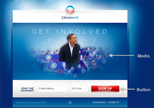
For example, on the Barack Obama election campaign website in 2008, four different CTAs were tested on the landing page. Six media were also offered (three images and three videos).
This made it possible to have 24 different combinations to know which one would work best. And on each of the media, different value propositions appeared.
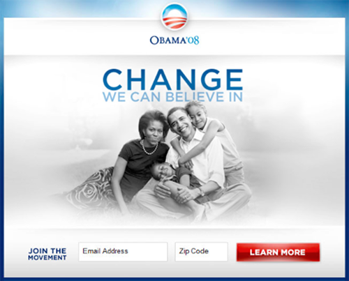
Barack Obama campaign site landing page
Different call to action buttons were used:
Join us, learn more, register nowHere's the winning combination.
A few comments on what worked here:
A photo with the children: it represents the future.
A happy and united family: it represents stability and develops sympathy capital.
The CTA button "Learn more" is less engaging than "Join us."
A sentence: "Change we can believe in." It calls for realism, change for a better world.
Rely on Tools
To ensure your activation, I suggest that you use some analytical tools and other more conversational tools.
Google Analytics
It's the best known and most used free tool with the minimum combination to get data on your visitors, traffic, and understanding of what's happening on the user side.
An underused feature of Google Analytics is that of user flow: it allows users to be followed according to the journey that they took on the website. It also allows you to see the most visited pages and the pages that make your visitors flee (exits in red).
Here's an overview:
AB Testing Tools
Optimize by Google (free) or Optimizely (paid) allow you to do all kinds of optimizations, including AB testing: test version A against version B of your website to see which one works best. Each of the tools offers in-depth analysis and are available without needing to know how to code.
Unbounce
Unbounce most notably has a pop-up functionality – a small window - that allows you to retrieve the visitor's email before leaving your website.
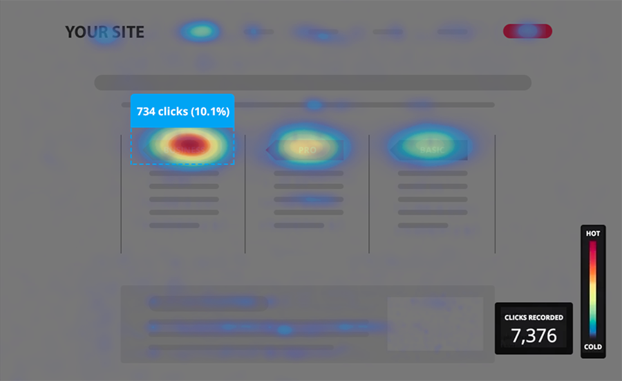
Hotjar
Hotjar is a very powerful tool that offers heat maps. Namely, you can see where your visitors click and spend the most time as a visual representation:
The red areas represent the places where users click the most or spend the most time. The blue areas represent those where they pass over but without spending much time. The colorless areas are not looked at.
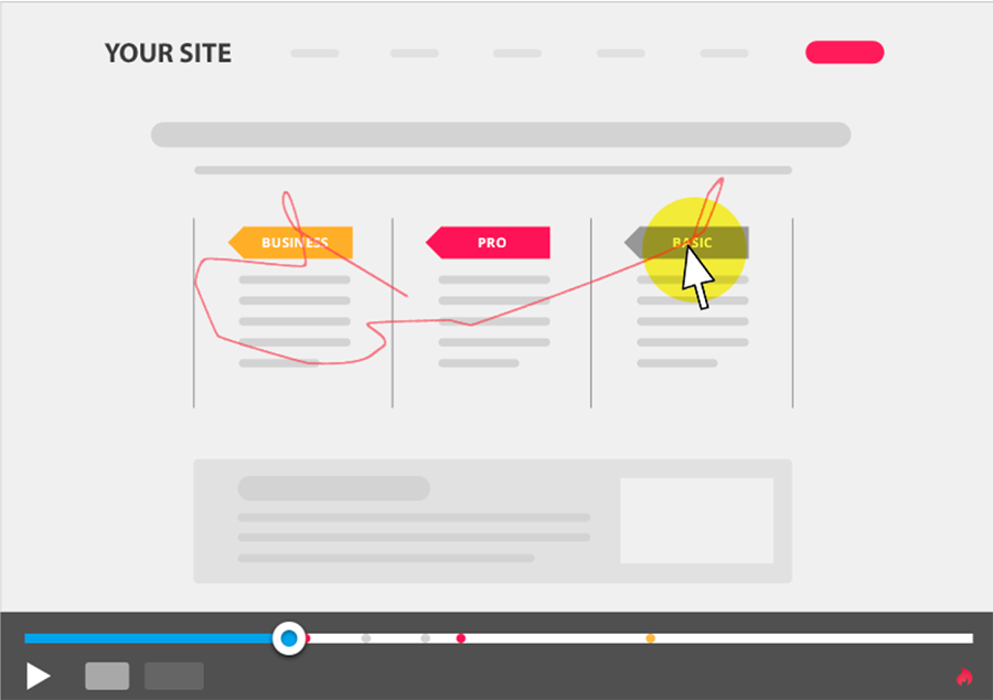
Hotjar also offers to save mouse navigations by recording the scenarios conducted by your visitors:
Using this, you can really see the behavior of the user.
Let's Recap!
The activation stage allows:
You to make sure that everything works and that the user follows the onboarding path that you planned.
Visitors to easily ask your team questions.
Good practices include:
Defining your user journey map(s).
Taking care of your value proposition.
Reducing friction.
Promoting the tailor-made experience.
Guiding users.
Educating users.
It is important to conduct user tests (AB testing).
Make use of statistical and behavioral analytical tools to study user journeys.
Your users are now active on your platform; you'll have to keep them and keep them coming back! This is the next step in the conversion funnel: retention. See you in the next chapter!