Table of contents
- Part 1
Develop an Email Strategy
- Part 2
Write a Persuasive Marketing Email
- Part 3
Send an Email Campaign
- Part 4
Optimize Campaign Performance
- Part 5
Improve Campaign Deliverability
Table of contents
- Part 1
Develop an Email Strategy
- Part 2
Write a Persuasive Marketing Email
- Part 3
Send an Email Campaign
- Part 4
Optimize Campaign Performance
- Part 5
Improve Campaign Deliverability
Prioritize the Information in Your Email
With your campaign brief complete, it’s time to start writing your email. An email is often not written by specialists, and it’s important to remember that it is not a website, poster, or letter. Like any channel, email has its own rules and systems linked to how recipients consume the message. It has its own language, if you like.
Think about how you use email. What will trigger an open? What will capture your contact’s imagination? What will trigger a click? This makes prioritizing information essential.
Organize Your Email With Zoning
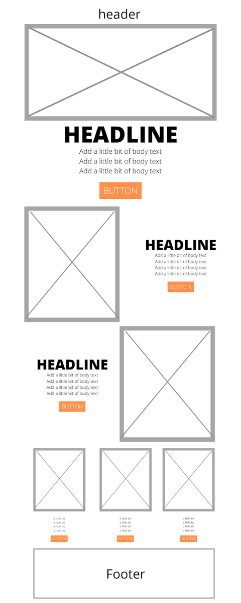
Zoning refers to the grouping of information based on the level of priority. As mentioned, layout is a key part of your brief. This is a document that lays out the different zones of your email, including the copy, serving as a guide for the designer.
Take a look at this example from online retailer Mankind:

As you can see, the email text and other elements have been laid out, organized, and prioritized. The most important information is in the first zone and the level of priority decreases with each subsequent zone.
Watch out, though – this is a working tool, and your designer may take the liberty of changing one or two things. Once the designer has completed their work, the text may still require some adjustment.
Consider Your Sender Name and Preheader
The sender name influences what recipients decide to do with your email. It should remain constant (not changing from one email to the next) and be easily identifiable in fewer than 30 characters.
The other element that will influence whether your email gets opened (we’ll talk about the subject line later on), is known as the preheader; the text that follows right after an email’s subject line.
The preheader appears in the recipient’s inbox and can be used to help ensure the email gets opened.

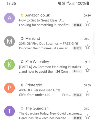
In this extract from my inbox, you’ll see that the second email, from Mankind, includes the text “Discover their minimalist skincare range," that follows from the subject line (in bold, as the email is unopened).
This is even more pronounced when you see the inbox on a mobile phone:

This mobile view is massively important. Exact numbers will vary according to your own mailing list, but it’s estimated mobiles account for as many as 85% of email opens. Yes, you read that right. About 85% of your carefully crafted emails will be read on a screen that fits in your hand.
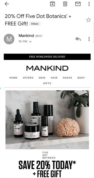
On opening the email, you’ll see that the preheader is not visible.

This tactic can be beneficial for emails that use images and a layout that includes a table, as the Mankind email does. By including an impactful preheader, followed up blank space, the sender controls what the email looks like in the inbox.
This is another factor that will influence whether a recipient will open an email or not.
Choose a Subject Line That Stands Out
Though the sender name is essential, it’s not something you can easily be creative with. Make it more friendly than “donotreply@...,” but your options are somewhat limited. Instead, focus your creative attention on the subject line if you want your emails to be opened.
The subject line is crucial in determining how your email will perform, so take your time with it. Don’t leave writing it to the last minute, just before your campaign mail-out. You should be considering your subject line as early as the brief stage, even if you’re likely to change it during the creative process.
Here are a few tips for a successful subject line.
Keep It Short (but Not Too Short)!
A short subject line is easier to remember than a long one, but too short will lack meaning. Aim for between six and ten words, an average of 50 characters. Again, remember that the vast majority of your emails will be viewed on a mobile device.
To get your emails opened, always try to put the most meaningful words first. They will be make or break!
Get Your Reader Interested
Attracting your target’s attention and capturing their imagination will improve response. Put yourself in your reader’s shoes and be creative.
Think benefits rather than features! Appeal to emotions. In some cases, subject lines that start with a number work well:
10 recipes to give you a boost.
5 reasons to mark International Women’s Day.
Top 3 most-read articles.
-20% on our membership plans.
Surprise your contacts and never reuse an old subject line, especially with the same recipients. Doing so could reduce performance. You won’t keep your contacts interested by going back over old ground.
Three Golden Rules
Choose verbs and power words. Verbs are action words, after all!
Don’t mention the sender name in the subject – it’s a waste of space (a precious resource!).
To be creative, be prolific: subject-line writing is a speed-writing exercise. Jot down as many as you can in one go to get the creative ball rolling, and then sort through.
Work on Your Call-to-Action
Your call-to-action is the button that you want people to click. It’s the ultimate goal of your email. In the next chapter, you'll see how your calls-to-action should look, but let’s take a moment to think about the words.
Just like for your subject line, if you want action, you’ll need verbs! But not just any verb – it needs to directly link with the action that you want your reader to take. And this action is not simply clicking (so you don’t want to have ‘Click here’). And please, forget the clichés. No "View," "Read on," or "Find out more," thank you very much!
Thinking back to the airline, you would use words related to that sector: fly, reserve, travel, or – in certain scenarios – cancel or rebook.
It’s important to take time over this. Along with the subject line, your call-to-action is an important factor in optimizing your email performance.
Get to the Point
"Perfection is achieved, not when there is nothing more to add, but when there is nothing left to take away." - Antoine de Saint-Exupéry
This quote perfectly conveys the takeaway message. Read your text and note any unintentional repetition. Then, delete it and re-read your text. Note all the adverbs (a quick search for 'ly' in your text editor works pretty well ;-)) and delete any that don't add meaning.
You only get a few seconds to secure your reader's attention with an email. Your content needs to be concise, simple, readable, and effective. Get to the point so that your reader can decide whether or not to click on your call-to-action.
Let’s Recap!
Start thinking about how to organize your email at the copywriting phase.
Sender name is the first thing that will attract attention.
Your subject line is the most important creative element of your emails.
Get to the point.
In the next chapter, we’ll look at the basic notions of email design.
Ever considered an OpenClassrooms diploma?
- Up to 100% of your training program funded
- Flexible start date
- Career-focused projects
- Individual mentoring
Find the training program and funding option that suits you best
