Present Your Strategy to Others
Communicate Risks to Your Team
You analyze a project’s risks to make it more secure. Then, you inform others about this positive, proactive approach at different points in the project:
During the project definition phase, when you have to convince others that the project is feasible.
At the project launch to present the main risks to the team.
During the project, to monitor the level of criticality, to consider new risks, or to bolster your prevention plan at steering committee meetings.
During the postmortem meeting where you will try to learn from the experience.
At such meetings, you will have to inform other stakeholders about your risk management work.
We have looked at various documents, tables, and diagrams during this course. Still, you probably won’t have time to show all of these to your colleagues at such meetings.
Use a Radar Chart
Your detailed prevention plan may be too much for colleagues or clients, so you'll need something quick, simple, and visual.
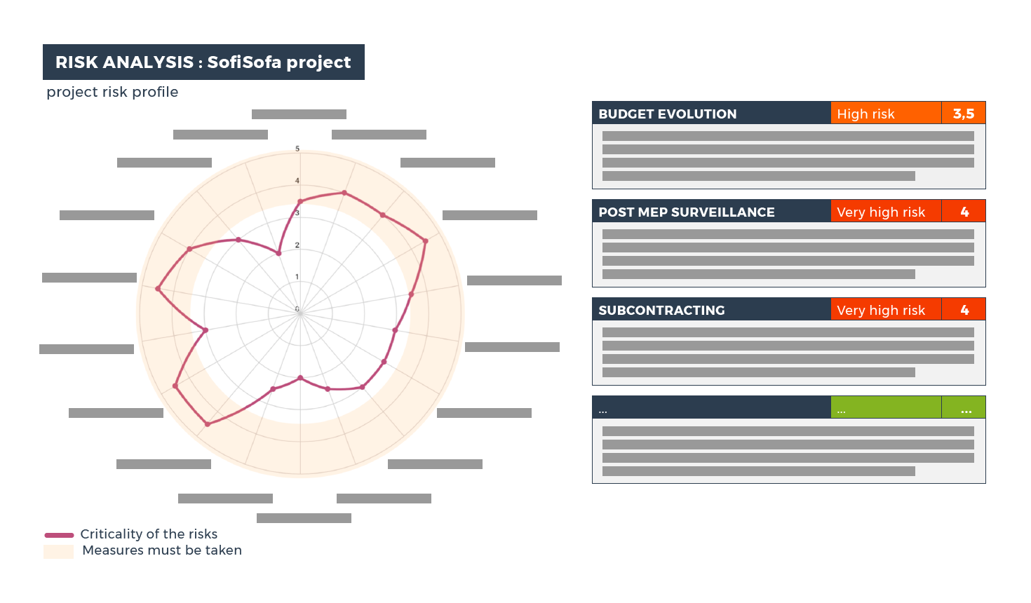
Here is an example of a risk analysis I did when our agency answered a call for proposals. I identified the following specific risks:
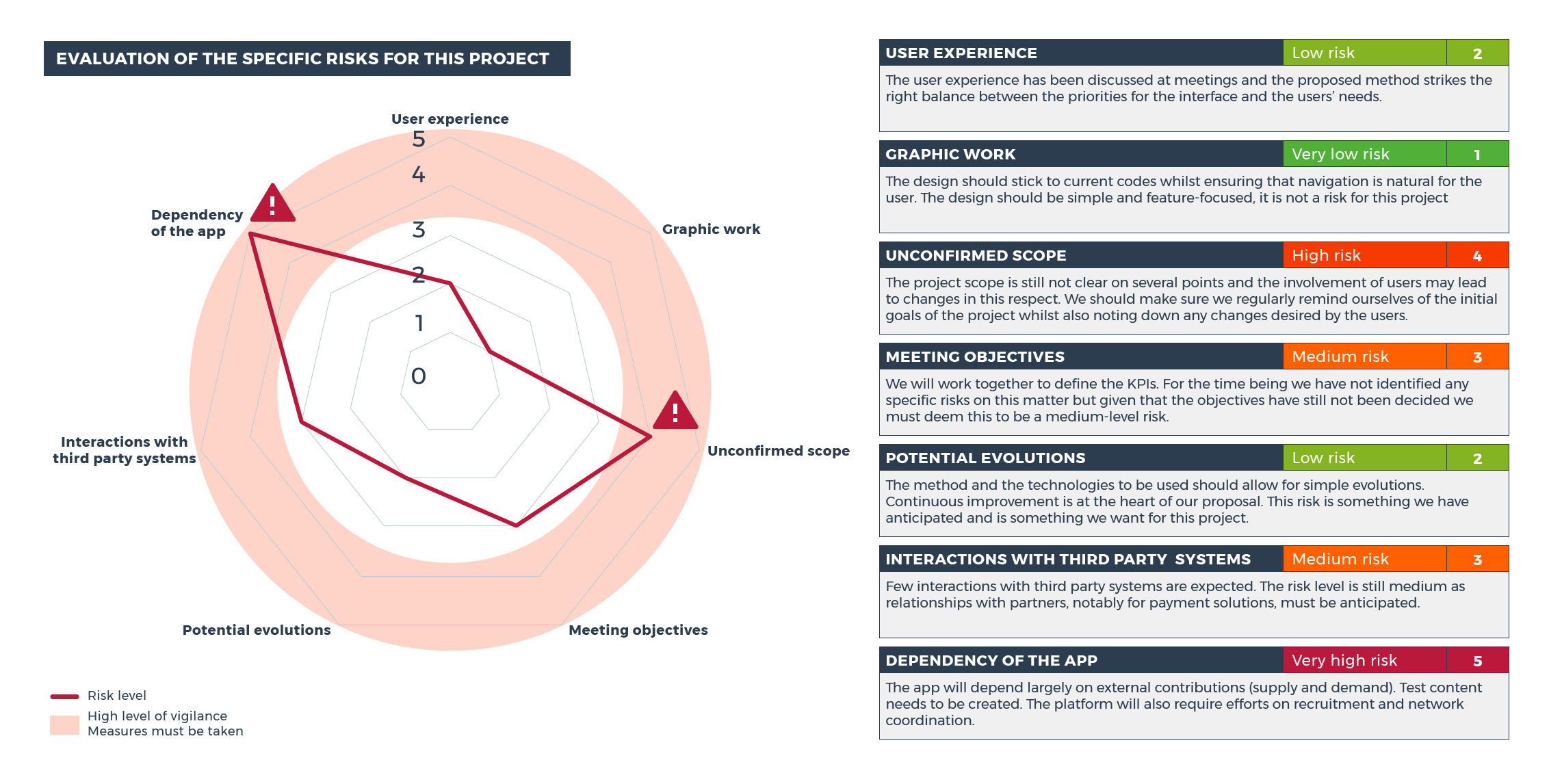
My objective was to present the key points we needed to be aware of at a meeting with the client. It was also to propose specific measures to lessen these risks. I wanted to express the following message:
“Your project scope isn’t clear enough. Once we start interacting with the users, it’s going to change. We should put together an initial basic scope and then gather information about all relevant changes to create a roadmap.”
“The concept behind the app and the way it works links a large number of future contributions from users, but there is no plan for managing this community. We need to include community management efforts in the project scope.”
I also presented my assessment of the risk levels for key parts of the project. It shows that the risk level is low for some but high for others. It reassures the client and makes you stand out as a true professional.
This radar chart focused on the specific risks for this project. I made another chart to cover the generic risks.
You should include your radar charts as part of the project report. These charts provide a concise overview of the risks and serve as a useful reminder of ones encountered during the project.
Base Your Radar Chart on Your Criticality Matrix
The advantage of a radar chart is that it quickly presents a project's risk profile. However, suppose you have very few specific risks (or none). In that case, you will only need to create one chart and include them both.
What if you need to analyze more than four or five specific risks? You would create a separate chart. It's important that you also communicate about the low-level risks to show that you have analyzed all the generic ones.
As you have seen, these radar charts are great communication tools. But if I enter my criticality levels straight into my radar chart, this is what I get:
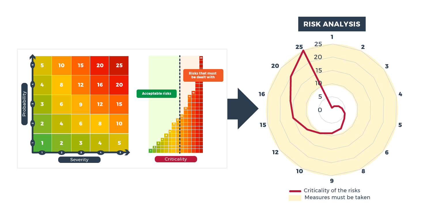
Because you multiply the probability by the severity to get the criticality levels, the figures are not linear. Therefore, the figures in the chart that are below ten are underestimated.
You must find another way to represent risks and their criticality.
Instead of multiplying, show the average severity and probability levels for each risk. It's not the true way to calculate, but it gives a more understandable result for this chart:
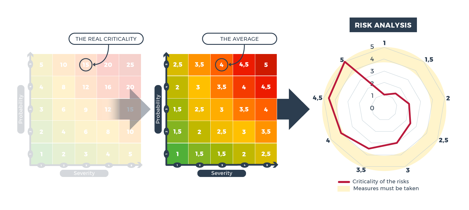
Using this chart, you should take immediate corrective action for any risks at 3.5 and over.
Learn to Create Charts
Use PowerPoint
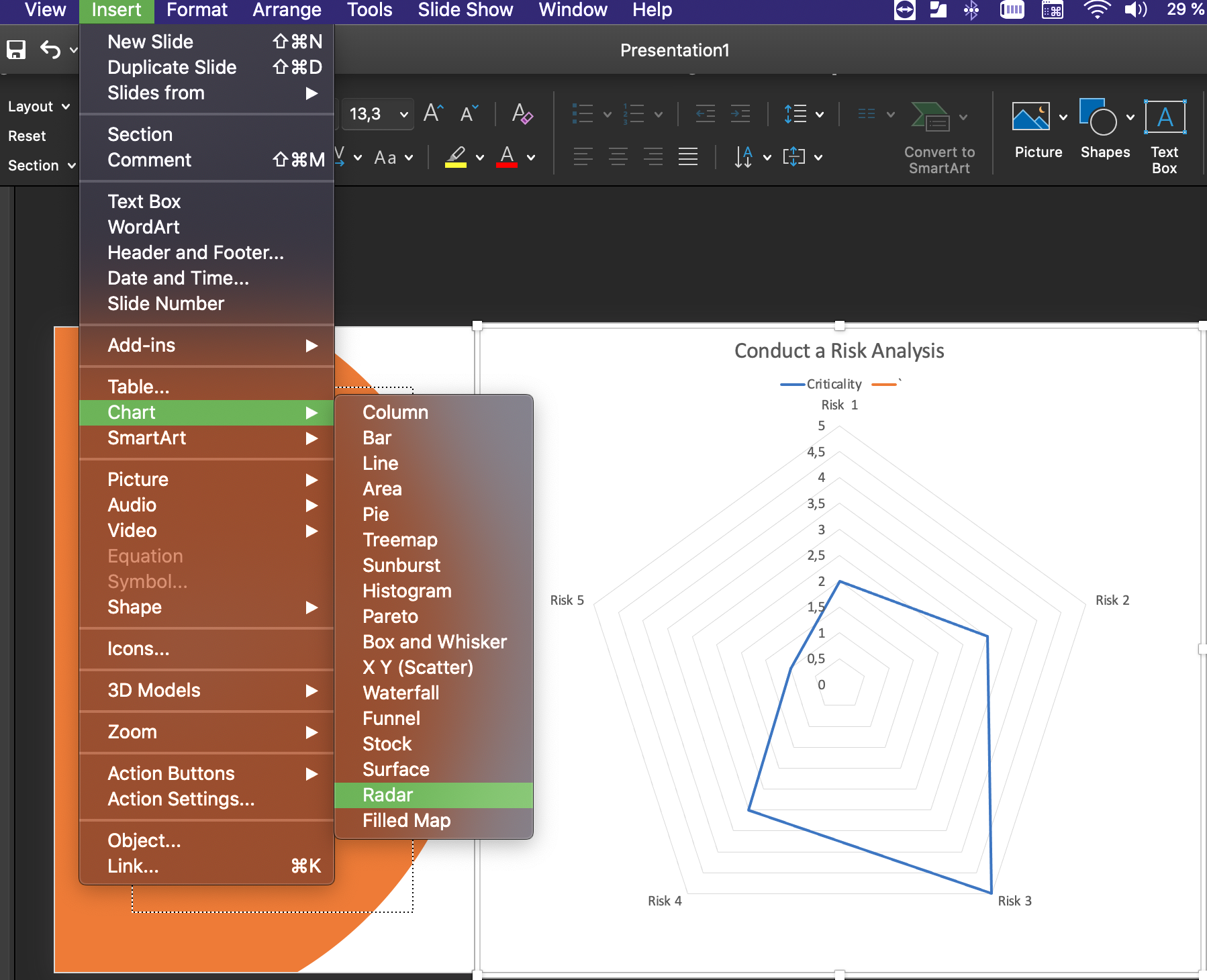
You can easily make radar charts in PowerPoint (Insert > Chart > Radar).
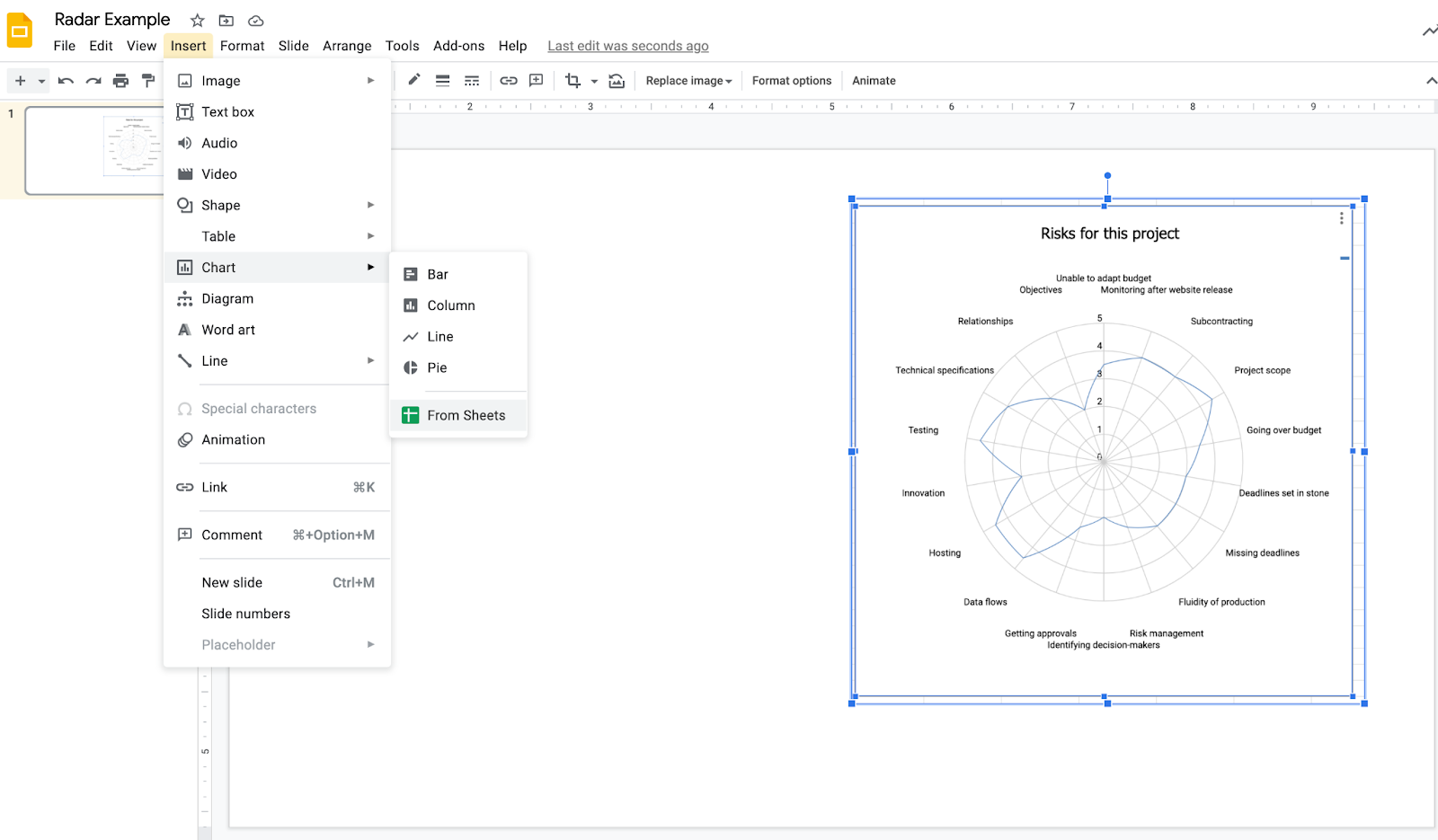
Use Google Slides
It becomes a little more complicated with Google Slides. Bring the chart over from Google Sheets (Insert > Chart > From Sheets and then select the file where you created your radar chart).
Present the Implemented Measures
You have presented the overall situation using your radar chart, but now you need to describe your action plan.
Outline the criticality level (I often add “high risk/low risk/critical risk”) for each risk. Then outline the measures to be implemented (or have already been implemented) to reduce the criticality level.
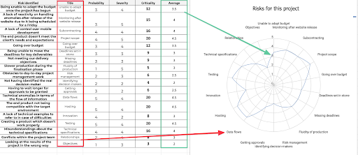
Notice that I added the average column for clarity purposes and the title column to give a shorter description of the risks that I could use in the chart's legend.
A Summary and Radar Chart
In the example of the SofiSofa project, most of the identified risks are generic. Only three of them are specific. But the 18 total would be too much for one radar chart, so it would be best to create a summary of this information. This will be your task in the last part of the course! ✍️
Instead of putting together a summary, I could have classified the generic risks under the seven dimensions of my 7D approach and then added the three specific ones for a total of ten. A radar chart with ten branches is much easier to present than one with 18.
Let's Recap!
The prevention plan is a highly detailed document that will help monitor risks. A chart/image is more effective for meetings.
A radar chart allows you to present a risk profile for your projects.
Use the average probability and severity to represent the criticality level to better represent the risks on a radar chart.
The document you use in meetings should highlight the measures you will take to decrease the main risks.
Closing Remarks
You are now a risk management expert - from identifying risks at the start of the project to presenting your plan of action to help secure its future.
Prevention plans and radar charts are helpful tools. Make sure you know how to use these concepts!
I've come up with one last activity to test your knowledge.
I wish you the best of luck in your career, and I hope you have enjoyed using OpenClassrooms!
I know you will be successful because nothing can hurt you when you know how to manage risks!
😉
See you soon!
