Table of contents
- Part 1
Learn What Bootstrap Is Used For
- Part 2
Create Responsive Layouts
- Part 3
Display Content Using UI Components
- Part 4
Add Interactivity to Your Website
- Part 5
Create Your Own Features and Themes
Table of contents
- Part 1
Learn What Bootstrap Is Used For
- Part 2
Create Responsive Layouts
- Part 3
Display Content Using UI Components
- Part 4
Add Interactivity to Your Website
- Part 5
Create Your Own Features and Themes
Explore Mobility, An Important Factor for Web Users

How Are People Using the Web?
In 2021, the World Wide Web celebrated its 32nd birthday! Its name says it all—it’s now an essential part of the lives of billions of people all around the world.
Another piece of technology has become just as indispensable for many people: smartphones.
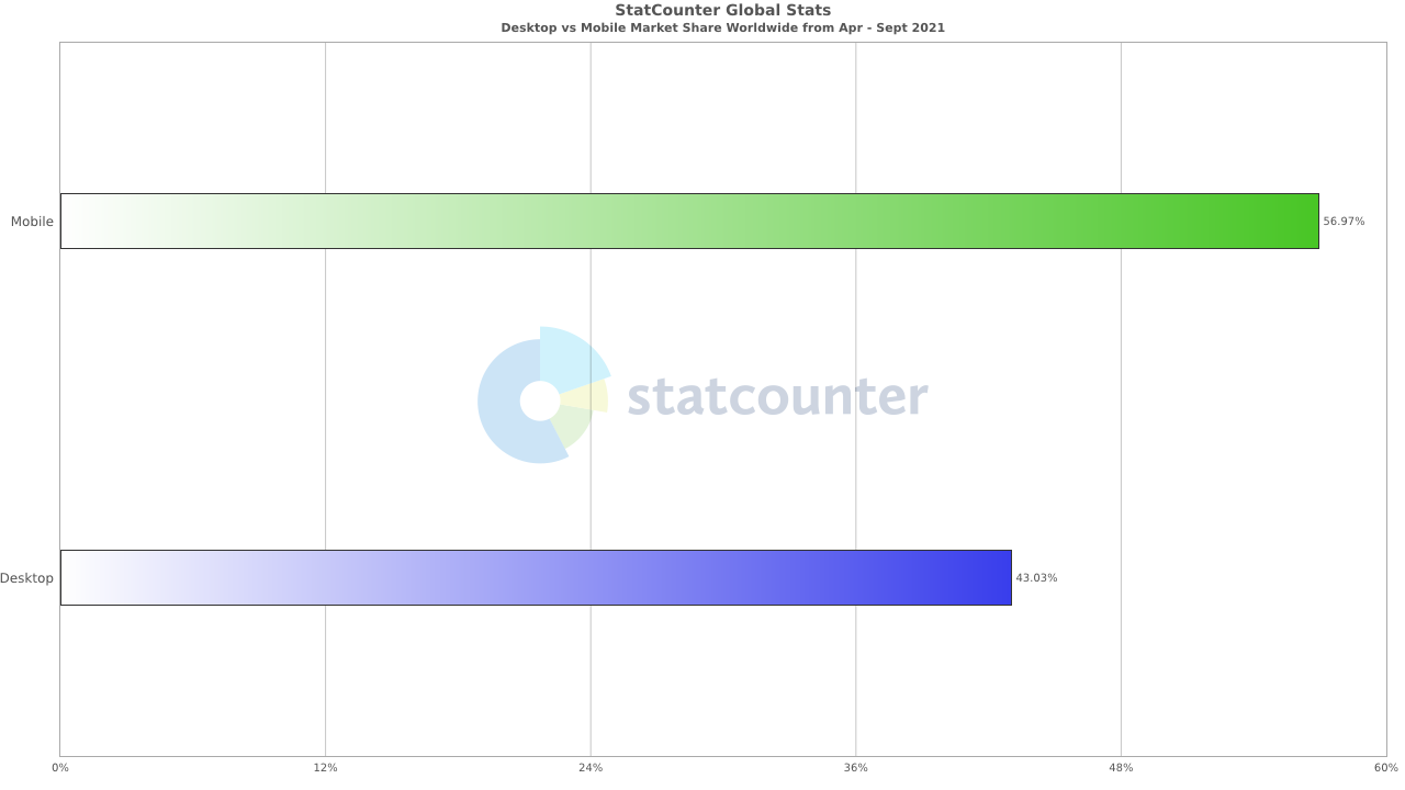
It’s no surprise, then, that these two trends have merged, to the extent that from April to September 2021, more than half of all web pages in the world were viewed on smartphones, according to StatCounter. And this figure seems set to grow even more in years to come.

What impact do these trends have on my work as a front-end developer?
Nowadays, your users can choose from a vast range of different devices and browsers to use an application.
With so many devices and browsers available, each device-browser combination may require its own tweaks to make sure web pages are rendered properly.
You’ll find that not only do different browsers have different capabilities and variations in how well they support web standards such as HTML and CSS, but even different versions of the same browser might have variations as well. When creating web pages, it’s important to take these variations into account to make sure they display and function correctly.
In addition to the complexity of the differences between browsers, smartphones need a high level of flexibility to display your web pages, as there are many different screen sizes. Also, smartphone users may view your website in portrait or landscape.
To account for all of this, you need to create responsive page layouts—i.e., layouts that respond dynamically to different screen sizes and orientations.

For example, if you use any social network platforms, you’ll see that the developers have built them in a way that renders the interface differently depending on whether you’re using a computer or a phone.
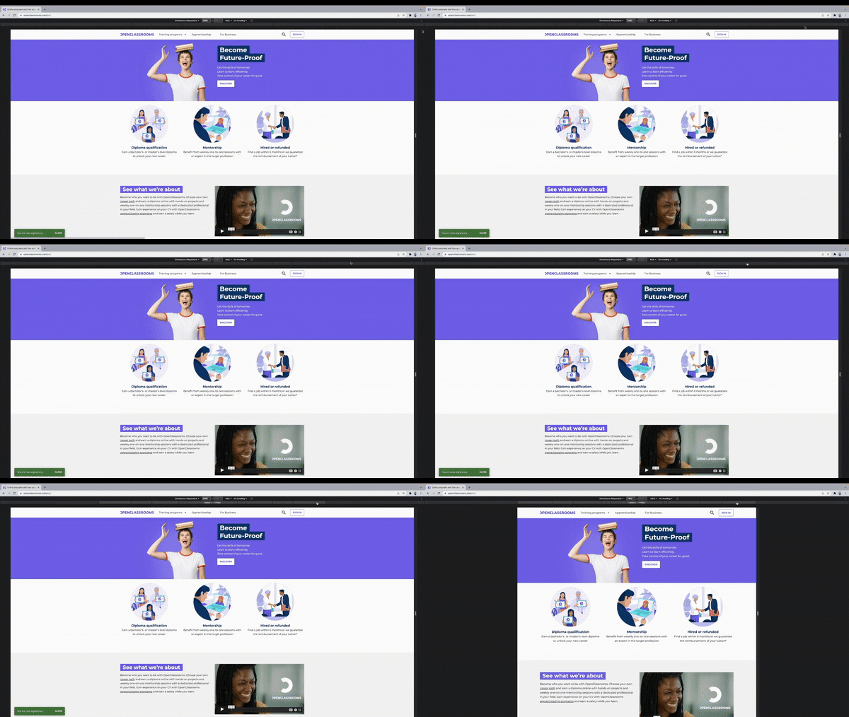
The same applies to OpenClassrooms. Try accessing this page from another device—if you’re currently using your phone, open the page on your computer, and vice versa. You’ll see that the layout changes to adapt to screens of different sizes. That’s responsiveness in action!
As a front-end developer, you need to be aware of these differences between devices and browsers when creating a website. Luckily, many front-end CSS frameworks have been developed to help you spend more time on the implementation and features of your websites and less time on debugging and refactoring to account for these differences.
Bootstrap is the best-known CSS framework, but many others offer a different approach or design.
Over the next chapters, we’ll look at the framework in detail to help you decide if it’s right for your project.
Let’s Recap!
Accessing websites via mobile phones is a growing trend that you need to account for as a web developer.
It’s best practice to create responsive layouts for your websites and applications.
Front-end libraries such as Bootstrap help you create user interfaces that provide tailored user experiences.
Now you understand the trends in mobile web access and the relevance of front-end libraries, it’s time to take a closer look at Bootstrap.
Ever considered an OpenClassrooms diploma?
- Up to 100% of your training program funded
- Flexible start date
- Career-focused projects
- Individual mentoring
Find the training program and funding option that suits you best
