Table of contents
- Part 1
Learn What Bootstrap Is Used For
- Part 2
Create Responsive Layouts
- Part 3
Display Content Using UI Components
- Part 4
Add Interactivity to Your Website
- Part 5
Create Your Own Features and Themes
Table of contents
- Part 1
Learn What Bootstrap Is Used For
- Part 2
Create Responsive Layouts
- Part 3
Display Content Using UI Components
- Part 4
Add Interactivity to Your Website
- Part 5
Create Your Own Features and Themes
Break Down Your Page Structure

Analyze the Design of Pages
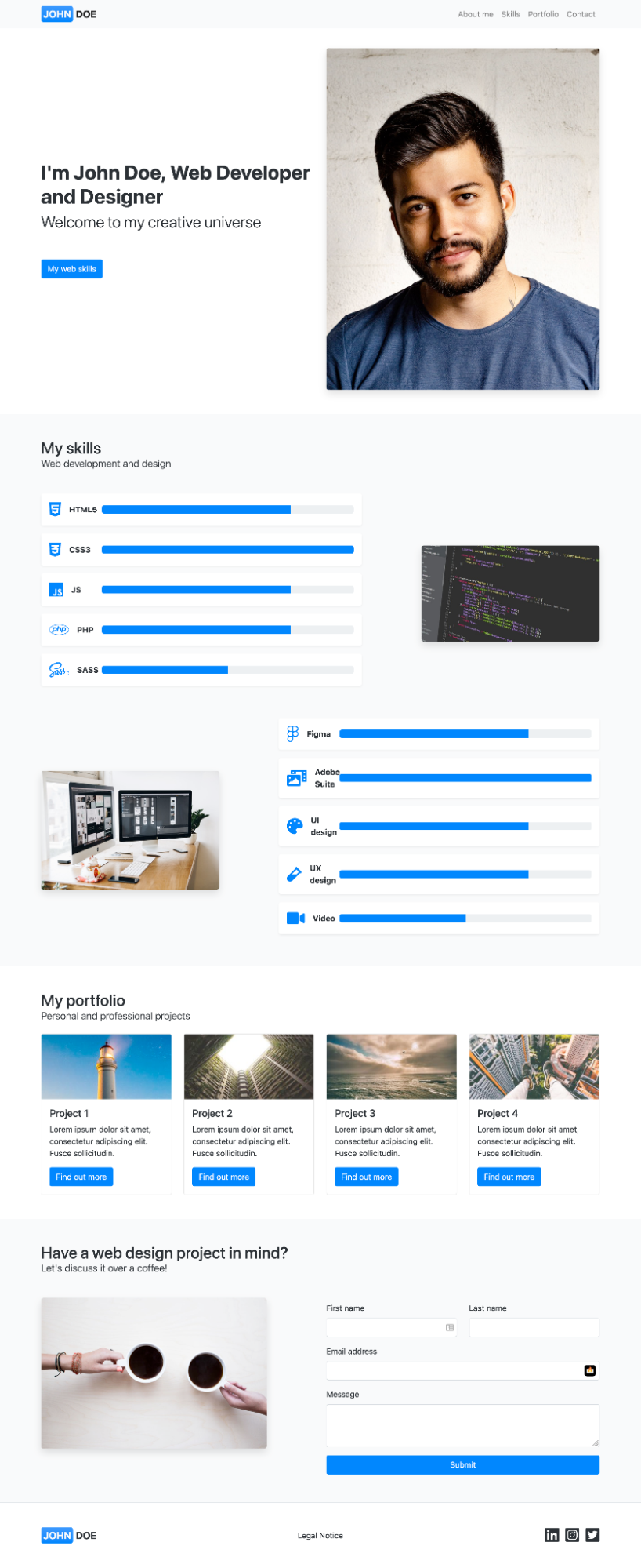
Let’s look at the page designs you’ll be implementing to help you understand how these can be broken down into different sections.
We’ll start with large screens and see how this translates into small, mobile screens later on in the course.
As a developer, you’ll receive page mockups to integrate. For this portfolio project, we will give you an image of the final product.
Here’s the image we’re going to use for our case study:

The first thing to do when you receive a mockup is to identify its different parts to understand the overall structure of the page. Let’s take a look at this together in the screencast below:
In a nutshell, the structure is made up of:
A navigation menu.
An introductory section.
A second section on technical skills.
A third section on projects.
A final section for contact details.
A footer.
All of these components are in containers.
Now you’ve seen what the general structure looks like, let’s go to the Bootstrap 5 documentation to see which parts of the framework can help us begin our project.
Understand Bootstrap Documentation
Go to the Bootstrap documentation to see how to get started:
Now you’ve got your bearings in the Bootstrap 5 documentation, you can start coding your portfolio!
Let’s Recap!
Before starting to integrate a mockup, you should always take the time to break it down (at least in your head!) to see its general structure.
The general structure of a page is often broken into different sections (menu, header, content, footer, etc.), which are divided up into separate containers.
You should always take the time to read the documentation of a new tool before you start using it.
Now you know what the website you’re going to create looks like, and you’ve seen how the Bootstrap documentation works. We’ll start creating your portfolio website using Bootstrap in the next chapter!
Ever considered an OpenClassrooms diploma?
- Up to 100% of your training program funded
- Flexible start date
- Career-focused projects
- Individual mentoring
Find the training program and funding option that suits you best
