Implement Your Page Structure

In the previous chapter, you saw how to break down a page into header, footer, and content sections.
Now you have a better idea of how to implement the structure — it’s time to start creating pages!
Containers
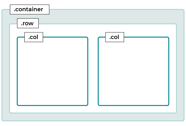
Let’s start with the most basic layout component in Bootstrap — containers. Wrapping your content in a <div> tag with the class .container centers your content on the screen by adding automatic horizontal margins.
In this way, the .container class helps break up the horizontal arrangement of content on your website.
<div class="container">
  <!-- Your content here -->
</div>
If you want the content to always take up 100% of the screen width, you can use the class .container-fluid instead. This removes the horizontal margins, which the framework applies by default.
Bootstrap Grid
Bootstrap 5 has a powerful and flexible grid system that you can use to create all types of layouts. This grid uses rows and columns to align your content. A row serves as a wrapper for one or more columns, which contain your content.
Ok, but what does that mean in practice?
A row <div> element is declared by assigning the class .row to it. For each column of the row, a child <div> element of the row <div> should be given one of the Bootstrap 5 column classes. The first of these column classes is the class .col .
Take a look at this code snippet:
<div class="container">
 <div class="row">
   <div class="col">
    First column
   </div>
   <div class="col">
    Second column
   </div>
 </div>
</div>
As you can see, there’s a parent <div> .row element that wraps two child <div> .col . Bootstrap 5 has a 12-column grid. In this specific case, Bootstrap will automatically assign half of the columns to each of the <div> class .col elements, giving a width of six columns per <div> .

In other words, this represents half of the width of the row. Bootstrap systematically divides the 12 columns equally between <div> elements with the class .col .
But what if I want to explicitly define the number of columns rather than leaving it up to Bootstrap?
Good question—what if you have a layout that doesn’t have equally-sized columns, for example? Imagine you have a row, and you want one column to take up two-thirds of its width and another column to take up the remaining third.
In this case, bearing in mind that a row of the Bootstrap grid can be divided into a maximum of 12 columns, you would need one <div> .col to take up eight columns and the other to take up four columns.
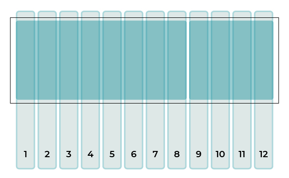
To do this, add each of these numbers to the corresponding .col class, as shown in the code below:
<div class="container">
 <div class="row">
   <div class="col-8">
    First column
   </div>
   <div class="col-4">
    Second column
   </div>
 </div>
</div>
If you want to learn more about grids, you’ll find everything you need in the Bootstrap documentation.
Create Background Colors Using the Bootstrap 5 Utility Classes
Now we’re going to use the Bootstrap 5 utility classes to add background colors, as well as padding (internal margins) and external margins between elements.
The utility classes are classes created by Bootstrap 5, which allow you to add CSS properties to your elements, such as:
background-color(e.g.,.bg-light)margin(e.g.,.m-5)padding(e.g.,.p-5)border(e.g.,.border-top)
…and many more! You can see all the classes in the Utilities list in the Bootstrap documentation.
Here’s an example of a menu:

You can see that there’s a first light gray bar that has been put in place using the utility class .bg-light . The dark gray bar has been added using the class .bg-secondary for the color and .py-4 for the padding.
You’ll come across other utility classes during the course, so it’s a good idea to look through them in the documentation and try them out in the different exercises.
Over to You
You’re now ready to put what you’ve learned into practice to create the structure of your portfolio.
Start by setting up a working environment.
You can use the folder yourFolder provided in the GitHub repository for this course as a basis:
yourFolder/
/css/
/js/
/img/
/sass/
index.html
Now you’ve set up your working environment, you can start developing your structure using the Bootstrap 5 grid system.
Your mission, should you choose to accept it, is to create the following structure:
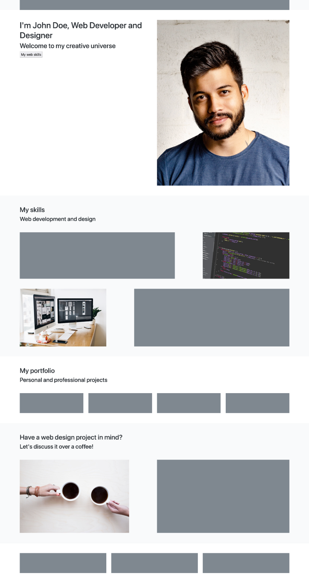
In the previous chapter, we identified the following parts of this structure:
A navigation menu.
An introductory section.
A second section on technical skills.
A third section on projects.
A final section for contact details.
A footer.
Use the concepts we’ve covered in this chapter to help you complete this exercise: containers, grids, and utility classes. Don’t forget to add colors to differentiate between the different sections.
If you want to see how we did this exercise (or check your work!), watch the screencast below:
Let’s Recap!
The container, row, and column classes follow a specific hierarchy when creating a grid in Bootstrap 5.
The Bootstrap grid has 12 columns.
You can use utility classes to add colors to the elements.
Now you know how to implement the structure using the Bootstrap grid, you’re ready to start learning how to make it responsive to different screen sizes.
