Make Your Layout Responsive

Breakpoints
We live in an age of rapid progress, and new devices seem to hit the market every day! This progress can be exciting, but it’s also exhausting to keep up with all the different screen sizes you have to account for to make sure your websites display and function properly.
The good news is that you don’t need to create a different layout for every screen size. Instead, you can make things easier for yourself while still creating a great user experience by grouping different screen sizes together in buckets or size ranges and generating layouts for each of these.
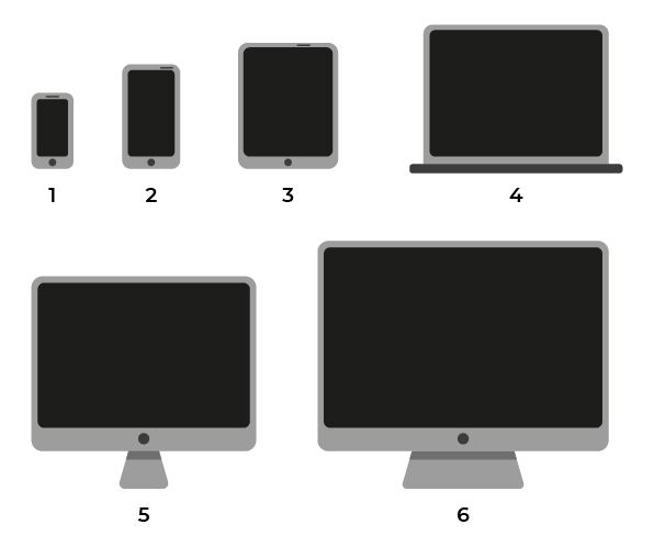
A typical example is to have a standard website layout for devices with large screens (desktop computers), another for devices with medium-size screens (tablets and small laptops), and another for smaller devices (smartphones).
What’s the exact number of pixels of each of these screen sizes?
Front-end developers are very particular about details (we’re sure you are too!) and need more precise definitions than “big,” “medium,” “small,” etc. We need to know the exact measurements of each of these.
The developers of Bootstrap also asked that question and came up with answers based on industry best practice, defining these breakpoints:
Size | Breakpoint | Class infix | Screen equivalent |
Extra-small | <576px | none | Small smartphone |
Small | ≥576px | -sm | Smartphone |
Medium | ≥768px | -md | Tablet |
Large | ≥992px | -lg | Large tablet and 13’’ PC |
Extra-large | ≥1200px | -xl | 15’’ screen |
Extra-extra-large | ≥1400px | -xxl | >15’’ screen |
As you can see, there are six sizes defined in Bootstrap 5, which gives you a range of options.
Many Bootstrap classes for layout and components let you add a size-related modifier to control how they're rendered on the relevant screen size.
Responsiveness in Action
We’ve covered a lot of theory, and you probably can’t wait to put your new skills into practice!
Let’s start by seeing how responsiveness works for the Bootstrap grid. The following video shows how a layout adapts to changes in screen size indicated by a breakpoint:
Even though Bootstrap has many predefined sizes, you can choose to adapt the number used to your needs or to the structure of the web page. However, bear in mind that in addition to the extra effort required to develop and test each layout, they would probably also require the input of a website designer.
It’s important to understand that class modifiers work upwards (smallest to largest screen size) to apply the right ones for these layout options.
This approach is mobile-first (you saw earlier).
Suppose you don’t add a class modifier for larger screen sizes. In that case, Bootstrap will automatically render the grid components and elements to the smallest screens, and maintain the same layout for larger sizes.
For example, if a <div> has just one class with the modifier -md , this will be applied to all screens from a minimum of 768px upwards.
If this same <div> uses a second class modifier for sizes larger than -md such as -lg (width of ≥ 992px) or -xl (width of ≥ 1200px), these will override the -md modifier when the screen size reaches the respective breakpoints.
Each class modifier is added on the same level as the <div> .
Responsive page adjustment automatically takes place as soon as the screen size displayed reaches a breakpoint.
<div class=”row”>
    <div class=”col-6 col-md-4 col-lg-3”></div>
    <div class=”col-6 col-md-8 col-lg-9”></div>
</div>
Here is a row with two child divs that take up different widths depending on the viewport size. The way to interpret the classes for the first of the row's child divs is:
The
.col-6 classmeans: for all screens with no minimum or maximum size restrictions, allocate six columns to this<div>.The
.col-md-4 classmeans: for all screens with a medium width (768px) upwards, allocate four columns to this<div>.The
.col-lg-3 classmeans: for all screens with a large width (992px) upwards, allocate three columns to this<div>.
A similar logic applies to the second child div .
Note that the total number of columns allocated to each class modifier still adds up to the 12 columns of the Bootstrap grid. In the example above, this means that when you use a class modifier on a <div> , you need to pass this on to the second <div> on the same level so that it adds up to 12 columns: .col-md-4 + .col-md-8 = .col-md-12 .
Use Gutters to Space out Your Columns
The spacing between the different columns of the grid is called a gutter.
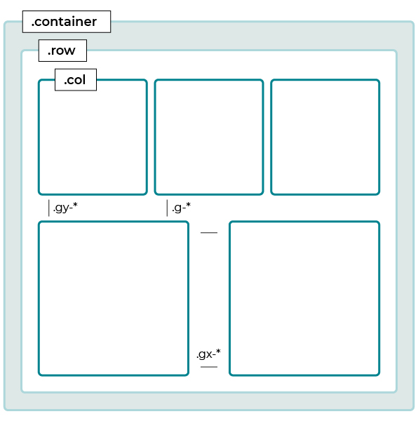
You can adjust these with the utility class .g-{1-5} . The default vertical spacing of the columns in Bootstrap 5 is that given by the class .g-4 , so in the previous example, adding the class .g-2 to the .row reduces the space between the columns.
Here’s an example of gutters in code:
<div class="container px-4">
    <div class="row gx-5">
        <div class="col">
            <div class="p-3 border bg-light">Custom column padding</div>
        </div>
        <div class="col">
            <div class="p-3 border bg-light">Custom column padding</div>
        </div>
    </div>
</div>
Read the Bootstrap documentation to find out more about gutters.
Leave Empty Columns Using offset
For some designs, you may need to leave a space equivalent to one or more empty columns between two columns. This is the case for the skills part of your portfolio:
To do this, Bootstrap provides the class .offset-{0-11} , which moves the content of a column between 0 and 11 columns to the right.
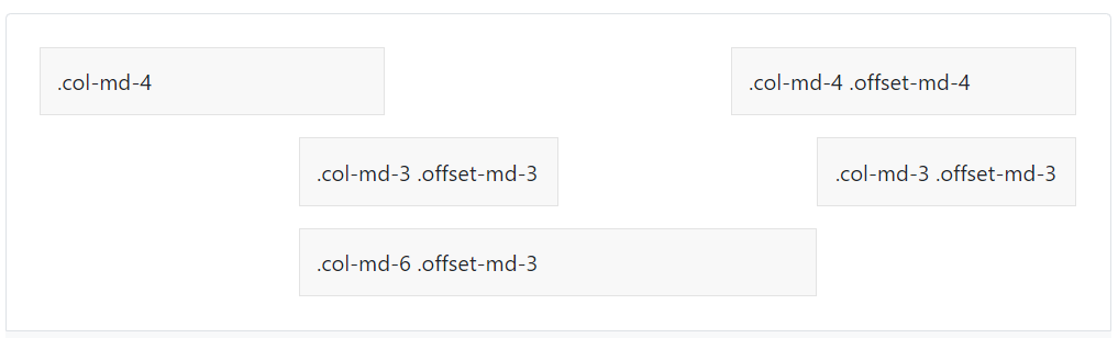
In the documentation, Bootstrap provides an example of the offset class:
<div class="container">
    <div class="row">
        <div class="col-md-4">.col-md-4</div>
        <div class="col-md-4 offset-md-4">.col-md-4 .offset-md-4</div>
    </div>
    <div class="row">
        <div class="col-md-3 offset-md-3">.col-md-3 .offset-md-3</div>
        <div class="col-md-3 offset-md-3">.col-md-3 .offset-md-3</div>
    </div>
    <div class="row">
        <div class="col-md-6 offset-md-3">.col-md-6 .offset-md-3</div>
    </div>

</div>
This code renders like this:
You’ll need to use the class .offset-1 on the second column to create the structure required for your portfolio. You can find out more about how to use offset in the Bootstrap documentation.
Over to You!
In this exercise, you’re going to make your website structure responsive.
Your task is to add:
The different class modifiers for each column.
The different class modifiers for the offsets.
Gutters to space out the columns.
Once you’ve made these changes, watch the screencast below to see how your work compares with ours!
Let’s Recap!
Bootstrap 5 is a mobile-first front-end framework.
A responsive page reacts to users’ different screen sizes by adjusting the layout of the components and content.
A breakpoint is the point at which the layout changes.
Breakpoints allow you to put the different viewport sizes into different buckets.
You can use gutters to space out your columns.
You can use the .offset-* classes to leave between 0 and 11 empty columns to the left of the column they’re applied to.
Now you’ve learned how to make a Bootstrap grid responsive — you’re ready to start adding UI components to your pages!
