Customize Your Page

In part 2, you saw how to put section titles in when creating the structure of your page. You’re now going to see how to customize these with the Bootstrap 5 utility classes.
When you look at the Bootstrap utility classes, you can see that they follow a certain pattern. Often, the utility class is made up of the initials of the CSS property it represents, concatenated to the value it adds.
For properties linked to text, there are many classes you can use to change the thickness of the text ( font-weight ) or its style ( font-style ).
Value | What it means | Utility class |
bold | Bold text | fw-{breakpoint}-bold |
bolder | Even bolder text | fw-{breakpoint}-bolder |
normal | Normal text | fw-{breakpoint}-normal |
light | Light text | fw-{breakpoint}-light |
lighter | Even lighter text | fw-{breakpoint}-lighter |
italic | Text in italics | fs-{breakpoint}-italic |
normal | Normal text | fs-{breakpoint}-normal |
Like with any other utility class, you can add breakpoints to make the text responsive.
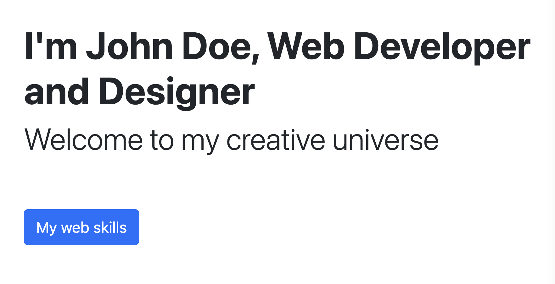
For the h1 , let’s add the class .fw-bold , which means font-weight: bold . Following this logic, add the class .fw-light to the h2 to reduce font thickness.
<h1 class="fw-bold">I’m John Doe, developer and web designer</h1>
<h2 class="fw-light">Welcome to my creative universe</h2>
You can find all utility classes linked to text properties in the Bootstrap documentation.
Make Your Typography Responsive
As with columns, you can add class modifiers to the Bootstrap breakpoints.
Don’t worry, Bootstrap makes this simple! It uses the modifiers { -xs , -sm , -md , -xl , -xxl } that you saw before. The structure is also the same as for columns: .{property}-{modifier}-{value} .
For example, you can add the classes .fs-3 .fs-md-2 to your h3 titles to reduce their size on mobile devices and increase them for medium-sized screens upwards.
See the Bootstrap documentation for all the utility classes linked to font sizes.
Add Text Direction Logic
In Bootstrap 5, text direction on a page is a crucial part of the logic for developing a framework. While it’s true that the text goes from left to right on most websites in English, this isn’t necessarily the case in other countries!
To improve accessibility, the Bootstrap 5 developers decided to replace the terms left and right with start and end .
This means that if you want to align your texts to the left, you should use the .text-start utility , and align it to the right, text-end . Therefore, there are three values for the CSS property text-align :
Value | What it means | Utility class |
center | Centered text | text-{breakpoint}-center |
start | Text aligned to the left (for a website with the text direction left to right) | text-{breakpoint}-start |
end | Text aligned to the right (for a website with the text direction right to left) | text-{breakpoint}-end |
See the Bootstrap documentation for all the utility classes linked to the text-align property.
Discover How Buttons Work in Bootstrap 5
Buttons are one of the most common ways of interacting with websites. They show users that a certain action can be performed on a page, such as sending a form, adding an object to the basket, etc.
To display a button in Bootstrap, use a <button> or <a> element with a .btn class, and a second class to define the background color.
These are the color classes available:
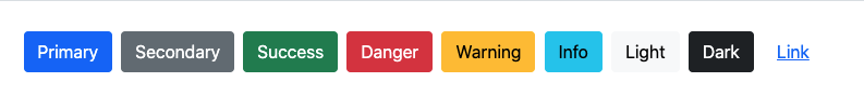
You can add a button using the <button> element (for forms) or the <a> element (for links) with the primary background color (blue by default) using this HTML code:
<button type="button" class="btn btn-primary">Button</button>
<a class="btn btn-primary" href="#" role="button">Link</a>
Let’s create a button for “My web skills.” Add the .btn and .btn-primary classes to apply the Bootstrap 5 button style.
Take a look at the Bootstrap documentation to learn more about buttons.
Add Icons
Bootstrap 5 has its own system for icon fonts which you can integrate into your user interface to link your social networks to the website, for example.
To use Bootstrap icons, all you have to do is add a <link> tag in the <head> of the page.
<link rel="stylesheet" href="https://cdn.jsdelivr.net/npm/bootstrap-icons@1.5.0/font/bootstrap-icons.css">Then, go to the Bootstrap 5 icon catalog via the documentation in the “Extend” section, and then “Icons.”
To display a LinkedIn icon, for example, you can add this line of code to the div that you want to wrap your icons:
<a href=”my linkedin link” target=”_blank”>
    <i class="bi bi-linkedin"></i>
</a>
Go a Step Further With the Bootstrap 5 Documentation
Many other CSS properties are covered by the Bootstrap 5 utility class system. The best way to learn about them is to look through the Utilities and Helpers sections in the Bootstrap 5 documentation.
You’ll discover different classes for font colors, backgrounds, borders, text sizes, etc.
Over to You!
Your mission for this chapter is to:
Format the titles following the example of the portfolio website.
Add the “My web skills” button with the correct formatting.
Add the icons in the footer.
Once you’ve made these changes, watch the screencast below to compare your work with ours!
Let’s Recap!
As well as adding color to your website, you can use the utility classes to:
Change the thickness and style of your text.
Make your typography responsive.
Choose the alignment of your text.
You can choose from many different Bootstrap button styles for your website.
Bootstrap has a wide range of icons you can add to your website.
Now you’ve started to style your portfolio — you’re ready to add different components from the Bootstrap 5 component library. Let’s go to the next chapter to find out how!
