Structure Your Content With the Card Component

Cards
Cards are a very popular type of user interface element. Almost all CSS frameworks have their own card system to allow developers to display information in a structured manner on their websites.
For our website, we’ll use them to display projects after the skills section.
As always, read the Bootstrap documentation first. The part you need here is in Components and then Card.
If you take a quick look through the page, you’ll see many different types of cards in Bootstrap 5. The different types of displays you can create with these cover many different needs and specific cases (photo galleries, e-commerce product summaries, etc.). As before, you can get even more out of these components with the utility classes.
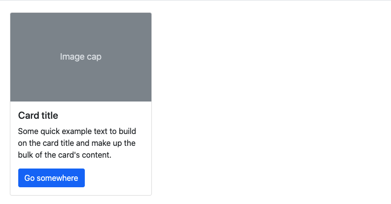
Let’s use the most popular display type—the first example in the Bootstrap doc: image, title, text, button.
<div class="card">
    <img src="..." class="card-img-top" alt="...">
    <div class="card-body">
       <h5 class="card-title">Card title</h5>
       <p class="card-text">Some quick example text to build on the card title and make up the bulk of the card's content.</p>
       <a href="#" class="btn btn-primary">Go somewhere</a>
    </div>
</div>
This component follows a certain architecture:
A general
divwith a class for the name of the component (you can get rid of the style attribute in the Bootstrap example).Within this
div, there’s animgand anotherdivwith thecard-bodyclass.The
div.card-bodydefines the location of the body of the card. This contains the card-title, card-text, and the button.
Over to You!
Your mission for this chapter is to create four cards in the “Personal and professional projects” section:
The four cards should fit on one row for large/xl/xxl screens and should take up four columns for medium screens, six columns for small screens, and the whole row for very small screens.
The cards should be composed of an image, a body with a title, a description, and a “Find out more” button.
For images, use a picsum photo link following this URL structure:
https://picsum.photos/300/150?random=1(replacing 1 with 2 for the second project).
Once you’ve made these changes, watch the screencast below to compare your work with ours!
Your structure is now ready to add projects to it. The advantage of this structure is that it’s responsive and easy to change as you go along.
In the next part of the course, you’ll see what the “Find out more” button is for.
Let’s Recap!
You can use cards to structure the content of a website.
Bootstrap provides several types of cards to cater to developers’ needs.
Now you know how to integrate different types of content, you’re ready to enhance the user experience by adding interactivity to your website! But before moving on to the next part, test your new knowledge with the quiz.
