Table of contents
- Part 1
Learn What Bootstrap Is Used For
- Part 2
Create Responsive Layouts
- Part 3
Display Content Using UI Components
- Part 4
Add Interactivity to Your Website
- Part 5
Create Your Own Features and Themes
Table of contents
- Part 1
Learn What Bootstrap Is Used For
- Part 2
Create Responsive Layouts
- Part 3
Display Content Using UI Components
- Part 4
Add Interactivity to Your Website
- Part 5
Create Your Own Features and Themes
Add Interactive Components

The website is starting to take shape with titles, Bootstrap 5 components, and navigation—well done! Now it's time to see how to make it more interactive.
Display Extra Information at the Click of a Button Using Offcanvas
At the end of part 3, you saw how to display projects using the Bootstrap card system. Now let’s find out how offcanvas can help provide more information on projects without overloading the page.

As always, remember to read the Bootstrap 5 documentation to see how this component works.
<div class="offcanvas offcanvas-start" tabindex="-1" id="offcanvas" aria-labelledby="offcanvasLabel">
    <div class="offcanvas-header">
       <h5 class="offcanvas-title" id="offcanvasLabel">Offcanvas</h5>
        <button type="button" class="btn-close text-reset" data-bs-dismiss="offcanvas" aria-label="Close"></button>
    </div>
    <div class="offcanvas-body">
        Content for the offcanvas goes here. You can place just about any Bootstrap component or custom elements here.
    </div>
</div>
Looking at the structure of this component, you can see that it works in a similar way to cards:
A general div with a class that has the name of the component.
This div also has an
offcanvas-startclass—if you remember,-startrefers to the alignment with the text direction of the website, from left to right.There’s also an
idto target the right element.Finally, there are two more
divs, one with the class.offcanvas-headerand the other with the class.offcanvas-body.
In our case, we want to add an offcanvas , which appears from the bottom of the page. If you look through the documentation, you’ll see that there is a variant that appears from the bottom.
<button class="btn btn-primary" type="button" data-bs-toggle="offcanvas" data-bs-target="#offcanvasBottom" aria-controls="offcanvasBottom">Toggle bottom offcanvas</button>
<div class="offcanvas offcanvas-bottom" tabindex="-1" id="offcanvasBottom" aria-labelledby="offcanvasBottomLabel">
    <div class="offcanvas-header">
        <h5 class="offcanvas-title" id="offcanvasBottomLabel">Offcanvas bottom</h5>
        <button type="button" class="btn-close text-reset" data-bs-dismiss="offcanvas" aria-label="Close"></button>
    </div>
    <div class="offcanvas-body small">
        ...
    </div>
</div>
In the example above, you can see the same structure described earlier and the architecture of the button that brings up the extra information. There are also some attributes that may be new to you—data attributes.
A Quick Look at Data Attributes
The basic function of data attributes is to exchange data between HTML and the DOM, which uses JS.
You can customize data attributes to suit your needs using this structure: data-{your-own-text}. Bootstrap 5 uses the semantics data-bs-{utility} ( bs for Bootstrap), and the utility represents the use it’s linked to in JS.
In our example, data-bs-toggle tells the Bootstrap JS that the button brings up the offcanvas component, identified by its id , which is provided in the second data attribute data-bs-target .
The advantage of this system is that it allows you to use components that work with JavaScript while remaining in HTML.
Over to You!
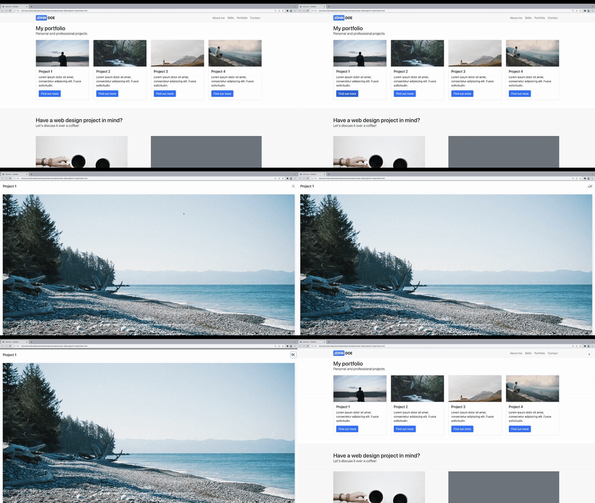
Now you’ve know how this component works, it’s time to add it to your portfolio website!
Add an
offcanvasto each of your project cards.These should appear from the bottom of the page.
Use the utility classes to make your
offcanvastake up the whole page.
Once you’ve made these changes, watch the screencast below to compare your work with ours.
Make sure you add your offcanvas in the body of your cards, and change the id and titles to correspond to each project.
You might have noticed that a class has been added to div.offcanvas.offcanvas-bottom.h-100 . This utility class gives your offcanvas the value height: 100% so that it takes up 100% of the screen height when opened.
Add an Image Carousel to Illustrate Your Projects
A common way to highlight information on landing pages and homepages is by adding a carousel, which is a slide show for cycling through content, including images and videos. These are often used in page headers to display images accompanied by a message.
The Bootstrap carousel uses the most popular format—a static insert that displays images one after the other:

As usual, start by reading the Bootstrap 5 documentation to see how carousels work. Click on “Components,” then “Carousel.”
The first thing you can observe is that carousels work with CSS and JavaScript, but Bootstrap 5 allows you to use them without writing a single line of JS!
The second thing you need to know is that carousels don’t normalize image dimensions. So to create a neat and tidy carousel, you’ll need to either add some CSS or edit your images first so that they’re all the same size (we recommend the second option, as it makes more sense from a website optimization point of view).
Let’s take a look at an example of a basic Bootstrap 5 carousel:
<div id="carouselExampleSlidesOnly" class="carousel slide" data-bs-ride="carousel">
    <div class="carousel-inner">
        <div class="carousel-item active">
            <img src="..." class="d-block w-100" alt="...">
        </div>
        <div class="carousel-item">
            <img src="..." class="d-block w-100" alt="...">
        </div>
        <div class="carousel-item">
            <img src="..." class="d-block w-100" alt="...">
        </div>
    </div>
</div>
There are a few things to note:
There’s a certain architecture of elements and classes that you must follow for it to work properly.
Utility classes are used for images, so they’re compatible (like progress bars).
There’s an
idon the main parent element.There’s also a data attribute to link to the JS.
What does all this mean?
The architecture is not particularly complicated:
A parent div with the
.carouseland.slideclasses.A child div with the
.carousel-inner class(this is used to define the edges of the slides).Finally, as many child
divswith the carousel-item class as there are slides in our carousel.
Over to You!
Your mission for this chapter is to create carousels for each of your projects:
The carousels should take up 100% of the height of the body of your
offcanvas.The slides should change automatically every three seconds.
The slides should have a title and a short description (in dummy text).
To generate different images using
picsum.photo, use this URL: https://picsum.photos/1920/1080?random=1 (replace the last 1 to get another image).The carousel should have arrows to the left and right to scroll through the slides.
Once you’ve made these changes, watch the screencast below to compare your work with ours!
Let’s Recap!
The
data-*attributes allow data to be exchanged between HTML and JS via the DOM (a set of HTML elements that structure a page), which is readable in JS.You can add content that is not visible by default to your page using the component
offcanvas, among others.Bootstrap provides an option to add carousels to your pages.
You must use a unique id for every component which works with JS, to prevent code-reading errors by the browser.
Now you know how to add interactivity, you’re ready to learn to use Bootstrap 5 to provide a contact form for your users. Let’s go to the next chapter!
Ever considered an OpenClassrooms diploma?
- Up to 100% of your training program funded
- Flexible start date
- Career-focused projects
- Individual mentoring
Find the training program and funding option that suits you best
