Table des matières
- Partie 1
Learn What Bootstrap Is Used For
- Partie 2
Create Responsive Layouts
- Partie 3
Display Content Using UI Components
- Partie 4
Add Interactivity to Your Website
- Partie 5
Create Your Own Features and Themes
Table des matières
- Partie 1
Learn What Bootstrap Is Used For
- Partie 2
Create Responsive Layouts
- Partie 3
Display Content Using UI Components
- Partie 4
Add Interactivity to Your Website
- Partie 5
Create Your Own Features and Themes
Add Contact Forms

Forms
Forms are used for everything that requires users to enter data—registration, login, search, changing information, etc. You’re now going to create a prototype contact form to enable website visitors to contact you.

First, let’s take a look at how to create forms using Bootstrap so that you can build your prototype.
Start by thinking about the necessary fields:
First name
Last name
Email address
Message
A “send” button
As usual, read the “Form” section in the Bootstrap 5 documentation first (you’ll be getting used to this by now!).
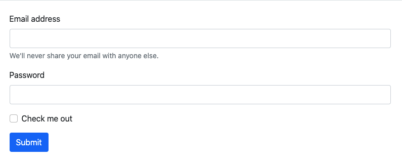
If you click on “Overview,” you’ll see the structure of a typical form.
<form>
    <div class="mb-3">
        <label for="exampleInputEmail1" class="form-label">Email address</label>
        <input type="email" class="form-control" id="exampleInputEmail1" aria-describedby="emailHelp">
        <div id="emailHelp" class="form-text">We'll never share your email with anyone else.</div>
    </div>
   <div class="mb-3">
        <label for="exampleInputPassword1" class="form-label">Password</label>
        <input type="password" class="form-control" id="exampleInputPassword1">
    </div>
    <div class="mb-3 form-check">
        <input type="checkbox" class="form-check-input" id="exampleCheck1">
        <label class="form-check-label" for="exampleCheck1">Check me out</label>
    </div>
    <button type="submit" class="btn btn-primary">Submit</button>
</form>
Leaving the checkbox to one side for the moment, you can see that there are two recurring elements in this example—the classes .form-control and .form-label . These two classes help format input and access alternative displays if they are disabled or readonly .
Another specific feature of the form structure is the div , which wraps the field (input + label). You can also see the utility class .mb-3 (margin-bottom) in the example.
So, to recap, the form field:
Must be wrapped in a
div.Should have the class
.form-controlfor its input.Should have the class
.form-labelfor its label.
Following this structure ensures the field will be displayed properly.
If you look through the documentation, you’ll see that the associated class and structure may vary depending on the type of input (select, checkbox, range, etc.).
This is summed up in this table:
Classes | Input |
| text (and related items such as email, passwords, etc.) textarea |
| select |
| checkbox radio |
| range |
Over to You!
Your mission for this chapter is to create a contact form in the “Contact” section of your portfolio:
The fields “First name” and “Last name” should be on the same line.
The fields “Email” and “Message” should be one underneath the other.
The “Send” button should take up the whole width of the line.
Now it’s over to you to create your form structure and use the right utility classes! Once you’ve made these changes, watch the screencast below to compare your work with ours
Once again, you can see that we’re using the Bootstrap 5 grid to create the form structure. And, of course, the classes you’ve just learned about come in useful for the field layout.
Let’s Recap!
Each main type of input has an associated Bootstrap class.
You can create the structure of the form fields using the Bootstrap 5 grid system and utility classes.
Now you know how to add forms, we’re going to see how to use modals and tooltips in Bootstrap 5.
Et si vous obteniez un diplôme OpenClassrooms ?
- Formations jusqu’à 100 % financées
- Date de début flexible
- Projets professionnalisants
- Mentorat individuel
Trouvez la formation et le financement faits pour vous
