Table of contents
- Part 1
Use Basic Excel Functionalities
- Part 2
Work With Your Excel File
- Part 3
Manipulate Data in Excel
Table of contents
- Part 1
Use Basic Excel Functionalities
- Part 2
Work With Your Excel File
- Part 3
Manipulate Data in Excel
Create Pivot Tables

Pivot tables are a well-known Excel feature and they are commonly used in the professional world.
What Is a Pivot Table?
An example is better than a long explanation. Let’s imagine that you want to analyze the sales data for the company where you work.
You've created a workbook of monthly sales information where you enter the following data:
Month: January to December
Salesperson: Davidson, Matthews, Phillips and Sciavo
Product category: Drinks, Dairy, Vegetables, Meat
Total Sales: total monthly sales figures
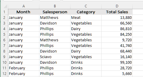
With a pivot table, you can analyze this workbook by combining different criteria. You could of course do this using filters, but the pivot table enables you to make calculations directly, and change the criteria really quickly.
Create a Pivot Table
Once you've taken care of that, it’s easy to create a pivot table:
Click on the Insert tab.
In the Tables group, click on the PivotTable icon.
You’ll see the following dialog box:
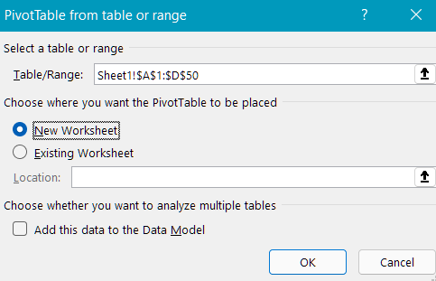
In the Select a table or range section, you’ll see the initial selection that Excel has made. You can change this if it isn’t correct.
In the Choose where you want the pivot table to be placed section, Excel is asking you to provide a location for your pivot table. By default, it will be placed on a new worksheet, but you might choose to insert it on a worksheet you’ve already created.
Click “OK” and a new tab will be created that will look like this:
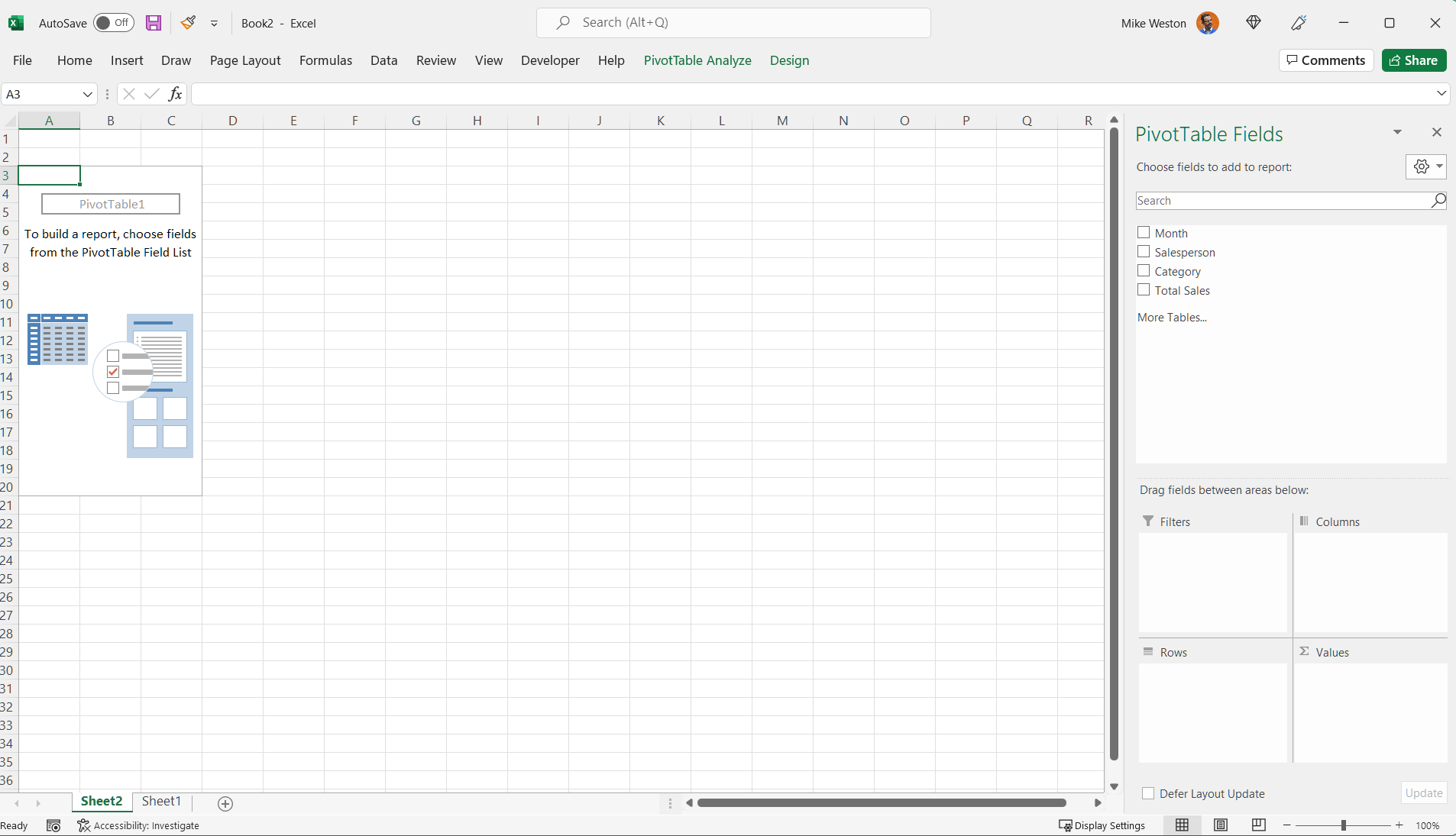
On the right-hand side, you’ll see the Task Pane that will help you to create the table. In this pane, you’ll see the list of columns from your workbook: Month, Salesperson, Category, Total Sales. These are called fields.
In the left-hand section, you’ll see where the pivot table will appear once you’ve created it.
Next, you select the fields that you’d like to appear in the pivot table, define which fields should be displayed as rows or columns, and determine which ones will require some calculation (i.e., which ones will hold values).
In our example, the value field will be Total Sales. So, you select the Total Sales field and drag it into the Values area (bottom right).
Using the same method, take the Month field and drag it to the Rows area, then place the Salesperson field in Columns. You could of course do it the other way around, depending on how you’d like to display the data.
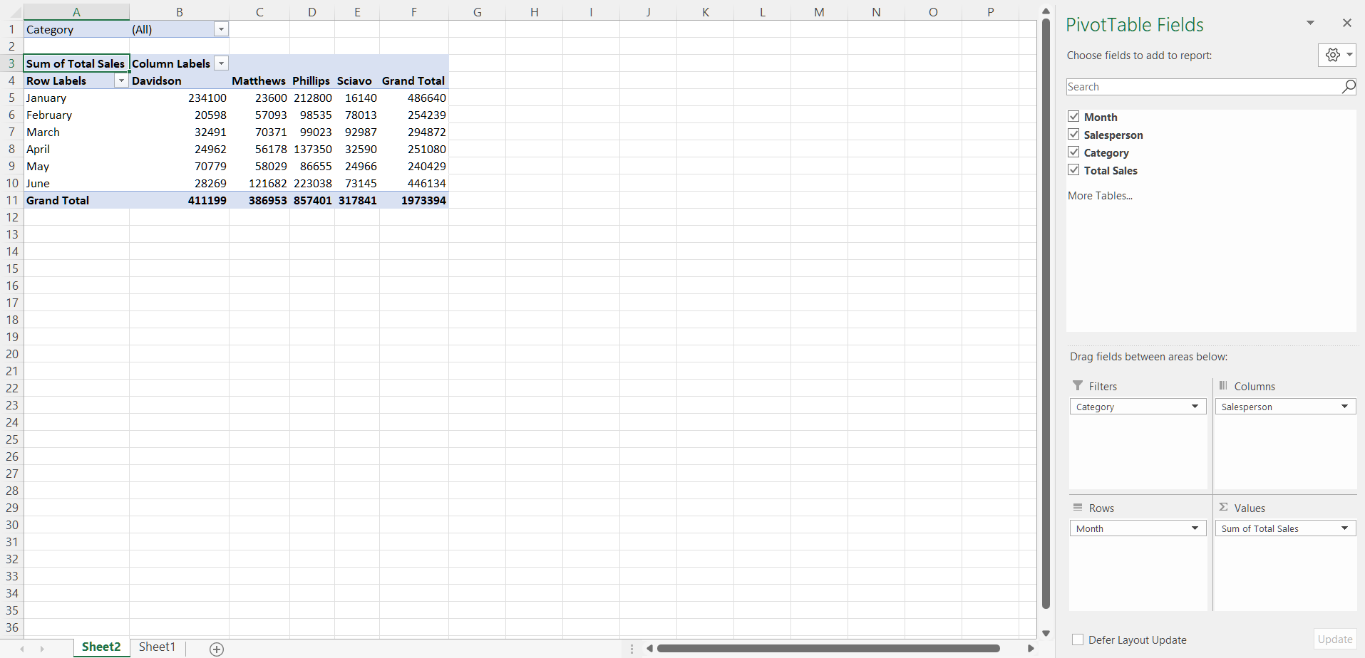
So there you have it! Your very first pivot table. It displays the total monthly sales by salesperson.
But you can see that the top left Filters quadrant in the task pane is currently empty. You haven’t defined any filters. You might decide that Category could be the filter you want to use in your report. Just like a standard filter in Excel, you can select the category you want to display. So, you just need to drag the Category field into the Filters area.
You’ll see that the first row of the pivot table, which was previously empty, has now been filled in. You can now filter the list by choosing “Vegetables,” for example. Here's the result:
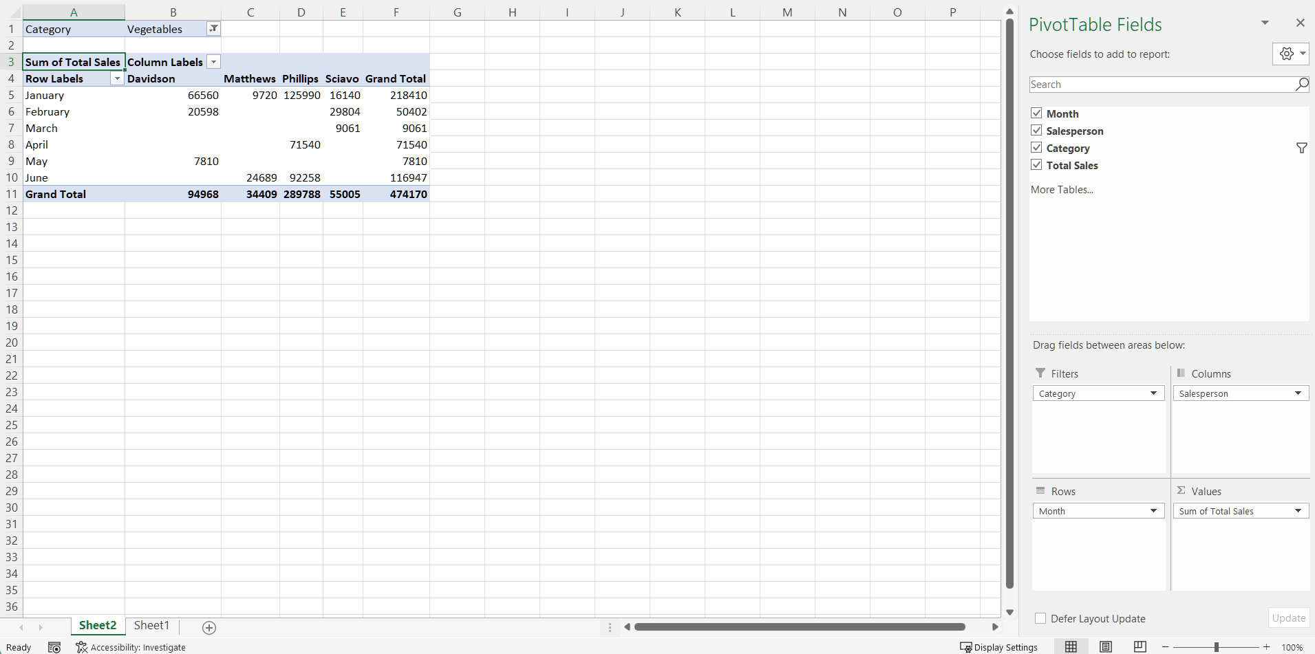
It’s still the same pivot table, but the values have changed, because you’re only showing one category of the four available.
In our example, I might actually want to display the data like this:
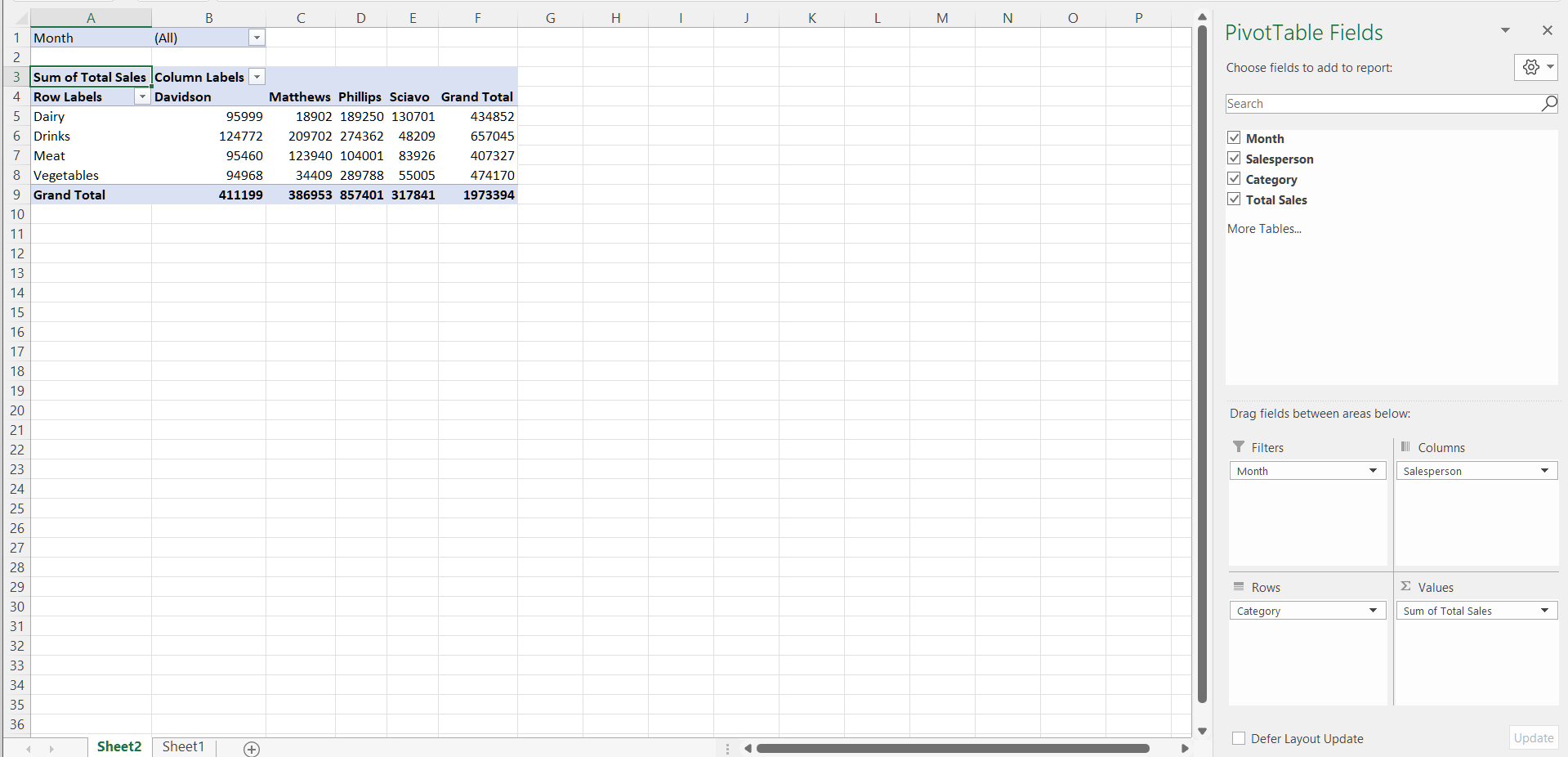
Here, I’ve chosen to display the values by month (I selected all months) and organize the data by category and salesperson.
Now it’s your turn: what other kinds of report could we produce using this data?
Refresh Your Pivot Table
For example, if you notice that Matthews’ total sales for January in the Meat category weren't $13,880, but actually $63,880, and you update this in the initial workbook accordingly, this change won't be reflected in your pivot table.
If you want the change to be reflected in the pivot table, you need to refresh it. To do this:
Place your cursor within the pivot table.
Click on the PivotTable Analyze tab.
In the Data group, click on the Refresh icon.
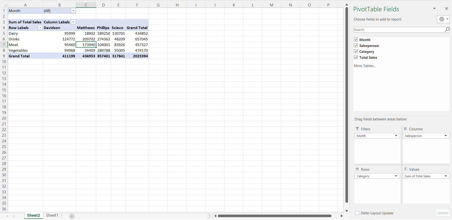
The update you made to your source data will then be reflected in your updated pivot table.
Find the Source of the Data in Your Pivot Table
A pivot table is the report we generate from data contained in an Excel file. But there can be a lot of data in pivot tables that can be arranged in many different ways—what if you want to go back to the source of the specific data in the report?
Let’s look at an example. Let’s say you’ve created the following pivot table:
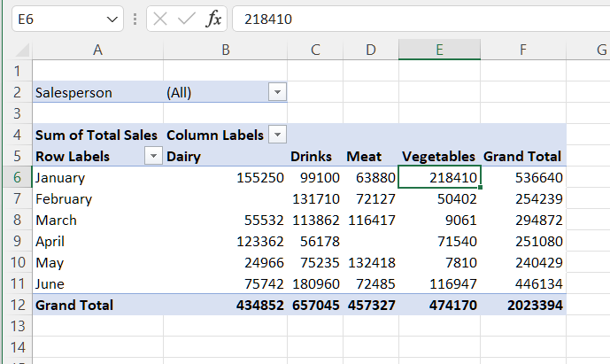
If you want to know which data contributed to the $218,410 earned in January in the Vegetable category, place your cursor in the cell whose details you want to investigate (E6 in this case) and double click. This will create a new tab, where you can see the relevant details:
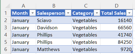
You now have the breakdown of the $218,410 earned in the Vegetable category.
And now you understand the basics of one of the key features of Excel, creating pivot tables! They allow you to create quick, clear summaries using large amounts of data. :soleil:
Watch the Video Tutorial
Watch a step-by-step recap of everything described in this chapter in the tutorial below:
Let’s Recap!
A pivot table is an extremely powerful tool that allows you to perform calculations on a large volume of data.
The data source can only contain a single header row.
The data source can’t contain any blank rows or columns.
When you update the source data, you need to refresh the pivot table.
Now you know how to create a pivot table. Well done! In the next chapter, you’ll learn how to illustrate your data using charts.
Ever considered an OpenClassrooms diploma?
- Up to 100% of your training program funded
- Flexible start date
- Career-focused projects
- Individual mentoring
Find the training program and funding option that suits you best
