Create Charts

If you want to get the most out of your data, you’ll probably need to create some charts. In Excel, these can be created very easily—and sometimes even automatically!
Create a Chart
To create a chart, you first need some data that you want to display. So, you have an Excel worksheet with some data you want to present more clearly.
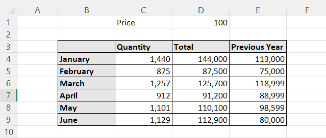
We’ll start with this table:
Next, you’ll need to define:
the data you want to represent in the chart.
the type of chart you want to create. The main ones Excel has to offer are:
column (vertical) or bar (horizontal) charts.
line charts (very useful for showing changes over time).
scatter charts.
pie charts (to show proportional data).
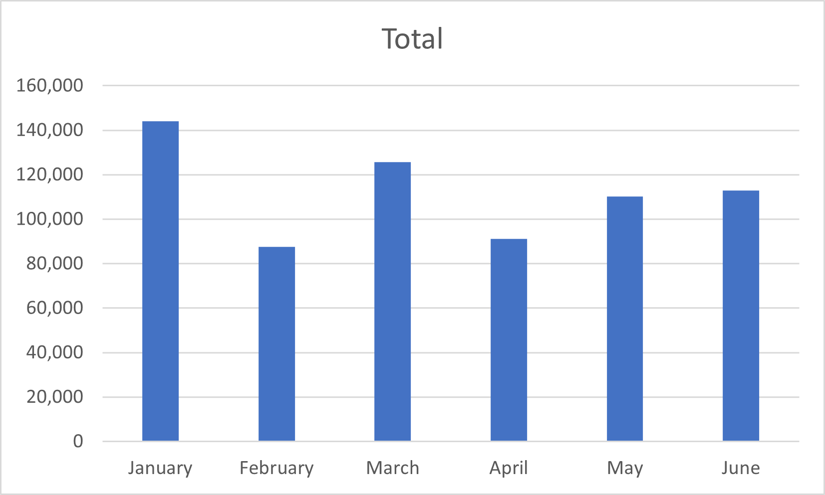
In our example, you want to create a chart to show the ups and downs of a set of sales figures from January to June. You might choose a line or column/bar chart. In both cases, you’ll have:
months on the x (horizontal) axis.
sales figures on the y (vertical) axis.
Select the Data
You want to create a chart containing:
months (cells B3 to B9).
sales figures (cells D3 to D9).
Choose a Chart
Click on the Insert tab.
In the Charts tab, click on the Insert Column or Bar Chart icon.
In 2-D Column, select Clustered Column.
Excel has automatically created this chart:
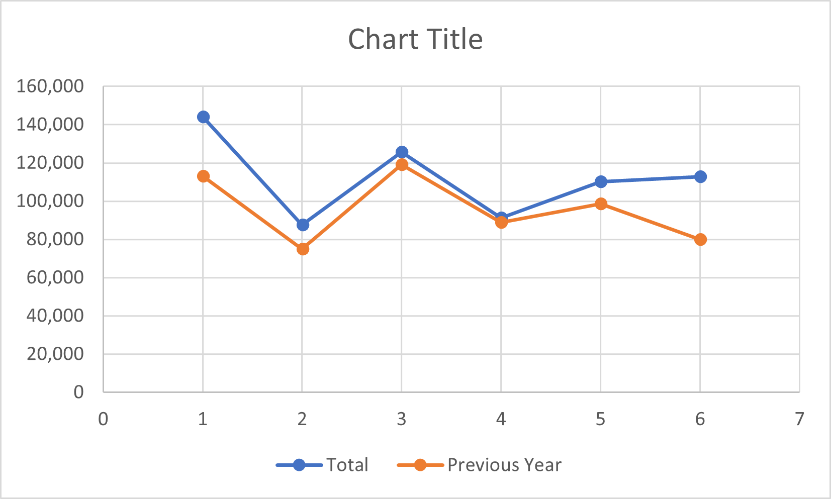
You could also create a chart comparing the monthly sales figures for the previous year vs. the current year.
To do this:
Select the data (here, B3 to B9 and D3 to E9).
Insert a chart, e.g., a line chart.
You’ll see the following chart:
Format the Chart
Give It a Title
Excel has created an automatic title for your chart using your column headings. If you’d like to change it:
Click on the title to select it.
Change the title.
Press Enter to confirm.
If Excel hasn’t provided it automatically, you can also insert a title:
Select the chart.
Click on the Chart Design tab.
In the Chart Layouts group, click on Add Chart Element.
Select Chart Title.
Specify the Legend, Data and Axis Titles
To specify the axis titles, you can choose Axis Titles from the Add Chart Element options.
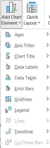
You can also add a legend either to the side of the chart or directly on it.
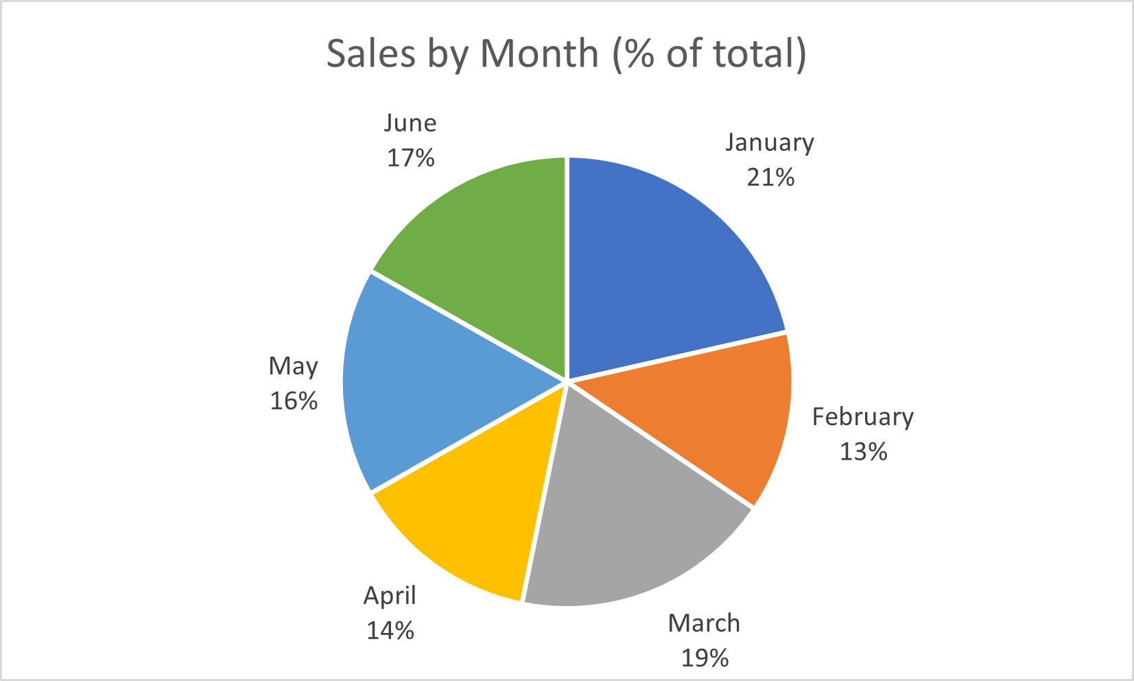
In addition, you can label the data on the chart. For example, we might use the worksheet data to create a chart showing percentages:
Move the Chart
You might not want to show the chart on the data source worksheet you used to generate it. To do this:
Select the chart.
Click on the Chart Design tab.
In the Location group, click on the Move Chart icon.
Select the new location.
Watch the Video Tutorial
Watch a step-by-step recap of everything described in this chapter in the tutorial below:
Let’s Recap!
Charts are visual representations of the data you’re processing. They are refreshed whenever you change the data.
Column and bar charts enable you to compare sets of data.
Line charts enable you to represent a change over time.
Pie charts enable you to represent proportional data.
In this last part of the course, you’ve learned how to analyze data in Excel. In the next chapter, we are going to put what we’ve learned into practice!
