Analyze Data to Support Insight Gathering
Analyze Quantitative Data
Did you notice something about the variables in the consolidated spreadsheet? Perhaps some were numbers, and some were text? Yes, of course, you did! When working with data, it’s important to understand that there are different classes of variables, and the operations and analysis you can do depend on the data type. Intuitively, you already know this! You know that you can multiply two numbers together and get another one. But multiplying two pieces of text doesn’t make much sense. What’s “hippopotamus” x “economics”?!! (There’s probably a good joke in here, but I don’t know what it is!)
Before going further, grab an enhanced version of the consolidated spreadsheet here. Zara gave you some additional data from her fitness tracker: her calories burned and sleep patterns. Use these for the remaining activities in this course.
Let’s first look at some things you can do with numerical or quantitative data.
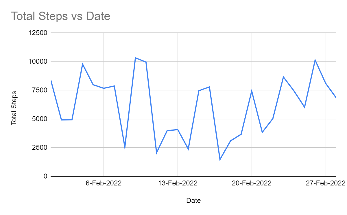
Take a look at Zara's total steps:
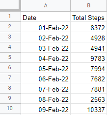
There’s the data, but what information can I derive from this?
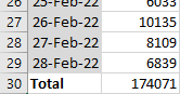
Perhaps you thought you could calculate the total number of steps in the month? In other words, you can aggregate the daily data to the monthly level:
As well as the total, you could compute the average, minimum, or maximum values in the column.
The mean gives you a single number representing all the numbers in the list. For example, the mean number of steps Zara takes each day in February is 6,216.8.
Watch the screencast below to see how I performed the above analysis, and follow along on your own copy of the data:
You can also use your spreadsheet program to plot a chart like the one below, showing Zara’s total steps each day of the month on a line chart. It’s a helpful way of showing the trend, i.e., the pattern(s) of number changes over time:

A scatter plot is another helpful chart you can produce. It shows how two quantitative variables relate. Here you can see how calories burned relates to the number of steps. This shows an important technique in data analysis called correlation.
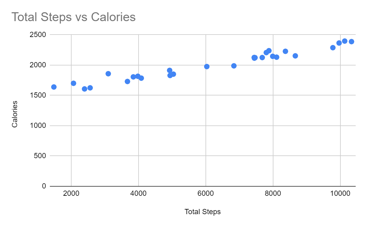
You can use the scatter plot to see if there is a correlation, or relationship, between steps and calories. For example, the chart above shows that the number of calories burned goes up as the number of steps increases. As you can see, there is a relationship between these two values. Nice!
Watch the screencast below to see how I performed the above analysis, and follow along:
The percentage is another essential calculation. It gives you the ratio of something in relation to a whole, expressed as a value out of 100. So if you counted 20 birds, and 16 of them had black beaks and four had yellow beaks, you would have 4/20 with yellow beaks. So to calculate the percentage, take 4/20 and multiply by 100. Therefore, 20% of the birds have yellow beaks.
Zara has a function in her fitness tracker to measure how long she spends in bed and how much sleep she gets. You can compute the proportion of time in bed where she is asleep by dividing one by the other and express this as a percentage:
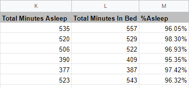
It looks like Zara is a good sleeper!
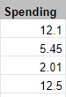
It’s essential to understand that there are different types of numerical data. For example, the total steps is a whole number or integer, whereas spending is a decimal:
Watch the screencast below to see how I performed the above analysis, and follow along on your own copy of the data:
Analyze Qualitative Data
Now let’s look at the text data, which is also called character or string data type.
Look at the Mood column:
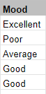
This data is qualitative.
The term categorical describes qualitative data. Categories are lists of values that a variable can have.
The above case describes the quality of Zara’s mood!
What sort of analysis can you think of for the mood data?
It can be hard to perform any meaningful analysis using qualitative data without first deriving some numbers from it.
What if I count the number of days Zara recorded with each mood?
Mood | Number of days |
Average | 1 |
Awful | 1 |
Excellent | 13 |
Good | 9 |
Poor | 4 |
To make the pattern easier to visualize, you can plot this information in a bar chart:
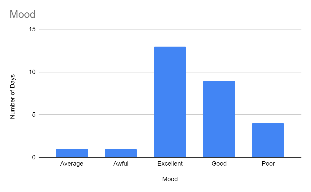
This chart gives you a sense of whether Zara has more good or bad days. Here you can see that Zara is mostly in an excellent or good mood!
You can also analyze another quantitative variable with a qualitative variable. Let’s analyze spending by mood. You can find the average money spent for days with different moods. Here’s that bar chart:
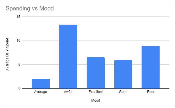
As you can see, Zara’s spending seems to be highest when her mood is poor or awful. Zara’s mother may be right: spending doesn’t improve your mood!
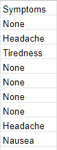
Is there another column with qualitative data?
That’s right! The symptoms column is also qualitative:
Watch the screencast below to see how I created the above charts, and follow along on your own copy of the data:
Filtering is a useful technique for exploring categorical data. Spreadsheet programs have handy features that allow you to apply different filters to inspect your data from different viewpoints. Watch this screencast to see how you can explore the data we have so far:
Analyze Date and Time Data
You’ve seen qualitative and quantitative data. Now let’s look at a third class: dates and times.
You might think dates could be quantitative or even qualitative, but it’s best to consider them as a class of their own. This is because dates behave differently and generally require some additional handling.
It’s very common to analyze data by date and time. You saw this when we looked at Zata's total steps per day. Granularity is critical here: for example, there was a whole year’s worth of transactions in Zara’s original bank data. We aggregated that to the day-by-day granularity, but we could also have aggregated to month-by-month or week-by-week.
To understand this further, let’s look at heart rate. Zara’s fitness tracker can record this information minute-by-minute. So, think of the date and time as the opportunity to analyze data at any of the following levels of granularity:
Year
Quarter
Month
Week
Day
Hour
Minute
Second
This gives you lots of flexibility! Here are Zara’s bank transactions totaled by year:
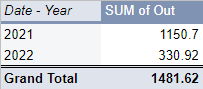
Then by quarter:
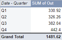
Then by month:
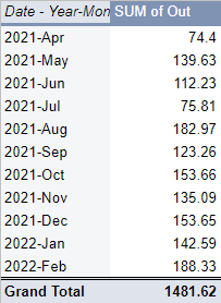
Watch the screencast below to see how I created the above views on the data, and follow along on your own copy of the data:
The moving average technique is handy when dealing with data arranged by date. Consider the total steps per day chart created earlier:
How would you describe the trend in the data here? It goes up and down a lot! It would be great if we could smooth out the line to see the underlying trend, like the red line here:
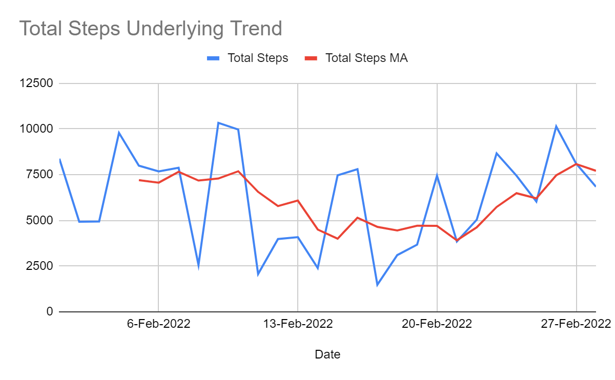
Here you can see that Zara’s steps dipped in the middle of the month but picked up again towards the end. The jagged line is smoother, making it easier to see the patterns.
Watch the screencast below to see how I created the moving average, following along on your own copy of the data:
Let’s Recap!
You can now see some helpful information and insights from the data. In this chapter, you learned:
There are different classes of data:
Quantitative, which is numerical and measurable
Qualitative, which is categorical or descriptive
Date and time
There are different types of data:
Integers
Decimals
Text (also known as character or string data type)
You can analyze quantitative data using various techniques, such as:
Aggregating using sum, average, median, min, or max
Plotting a line chart to see a trend
Plotting a scatter chart to see a correlation
Computing percentages
You can analyze qualitative data using a few techniques, such as:
Counting the number of times each category occurs.
Plotting a bar chart to visualize a count or other quantitative value.
Filtering the data by different categorical values.
You can analyze date and time data using several techniques, such as:
Aggregating by date: year, quarter, month, week, or day.
Aggregating by time: hour, minute, or second.
Plotting a line chart to see a trend.
Computing a moving average to see an underlying trend or smooth out a chart.
Congratulations on reaching the end of Part 2! By now, you’ve tried quite a few ways to analyze data, and you saw that some involve creating graphics. And there are lots more fun ways to visualize your data! We will look into them in Part 3.
