Prepare Your Data-Driven Story
Appreciate the Power of a Good Story
Did you know that data can tell a story? Yes, it’s true! Keep that in mind when working with data.
Look at this classic data visualization from 1854:
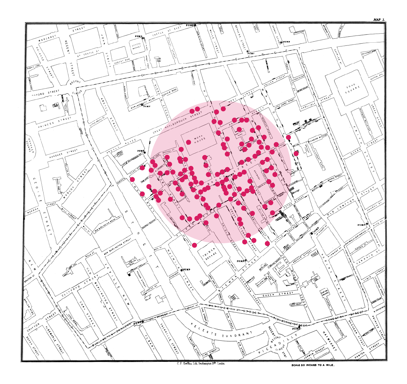
This map shows a severe cholera outbreak in London in 1854. The popular theory at the time was that cholera, like many diseases, was airborne. A physician, John Snow, took data containing the names and addresses of everyone who had died of cholera during that period and plotted them on a map (the black bars). Using this map, he could show that cholera was spreading through water from a street pump. He halted the outbreak’s progression by removing the pump’s handle. Read the Wikipedia article or watch this video on YouTube to learn more.
The above map looks rather dull by today’s standards (spreadsheets weren’t invented yet!), but it tells a powerful story. Furthermore, that story provoked an action that had a positive effect.
It helps to think like a journalist when working with data. What stories can you uncover, and what actions can you drive?
Define a Process
So, how do you create data stories? Here’s a process to help you:
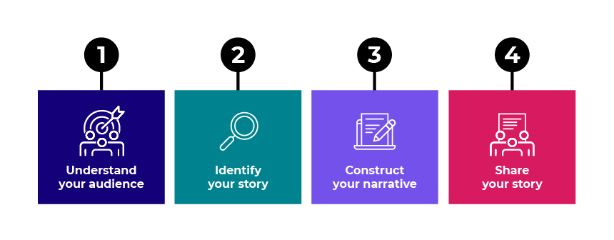
Let’s look at each part of this process.
Understand Your Audience
Who is my audience?
It’s crucial to understand your data story’s target audience. It allows you to tailor how you present your insights to their needs.
Throughout this course, you’ve worked to help Zara with her health and fitness goals. She is clearly the audience for your story.
What are their motivations?
You must be clear about your audience’s motivations. If your story doesn’t appeal to them, it won’t have much impact.
Zara’s motivation is to improve her fitness and health by understanding the underlying factors that affect these aspects of her life.
What sort of story experience would work for them?
Different audiences respond to different ways of delivering a story. For example, you would pitch a story illustrating poor financial performance to a corporate board meeting differently than one showing the benefits of enjoying walks in nature!
The insights uncovered for Zara are a mix of fun perspectives on her lifestyle plus some serious health implications. You must strike a balance here.
Who are the other stakeholders?
Of course, Zara is not the only one who can benefit from your data story. Her personal trainer will also benefit from evidence of her fitness achievements. Her doctor will benefit from evidence of her lifestyle and symptoms. So keep them in mind when constructing the story.
Identify Your Story
This is where you need to think like a journalist. You’ve prepared the data, extracting information and visualizing it.
You’ve uncovered some interesting things that could be the basis for a story. For example, Zara’s mood seems to have strong links to her spending and guilty pleasures.
You’ve also seen some things that don’t appear to lead to a strong story. For example, Zara’s heartbeat data showed low variance, so it has little useful information. And the scatter chart you plotted of steps against spending showed no obvious correlation.
Here are a few questions you can ask to uncover a good story.
Are there any notable exceptions in the data?
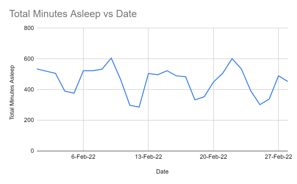
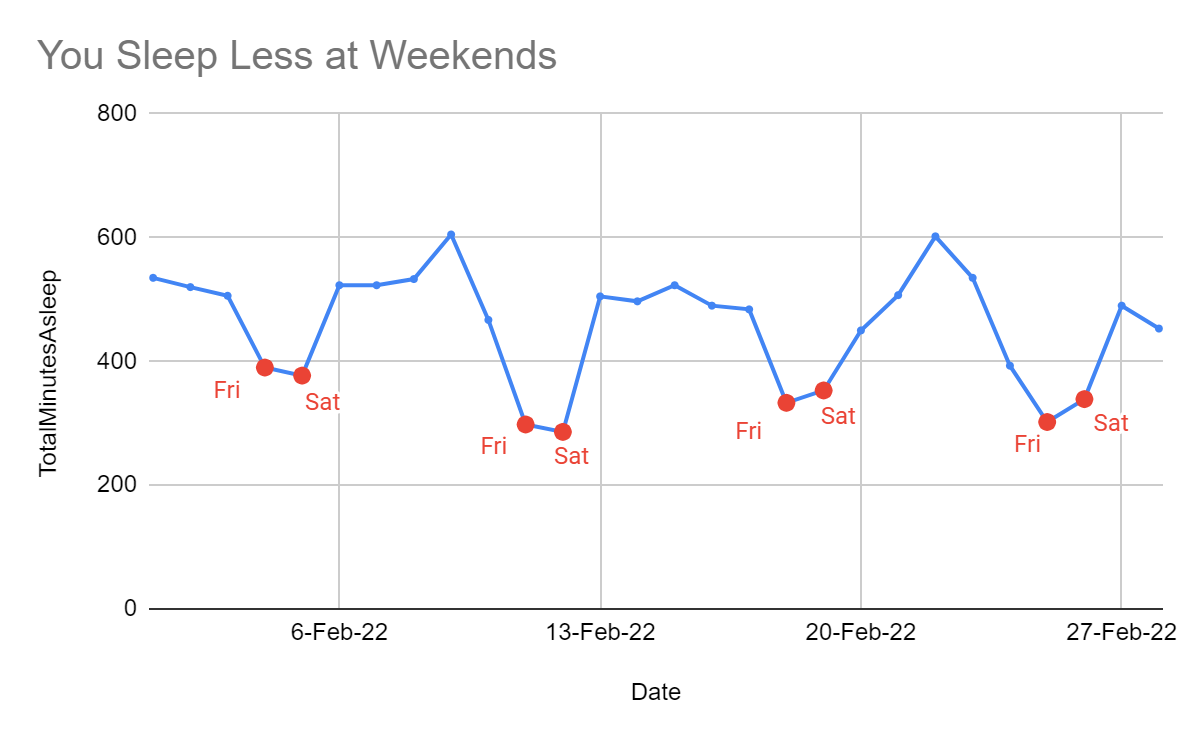
You plotted Zara’s sleep in the second quiz. You may have noticed that her sleep goes up and down:
Did you notice that she gets less sleep on Fridays and Saturdays? Here, the Fridays and Saturdays are circled in red:
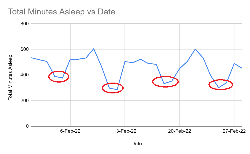
Now that’s the basis for a story!
Are there any notable trends in the data?
In part 3, when looking at Zara’s spending data, you saw that her bills increase each year:
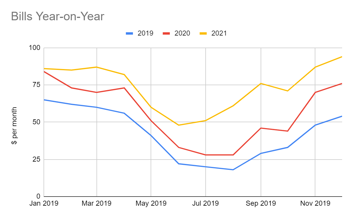
Maybe this isn’t too surprising given inflation and the general state of the economy, so perhaps there is no story here. Don’t expect to find a good story everywhere you look. Good data journalism is about being selective!
Are there any notable correlations in the data?
In part 3, you also saw that Zara and her friends all seem to take fewer steps on days when they get more emails:
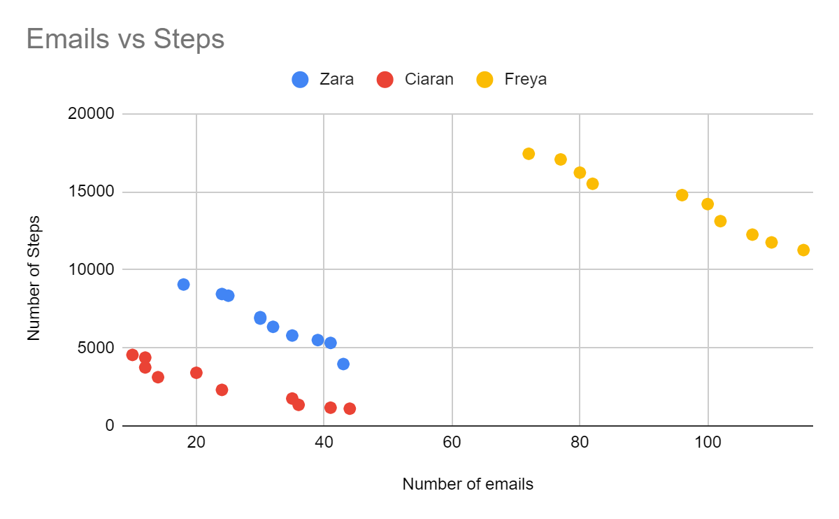
This is interesting. There’s definitely a story here!
What if I can’t find a good story?
Sometimes it’s hard to find a good story. If you can’t see one, try looking at the data differently, such as plotting different charts or aggregating the data somehow. Or add other data, as we did with Zara’s guilty pleasures research.
Your Turn: Find a Story About Zara’s Mood
Using the above questions as a guide, see what other stories you can identify in Zara’s mood data.
✅ Check your work: How did you do? You might have come up with something different, but here’s one story that I spotted.
Construct Your Narrative
Once you have identified your story, it’s time to pull it together. As you do this, focus on your audience. Speak to them. Be selective. You don’t need to share all your information. If you do, you risk overwhelming the audience. It’s better to select a few strong messages and focus on them.
Looking at the potential stories from Zara’s investigation, here is one way to present the information:
Work impacts your fitness goals. Zara and her friends take fewer steps when they get more emails.
Try to get more sleep on weekends. You sleep less on Fridays and Saturdays.
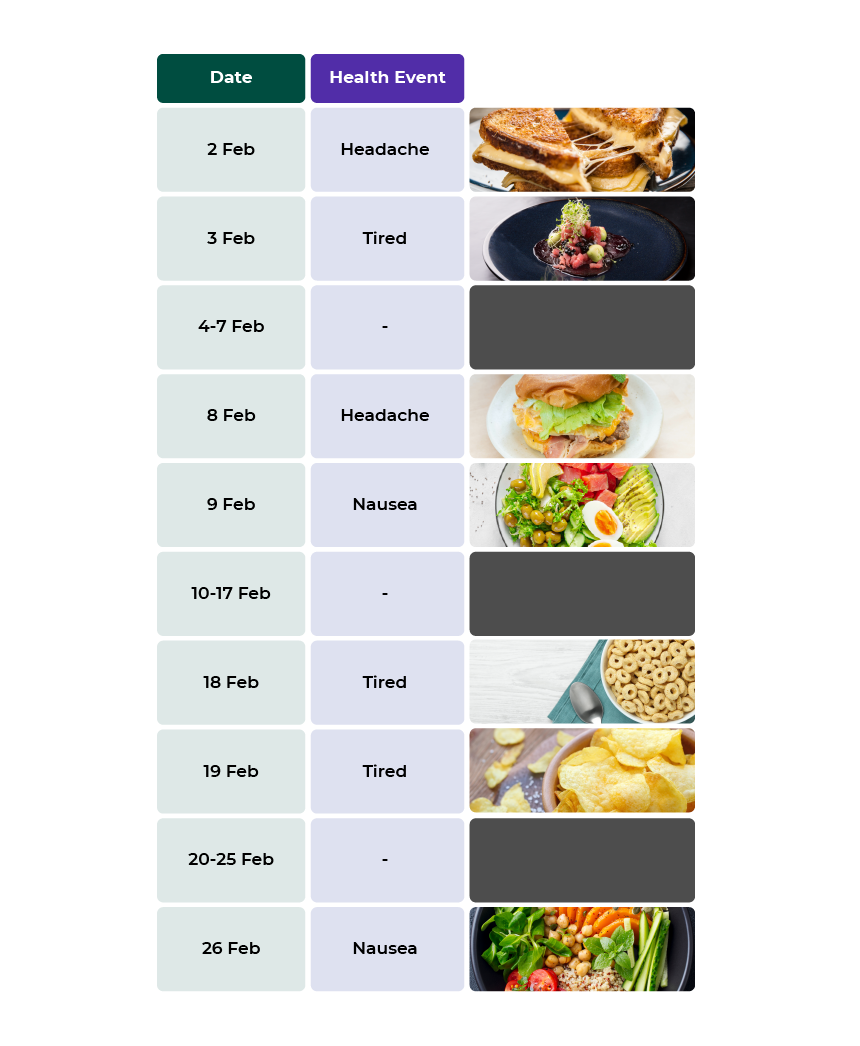
Watch what you eat! Your symptoms coincide with certain eating habits.
|

Remember the idea of actionable insight (see Part 1, Chapter 2 to refresh your memory)? Looking at the above story, you explicitly told Zara what she must do next, as there are clear insights that allow her to make an informed choice:
Seeing that her workload impacts her exercise, she can decide what to do about it (e.g., find time to exercise on busy days).
She can also see that she gets less sleep on certain days and choose to do something about that.
Finally, she can see how her symptoms might be linked to her eating habits, so she may decide to eat differently.
Your Turn: Add Another Part to the Above Story
Now it’s your turn. Look back over the investigations you did into Zara’s mood. What story can you tell about the related factors?
✅ Check your work: How did you do? You can check my response here to compare it with yours.
Let’s Recap!
In this chapter, you played the role of a data journalist! You have successfully built your data-driven story following these steps:
Understand your audience
Identify your story
Construct your narrative
Now that your story is ready, it’s time to move to the final step—sharing your story with the world, which we will do in the next chapter!
