Draw a Wireframe on Paper
In the previous chapter, you saw that the prototyping process involves low-fidelity wireframes and high-fidelity mock-ups. Let’s start with wireframes! 💪
Identify the Client’s Needs
In this course, we’re going to create a mock-up for the website of a chain of noodle restaurants, Yummy Noodles. Yummy Noodles has already had a logo and a menu designed and has a set of photos on its social media.
Here’s the client brief, which was sent to you via email.
Hello,
As agreed during our discussion this afternoon, these are the features we already have, and those we don’t yet have but would like to be part of the website.
What we already have:
A small and large version of the logo—please see attached
Photos and illustrations which we already use on social media, including photos of our restaurants from the outside
Our menu with the logo on it
Our market positioning—our target audience is young, professional digital technology users in their late 20s/early 30s.
What we need:
Several different web pages—the homepage, our full menu, and a contact page
A presentation of our expertise
A full-screen display of our menu
Photos from our Instagram account
A map showing where our restaurants are located
Our email address and telephone number
A link to place a Click and Collect order
A link to our social media (Facebook, Instagram, and a Google Maps link)
Our trademark “Yummy Noodles—all rights reserved” must be displayed.
Looking forward to working with you! Please get in touch if there’s anything else you need to know. 😊
P.S. For the slogan of our restaurant, we decided on “Yummy Noodles, the yummiest noodles in Paris!”

Lucky for you, the manager of Yummy Noodles knows what they want! But that’s often not the case, and you’ll need to communicate with the client to understand their needs.
Well, we’ve got a lot of work on our plate! Let’s get started on designing our wireframes.
Identify What Makes an Effective Mock-Up
As we saw in the previous chapter, wireframes are used to sketch out the general idea of a website. At this stage, the aim is not to develop the aesthetic aspect of the product, as wireframes are a low-fidelity representation, but to find the best way of arranging the content on the page.
Clients who visit the website will already have heard of the restaurant (word of mouth, etc.)—they won’t just have ended up there by accident. The aim is to convert visitors into clients and to do this, we need to:
make it easy to order online.
provide essential information (address, opening hours, telephone numbers) so people can get to the restaurant.
display the menu so people know what’s available.
Let’s get to work and see how we can achieve these objectives!
What software do I need to create wireframes?
For the moment, you don’t even need a computer, just plain old pencil and paper! It’s true that many professionals work with software, but some very often design their wireframes by hand.
Create Layouts
Let’s start with the homepage.
To create a simple page, taking into account what the client told us, there are three essential things we need to put on the homepage:
The restaurant’s unique selling point (USP), or slogan
Navigation
A call to action to engage visitors and allow them to place a click and collect order.
Use Best Practices as Inspiration
If you don’t know how to lay out the different elements, take a look at the homepages of other websites to get some inspiration. You’ll need to keep up to date with the latest trends and developments.
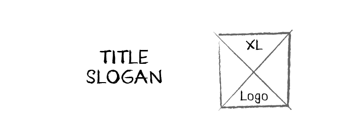
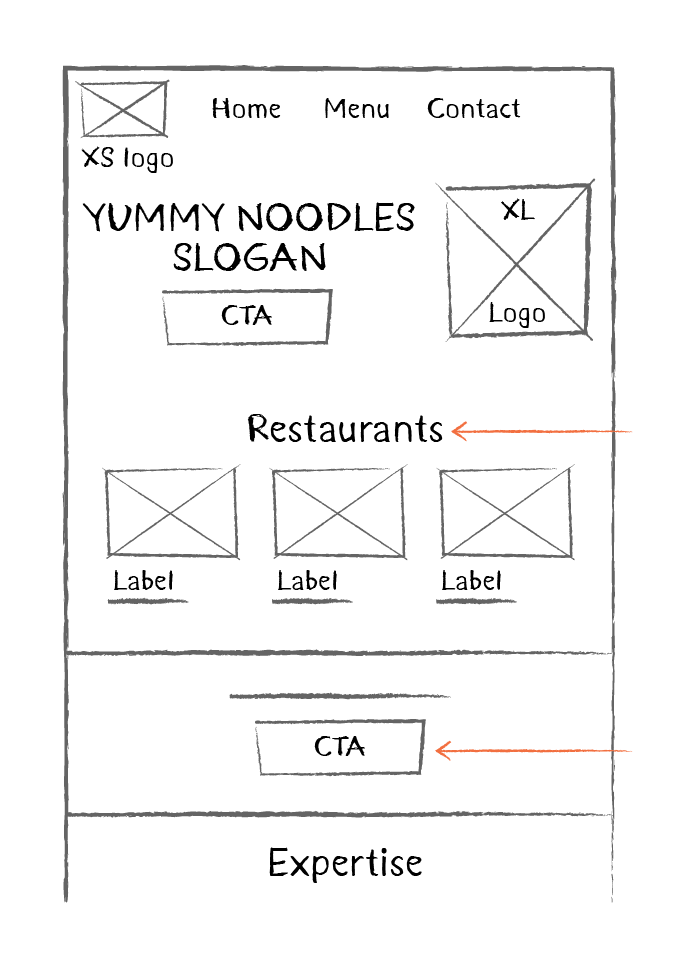
Let’s start with the USP. We can put the name of the restaurant, the large version of the logo, and the restaurant’s slogan in the center of the page, like this:
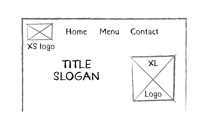
Now let’s add navigation.
In our case, there isn’t much to navigate between—just the homepage, the restaurant’s menu, and the contact page. We can therefore use a horizontal navigation bar (Header), with the menu on the left: 👇
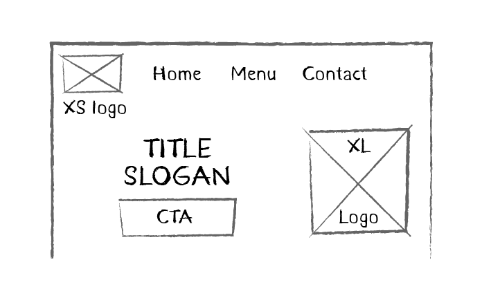
We can place the call to action just below, like this:
Then we can add a text box with the description provided by the manager of the company’s expertise. Just below this, we can add the photos taken from social media and a contact section.
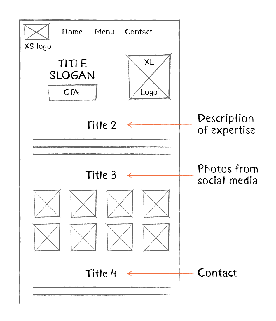
Looking good! All we need now is the footer.
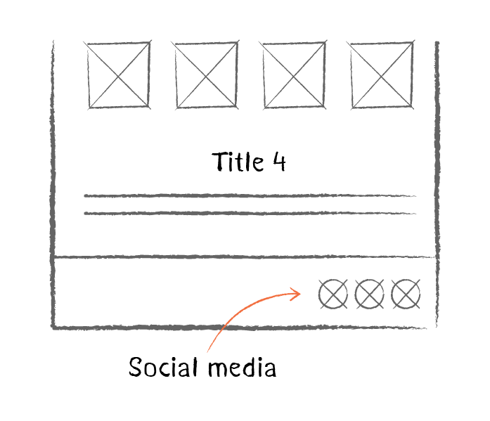
We can use the footer to add links to the company’s social media, and the copyright, like so: 👇
Nice work—our page now has all the elements it needs! 😎
But wait… reading through the elements on the page, there’s no indication that there are several different restaurants. We can’t have that!
But I’ve already drawn it now! What should I do? 😱
Don’t worry! You can simply start again. That might seem daunting, but it’s only a matter of drawing simple shapes on paper—I promise it’ll only take you a few minutes. You can even take this opportunity to improve on what you’ve already done. Prototyping is an iterative process, which involves thinking, creating, and testing over and over again until we get the result we want. 🔄
So, let’s add some space for the information on the three different restaurants, and while we’re there, let’s add a new call to action.
Let’s think about how we’re going to create the next pages… 🧐
We’ll also need a header, footer, and a call to action. These elements can be considered reusable components.
We’ll learn more about this later, but bear this in mind as we go along!
Over to You!

It’s now time to put what you’ve learned into practice! We’re going to create wireframes for the menu and contact pages. Here’s a list, in no particular order, of the elements we need to include.
For the Menu page:
A call to action
The menu
The header (horizontal navigation bar)
The footer
Contact information
For the Contact page:
The header (horizontal navigation bar)
The footer
A call to action
Contact information
An interactive map
A list of the addresses of the three restaurants
Your mission, should you choose to accept it, is to prepare the wireframes for these two pages. Get your paper and pencils ready! You can start by drawing the navigation bar with the links, then move on to the other elements, and finish with the footer. If it goes wrong, just start again—it’s a process of trial and error, and that’s OK! There are many different ways of creating wireframes, so it’s up to you now to find yours.
Check out the video below to see how I did it! 👇
You can also download my ideas for the wireframe for the menu page and the contact page.
Let’s Recap!
Before creating wireframes, it’s essential to communicate with the client about their specific needs.
To lay out elements in a wireframe, take inspiration from best practices in web design. Look for inspiration online from the best landing pages.
Creating wireframes is an iterative process: you test a solution, then another, then you go back and add something, and so on.
So, did you get your ideas down on paper? How did it go? Did you enjoy putting what we learned into practice? In the next part, you’ll discover one of the most widely used software programs for web design—Figma. But first, test your knowledge with the Part 1 quiz. 🤓
