Adapt Your Wireframe to Different Formats
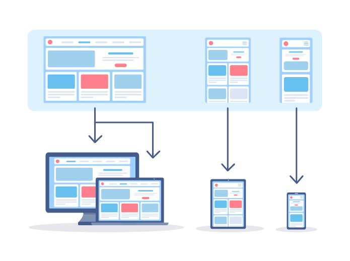
So far, we’ve been using the Desktop format to create our wireframes in Figma. This means that our wireframe is suited to computer screens.
But what about smartphones? How would our website look in this format? It’s time to find out—we’re now going to adapt our wireframes to different screen sizes. 🎉
Take Different Formats Into Account
The aim here is to adapt the website layout so that the content changes to fit any screen size, without the user having to scroll to look for the content or zoom in or out. It’s also important to keep the design as similar as possible to the desktop version, without deleting too much. This means that we’ll need to reorganize and resize our content blocks (image and text) to fit the space available on the screen.
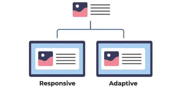
Developers always aim to make their websites responsive, which means that the content adapts to any type of screen, rather than simply adaptive, which means that they only adapt to certain, given screen sizes.
Is there a way to check if a website can adapt to a mobile format using a computer?
There are several! I’ll show you in the screencast just below. 👇
Design Your Mock-Up for Mobile Devices and Tablets
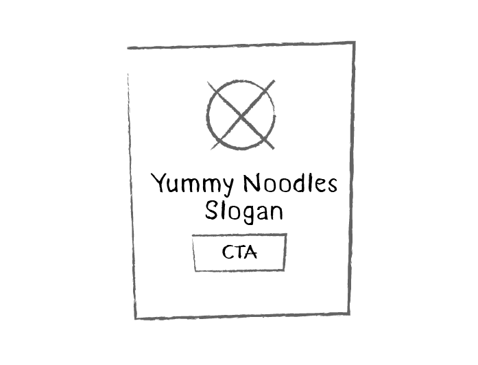
It’s time to go back to our revolutionary tools—paper and pencil. 🤓 So far, we’ve used a horizontal rectangle to create our wireframes. For the mobile version, all we need to do is change the basic layout to a vertical rectangle. If you aren’t sure about the dimensions, place your smartphone on a sheet of paper and draw around it!
Now go back to your wireframes (here they are). The aim is to adapt the content so it fits on the screen of a smartphone.
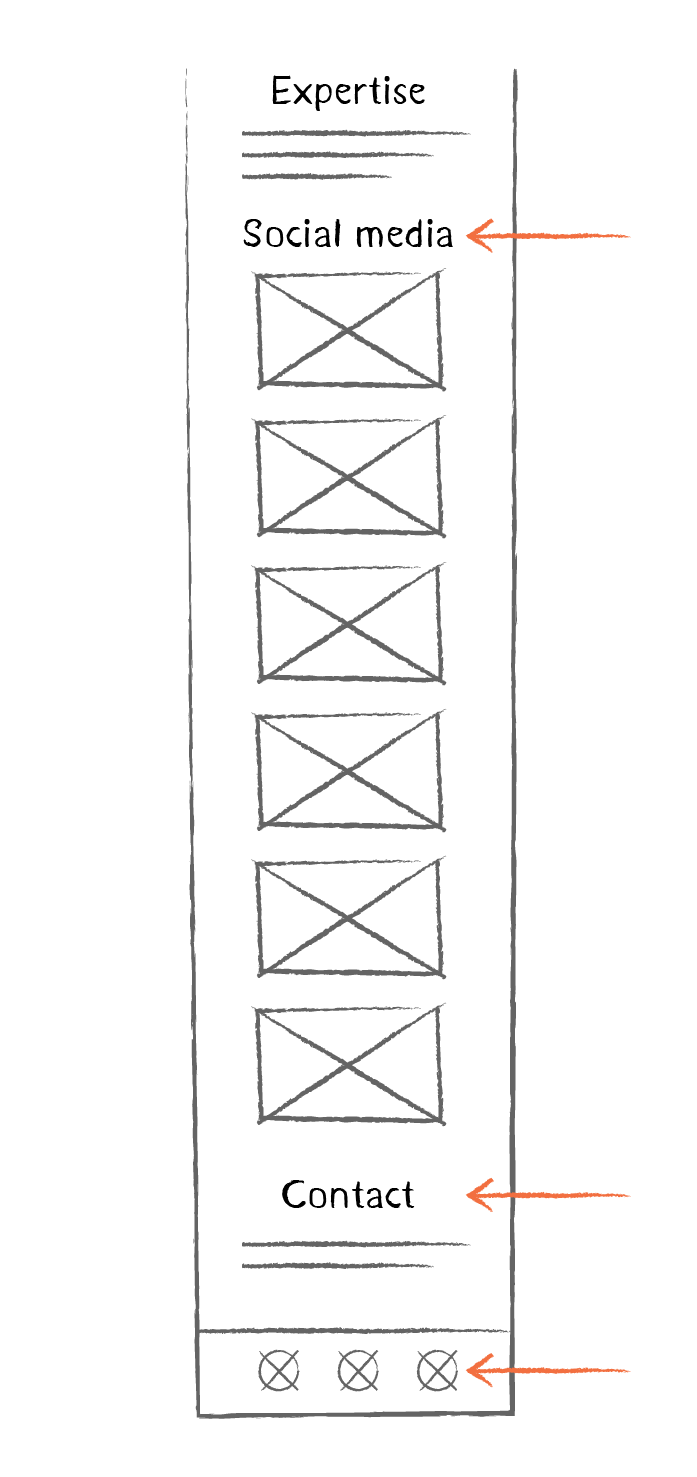
Let’s start with the homepage. Here, we can arrange everything in a vertical column. This means that we need to take the different elements and rearrange them like this:
Not bad, eh?
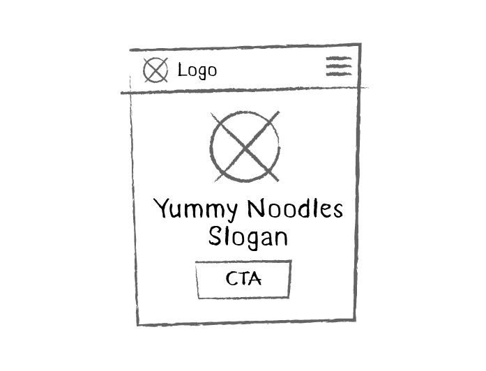
But what about navigation?
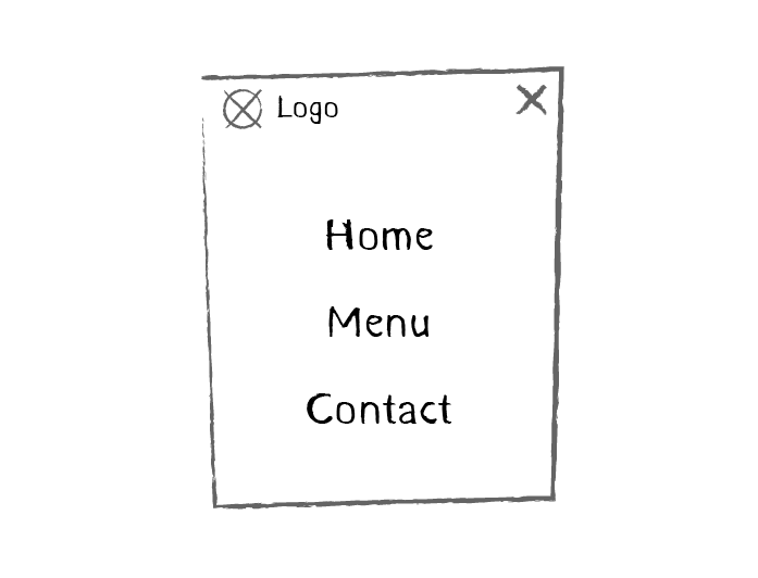
In this case, we’re going to add a hamburger menu! Sound familiar?
This menu takes the form of an icon composed of 3 parallel horizontal lines. It looks a bit like a list (and also like the 3 layers of a hamburger!). When we click on it, the content of the navigation menu slides out. You can see an example on this page.
Here’s our wireframe with navigation added:
So what happens when we click on the hamburger menu?
While we’re here, let’s draw it! It slides out, so the icon changes, and we get a list of navigation elements: 👇
Let’s move on to the next bit of content. For the next section, we can also lay out our content vertically, and expand the text box:
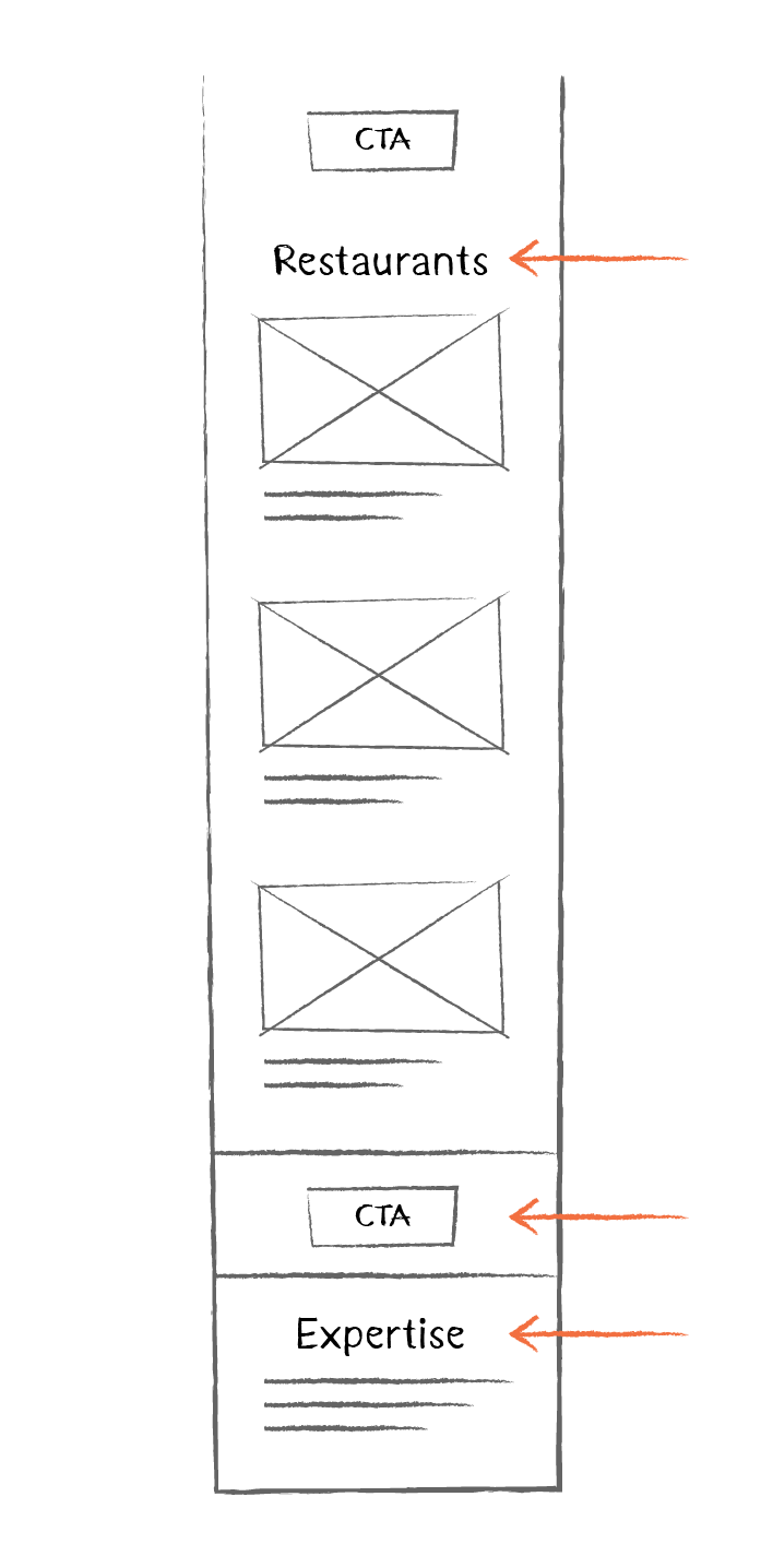
Let’s finish off the homepage… ta-da!
Smartphones have smaller screens, so does that mean that we need to reduce the size of everything, including the text?
Not necessarily. The idea of adapting the design for mobile devices isn’t to keep exactly the same layout and just shrink all the elements. But we can use different font sizes for the different versions (mobile or desktop). We’ll learn more about this in the next part, when we’ll design a mock-up with its own style.
Create Wireframes in Mobile Format in Figma
It’s time to create a mobile version of our wireframes in Figma. As usual, we’ll start with the homepage.
Remember how we created frames in the previous chapter? Well, we’re going to do exactly the same thing here to create a mobile screen.
To create a new frame, click on the Frame button in the horizontal toolbar, and the options will be displayed on the right. Select Mobile, then the size you want (in our case, iPhone 11 Pro/X), and you’ll get this: 👇
Now you’ve got the basis of your mobile frame, like in the GIF above, let’s give it a name—we’ll call it Homepage-smartphone.
In the screencast below, you’ll discover the next steps for creating your mobile wireframe, and how to use layout grids—a very handy tool for laying out your elements:
OK, so we’ve got two screens, one for a desktop and one for an iPhone 11 Pro/X, but what happens for slightly smaller or larger screens? We aren’t going to design a different screen for every possible resolution, are we?
No, we aren’t, don’t worry! This would take far too long, and wouldn’t be very efficient. For the next phase of development, we’ll use the screens we’ve designed as inspiration and enable the elements to adapt to the sizes between the two. As I mentioned earlier, ideally we want our website to be responsive.
Over to You!

Time to put your skills into practice! Try creating the menu and contact pages on paper first, and then integrate them into your Figma wireframes.
The solution to this exercise is in the two videos below—the first is for the paper wireframes and the second for the Figma wireframes. Start by designing the wireframes on paper, then watch the video, and then move on to the second part of the exercise! 🎉 Here’s the video for the wireframes on paper:
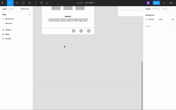
You can download my wireframes for the Menu page and the Contact page. Now I’ll show you how I integrated these into Figma:
Let’s Recap!
It’s essential to create a mobile version of each of your designs to make sure the content can adapt to different screen sizes.
Adapting content for mobile browsers involves rearranging and resizing the elements.
In Figma, you can create mobile screens easily using the Frame tool.
The layout grid tool helps you keep the right proportions in your designs.
Hamburger menus are a good way of adding navigation for the mobile version of websites.
So, how did you get on with mobile screens? As you can see, our wireframes are now ready for us to move up a level. In the next part, we’re going to create high-fidelity mock-ups. But first, test your knowledge with the quiz! 🤓
