Create a Visual Identity
You’ve now reached the last part of this course, which I’m sure you’re super excited about! We’re now going to add an aesthetic dimension to our wireframes, and build efficient and attractive mock-ups! 😎
I’m not particularly creative… is this going to be a problem? 😱
Not at all! We’ll go through the creative process together. You can take it at your own pace, and once you get to grips with it, you’ll be perfectly capable of creating the foundations of a visual identity. Let’s get to work! 👩💻🧑💻
Look for Inspiration
First things first—a critical stage in the creative process is looking for inspiration. Even experienced designers never skip this step! There are several ways of going about this.
Personally, when I’m looking for inspiration I always start by consulting Dribbble, a platform where designers can showcase their work. You can put together a sort of mood board for your project in Dribbble by creating a “collection” in your account.
What’s a mood board?
Mood boards are from the world of graphic design. They’re a type of collage of images, text, and even objects representing the visual identity the graphic designer wants to use for their project. In Dribbble, you don’t exactly make a collage, but you can group together the design elements you like and see how they look next to each other.
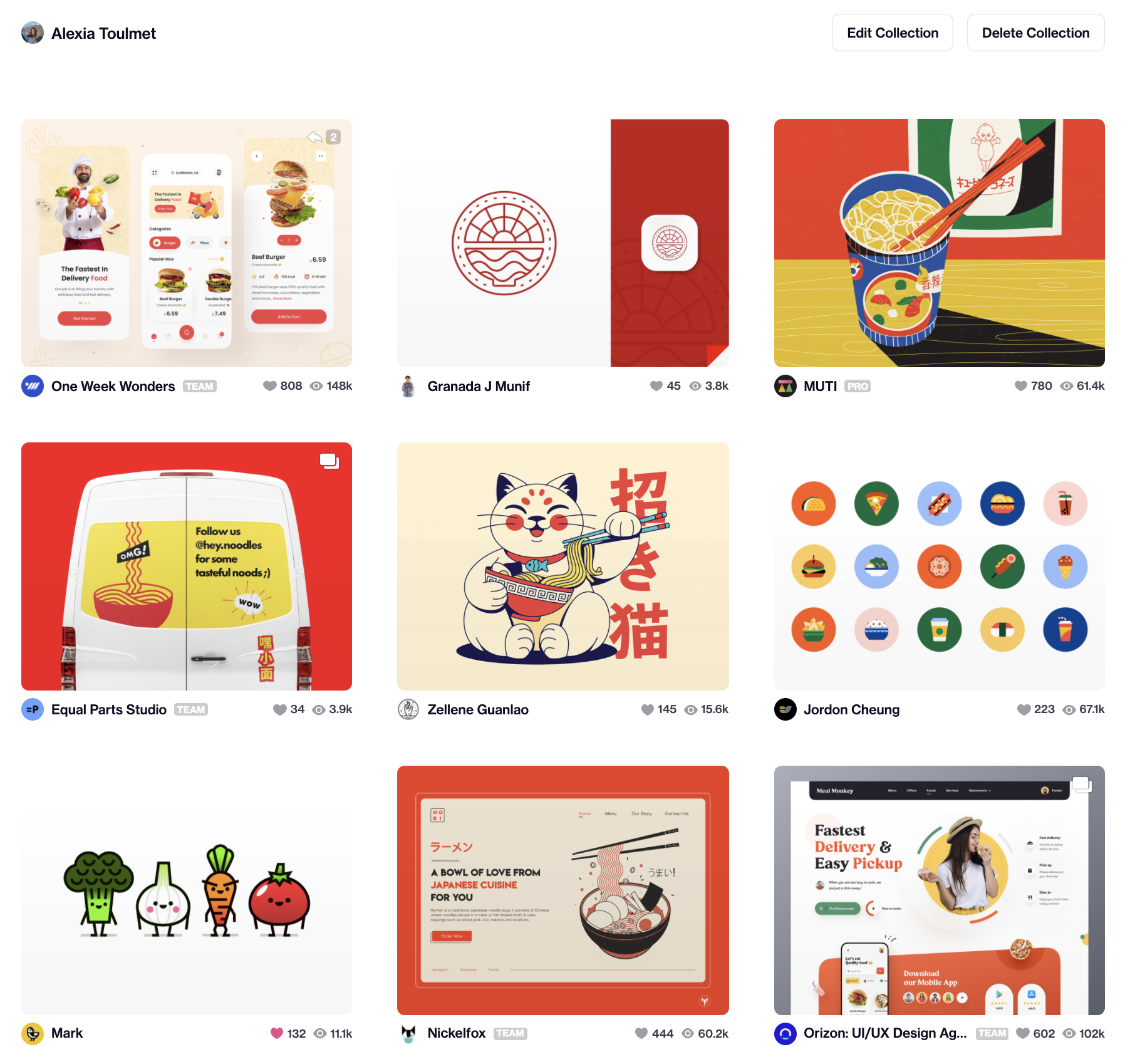
Yummy Noodles has a target audience of young professionals and serves Asian food, so I’ve aimed to create a visual identity inspired by kawaii. This means “cute” in Japanese, and corresponds to very specific visual codes. Google it if you want to see what it looks like! In the Dribbble search bar, I searched for “noodles,” “kawaii food,” etc.
Here’s a glimpse of my Dribbble collection for the Yummy Noodles project: 👇
Dribbble isn’t the only way to search for inspiration. There are other platforms where designers share their work, such as Behance and Awwwards, which gives out prizes for the most aesthetically pleasing website (in different categories). You can also simply look at websites you like, search on Google, sign up for design-oriented newsletters, etc. I’ve also added the Muzli browser plugin, which shows me all the latest design trends every time I open a new tab.
Choose a Color Scheme
Now you’ve put your sources of inspiration together in the same place, it’s even easier to use them! For example, you can identify colors you like in the images. In my Dribbble collection, there seem to be a lot of red-orange colors, but I haven’t yet found the right color for my interface.
If you can’t decide, don’t worry—that’s normal! And you don’t have to limit yourself to one color, you can choose several different ones. There are tools you can use to choose a color palette to make sure they go together well.
Colors aren’t only for making your page look nice—they’re also a good way of conveying emotions and making certain bits of information stand out.
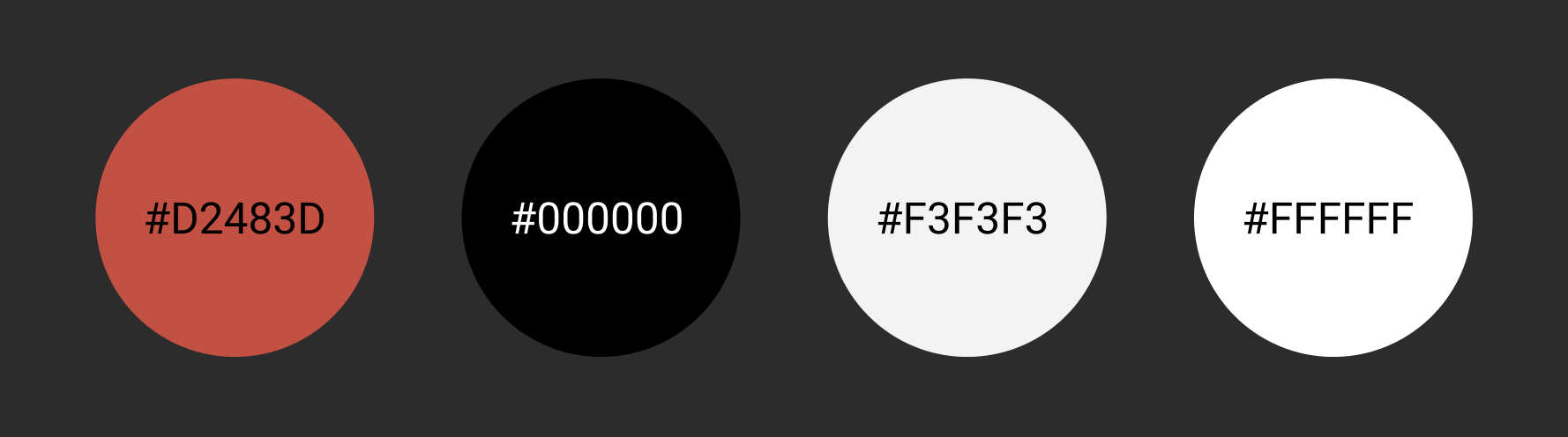
To find the perfect color palette for your website, take a look at Coolors, or go to the Adobe color trend explorer. For Yummy Noodles, we’re going to use the following colors:
While we’re on the subject, you haven’t seen how to use the color tool in Figma yet! Go to the screencast below to learn all about it: 👇
Choose Your Fonts
Not only are the colors you choose important for your website design, but the fonts you use are too. They’re an integral part of the design of your website and your visual identity.
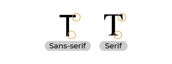
The possibilities are endless—you can choose between serif and sans-serif, cursive fonts, etc.
It’s also recommended to combine two different fonts—one for titles and the other for text.
For example, you can combine a serif font for titles with a sans-serif font for the body of the text, or the other way round.
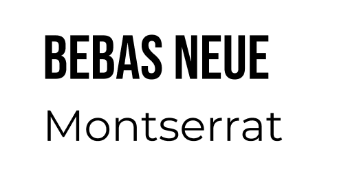
In the meantime, for Yummy Noodles, we’ll keep it simple with sans-serif fonts. To find this pair of fonts, I drew inspiration from this article and chose Bebas Neue and Montserrat.
Standardize Spacing and Sizes
Define Your Sizes
When I create an element, how do I define its size? For example, when I use a logo, do I just choose a random number of pixels for its length and width?
As you may have guessed, we leave nothing to chance in design! 😉
This is a perfectly legitimate question. To make sure everything fits together well, we can use a scale. This involves taking an initial size and sizing all our elements based on multiples of this.
We’re going to choose the most commonly used scale—a scale based on multiples of 8. Here it is: 👇
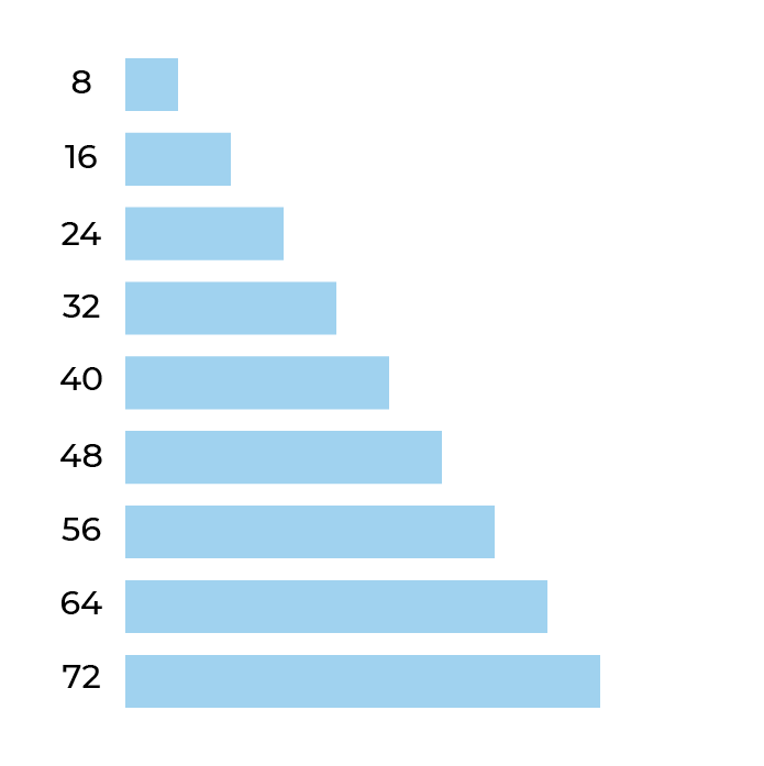
This means that when you need to create a new element—for example, when you import the logo into the navigation bar of your mock-up—you can refer to the scale to decide what size it should be.
Keep Spacing Consistent
One last thing you need to think about when creating a visual identity is defining spaces.
Spaces are a subject in their own right in design. They’re important to take into account, as they help focus the user’s attention, and create a link or a distance between elements when required. They also help establish a hierarchy of information.
We, therefore, need to think carefully about how we’re going to create them. This will help keep the content of the mock-ups consistent.
To do this, we can refer back to the scale based on multiples of 8 which we used for sizes.
Choose Your Font Sizes
While we’re on the subject, let’s choose our font sizes, too! We can take inspiration from the scale below. As you might suspect, the largest font sizes are for the most important elements (headers and titles, for example). You can also make certain elements stand out using bold.
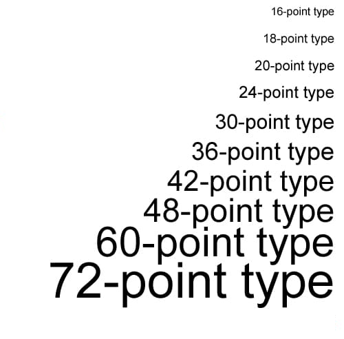
For our mock-up, we’re going to use several different text sizes. The header corresponds to the title of each page (respectively, Yummy Noodles, Menu, and Our addresses). Title 1 will then be for the titles of different categories, and Title 2 for the section titles. The body will be used for the body of the text, and Body Highlight to make the text stand out where needed. For our desktop mock-up, we therefore have:
Header: Bebas Neue – 72px
Title 1: Bebas Neue – 24px
Title 2: Montserrat – 24px
Body Highlight: Montserrat – 20px – Semi bold
Body: Montserrat – 20px
And for the mobile version, we have:
Header: Bebas Neue – 40px
Title 1: Bebas neue – 20px
Title 2: Montserrat – 20px
Body Highlight: Montserrat – 16px – Semi bold
Body: Montserrat – 16px
Align Your Elements
Finally, just a word on something we saw previously, which makes an important contribution to the visual harmony of a mock-up—alignment. As we saw in the previous part, you can use layout grids for this, and there are also automatic spacing tools you can use.
Over to You!

Now you’ve seen the basics of creating a visual identity, it’s time to put this into practice in your Figma file. To do this, you’ll need to:
create a new page with the title “graphic identity”.
create a list of the colors you’re going to use (#D2483D, #000000, #F3F3F3, and #FFFFFF) using the color styles system.
create a list of the different font elements with the right fonts and sizes. You can also create text styles—you’ll see how to do this in the solution to this exercise.
For each element in the list, you can create a new frame to group your shapes and text boxes together.
Watch the screencast below to see how I did it! 👇
Let’s Recap!
Creating a visual identity generally starts with searching for inspiration, on design platforms such as Dribbble and Behance, for example.
You can search for color palettes and pairs of fonts that go well together.
Colors convey emotions and help establish a hierarchy of information.
It’s important to maintain consistency in spacing and font sizes to produce an effective mock-up.
In this chapter, you’ve learned the basics of creating a visual identity. However, this is only a taster of this subject—if you’re interested, why not do some of your own research into the subject by reading articles, watching videos, etc.?
You’re nearly at the end of the course! Let’s go to the last chapter to put everything you’ve learned so far into practice, and bring your high-fidelity mock-up to life! 🚀
