Create a Mock-Up With Figma
You now have a solid foundation for creating your high-fidelity mock-up, with your wireframes in Figma and your visual identity. So without further ado, let’s get to work! 💪
Integrate the Structure Into Your Mock-up
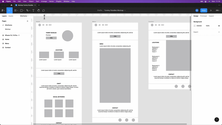
In the meantime, we’ve checked that the client is happy with our wireframes, and they’ve provided us with the text content for the website in comments on the wireframes—you can see them here in Figma.
To show the content of the comments, just click on the “comment” button in the toolbar at the top, and they’ll be displayed directly on your wireframes in the right-hand column.
Now we can integrate them into our high-fidelity mock-ups! 🤩
Let’s get to work!
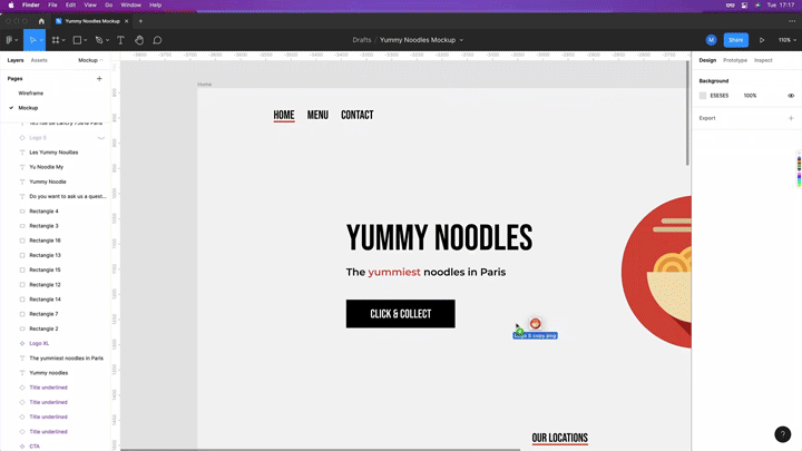
We’ll start by changing the background color of our frame.
To do this, we need to select our frame and change the color in the bar on the right-hand side, as we saw in the screencast in the previous chapter. We’re going to enter #F3F3F3.
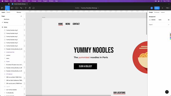
Let’s also start to create the navigation for our website. We’ll use our Title 1 font in Bebas Neue. This is what we get:

But how will users know what page they’re on?
It’s simple—the page they’re on will be underlined. To do this, we need a line as long as the text, 3px thick, positioned 4px underneath Homepage, like this:

Next, we can move on to the header of the page Yummy Noodles and the slogan “The yummiest noodles around,” which we’ll put just underneath. We can even highlight the word “yummy” in red. Be careful with the spacing, as we saw in the previous chapter!
Now let’s do the call to action. To decide on its size, we can use our new spacing and size scale based on multiples of 8, and create a rectangle with a height of 56px. For the width, let’s take a value of 216px for the time being, but in a moment we’ll see a special way of adapting the width of the button.
On top of this, we need to create a text box, write Click & Collect in it, and then center our shape, along with the text on the button. Our call to action now looks like this:

But that’s not all! Let’s go back to the width of our button. I’m going to show you how to use the create component tool in Figma, which you’ll find very useful during the prototyping process. In the screencast below, I’ll explain how to create a component in Figma and how to adapt the width of a button to the text it contains. 👇
Optimize Your Image Management
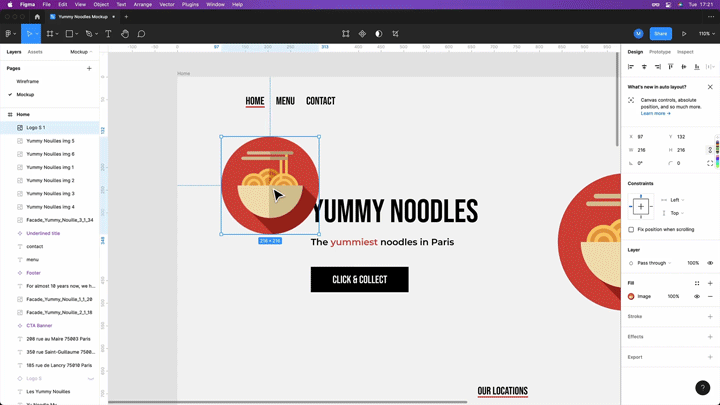
Ok, so we’ve got our Homepage, Menu, and Contact links, but when are we going to add the logo?
Don’t worry, I haven’t forgotten! Here’s how to manage images in Figma.
To add a new image in Figma, there are a few options:
1. You can drag the file (JPEG, JPG, SVG, or PNG) directly into the window in your browser.
2. You can also click on the button with the Figma logo in the horizontal bar, select File, then Place Image…, and select the image to insert.
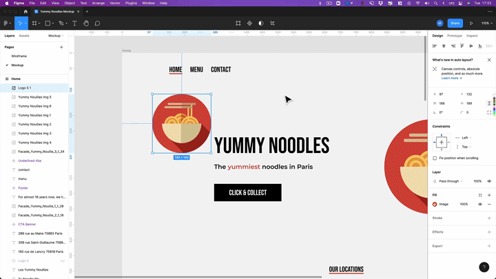
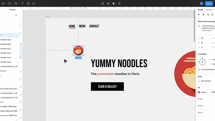
Once you’ve inserted the image, you can resize it by clicking and dragging the corners (like in most other tools).
You can also press and hold the shift key while you’re resizing an image to keep the same proportions.
Which is the best type of file to use, out of JPEG, SVG, and PNG?
It all depends on the file you have. JPEG and JPG files tend to be smaller than PNG files. However, PNG files provide the possibility of having a transparent background.
If you have the choice, I recommend using SVG files in Figma for icons and logos. SVG files are vector files (a different type of file from those normally used, which are based on pixels), which means that you can modify the file as much as you want (make it bigger, change the color, etc.) with no impact on quality.
Now let’s insert the images of the restaurants. If you click on Fill in the bar on the right-hand side, you’ll see that you can also crop images, change the contrast and saturation, export them in PDF format, etc.
Save Time
Let’s continue creating our mock-up based on the wireframes. For the titles of the sections “Our Addresses,” “Our Expertise,” etc., we’ll use an underline as we did for the “Homepage” link in the navigation bar. This means that we’ll need to reuse this shape several times.
So can we just copy-paste it?
We could, but that would mean that we’d have to resize it every time to fit the width of the text box.
Instead, we’re going to use the create a component technique that we saw at the start of the chapter. To do this, select the text and the line below it, and create a component called “Title underline.” We can configure it to make it perfectly fit any text with the auto layout.
We can then use it whenever we need it.

Now let’s move on to the CTA section, and add a background color to make it stand out and distinguish it from the other sections. To do this, add a colored rectangle which takes up the whole width, like this. 👇

Then we can add a body text box and copy our CTA.
We can use the Title underline component again and simply change the text to Our Expertise.
It’s starting to take shape! 😎
We’ll continue creating our mock-up in the screencast below.
It’s common practice to save time by reusing previously created elements as we just saw, so feel free to use this technique whenever you want!
Over to You!

Your mission is to complete the Menu and Contact screens for the Desktop and Mobile versions. Feel free to reuse elements we’ve already created. Now it’s over to you! 💪
Take a look at the screencast below to see how I did it.
And here’s the final version of the mock-up!
Let’s Recap!
Components allow you to reuse a structure in Figma, rather than copy-and-pasting elements and then having to spend time modifying them.
To add a new image in Figma, you can:
drag the file (JPEG, JPG, SVG, or PNG) directly into the browser window.
click on the button with the Figma logo in the horizontal bar, click “File”, then “Place Image…”, and select the image to insert.
You can also crop images and change their contrast and saturation, etc.
Now you’re equipped with all the skills you need to create wireframes on paper and in Figma and transform them into high-fidelity mock-ups. Well done! In the following chapter, we’ll take a look back over everything we’ve learned.
