Prepare Your Dashboard Model

Now your data is ready to use, you need to create the model which you’ll use to analyze your data.
The model sets out the layout of your future dashboard. I’d advise you to create it before adding the data.
Really? Why?
So that you can focus on the question that you need to answer without being influenced by the data. You should therefore make up some data for now!
Decide Which Components Are Relevant to Your Analysis
A quick reminder of the two questions asked:
How have our Western European sales been going since 2019, by garment and on a quarterly basis?
Are the 2018 collection pants selling as well as the 2020 collection ones?
How Not to Do It!
You might decide to answer these questions on a superficial level, which would give you something like this:
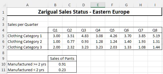
This table does answer the questions. However:
the reader has to “read” each part of the data to understand it.
the dashboard is not well presented. There are no colors or graphs to draw the reader into the analysis.
analyzing this table is very time-consuming.
Best Practice
Before creating the model, ask yourself the following questions:
What type of table/chart is the most suited to your objective?
If you’re looking at patterns and changes, a line or bar chart might work best.
For comparison purposes, you might wish to use conditional formatting to highlight the data, or a different type of chart.
Can I anticipate the questions that might arise after the analysis?
Think about a more detailed analysis for each country to fine tune your answer to the first question.
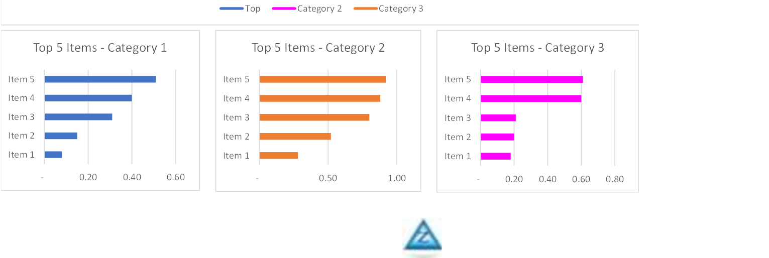
Perhaps show a breakdown by garment within each category.
Will the colors in my dashboard help the reader?
It will help the reader if you give each category a specific color for the whole dashboard.
You can also answer the questions using a dashboard like the one below:
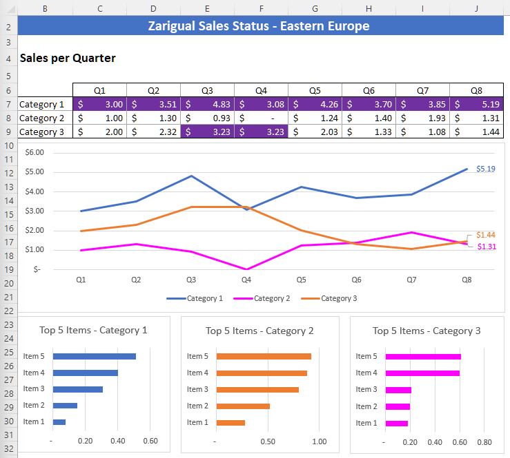
It’s far easier to read, isn’t it? 😊
Ta-da! You’ve created your model! Asking your boss to check it before adding the data can save you precious time! I once had to reformat an entire report because the client didn’t like the colors! 😅
Think About Using Conditional Formatting for Your Data
Have you already heard of conditional formatting in Excel? If you haven’t, I’d advise you to read this chapter from the Master the Fundamentals of Excel course.
In this example, we can use conditional formatting, which combines a number of different conditions:
The values in the top 5% of sales should have a dark green background.
The remaining values in the top 15% of sales should have a mid-green background.
The remaining values in the top 25% of sales should have a light green background.
You’re therefore going to create three different conditional formats and prioritize them.
Conditional Format No. 1
Select the cells from your main table.
Click on the “Conditional Formatting” icon, and then “New Rule...”
In the dialog box, select the rule “Format only top or bottom ranked values.”
Select the value 25%, and choose a light green fill color.
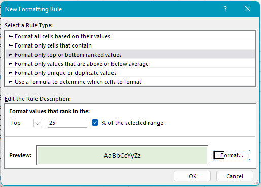
Click OK.
Conditional Format No. 2
Go through the same process to create a second conditional formatting rule, with a criterion of 15% and a mid-green fill color.
Conditional Format No. 3
Go through the same process to create a third conditional formatting rule, with a criterion of 5% and a dark green fill color.
The result looks like this:
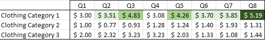
The reader’s eye is now drawn to the best sales results!
Customize the Page Layout of Your Model
Add a Logo in the Footer
You never know where your dashboard may end up! Why not make it look as professional as possible? 😊
To add your company logo to your model footer:
Click on the Page Layout tab.
Click on Page Setup.
In the Page Setup dialog box, click on the Header/Footer tab, then on the Custom Footer button.
Click on the Central section, then on the Insert Picture icon.
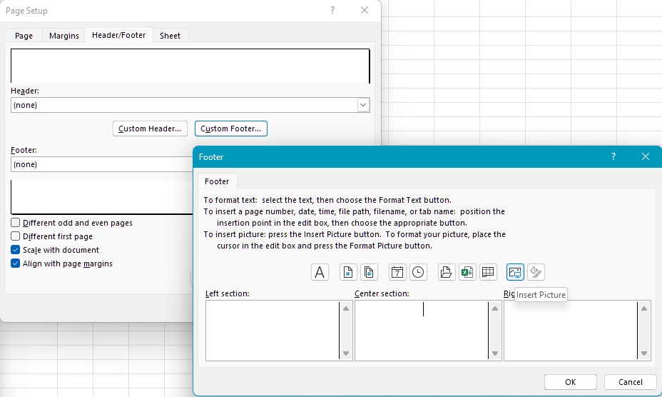
Check out the result using print preview:
Ta-da! You have inserted your logo! 😉
Think About Printing Your File
I’m sure that you know about Excel’s specific layout tools. If you need a reminder, go to this chapter in the Master the Fundamentals of Excel course.
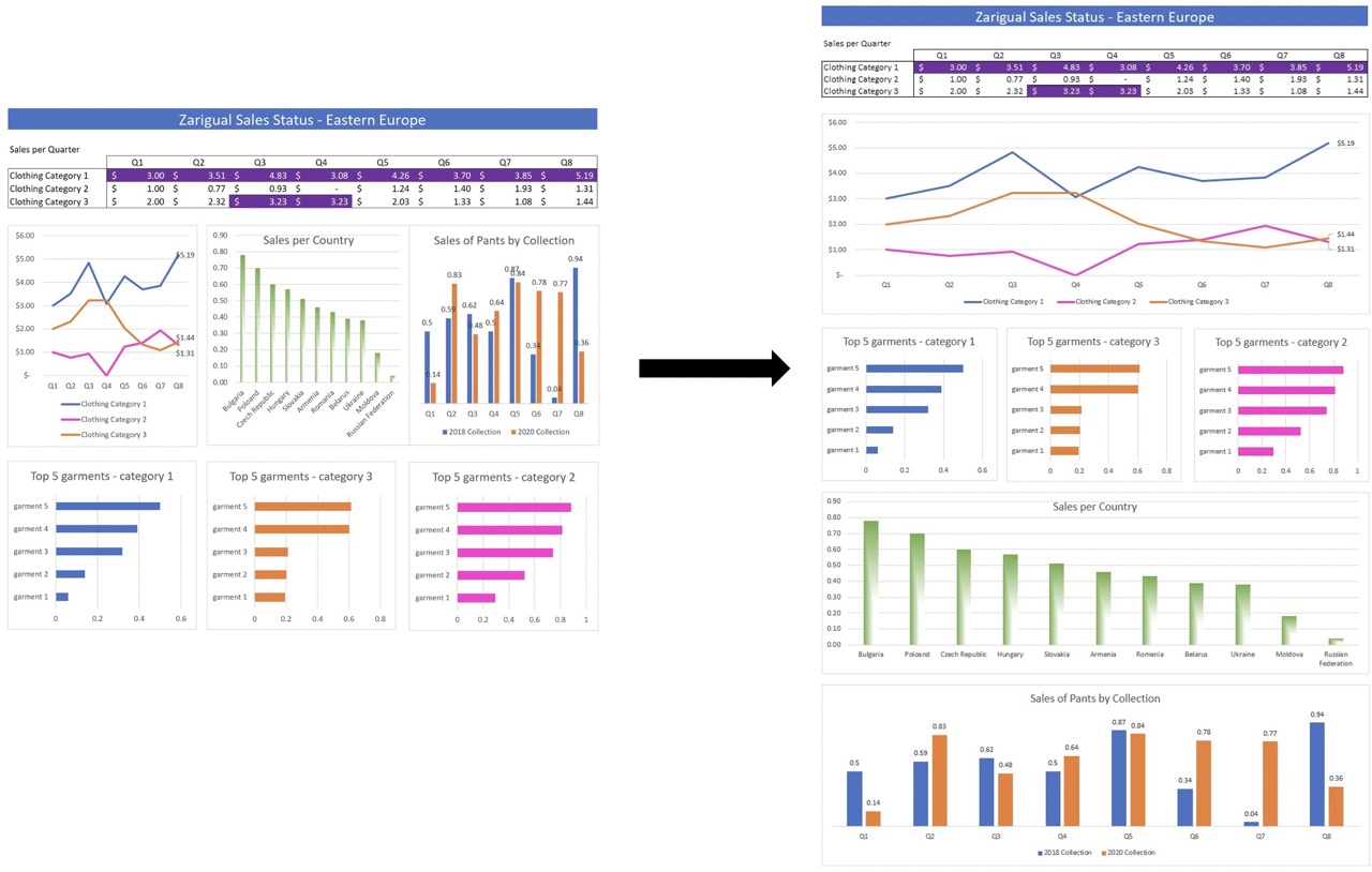
The most important of these tools is defining the print area. It should be adjusted to your model, and exclude any empty surrounding cells. Don’t forget to regularly make use of the print preview tool. You are looking for your model to fill as much of the print preview as possible.
It’s also a good idea to use a rectangular shape for your model, so that you can avoid having gaps around the model. This is crucial for:
ensuring that your dashboard is displayed clearly on smartphones, tablets, and computers.
avoiding big gaps when printing onto paper or presenting using a projector.
Still not convinced? Below, you’ll see the difference depending on whether or not the layout has been optimized: 😃
Over to You!
You have just created the first two tables to answer your boss’s questions.
Now let’s move on to the formatting! Download this file and do the following:
In the first table, set up conditional formatting to highlight the two biggest changes, where:
the biggest change is identified with a dark green background and a white font.
the second biggest change is identified with a light green background.
In the second table, set up a conditional format which defines the fill color as yellow, for any change which is less than the figure shown in G13.
Answer Key
You can find the answer key here and watch the video below to check your work.
Let’s Recap!
Define the main components that should make up your dashboard.
Set up conditional formatting for several criteria.
Add your company logo to the dashboard header or footer.
Optimize the model layout for printing and reading on all devices, using a rectangular format.
Your model is ready! The next step is to protect your dashboard so that you can share it securely. 😀
