Make Your Dashboard Easier to Read

Insert a Combo Chart
Charts communicate far more effectively than tables. Unfortunately, they take up a lot of space in a summary dashboard.
So, how can I make my table easier to read?
One solution is to combine information in a single chart! To do this, you can use a combo chart. Again, this is a two-step process:
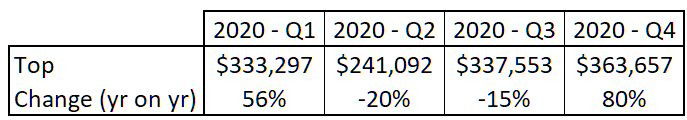
1. Prepare Your Data
You data must include:
a row of sales results (in dollars) for each quarter.
a row for changes in sales (as a percentage) for each quarter.
2. Create the Combo Chart
To set up the combo chart, go to the “Insert” tab and click on the “Combo Chart” icon  . Finally, select the icon for “Clustered Column - Line on Secondary Axis”:
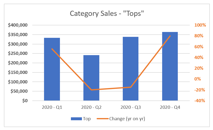
You have succeeded in merging two information types into a single chart, making it easier to analyze your data. 😉
Insert a Pivot Chart
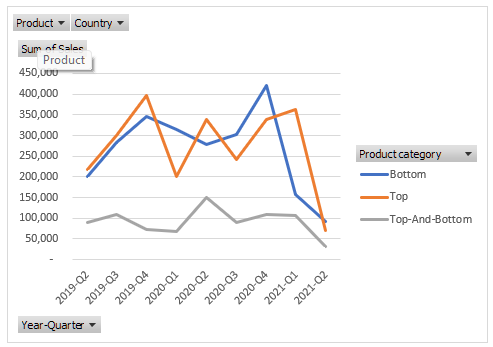
Another type of chart is available that lets the reader carry out a far more in-depth analysis. This is called a pivot chart!
This type of chart is different as, like a pivot table, the user can select values and filter them in real time. 😀
The idea here is to create a very simple pivot table consisting of sales by category and sales by quarter.
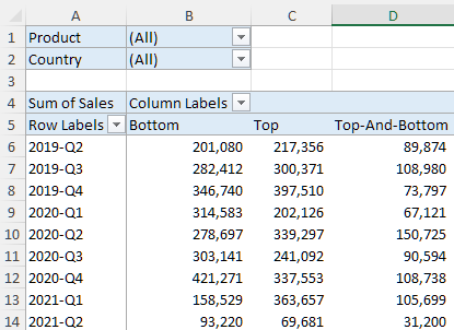
Next, select one cell from the pivot table.
Click “Insert,” then the
 icon.
icon.Select a chart type. In this example, a line chart seems like the best option.
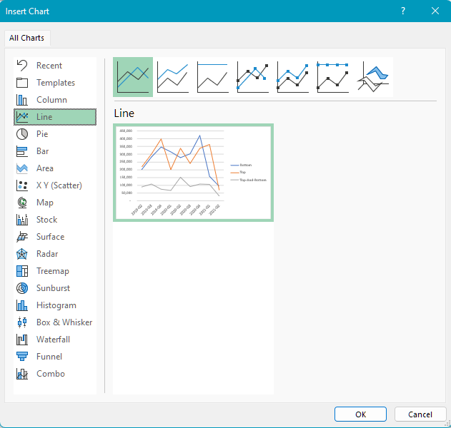
Click OK.
You have created your pivot chart! 😀
Use Specific Charts
There are many types of very specific charts, which will be really useful for answering your boss’s questions. Unfortunately, they are seldom used!
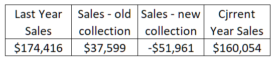
You can use a waterfall chart to answer the question “Are the 2018 collection pants selling as well as the 2020 collection ones?”
The purpose of this chart is to explain a change between two points, while separating the positive impacts from the negative impacts. In this example, the two points in question are:
Last year’s sales
Sales from two years ago
The positive and negative impacts are:
The change in sales based on when the product was released, i.e., products from the old collection and those from the new collection.
Prepare your chart source data like this:
Select the source data.
Next, click on “Insert” then the Waterfall Chart button
 .
.
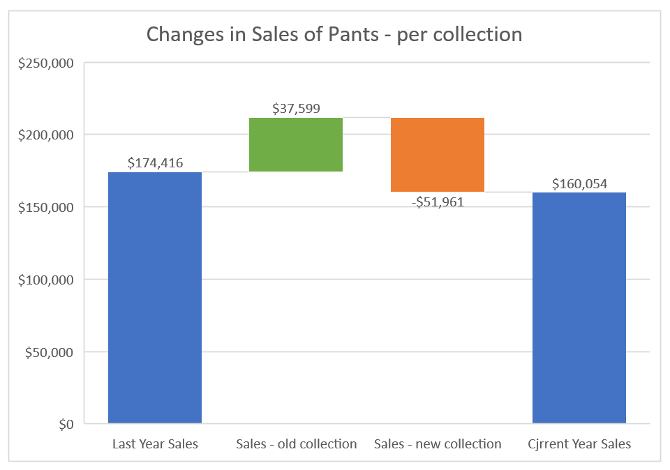
You get this result! 😀
Use Graphic Objects
Graphic objects, also known as SmartArt, form part of the Microsoft Office suite. They are used in Word and PowerPoint, too.
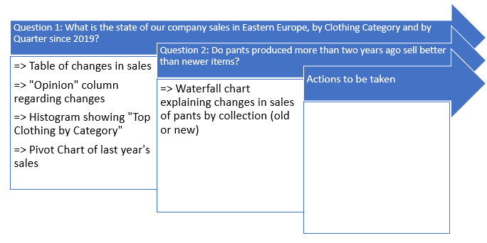
In this example, you can create a graphic object to explain how you’re going to answer your boss’s two questions:
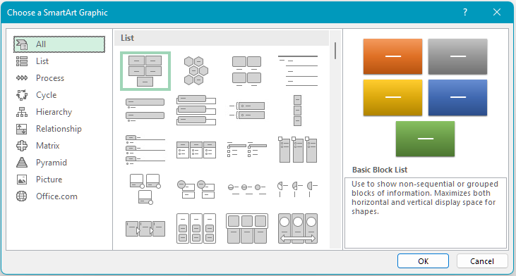
Go to the “Insert” tab, then “Illustrations,” and click on the
 icon.
icon.Choose the graphic which best answers your question.
Click OK.
Excel creates a blank SmartArt graphic. It is up to you to fill it in and to add or delete steps.
Here is one example of a SmartArt graphic to present our dashboard:
Over to You!
Download this file and do the following:
Create a pivot chart which presents sales for March 2021 by country.
Create a SmartArt object (Relations>Balance) to present the advantages and disadvantages of using a combo chart.
Answer Key
Look at the answer key and watch the video below to check your work.
Let’s Recap!
Create a chart which is a combination of a column chart and a line chart, to combine data on different scales.
Let the reader get involved in analyzing your data using pivot tables.
Visually analyze a change between two points, using a waterfall chart.
Use graphic objects to provide a visual response to the “Why?” and “How?” questions.
Congratulations!! You have completed your first professional dashboard! 🥳 So what’s the next step? Manipulating your dashboard data, of course! But first, test your knowledge with a quiz!
