Make Informed Decisions Based on Data
A Day in the Life of Data
To kick off this chapter on data, let’s review your typical day.
Hyperconnected and extremely online, you manage your active lifestyle from your phone and computer. You have accounts on Instagram and LinkedIn. In addition, you use several Google tools at home and work: your browser (Chrome), search engine, Google Maps, email, and calendar.
These tools help you be more efficient because they are very well designed and know you exceptionally well. That smartphone sitting in your hand is an expert on you and your habits! And it’s all thanks to data. Everything you do online leaves a trace, which can then be used by brands that are only after one thing: to get to know you better.
Define Data by Identifying its Uses
What is data? It’s the information traces left behind by your actions. Data is any digital information that can be stored and read by a machine.
We touched on this a bit earlier—you create data every time you interact with a machine. Some examples:
On websites: products you’ve viewed or bought, pages you’ve viewed, and how much time you spent on them.
On social media: your reviews, “likes,” what you’ve shared, etc.
In “real life”: the information stored on your credit card when you make a purchase.
OK, but who uses all this data, and what for?
Businesses or service providers: Processing data can help them better understand their users on a massive scale. This knowledge can then be used to make better business decisions.
Users: The stored data lets you quickly retrieve information every time you go online, like when Netflix remembers where you left off the last episode you watched or your preferred language and content.
In short, everyone in the value chain uses data.
In the digital world, data is the method used to collect, aggregate, sort, and interpret it. Why? To solve problems and make decisions.
Would you like to learn how anyone can use data to make better decisions? Then let’s go!
Apply a Simple and Actionable Methodology at Any Scale
Let’s return to the wellness coach to see how data works.
How can you use data to help decide between meditation 🧘 or yoga class 🤸♀️?
By following a simple methodology that requires no special skills:
1. Ask the Right Question
What do you really want to know? Be specific and ask a question requiring a measurable response so you can take action. In the scenario, the question, “Do my potential customers prefer yoga or meditation?” will provide a clear choice. This is more desirable than an open-ended question such as, ”What activity will best meet my coworkers’ expectations?”
Why is taking the time to ask the right question so important? 🤔
In terms of data, there is such a huge volume of information to process that you have to make sure the question is specifically targeted to avoid wasting time and obtaining useless results.
2. Collect Data
How do you collect data at your scale?
Test both of your options under the same conditions and over a set time. The conditions for each option must be as similar as possible (price, schedule, access, promotion). By eliminating as many variables as you can, you’ll get an answer to your original question: yoga 🤸♀️ or meditation 🧘?
This is known as A/B testing.
A/B testing? 😳
It’s a method used in the digital world to evaluate the performance of different versions of a product or service, while removing biases.
3. Visualize and Interpret
Enter your collected feedback in a spreadsheet, categorizing it as quantitative (a) or qualitative (b).
Let’s see how to do that with these two types of data:
1. Start with quantitative data (i.e., from your survey). Then use your numbers to make a chart.
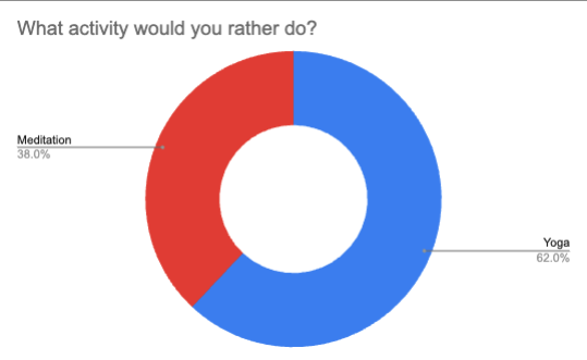
Keep it simple! In your opinion, which chart would best represent the distribution of your customer’s preferences for meditation or yoga?
|
|
Pie chart | Bar graph |
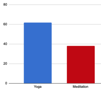
The pie chart on the left has a simple key and a straightforward question in the title. The bar chart on the right has no title, no unit of measure, no precise figures, and no clear distinction between the two variables. It’s easy to see that the one on the left gives you all the information you need at a glance, while the one on the right is unclear and forces you to think more. This is the key to a good graphic.
2. Next, analyze the qualitative data, like reviews and feedback. This means identifying any “verbatims” that are telling and finding the keywords and themes that come up the most frequently (i.e., using word clouds). In a word cloud, the more frequently a word comes up, the bigger it appears in the cloud.

Wait one second...a verba-what? 🥴
Verbatim is derived from the Latin verbum, meaning “word.” It usually refers to a complete, word-for-word retelling of a conversation or speech.
Getting back to our project: you have by now gathered lots of data from your test classes.
Let’s start with the quantitative data: The number of sign-ups, classes taken per person, cancellations, etc. With this data visualized in a simple bar chart, you can compare the results for both courses, yoga and meditation.
Then move on to the qualitative data: How satisfied your students are with the classes (i.e., a rating scale) and their opinions. What did they like about the classes? What did they think could be improved, changed, or eliminated?
Here are some common mistakes to avoid when creating a data visualization chart:
Overloading your chart (too much information gets confusing).
Not using a title that clearly indicates what the chart is about (or your message won’t come across).
Prioritizing visual style over clarity, making your chart harder to read (3D charts are infamous for this).
Choosing the wrong kind of chart (i.e., using a pie chart for something other than percentages when you should have used a bar chart).
Check out these examples of poorly visualized data to see what these might look like.
4. Take Action
You’ve just analyzed your results, and the most popular choice was the yoga class. Your yoga students show up twice as regularly and cancel less often. The qualitative analysis showed what people liked about the yoga class: the ambiance of the room, the equipment, the accessibility of the class, and the varied playlist.
Great job!🎉 Now the time has come to kick off your classes. Don’t forget to consider what you’ve learned from your data to ensure your product is the best. All that work you did will be for nothing if you don’t use it to make decisions.
But there’s still a long road ahead. You want your course to be as well suited as possible to your target audience, so continue to learn from your students, collect feedback, and improve!
Demystify Data-related Careers
I hope this course will help you feel less intimidated by data and realize that these principles are accessible to everyone.
The field of data expertise is exploding, and many new careers have been created, all in very high demand.
Some examples:
Data miner – the explorer: 👷♂️ Data miners go through a company’s data sources to seek out information. To ensure that data is collected, they have to be experts in data storage and processing and the “big data” platforms. Their role also involves sorting and categorizing data to lay the groundwork for data scientists.
Data scientist – the star of data intelligence:🧑🔬 With a combination of mathematical, statistical, and computer skills, data scientists leverage data to create new services or optimize existing ones. This is one of the most in-demand careers in data.
Data analyst– the data counter: 🧙 Data analysts are responsible for interpreting the information collected via different channels to aid company executives in their decision-making.
Let’s Recap!
Data is a term used to describe how information is collected, aggregated, sorted, and interpreted.
Today, every one of our online actions generates data, which helps businesses understand and analyze consumer and user behavior.
It’s essential to follow a basic method to make data-informed decisions:
Ask the right questions.
Collect data.
Visualize and interpret the data.
Take action!
The field of data expertise has grown exponentially. Many new careers have been created, and the industry is recruiting in huge numbers.
We’ve almost reached the end of this course. I’ve saved one of my favorite topics for the last chapter: the new ways of working that have the power to improve efficiency and well-being at work!
