Learn Data Visualization Best Practice
Understand the Power of Graphical Representation
Businesses all over the world today generate a huge volume of data, amounting to several dozen zettabytes (billion terabytes) according to the latest estimates. And this figure is only set to increase exponentially as data storage technologies evolve.
It’s essential for businesses to have the right tools to analyze this data to draw out actionable business insights (e.g., how buying trends change over time) and, on a more general level, to monitor different parts of the business with a view to identifying potential issues.
All of the libraries we’ve looked at so far are part of this toolset, but they do require at least some technical coding skills. However, most people who head up the strategy function within a business (i.e., the decision makers) don’t normally have this kind of background.
So, we need a tool to make data more accessible for these people, right?
Absolutely! This is what we call data visualization, or dataviz for those in the know. Data visualization is a set of techniques used to draw out key information from a large volume of data and present it in such a way that everyone can more easily understand it. This subject started to become more common in the business context during the 1980s, when companies realized that analyzing their data could be extremely helpful in decision making.
“A picture is worth a thousand words.”
Confucius
When we talk about different ways of displaying data, there are many options out there. These include, but are not limited to:
line graphs with a curve representing a change over time (such as demographic data).
circle graphs (much better known as pie charts), which show a proportional representation of data.
maps, if you want to display geographical information.
There are many other ways of visualizing data, but let’s take a look at some of the main ones in more detail.
Choose the Right Chart
Choosing the right chart will depend on the type of variables we want to show in our visuals, as well as the data we have available.
Display a Change Over Time
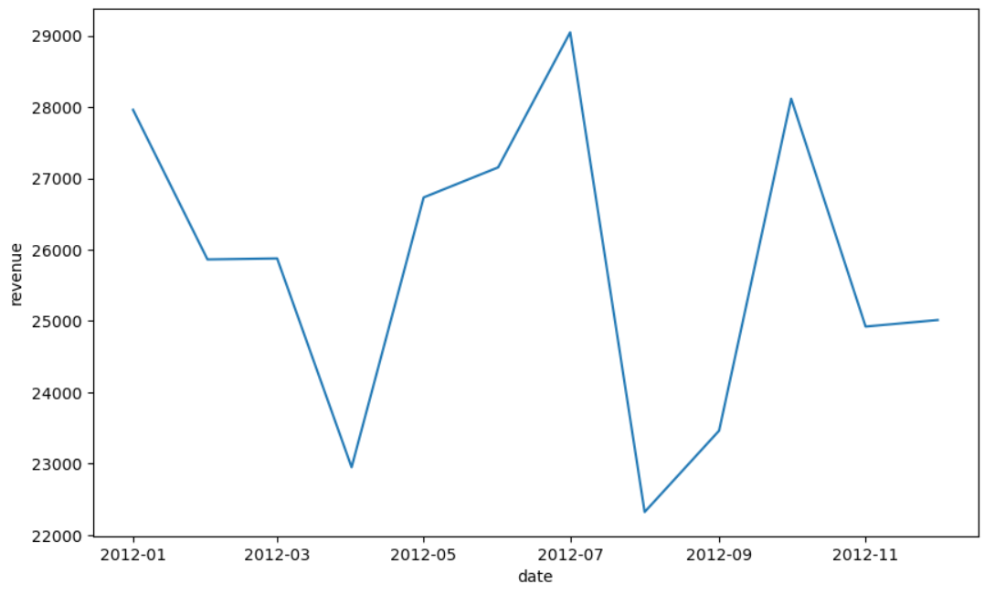
This method is used when we want to show how a numeric variable has changed over time. This implies that we only have one numeric value for each period of time we want to represent, e.g., per month, per year, etc.
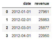
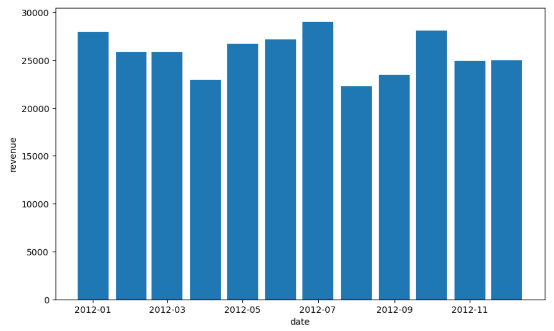
To display how a variable changes over time, we can use line or curve graphs:
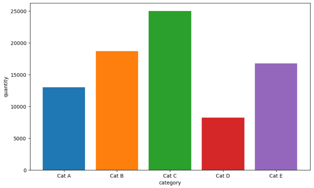
But we can also use bar charts:
Compare Different Groups
We generally use this type of chart when we have aggregate values for a non-numeric variable. So, we have one aggregate numeric value associated with a group or category:
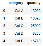
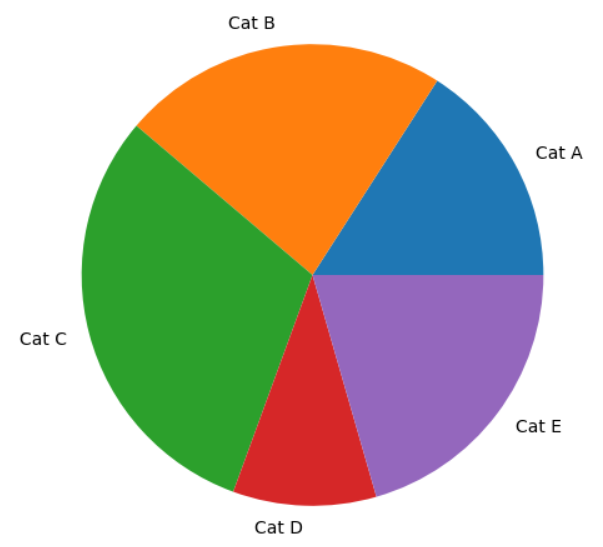
To display this data, we can use circle graphs, which are much more commonly known as pie charts:
But the ideal solution (as we’ll see a bit later) would still be to use a bar chart:
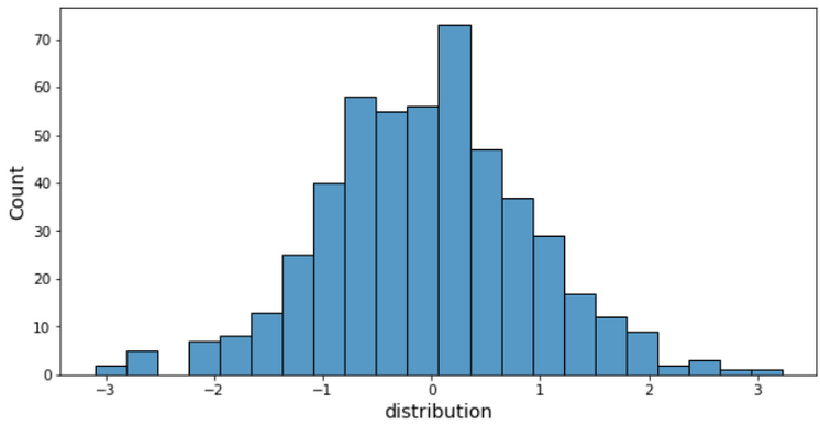
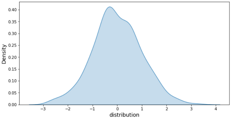
Display a Distribution
This type of chart is particularly useful when carrying out a preliminary analysis to understand the data we have available and how that data is distributed. There are two options, depending on whether we have numeric or non-numeric values.
For numeric variables, we would generally use a histogram:
There’s also another type of histogram, which is known as a density chart:
If we have a non-numeric variable, this is actually a type of visualization we’ve seen before. Because the first thing we need to do is aggregate our data to count the number of occurrences of a variable by category or group. Then we’re back to the comparison scenario we saw before, where we could use a pie chart or a bar chart.
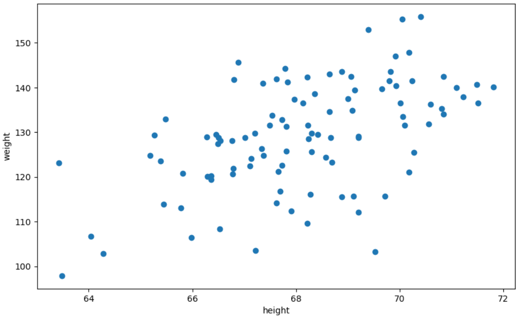
Show the Relationship Between Two Numeric Variables
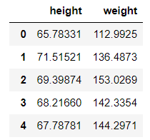
The final, commonly used option that we haven’t yet covered is a chart we use when we want to display the relationship between two numeric variables. The dataset we’d use for this would have a number of rows with at least two numeric variables on each row:
We can plot a number of points (one for each row in the dataset) with one of the variables on the x-axis and the other on the y-axis. This is what we call a scatter plot.
This is obviously not an exhaustive list and this course would be way too long if we had to cover all of them, but this is a reasonable selection of the main ones you’re likely to encounter.
Define Dataviz Best Practices
Now we have a number of different charts we can use, we need to define how best to create these visual representations, and this is what we call data visualization best practices.
This is a set of simple rules that we recommend you follow to ensure that your visuals are readable and easy to understand.
1. Opt for Simplicity
When you’re working on data analysis, you’re likely to be working with many data variables. It can be tempting to combine them all into a single chart with various colors, dot sizes, dot shapes, etc.
Here’s an example:
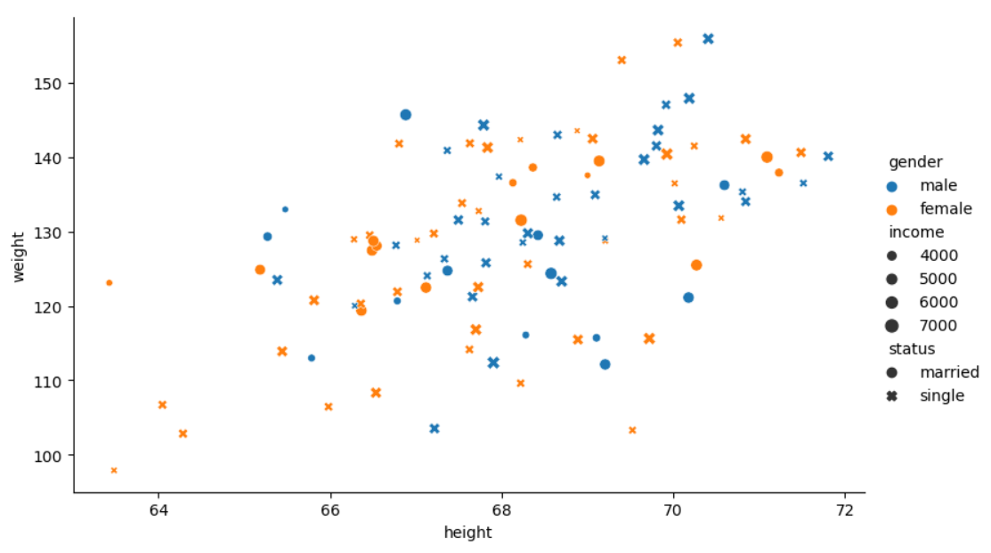
On this chart, we have five data items:
Height on the x-axis
Weight on the y-axis
Gender represented by color
Income based on dot size
Marital status based on dot shape
Phew!
You have to admit that even using the legend to interpret the chart, it’s still too cluttered with data. In cases like this, it’s better to create several charts with minimal data on each so that they’re quick and easy to interpret.
2. Make Your Chart Clear
There are so many fancy and complex ways of displaying data these days. You need to keep in mind that your primary aim when creating a visual is to ensure that it’s as clear as possible. In a way, the chart needs to stand on its own. Anyone should be able to read and understand it based on the information provided above and around it.
I’ll illustrate what I mean. Let’s take the following chart:
It might look pretty good, but what exactly are we talking about here? What information is being displayed? What does each bar represent? What does each color represent? There’s too little information for us to be able to understand it.
Now, what about this one?
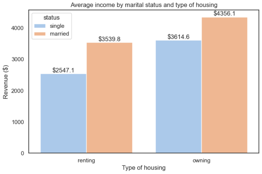
It’s exactly the same chart, but this time we have some explanatory notes to help us interpret the data. How did we do it?
Four elements:
Axis titles—we even provided the relevant units!
A legend to interpret the colors
A title to indicate exactly what we’re looking at
Values above each bar to add some precision
3. Choose the Right Chart
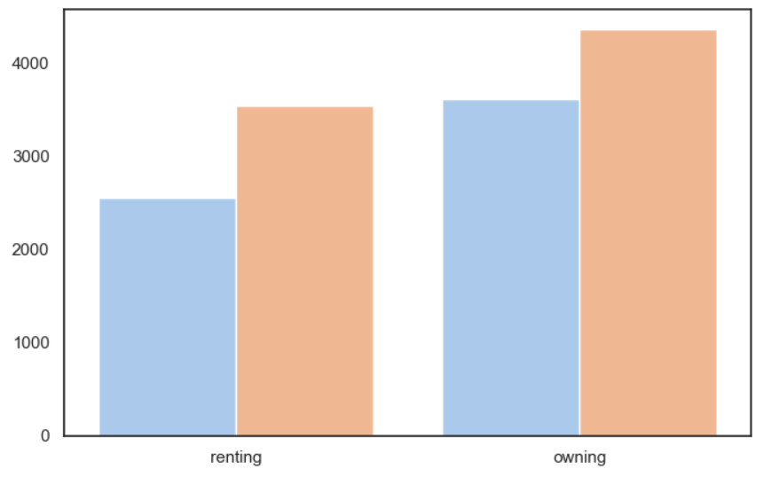
This follows on from the previous section, where we showed the different chart types. Let’s take the following chart:
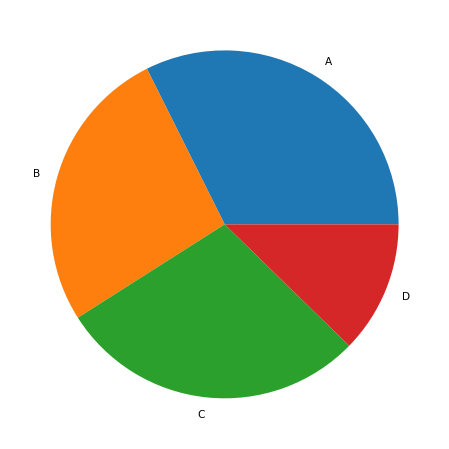
We have the stock quantity for each product category (A, B, C and D).
I can't immediately see whether B or C has the most stock.
It’s not particularly clear, is it? Let’s now display the same data in the form of a bar chart:
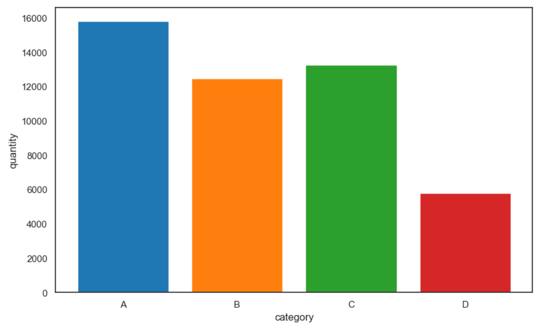
The difference between B and C is immediately clear—category C has a higher stock level than category B—despite the fact that we’re using exactly the same data. This is why a bar chart is generally more suitable than a pie chart if we have more than two groups to compare.
Let’s Recap
Data visualization is a set of techniques used to draw out key information from a large volume of data and present it in a visual way that can be understood and analyzed.
If you want to show:
a variable changing over time, choose a bar chart or line graph.
a comparison between different groups, use a pie chart or bar chart.
a data distribution, opt for a histogram or density chart.
a relationship between two numeric variables, create a scatter plot.
There are a few rules you need to consider to create an effective visual:
Opt for simplicity, even if it means you have to create multiple visuals.
Opt for clarity by providing all the information the reader needs to understand the chart on their own.
Choose the most suitable chart type based on what you’re trying to display.
Now we’re going to look at how to create different charts in Python using the Matplotlib library.
