Create Complex Charts Using Seaborn
Matplotlib provides many options to help you fully customize your charts. But it can be rather time-consuming fiddling around with individual elements to create an appealing visual. Also, you might find that one small modification can quickly turn into several lines of code if you’re not careful.
Identify When to Use Seaborn
The Seaborn library brings an alternative option to Matplotlib. It’s also a library that enables you to generate charts, just like Matplotlib. I think I’d go a little further and say that Seaborn is an overlay of Matplotlib.
Seaborn follows the same concept, only applied to Matplotlib. It’s a library that follows the same principle as Matplotlib, but with some add-ons to provide different chart styles and features. If you’ll allow me one final analogy, we could see Seaborn as a brand new car with a Matplotlib chassis and engine underneath.
So, what are these new features that Seaborn provides?
Seaborn has changed some of the defaults in Matplotlib:
It offers a number of high-quality, appealing, predefined chart templates by updating the default chart options in Matplotlib.
It has an added interface for DataFrames to make it much easier to use them to generate charts.
It offers a rich catalog of chart functions to satisfy the most precise requirements.
The trade-off is that Seaborn has fewer in-built customization options.
These two libraries complement each other so that you can make the most of the advantages that each has to offer. It’s a particularly harmonious relationship, which we’re now going to explore.
Get to Grips With Seaborn
With Seaborn being an overlay to Matplotlib, there are many similarities between the two libraries. Need a scatter plot? We have the scatter function in Matplotlib. And guess what! We have the scatterplot function in Seaborn.
Here’s how to use it:
import seaborn as sns
sns.scatterplot(data=loans, x='income', y='debt_to_income')
Let’s break it down to see how it works:
Firstly, we define the DataFrame we want to use to create the chart, using the
dataargument.Next, we just need to define the variables from the DataFrame that we want to use as the x and y axes.
Where Seaborn comes into its own is when we want to change certain elements, such as colors or dot sizes.
Let’s go back to the same chart and add a color to each variable type on the chart. In Matplotlib, we needed a loop to achieve this, but here’s the Seaborn code:
sns.scatterplot(data=loans, x='income', y='debt_to_income', hue='type')... which gives us the following result:
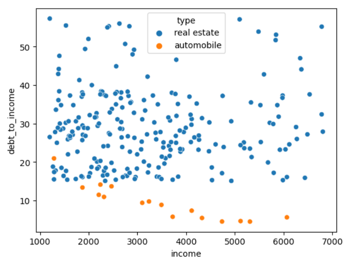
By specifying the variable using the hue argument, Seaborn automatically creates one color for each existing value of the variable.
Now, rather than the type of loan, we want to add information about the loan term. We can do this by linking the size of the dot to the length of the loan term:
sns.scatterplot(data=loans, x='income', y='debt_to_income', size='term')To finish off this chart, we can use the different Matplotlib functions we saw earlier:
plt.figure(figsize=(10,6))

plt.rcParams.update({'font.size': 14})

sns.scatterplot(data=loans, x='income', y='debt_to_income', hue='type')

plt.ylabel("Debt to income ratio")

plt.xlabel('Monthly income ($)')

plt.grid()

plt.xlim(500, 7500)

plt.legend(bbox_to_anchor=(1, 1.02))

plt.title("Debt to income ratio based on monthly income\nby loan type")

plt.show()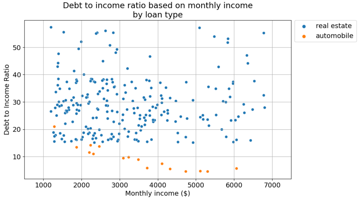
Let’s go through the different functions we used:
The
rcParams.updatefunction, with thefont.sizeargument, sets the font size to 14 for all elements (xlabel, title, legend, etc.) on all charts (not just the one currently being generated).griddisplays the gridlines.The tick limits can be set to between 500 and 7,500 using the
xlimfunction.The
legendfunction displays the legend on the chart. But the new feature we have here is the use ofbbox_to_anchor, which allows you to set the legend position outside of the chart by providing coordinates.
Aggregate Data With Seaborn
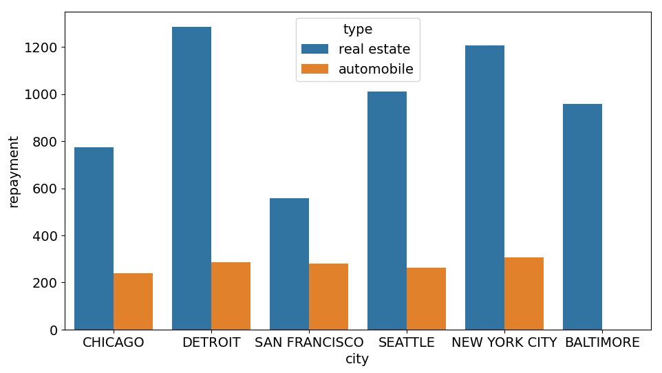
Let’s return to our bar chart showing branch sales revenue figures that we created before. With Matplotlib, we had to aggregate our data before we were able to plot our chart. The barplot function in Seaborn does this step for us directly within the chart.
plt.figure(figsize=(11,6))
sns.barplot(data=loans, x='city', y='repayment', errorbar=None, estimator=sum)
The first part of the code is similar to what we saw for the scatterplot function, but here we have two new arguments:
errorbar, which allows you to visualize the spread of the underlying data or the uncertainty of the estimate such as confidence intervals on each bar. If you set this argument toNone, these won’t be visible.estimatoris the aggregation function.
All of the arguments we’ve seen up to now will also work, e.g., the ability to use color to indicate sub-groups, for example:
plt.figure(figsize=(11,6))
sns.barplot(data=loans, x='city', y='repayment', errorbar=None, estimator=np.mean, hue='type')
... gives the following result:
Why not go ahead and try out these functions on your own, so you can see how Seaborn really adds value?
Improve the Appearance of Your Visuals
Well, I can’t finish off this course without telling you how Seaborn handles the appearance of your charts. I mentioned earlier that Seaborn provides much more appealing results than Matplotlib. There are two elements involved, and they are color palettes and themes.
Color Palettes
Color palettes represent a set of colors that we want to use in a chart. Of course, you can define a palette yourself, but Seaborn offers a choice of particularly harmonious palettes that you can use as you wish.
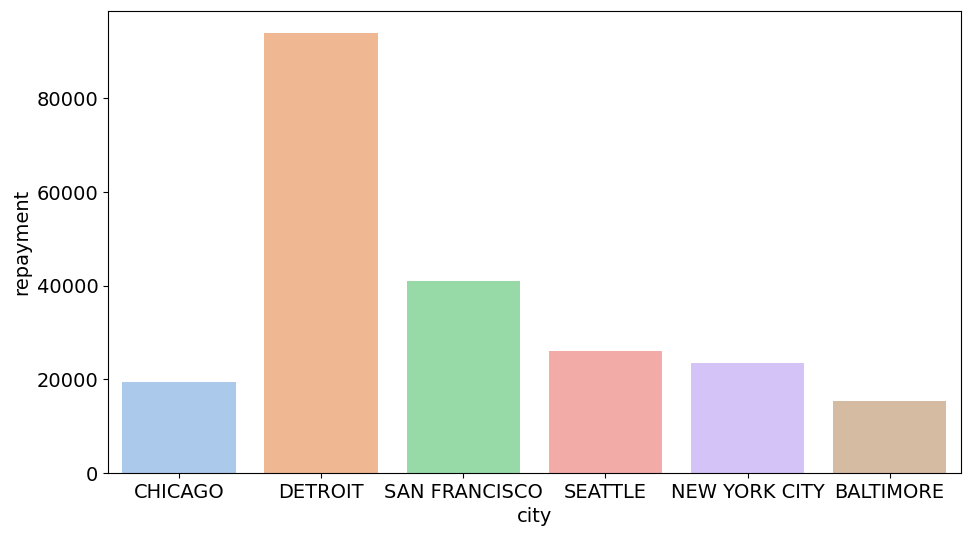
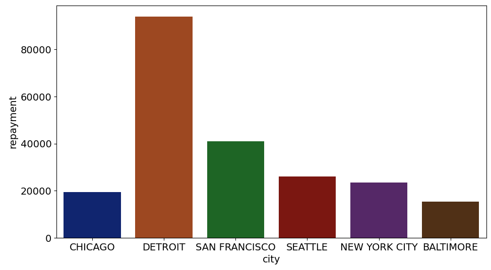
Let’s take our chart showing total revenue figures by branch:

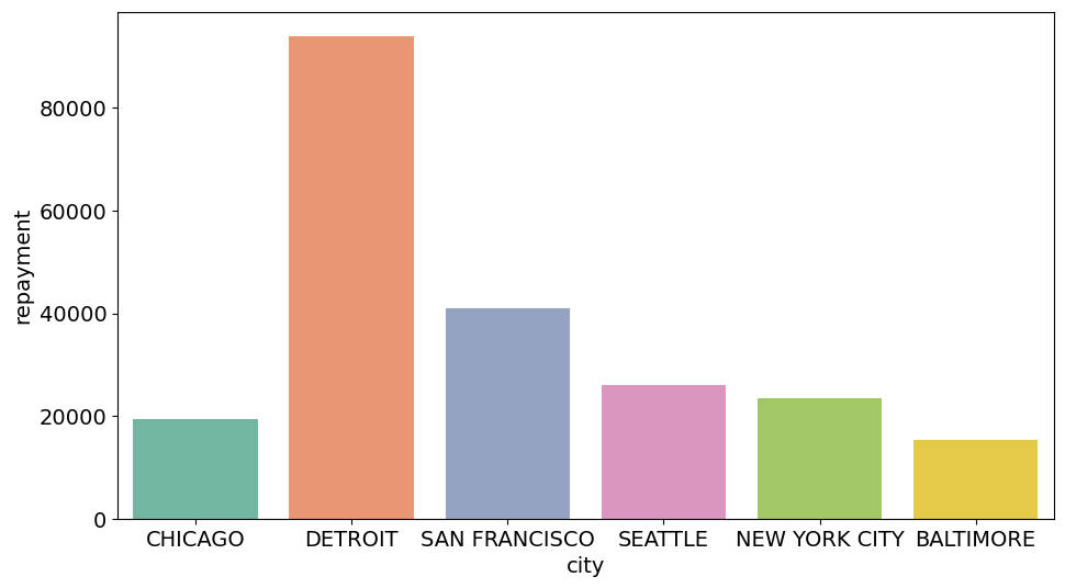
To set a new palette, we’re going to use the set_palette function in Seaborn. Let’s give our charts more of a pastel-colored feel: sns.set_palette('pastel') :
Or maybe a darker feel, using sns.set_palette('dark') :
There are also a number of palette sets available. Personally, I’m a fan of the second set sns.set_palette('Set2') :
Themes
Themes are a way of grouping together a set of predefined chart features (axes, background, tick style, etc.) that Seaborn has provided for us to use however we want. We can apply our theme of choice using the set_theme function.
First, let’s apply the default visual theme:
sns.set_theme()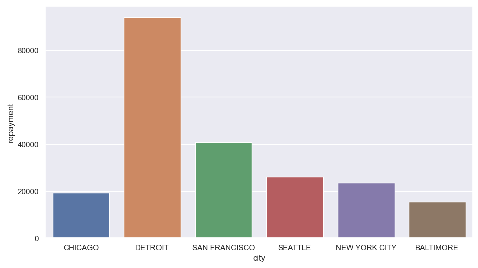
It already looks completely different, doesn’t it? We can even combine our chosen theme with a color palette:
sns.set_theme(style='whitegrid', palette='pastel')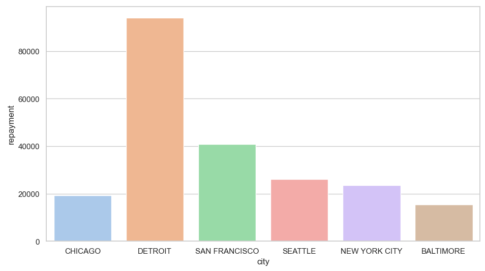
As well as fully incorporating DataFrames into the chart creation process, Seaborn makes it really easy to generate visually appealing charts. And if there’s part of a theme that we don’t like? No problem! We can use different Matplotlib functions to further refine our customization. These two libraries give us a complete set of tools to handle all our data visualization needs.
So, now’s the time for you to apply all your newly acquired Seaborn knowledge! The following exercise will let you do just that.
Over to You!

Background
The monthly reporting is usually created using Matplotlib. Your task is to improve the visual appeal of the report using Seaborn.
Guidelines
Your objective is to re-do the work you did previously, but this time using Seaborn. As well as creating the charts, your manager has snuck in some additional requirements to add certain elements to the charts.
Head over to the exercise and see how you get on.
Check Your Work
Great stuff! Why don’t you compare your answers with the solution?
Let’s Recap
Seaborn is an overlay to Matplotlib, which means you can combine functions from both libraries when working on a single chart.
Seaborn was created to make it easier to generate visuals from Pandas DataFrames. This approach enables us to add as many different features (color, shape, size) as there are variables in a DataFrame.
Seaborn brings a whole new aesthetic quality to your charts by letting you change themes and/or color palettes.
Well done! You’ve reached the end of this course. But before you go, I suggest you finish off this part by testing your knowledge in our quiz.
