Shape the Conceptual World
Creating experiences involves constructing a universe around a product, which comprises everything from functionality to look and feel, including how the user feels.
Designing conceptual models
Mental models reflect thoughts and expectations, while conceptual models are the worlds and interfaces created by products. Understanding mental models helps create conceptual models, or the worlds in which experiences take place. Mental models can help inform decisions around information architecture, navigation, and user flow (the steps users take to accomplish a goal). Susan Weinschenk defines conceptual models as "the model that is given to the user through the interface of the product." Interface design involves determining what the different components of a website look like, and their placement. We'll explore more specifics of interface design in the course Design the Visual Side of Experiences.
Let's consider the conceptual worlds of Apple and Android smartphones. Both serve the same purpose, but the two platforms and their interfaces are quite different. If you're an iPhone user, you may struggle to complete simple tasks on an Android phone, and vice versa. This is because each platform has created its own world and established a unique way of doing things. Each product has its own conceptual model: buttons, interaction and interface design, features, functionality, and even a unique language for talking about the product. For instance, a "floating action button," is unique to Android. Through your mental model, you may be able to figure out how the other operating system works if you're using it for the first time. However, You may get stuck during certain interactions due to the conceptual model.
When expectations don't meet the reality of how something functions, it is deemed "not intuitive." The goal is to design experiences that align with user expectations. When they do match, users will typically experience the feelings of joy and delight. When they don't match, it can result in a frustrating experience. If it goes really wrong, they may never use your product again. 😱
When designing a conceptual model, you have the option to design around existing mental models or to create a new conceptual model. The challenge in creating your own conceptual model is that you need to teach users how to use your product quickly, without losing their focus or attention. When smartphones were first introduced, they presented a new conceptual model, replacing physical buttons with touch screens. In this situation, the designer needs to consider how tutorials, how-to's, videos, in-line hints, or content strategy can be integrated in order to communicate how something works and why it is valuable.
Integrate the Gestalt principles
In the words of Don Norman, "attractive things work better." This, of course, is not always true. There are plenty of products on the market that look beautiful but have a poor user experience. What Don Norman is trying to say is that when a product looks good, it's often perceived to work better or to be a higher quality product.
One way to help ensure that layouts are effective for users is to integrate the Gestalt principles of visual perception. (See the course Create Simple Prototypes with Wireframes).
Gestalt means "shape" or "figure" in German. The way the information, elements, and forms are arranged or placed influences the way content and information is interpreted by the viewer.
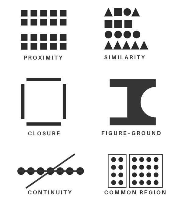
Gestalt principles can help us consider whether or not:
Button placement is intuitive.
Labels, titles, and captions are well-aligned.
Elements are consistent throughout the entire site (one thing you can consider doing is a "button audit" to see how many different kinds of buttons are on the site).
Information is grouped in a way that makes sense to the user.
Lines or shapes are needed to separate information.
Users know where to look on the page (in other words, users easily find the most important information).
Every project will not integrate every principle, and principles can exhibit themselves in different ways. Here's a checklist you can keep in mind when designing:
Proximity – are elements that go together placed next to each other? Will the user be able to guess what happens next when he clicks a button? Is there enough spacing between paragraphs to show when ideas are related vs. a new idea is being explored?
Similarity – are elements consistent throughout the product? This could be typographic, the way color is used, the size of buttons, etc. Too many things going on at once can be confusing to the user.
Closure – if information is hidden from the user, is it obvious what is being communicated? (When in doubt, do a usability test!)
Figure ground – does your eye know where to look first? Sometimes when everything is the same size and there is no space, the user doesn't know what they should do first.
Continuity – do ideas and UI elements connect within pages/screens, and across pages?
Common region – is information organized in ways that make sense to users? Explore mental models if you're not sure. Can using a box or different visual treatment help make it stand out or differentiate it from other content?
By conducting usability tests, you can ensure that your layouts and design make sense for users in context as well! Tests can provide useful insights for both UX and UI designers before a product has launched, and as you work through improvements.
The psychology of emotion and color
Color is a key tool designers use in UI design. Talking about color can be slightly problematic, because it holds different cultural associations in different parts of the world and is hard to measure. We'll look at a few different approaches to color in this chapter, and we'll explore color on a more practical level in the course Design the Visual Side of Experiences.
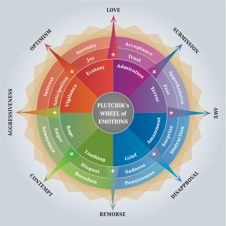
According to the field of psychology, humans can experience 34,000 kinds of emotions. Psychologist Dr. Robert Plutchik has proposed eight primary emotions that serve as the base for all the other emotions we feel: joy, sadness, acceptance, disgust, fear, anger, surprise, and anticipation.
Still, emotion is something that is hard to measure. What is most important in UX is the general feeling of the user.
You can attempt to design for these emotions, but it is not until you see the user interacting with the product that you can fully grasp the feelings associated with the interactions you've designed. Furthermore, you cannot assume that all users will have the same reaction. Therefore, usability testing from the start of a project—and throughout—are valuable.
Color is one way to help guide the emotions behind the user experience. Colors carry meaning, give impressions, and have associations. They can be used to communicate message and tone.
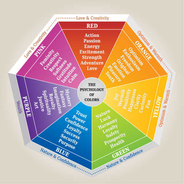
In general, avoid assigning universal associations between color and emotion. Aside from varying cultural meaning and associations (white can mean purity in some cultures, and represent death or mourning in others), color can also be linked to unique personal experiences, psychologies, and even physiologies. If you refer to color charts like the one below, use it as a guide but not as a fixed rule.
Also note that, even within a single cultural context, a color can have multiple, sometimes contradictory associations. Therefore, a single color can have different effects on a single user depending on how it is used in design. For example, the color red can be associated with joy and passion, but it also has an association with danger and anger; similarly, the color blue can signify transcendency and eternity, but also depression. This is important to consider.
Consider wedding websites. For a North American audience, whites, cremes, and pastel colors may be dominant. However, for an Asian audience, red may be the principal color. The context and audience you're designing for are important! A westerner may be shocked to see red in a wedding whereas it's normal for other cultures.
Check out these resources to go deeper into color:
Color in design influence user's actions from Tubik Studio
The history and psychology of color from Canva (they also have a fun color picker)
Why color matters by Jill Morton
Final thoughts
Conceptual worlds can reflect brand values and serve as a way to connect with people. Color is a key way this is achieved. The conceptual model can have a powerful emotional impact for users and customers, helping to shape their perceptions while building credibility and trust.
Start to observe which colors are most prominent in the products you use regularly.
Let's recap!
Mental models reflect thoughts and expectations of how we think something will work.
Conceptual models are the worlds and interfaces created by products.
Two products can be in the same product market, yet reflect different conceptual models.
When Don Norman says, "attractive things work better," he's referring to the power of perception.
Gestalt principles of perception help users understand associations and information from how they are organized.
Colors carry meaning and have associations. (However, those meanings and associations vary.)
In the next chapter, we'll examine how social influences impact trust when designing experiences.
