Discover the concept of a mockup
A mockup is the equivalent of a printed version of your website that allows customers to see all the visual aspects of the proposed site, the overall layout, details such as colors, fonts, some images, icons, logos, and the list goes on!
Imagine printing out a website... before the website itself has even been built. Mockups are created after a thorough study of a client's needs, a process which is often accompanied by something called a spec sheet.
A spec sheet is a document that lists customer needs as well as the eventual process you'll adopt to end up with a final result. It is extremely important to have one to make sure that you and your client are working towards the same goal.
The mockup and spec sheet combination is great because it allows the customer and developer to be very much on the same page in terms of project and planning. For developers, this is especially great, since many of the important website design and layout choices have already been made!
A mockup itself is made by a designer, someone who's well-versed specifically in web design. More specifically this might be a UI designer. The tools they use most are Photoshop, InDesign, or Sketch.
Once a mockup has been made, it's really the starting point for the developer building the site. In fact, the first task for the developer will be to translate the mockup into the languages of the web: HTML and CSS. The developer will also need to discuss interactive elements that will require JavaScript with the designer who made the mockup to better understand the way the page will behave.
HTML: the general structure
The first step after receiving a mockup is to deconstruct it into an HTML page. You'll start by breaking down the elements that compose the header, the page body, and the footer if there is one.
Once you have the HTML structure of the page layout, you can then move on to complementing it with CSS.
CSS: decorative elements and styles
A common mistake when getting started with mockups is that people often do everything style wise by putting together a bunch of exported images when in fact you can use CSS to do the same thing.
For example, let's imagine that we're working on a mockup that has a title and a double horizontal rule that appears on both left and right sides of the subtitle:
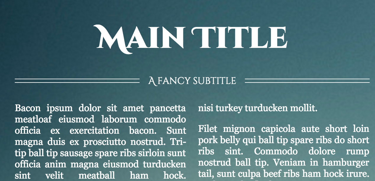
Source: http://codepen.io/chriscoyier/pen/zDGkw
Your first reflex might be to export the double bar as images. This is much faster and more flexible in CSS!
Why should I bother to write a bunch of CSS when I can simply export images and get the same results?
Understandable question! Since your mockup is an image, why not just make your website an image too? This isn't a good idea though. Firstly, let's go over the importance of responsive design, meaning that a webpage should be able to look good on any device (cell phone, tablet, computer, etc.) without taking a hit in terms of performance. With so much web traffic coming from smartphones these days, you want to make sure that your website looks just as good for mobile traffic as it does on desktop.
What does this have to do with CSS and images? An element handled with CSS can better respond to different screen sizes, which is not the case with images.
In the above example, I'd want to get rid of the horizontal bars (or at least reduce their size) when the user is looking at the page from a mobile device. If these elements were images, you would need to ask for multiple versions of the same image just to compensate for the possibility of someone viewing your website at a certain size. If one day you wanted to change the color of the bars, then you would have to start all over again! On the other hand, controlling the appearance of elements with CSS lets you spend only 10 seconds to make this kind of modification.
Lastly, an image takes much longer to load than a stylesheet in CSS. Think of two very important parties on the web: your users and Google. If your page takes longer than three seconds to load, you've already lost the user who values speed or is on a slow connection.
Optimize images
There is still some content that you can't handle in CSS, like logos, icons, and photos. Again, you'll also need to think about adaptability and speed. An image format called SVG is a great choice for your logos and icons. It's a vectorial image format that will never become pixelized, no matter what screen size a user has. The format is also lighter than your classic image.
Ultimately, you should only have images for actual photos on your site (and those should be in PNG format).
Ready to get started? Let's go!
