Analyze dimensions and sizing
Integrating a mockup means you will have to copy exactly what you see and translate it into the languages of the web. Each pixel counts! This is why element sizing and proportions between elements are so important.
We mentioned before: the mockup of your site probably looks great for a computer, but you have to think about how it will appear on a smartphone or tablet.
Does this mean I'll have to make additional mockups? How do I manage the position of each element on screen sizes that fall somewhere between two different devices? For example, what if someone is using a device that has a 500px width when my mockup was made for a 480px width?
Don't worry; it's not necessary to create new mockups for these situations. As for dimensions that fall somewhere between two values, no fear. You'll see in a few minutes!
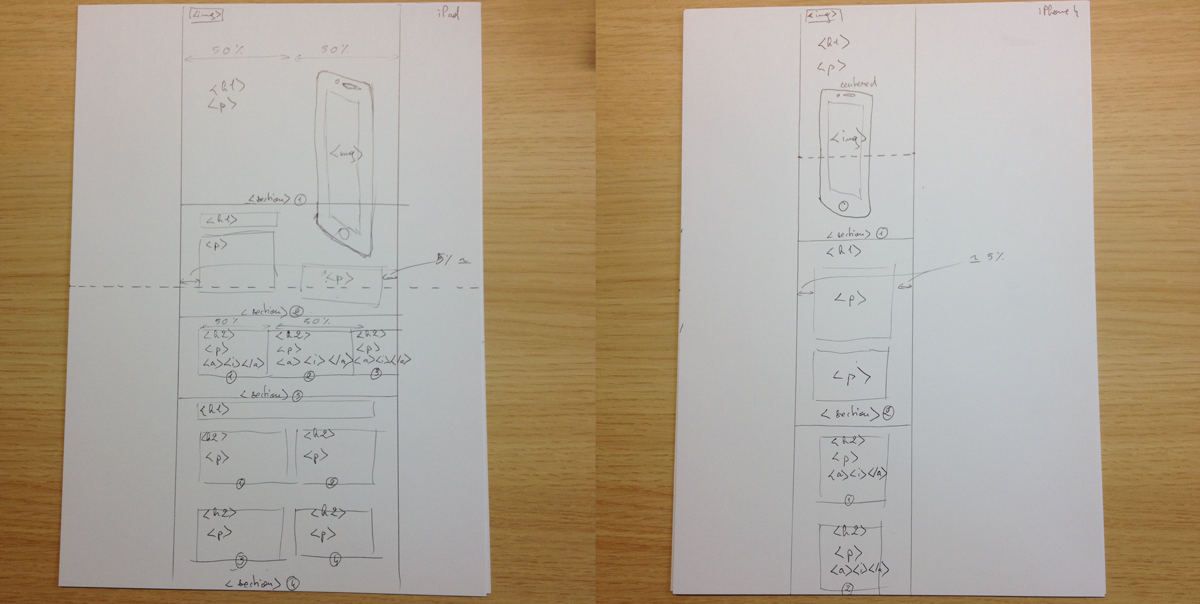
Let's start with a little drawing. We can make one for a smartphone and one for a tablet. The goal will be to organize elements in the mockup for smaller screens as well as medium-sized screens, for example that of a tablet. Get out your pen and paper again and organize the elements like you're putting together a puzzle!
There we go!
Now let's look at a element positioning for screen sizes that fall in between small, medium, and large. We are obviously not going to make a drawing for every possible screen size in the world. Instead, we are going to define a breaking point. We will decide at which size point the organization of certain elements will change.
In general you have breaking points for:
Very small screens (< 768px: for screens with widths between 0px and 768px)
Tablets (768px - 991px)
Computers (992px - 1199px)
Big screens and TVs
Let's take an example and use the breaking point of very small screen sizes. From 0 to 768px, <h1> and <p> will be below the image. Above 768px, the title and the paragraph will be next to the image.
The goal is to think about proportions rather than pixels, as well as how it all might fit into a grid. Each element in the grid takes up a certain number of columns or a certain percentage of space, for example six columns out of 12 means an element takes up 50% of the page width. You could make this true no matter which screen size a user is on. This means you don't need to take down exact pixel measurements for each element you're dealing with.
Let's have an example. This text:
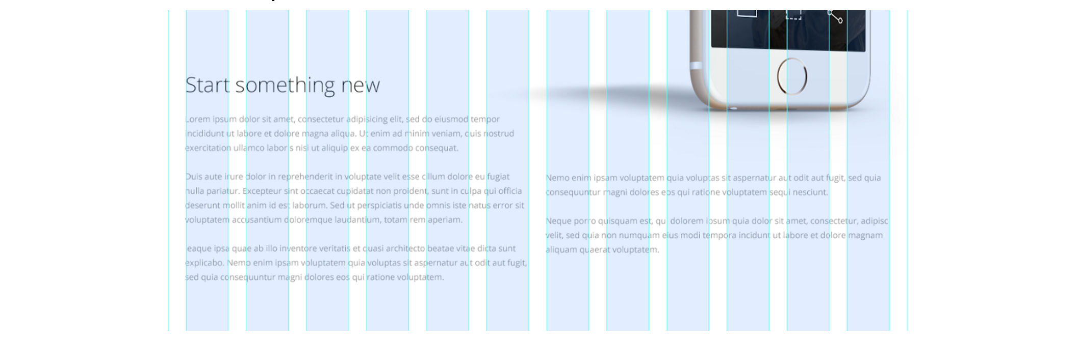
You can notice invisible columns, one on the left and one on the right. If we use a 12 column grid, the text on the left will take up six columns worth of space out of 12. The same will be true for the right.
Therefore, each of these columns will take up six columns of space out of twelve columns.
When a user visits this page from a mobile device, each element will take up to 100% of the screen width. They will see the title first, followed by the paragraphs of the invisible column on the left and on the right. This content might actually be easier to read, since it will appear larger on a smaller screen size.
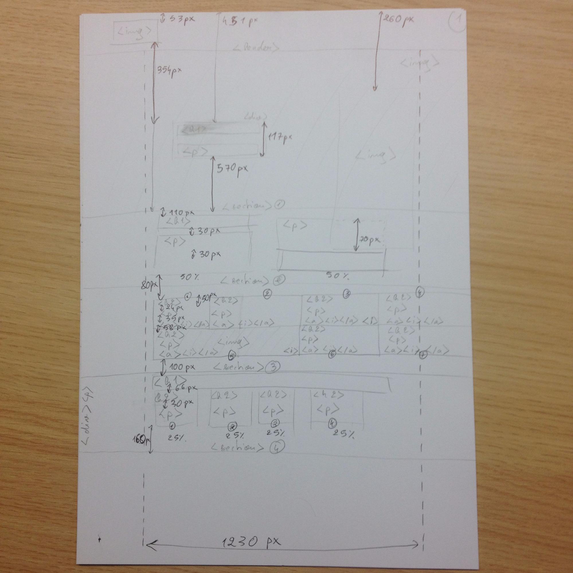
There's still one element that you need to take notice of in pixels: the width of the grid! Since the grid width is objective, not relative, it cannot be defined in percentages.
Go back to Photoshop and select the ruler tool in the left hand column. Slide your cursor to measure the space between the leftmost and rightmost lines of your grid.
Next look at the value that shows up in the upper bar: 1230 pixels. Write this down on your pen and paper drawings so that you can remember it!
Vertical dimensions
We've talked a lot about elements within columns, but how do you measure elements in terms of height? Can we still think in terms of percentages?
Yes, but this is not very useful. If we wanted to do them in terms of percentages, we could. You would need to measure the total height of the page, plus the desired height of the elements within the total page height, and find the proportion between the two. This gets tricky when you think about how the content of your page might change, which would throw off all of your vertical dimensions. Instead, it is better to think in terms of pixels for vertical dimensions.