Refine Page Layouts
The ways text is organized on a page can help break up the monotony of a layout and make it more engaging for the reader.
Consider the following design decisions used for headlines, sections, paragraph copy and descriptions:
Size and scale. In general, the largest element on the page is going to be what your eye goes to first. For a résumé it makes sense that the name of the person should be the most prominent.
Group information. Think about what information goes together. For a résumé it makes sense that the name and contact information are all in the same “box”. Similarly for each job experience, you can add additional space between each item, so that it is visually grouped together. Just make sure you're consistent with how your using spacing throughout the document.
Hierarchy. Not all content is created equal. It’s one thing for a page of a book to all be set in the same type, but in that case the cover is key to getting you to open it. For a résumé you need to think about which information you want a potential employer to see first. Those starting out on their professional path will likely put education at the top of their résumé, while someone with more work experience will move education to the bottom. It’s important to think critically about the flow and order of content. Another way to establish hierarchy is to add section headlines, such as experience, skills, awards, education, interests, etc.
Emphasis. Giving different typographic treatment can make the content easier to read. Think about a job description on your résumé. The title is more important than the dates you worked there. It may be interesting to include the location, but again, that doesn’t need extra emphasis (perhaps, it’s in italic, or a lighter shade of grey, or a smaller size).
Margins and white space. Many documents look the same, and quite frankly generic and boring because of that. For a document like a résumé consider using a wide margin to welcome some white space on the page. It not only gives the viewer’s eye a break, but it also has a practical function of being a place where the interviewer can take notes, or write questions.
Consistency. Use size and spacing to highlight certain information, but make sure you do it consistently throughout the document, or at least for each section. The same goes for your font choices.
Think like an editor. Design is a process. Revisit text and content as you work through design and layouts. What seemed necessary at the start of a project may no longer be relevant as the layout helps communicate the story. Similarly, for documents like résumés you want to work on including succinct explanations and avoid excess copy and long descriptions.
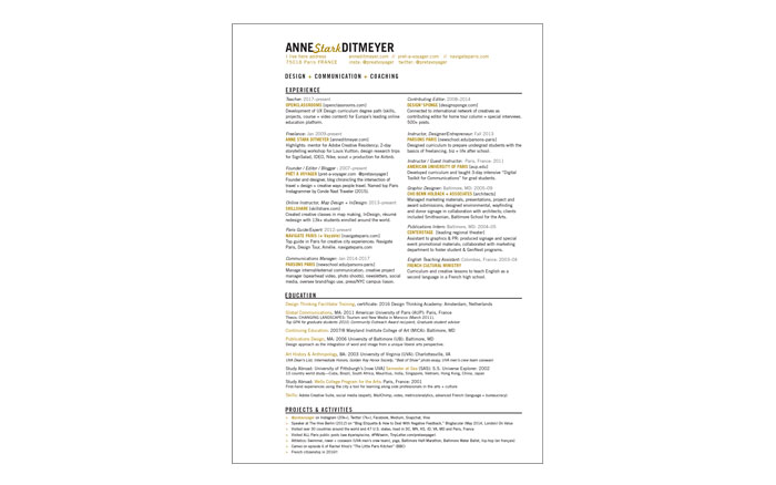
On my résumé I like to have a wider margin on the left in order to create a more dynamic page design. It also has the practical function of leaving the interviewer a space to write notes! A large margin is also a good example of "white space" in design. Remember you don't have to fill the page with content. By viewing it at a small size you start to be able to see which pieces of key information stand out for the viewer. My next challenge is to consider if all the information is necessary, and try to cut as much as possible. Keep it simple!
TIP: Limit yourself to one or two fonts, and one accent color. This ensures you're focusing on the content as a design element. Be careful using a color like yellow, which may not read well on some screens.
