Table des matières
- Partie 1
Communicate Your Ideas Visually
- Partie 2
Explore Graphic Design Basics
- Partie 3
Engage your audience
Table des matières
- Partie 1
Communicate Your Ideas Visually
- Partie 2
Explore Graphic Design Basics
- Partie 3
Engage your audience
Create a Dynamic Presentation
Now that we've see the importance of having the right presentation mindset and thinking about what story you want to tell, let's look concretely at how we can create a dynamic presentation.
Rethinking PowerPoint
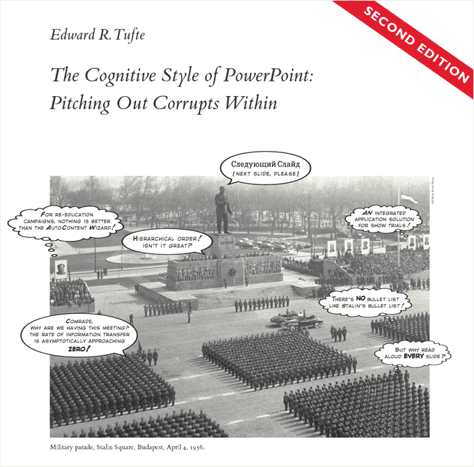
Edward Tufte is an American statistician and professor best known for his work on information design and data visualization (we'll revisit him in a future course). One of his popular essays is on “The Cognitive Style of Powerpoint” and questions a lot of the features and uses that have become all too common, from long lists of bullet points to flashy graphics which may look good at first glance glance, but ultimately "chart junk" (information designed to look good, but isn't effective at communicating a clear idea.)
View “The Cognitive Style of Powerpoint” on Edward Tufte's website to fully appreciate the thought bubbles.
In Tufte’s own presentation style he believes that Powerpoint should only be used as a tool for projection (aka putting images into a slide show and projecting the slideshow on a wall). His arguments include:
it's boring to listen to someone who is reading you exactly what's on their slides
if someone is too busy reading the slides they’re not listening to you
information gets lost in bullet points
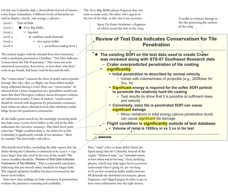
He uses the example of slides from the Columbia space mission to show cluttered slides with unclear information, noting the vast amount of information on a page, excessive hierarchy, and confusing language.
 Example of an ineffective PowerPoint slide from Edward Tufte. [scroll down linked page for more]
Rethinking slides
We've seen some examples of bad slides, and no doubt you've suffered through some yourself. What are some alternatives to dry, dense slides with bullet points? How can we design better presentations, and better experiences?
Google has recently taken on a visual storytelling approach to presentations rather than bullet points. In the 2017 Keynote below, notice the large amount of white space, simple graphics, and use of storytelling to get the audience excited.
Google CEO Sundar Pichai's Google I/O 2017 keynote. (The 10 minute edit is above, or watch the full presentation).
Check list for creating slides:
Limit yourself to one idea per slide
Consider how you can use one image to tell the whole story
Select a clear, legible type
Use quotes or soundbites of text rather than long paragraphs
Use enough contrast for someone in the back of the audience to see what you're projecting (even when the quality of the projector may not be the best)
Presenting with creative constraints
The word "presentation" tends to have a serious connotation, but that does not mean presentations need to be boring! Presentations can be FUN too! One alternative format for presentations is known as PechaKucha. The format was imagined by Astrid Klein and Mark Dytham in Tokyo. They loved learning from others but felt architects talked too much, so they wanted to create a way where they – and any creative field – could learn from each other, but in a way that didn’t have to go on and on and on.
The 20x20 format is 20 slides for 20 seconds each which are set to automatically advance. The total time of every presentation is 6 minutes and 40 seconds – short, sweet and succinct! These "creative constraints" are a helpful tool for making sure you get to the point without rambling on forever. To this day there are PechaKucha nights held around the world, but also it can be a format used in any situation.
Ignite are another variation of this, with the mantra "Enlighten us, but make it quick!" For Ignite presentations presenters get 20 slides that auto advance every 15 seconds for a five minute presentation.
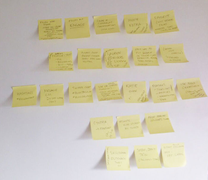
 Sticky notes can be a helpful way to think about and organize ideas for your presentation.
 This is a storyboard style sketch of lecture slides I put together in the past. Unlike sticky notes, it's harder to move ideas around.
A few ideas for cooking up your first presentation:
Write an outline of key themes and ideas (limit yourself to 4 or 5 main points – less is more!).
Storyboard the key moments in your presentation.
Use small sticky notes and write one idea on each. Move and rearrange them as you start to think about how you want to tell your story.
Use a digital tool such as Trello to explore different ideas and move them around until you find an order you're happy with.
Sketch out a series of rectangles [slides] and ideas on a piece of paper (if you need to you can always cut it up later and move it around).
Mini challenge
You never know when you may be asked to present at an event! It's nice to have a "go to" deck you can refer to rather than starting at zero. (Of course, any presentation deck will need to be updated over time.)
Here's your challenge:
Create a PechaKucha style presentation with the theme "Past/Present/Future". The context is a presentation at "meet & greet" style event – it's rather informal, but you know you could meet potential contacts for future jobs, so you want to impress the audience. Don't just make the slides, actually present it! Make an evening of it and invite your friends to make one too 🤗
Things to consider:
Give it a title that makes your audience 🤔 or 😂 or 🤗
How do you want to start to grab the attention of your audience?
Do you have any jokes you can tell? Or images to make people laugh?
What typeface is best suited for the kind of presentation/story you want to tell?
What existing work do you have that you can integrate into your presentation? (Think mind maps, storyboards, sketches, etc.)
What photos can you use to help tell the story?
Reminder: Because the slides auto advance, you will need to practice!
Tools for auto advancing slides:
Et si vous obteniez un diplôme OpenClassrooms ?
- Formations jusqu’à 100 % financées
- Date de début flexible
- Projets professionnalisants
- Mentorat individuel
Trouvez la formation et le financement faits pour vous
