Design Your First Screen

In this chapter, we will draw the user interface for the application’s first screen. In other words, we will determine which graphic elements we need and how to position them on the screen.
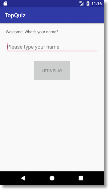
In this first screen, we want to welcome the user by asking them to enter their first name. This screen will require a text field, an input area, and a button. The expected result is this:
Activity and Layout
An Activity, as noted previously, is a fundamental building block of Android (one of Android’s core app components). Activities also provide the entry point to all Android applications.
One Activity in particular is responsible for acting as the entry point for the user. This Activity is a class which inherits from either the Android Activity class or the AppCompatActivity class.
What’s the difference between Activity and AppCompatActivity?
To bring new features to old versions of Android, Google began releasing support libraries. These libraries provide classes that imitate new features on old devices by running in “compatibility” mode. The behavior looks like this:
// Compatibility mode
if (currentAPILevel >= newFeatureAPILevel) {
    // Run normally
} else {
    // Run compatibility mode
}
The AppCompatActivity behaves like an Activity but also brings modern design features, like the ActionBar, to older API versions. Google does not offer compatibility modes for every new feature: they primarily focus on backporting new user interface classes.
If you want to have two screens in your application (e.g. a login screen and a tutorial screen), you will generally use two Activities. The first Activity handles the login flow and the second manages the tutorial. By convention, the name of an Activity is always followed by the word “Activity” and is written in CamelCase. Therefore, you might name your two Activities "LoginActivity" and "TutorialActivity," respectively.
Why did I say “you will generally use two activities?”
We will see later on that it’s not mandatory to have a separate Activity for each screen, but it’s not essential to look into that this early in the game. 😉
To allow the user to interact with our application, we have to present graphic and control elements (aka. widgets) so that they can see and touch our app. These widgets can be buttons, input fields, drop-down menus, images, and a lot more.
To choose which graphic elements to use and where to position them on screen, we use a layout file. A layout file is an XML file which the Activity loads upon creation. This XML file is always stored in the res/layout directory of your project.
As mentioned before, if the layout file links to an Activity, it is always prefixed by “Activity,” followed by the name of the Activity. The file name must be written in lowercase and each term should be separated by an underscore (_).
This means the layout file associated with MainActivity will be activity_main.xml. Similarly, if we had an activity named LoginActivity, we would have created the associated layout file asactivity_login.xml.
Building the Interface
The Graphic Editor
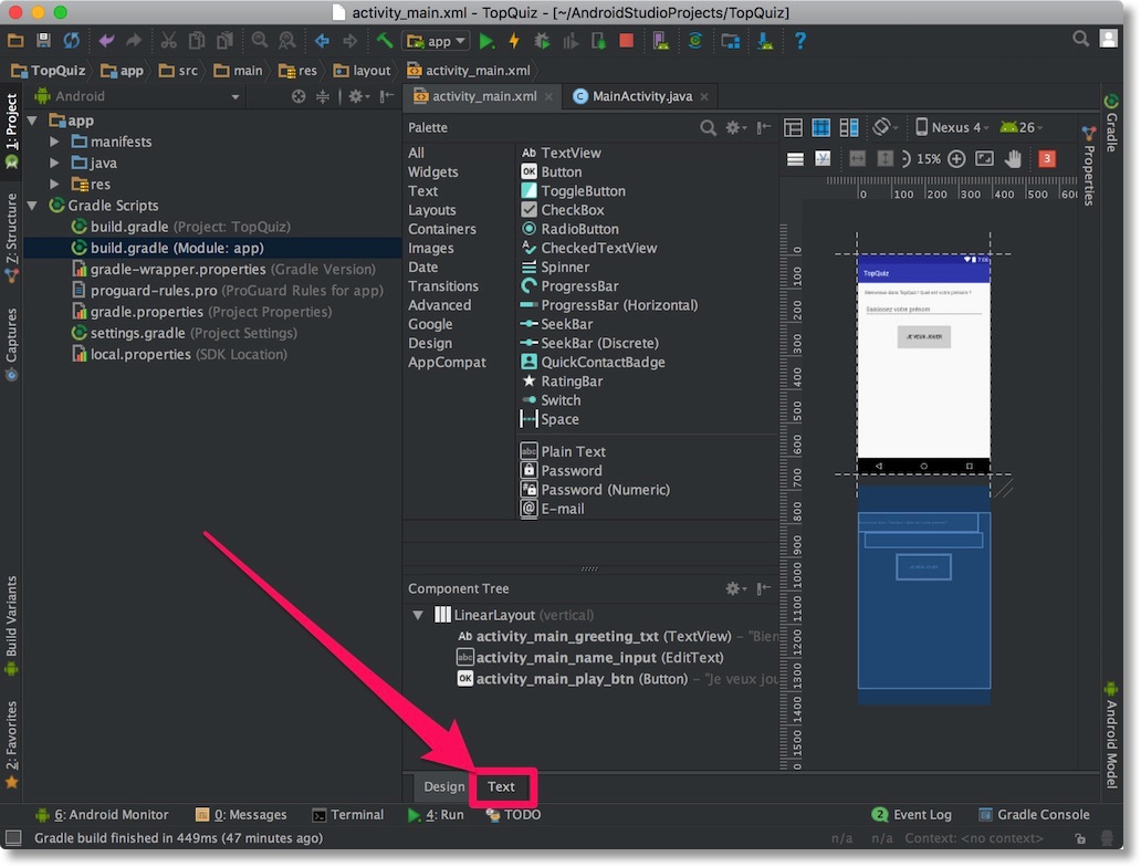
In Android Studio, navigate to the project tree and open theactivity_main.xml file located in res/layout by double-clicking it.
By default, Android Studio opens the editor in Design mode. Design mode allows you to create your layout visually and it generates the XML content for you. This sounds like the obvious way to go, but we will use Text mode instead.
Text mode grants us more control over where and how we place our elements. To switch to Text mode, click on the Text tab at the bottom of the screen.
The default content may vary depending on your version of Android Studio, but you will see something that resembles this:
<?xml version="1.0" encoding="utf-8"?>
<android.support.constraint.ConstraintLayout
    xmlns:android="http://schemas.android.com/apk/res/android"
    xmlns:app="http://schemas.android.com/apk/res-auto"
    xmlns:tools="http://schemas.android.com/tools"
    android:layout_width="match_parent"
    android:layout_height="match_parent"
    tools:context="com.ponroy.florian.topquiz.MainActivity">

    <TextView
        android:layout_width="wrap_content"
        android:layout_height="wrap_content"
        android:text="Hello World!"
        app:layout_constraintBottom_toBottomOf="parent"
        app:layout_constraintLeft_toLeftOf="parent"
        app:layout_constraintRight_toRightOf="parent"
        app:layout_constraintTop_toTopOf="parent"></TextView>

</android.support.constraint.ConstraintLayout>
Don’t worry if this looks horrifying at first, soon it will make sense!
To see the real-time rendering of your XML content, click the Preview button on the right side of the window. You will see the rendered XML content. In this case, it will be a screen featuring, “Hello World!”
Layout Containers
To display items on the screen, we have to use a container. A container is a special view that organizes other views on screen (including other containers). Imagine that you want to hang your holiday photos on the wall. You might buy a large picture frame in which you organize all your photos.
ADD IMAGE OF PICTURE FRAME??
In the world of Android, your photos are the elements and your frame is the container.
In the XML file, the first element we see is of type android.support.constraint.ConstraintLayout. This element is a container. Android always appends “Layout” to the name of a container class. In this example, the container holds a TextView element, used to display, “Hello World!”
Among the containers offered by Android, here are the ones you're most likely to use:
FrameLayout: position elements in a stack directly on top of one another
LinearLayout: position elements next to one another, either horizontally or vertically
RelativeLayout: position elements relative to each other, below, above, etc.
ConstraintLayout: like RelativeLayout, but with higher-level positioning rules
ConstraintLayout is a little advanced, so we'll replace it with LinearLayout for now. To do this, replace the XML tag android.support.constraint.ConstraintLayout with LinearLayout, then delete everything preceded by the app: tag. Your XML file should look like this:
<?xml version="1.0" encoding="utf-8"?>
<LinearLayout
    xmlns:android="http://schemas.android.com/apk/res/android"
    xmlns:tools="http://schemas.android.com/tools"
    android:layout_width="match_parent"
    android:layout_height="match_parent"
    tools:context="com.ponroy.florian.topquiz.MainActivity">

    <TextView
        android:layout_width="wrap_content"
        android:layout_height="wrap_content"
        android:text="Hello World!"></TextView>

</LinearLayout>
In plain language, here's what we've indicated with our XML:
“Display my elements one after the other. The first graphic element I want to display is a text field.”
Attributes
Occupying Space
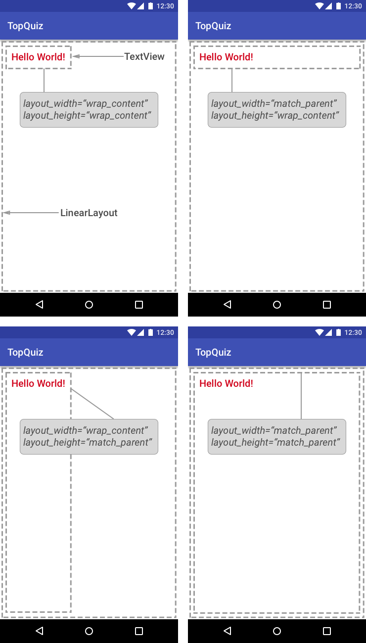
Each XML tag has several attributes. At minimum, you must include both layout_width and layout_height. These attributes determine how much visible space to provide an item with respect to its container. Two of the most common values are:
match_parent: The element must occupy the maximum amount of available space offered by the parent element (parent container).
wrap_content: The element consumes only the space required to display its contents.
An image will certainly do a better job of explaining these properties. Here is the space consumed by our TextView given every possible combination of match_parent and wrap_content:
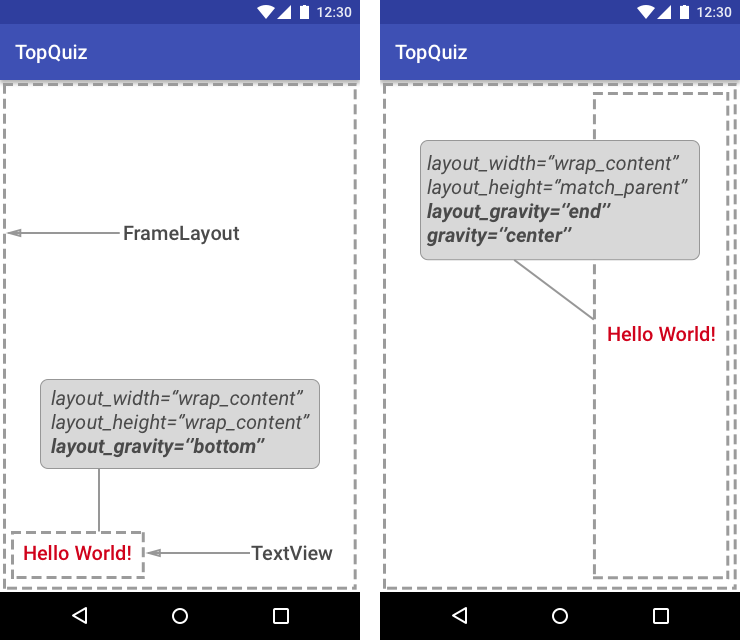
Gravity
Gravity can apply to an element or its content (child elements). It determines how to position an item relative to its container or how to position the contents of an item, such as the title of a button.
To define the position of an element, we use the android: layout_gravity attribute. There are many possible values: left, right, center, center_vertical, center_horizontal, etc.
To define the position of a title within a button or a text field for example, we use the android: gravity attribute. The possible values are identical to those for the layout_gravity attribute.
To understand the difference, look at the various results when tinkering with gravity:
Text
Replace the text in the TextView element to something more welcoming. All you need to do is change the value of the android:text element, for example: “Welcome to TopQuiz, what is your first name?” Check the preview area after you change the text - the rendered screen should reflect your changes.
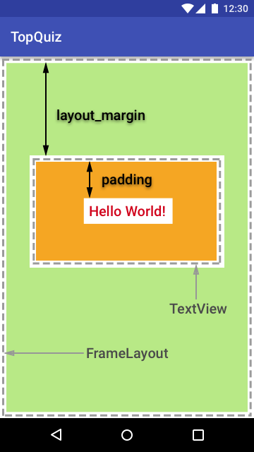
Margin
You may have noticed that the text is displayed at the top-left of its container, which is not where we want it. To move it slightly away from the edge, we need to add the android: layout_margin attribute. This allows us to specify a margin.
The value is measured in dps, for Density-Independent pixels. By specifying a value of 10dp, the TextView will move away from every edge of its container. If you want to set the margin in a single direction, you can use the following attributes: layout_marginTop, layout_marginBottom, layout_marginStart, or layout_marginEnd.
Padding
Padding adds space between the contents of an element and the edges of that element:
If you added a margin and a padding to the TextView element, your XML should look like this (TextView only):
<TextView
    android:layout_width="wrap_content"
    android:layout_height="wrap_content"
    android:layout_margin="10dp"
    android:padding="20dp"
    android:text="Welcome! What's your name?"/>
That's enough about element layout. Now we'll look at elements the user can interact with!
Control Elements
Input Field
To type their first name, we must present the user with an element which accepts text. In Android, the EditText element enables this behavior. To include one, we must add it to our activity_main.xmlfile.
As you begin to type the chevron < Android Studio presents you with auto-complete options. Select EditText and press the Tab key. Android Studio inserts the EditText and automatically adds the layout_width and layout_height attributes. It also positions the cursor on the first value – neat! 👍
Begin typing the first few letters and auto-complete anything by pressing Tab. Press Tab again to move to the next attribute, and so on. Press Tabagain and bam – your project is done!

However, the input field is trapped between the text and the right edge of the screen. It would be better to position it below the TextView element, right? If you remember, we said that the LinearLayout container was capable of ordering elements either horizontally or vertically.
By default, LinearLayout orders child elements horizontally. To change that to vertical, add the orientation attribute to the LinearLayout, and use the value “vertical” (again, begin typing “vertical” and Android Studio will complete the rest for you).
Like the text field, we can add a margin to prevent the input area from being too close to the edges, e.g. left and right margins. It's also possible to add an input hint using the android:hint attribute. This hint appears in the input box to help the user understand what to type. The hint disappears as soon as the user begins to enter text.
You should have the following XML result (showing EditText only):
<EditText
    android:layout_width="match_parent"
    android:layout_height="wrap_content"
    android:layout_marginStart="10dp"
    android:layout_marginEnd="10dp"
    android:hint="Please type your name"/>
Button
Now that the user has identified themselves in the EditText , they're only a button press away from playing. The XML element that corresponds to a button is... (drum roll 🥁) Button. The Android API may not be clever, but it's pretty straight forward.
Button inherits from TextView, so the attribute to specify a Button's title is the same:android:text. We decided to title the button “Let's play,” but we're unoriginal so feel free to name it whatever you like. You can also change the margin and padding to position the button where you like. We centered it horizontally and added a little padding to make it stand out. Here is the result:
<Button
    android:layout_width="wrap_content"
    android:layout_height="wrap_content"
    android:layout_marginTop="20dp"
    android:padding="30dp"
    android:layout_gravity="center_horizontal"
    android:text="Let's play"/>
Let's Review With a Demo
You can see these steps in the video below:
Let's Recap!
The Activity uses a layout file to define and position elements on the screen.
There are several types of layouts—each one has its own specificities.
Use the available attributes, for example margin, padding, layout_gravity, etc., to properly position elements on the screen.
And there you have it—the graphical interface is ready! In the next chapter, we’ll look at how to manipulate graphic elements in code within your Activity.
