Table des matières
- Partie 1
Get the Most Out of This Course
- Partie 2
Discover Business Intelligence and Power BI
- Partie 3
Make Data Visual Using Power BI
- Partie 4
Organize Your Data to Help With Decision-Making
Table des matières
- Partie 1
Get the Most Out of This Course
- Partie 2
Discover Business Intelligence and Power BI
- Partie 3
Make Data Visual Using Power BI
- Partie 4
Organize Your Data to Help With Decision-Making
Follow the Basic Steps for Impactful Visualizations
Ask the Right Questions
You’ve imported the data from Jane. Great work!
However, if you take a few moments to look at the data and the first visualization you created, you might find yourself questioning a couple of things.
The table with borrowers’ family circumstances Jane provided contains personal data. Is that right?
Nope! You need to delete these columns in the file because you don’t need them.
Don’t forget to remind Jane to let Global Bank’s data protection officer know.
Secondly, in the last chapter, we selected a pie chart to visualize Global Bank’s mortgage transaction amounts.
Does it make sense to choose a pie chart?
Not really...
With a pie chart, you could visualize loan distribution by amount.
Not sure how to change the visualization? Let’s go through it together!
Select your graph and click on the column chart visualization in the visualization pane. Your pie chart is instantly replaced with a stacked column chart.
Now add Approved to the “Legend” data field. You’ll see that your graph now shows the mortgage-transaction amounts by year AND the loans approved or rejected.
What: What data does your user want to visualize?
Different types of visualizations work better for different types of data.
Why: Why does your user want to visualize this data?
This question has a real impact on the visualization you’ll choose and the interaction that you should set up. Does your user want to identify a trend? Correlation between variables? Are they looking for a particular value?
How: Finally, ask yourself how you should present the data to your user.
Do they want to see sorted or filtered data?
Do they want to see all data points, or do they want the information combined into groups of values?
Avoid Poor Data Representation
WTF visualizations list various examples of misleading visualizations. I’ve selected a few typical examples of poor ones:
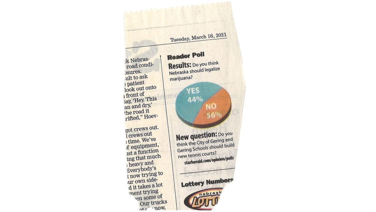
Pie Charts
This example gives readers the visual impression that a majority of Nebraskans are in favor of legalizing marijuana. However, the figures tell a different story…
Line Charts
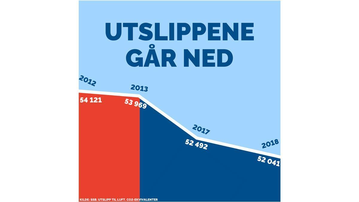
In the example below, the Norwegian conservative party wants to show that CO² emissions have reduced since they came into power in 2013. However, 2014 and 2016 are missing, as emissions did not go down in those years.
Column Chart
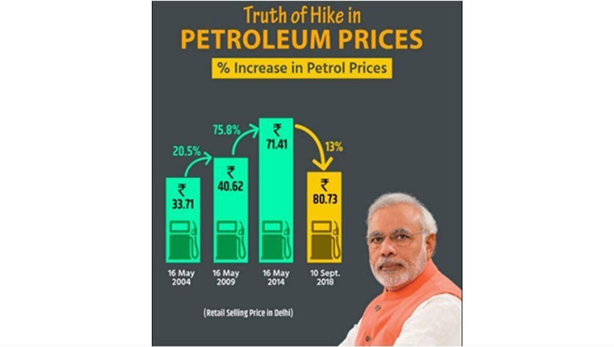
In this example, the ruling party in India wants to show that after two sharp increases in gas prices (+20 % and +75 %), they have contained the latest increase at +13 %. However, this is still an increase! The graph leads us to believe that gas prices have almost halved, which is not the case.
Over to You!

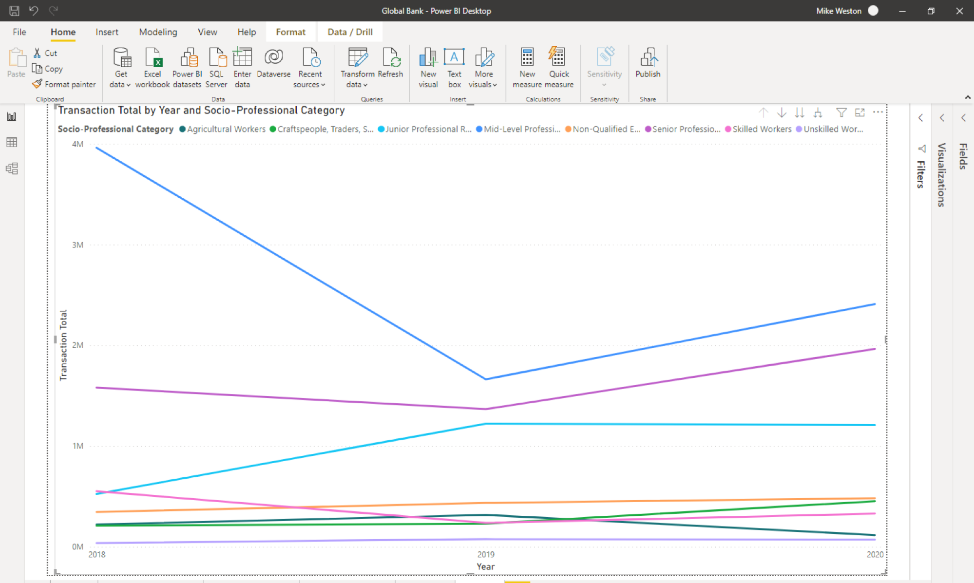
Global Bank wants to position itself as a preferred partner for real-estate projects for people in a variety of professional categories. It wants to ensure that over the past few years, this positioning has resulted in a growing number of mortgage applications received from these categories (user story 6):
User story 6: As a branch manager, I want to be able to analyze the make-up of my mortgage portfolio by socio-professional status in order to monitor whether we are positioning ourselves correctly.
Answer the Following Questions
Question 1: Which of your data is useful for creating this visualization?
Branch data
Down payment data
Mortgage application data
Family circumstance data
Professional situation data
Question 2: Which type of graph is best for this visualization?
Pie chart
Scatter graph
Column chart
Line chart
Map
See the Result
For Question 1
The correct answers are 3 and 5, as the data we need are the mortgage application date, amount, and the customers’ socio-professional category.
For Question 2
The correct answer is 4—a line chart is best for visualizing how this has evolved.
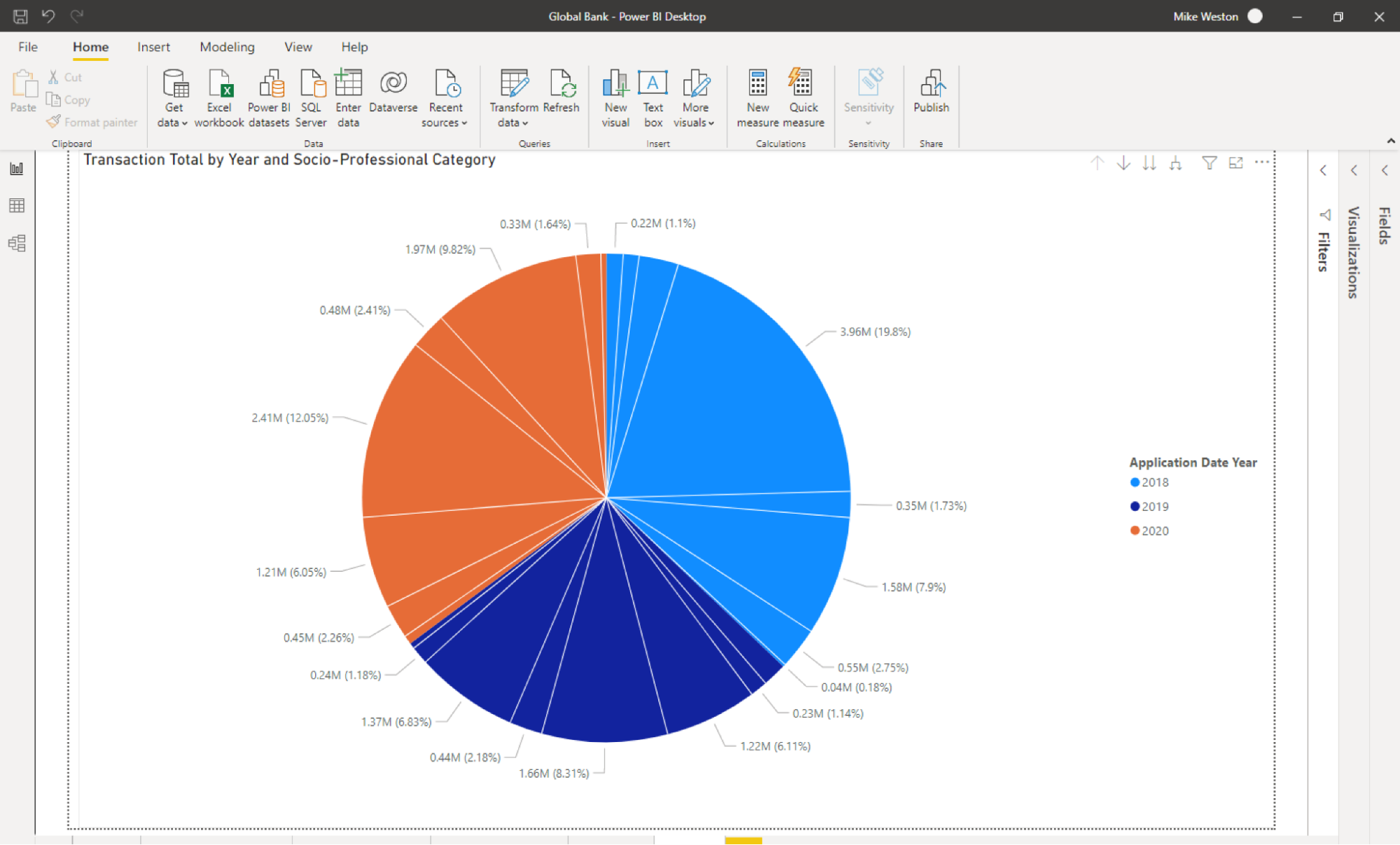
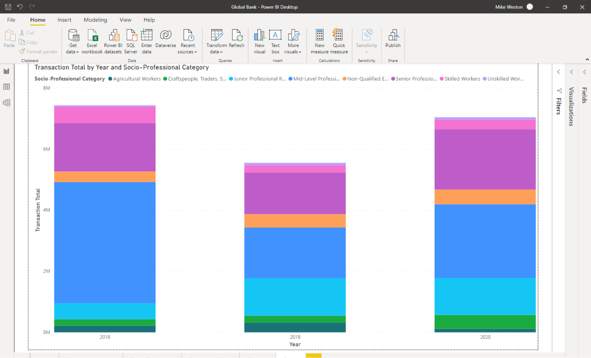
To see for yourself, you can recreate the graph below and click on other visualizations, such as the pie chart or column chart. You’ll see that they’re either impossible to read (the pie chart) or less accessible for understanding how many mortgage applications are received annually by category.
Example with a pie chart:
Example with a column chart:
Let’s Recap!
Select your visualization based on the data you have available.
Ask yourself what your end user needs: do they want to identify a trend? See correlations between variables? Or look for a specific value, and why?
Finally, ask yourself how you should present this data to your users: do they want the information sorted? Filtered? To see all of the data points or have them grouped together?
Learn how to avoid bad visualizations by swerving pitfalls such as missing legends, incorrect proportions, or missing data.
In the next chapter, you’re going to see which visualization options are available with Power BI, and how to make choices that work for your specific needs!
Et si vous obteniez un diplôme OpenClassrooms ?
- Formations jusqu’à 100 % financées
- Date de début flexible
- Projets professionnalisants
- Mentorat individuel
Trouvez la formation et le financement faits pour vous
