Table des matières
- Partie 1
Unlock opportunities through UX design
- Partie 2
Practice human (user) centered design
- Partie 3
Design for everyone
Table des matières
- Partie 1
Unlock opportunities through UX design
- Partie 2
Practice human (user) centered design
- Partie 3
Design for everyone
Be Curious and Observe the World Around You
Design is all around us. Before starting this course you may have been taking much of it for granted, but from this moment on, you’ll start looking at the world in new ways. Chances are you will want to start designing and redesigning everyday experiences once you become more aware of them.
Stop and reflect. What was the last amazing experience you had? What was the most frustrating one?
Consider in-person experiences like making a purchase at a store, going to the doctor, or riding public transportation in a new city; but also digital experiences like making an online purchase, staying in touch with friends on apps, to teaching your grandparents to use technology. Were there any moments of joy? Frustration? Not memorable at all?
UX Design refers to “user experience design.” Often also known as user-centered design or human-centered design. User experiences are all around us in many forms, which we'll explore throughout this course. Now we need to start looking at them with a critical eye.
Examine everyday experiences
We interact with products and services all the time. Some experiences we barely notice as they feel seamless, while others may be frustrating or make us feel like we're wasting our time (or we give up before accomplishing what we set out to do!). Consider the most recent interactions you had with the following:
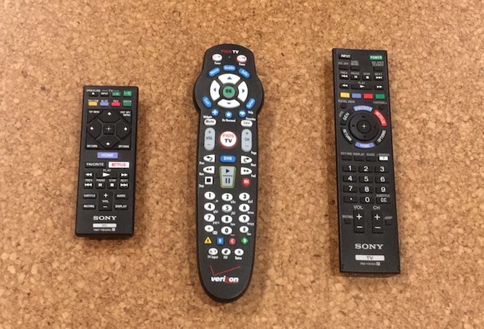
Remote controls: Does it have the same functionality of all TVs?
Controls in a car: What if you rent a new car or drive someone else's – can you turn on the headlights and radio?
Directional signs: To get where you need to go (Metro, subway, airport, etc.)
Riding public transportation in a new city: What was it like buying a ticket? Finding your stop?
Self-check out stations at the grocery store: What does it feel like if you try a different store?
Machines at the post office: Can you get what you need on your own or do you need to ask for help?
New app or piece of technology: Did you love the new app, or give it up after one try?
Now, ask yourself if there were areas where the experience could have been improved or made better. Your goal as a UX designer is to find opportunities to improve the experience of the user. In our own day-to-day lives, we accept most actions as they happen, but the reality is that there is always room for improvement.
One of the ways to make the quality of an experience apparent is to watch someone outside of your own demographic as they work through an activity. Chances are your parents or grandparents use technology differently than you do.
For many people, there’s also a psychological block. For instance, my uncle, who is an engineer, has a fear of smartphones and is not open to trying one - even to see photos of his grandchildren. On the flip side, my aunt who is a nurse is more of the “early adopter” variety, meaning she's always one of the first to have new products or technology. Even with the savviest of users, there are opportunities.
Frustrating user experience: Remote controls I don't own a TV, so I find the buttons confusing. I don't even know which of these three remotes I should start with (they all go to the same TV!). I usually have to ask a friend or family member to teach me how to use their television, which makes me feel stupid. Question: Are all these buttons really necessary?
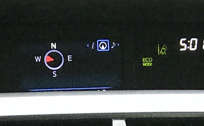
Confusing user experience: The compass icon in my parents' car
The red arrow appears opposite from what I would expect and makes me think way too hard. In this image, the car is going East (I thought it was going West!).
Question: Why doesn't the red arrow touch the direction (i.e., East) the car is going?
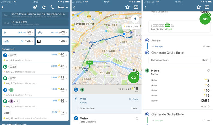
Good user experience: City Mapper app
The simple functionality makes it easy to use with clearly displayed results. I am given several options, including different modes of transportation presented in a visual way that is not overwhelming. As I click into each option, there is more detail, including where exactly I should get on the metro to have the fastest connection. I find City Mapper easier to understand than the "official" transportation apps.
Bonus: Look for the "Easter eggs" (hidden surprises in digital interfaces) like "catapult" or "teleport" at the bottom of the results screen after you look for directions [not pictured]. They don't appear every time, but when they do, it's worth a click! These elements of fun make the app more memorable.
Et si vous obteniez un diplôme OpenClassrooms ?
- Formations jusqu’à 100 % financées
- Date de début flexible
- Projets professionnalisants
- Mentorat individuel
Trouvez la formation et le financement faits pour vous
