Choose the Right Color Scheme
Start With the Colors of Your Presentation
Colors are one of the building blocks of a slide deck; as fundamental as text and images because they are one of the two key components of your visual identity.
A visual identity is made up of choice of color and typography. There is also tone, images (photos), visuals (shapes, pictograms, etc.), and the atmosphere associated with the brand. However, colors and typography are the foundations.
Colors are a simple and fun place to start. It’s the first thing people remember; even before text and shapes. So it’s important to pay attention to how you pick your colors!
Take this opportunity to do your homework. People learn best from the visual component.
Pick Colors That Match Your Message
People are usually predisposed to certain colors as they can mean something personal. Some have a soothing effect, while others are stimulating. Choosing a particular color for a graphic is important when you have a certain idea in mind or when you want to convey a message or emotion.
Pick colors that match your message or your activity because colors can send messages at an unconscious level. For example:
Blue is soothing, conveys confidence, and expresses unity.
Green symbolizes freshness, nature, birth, and the environment.
Red is a symbol of passion, love, strength, and energy.
It doesn't stop there. The effects change according to the shades; blue can be cyan, turquoise, navy, royal, light, dark, etc.
Facebook picked blue for its logo because the color is often associated with friendships or relationships. It is the most common color in social networks (LinkedIn, Twitter). It’s also the color of the European flag and in the United Nations one as well.

Check out this great article on the blog of the popular graphic design tool Canva for more on the meaning of colors.
Combine Colors
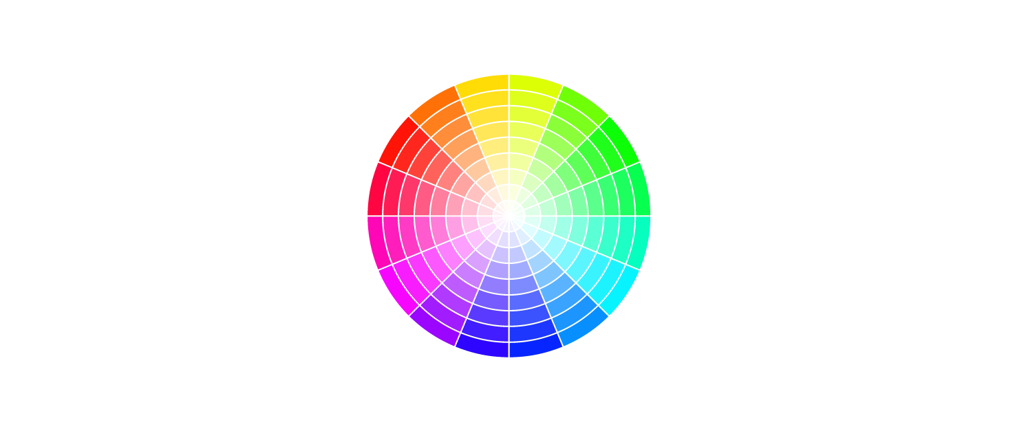
If you want to combine colors, a good place to start is with a color wheel. It’s useful for seeing how colors can be associated with each other.
Chroma comes from the Greek (χρώμα or khróma) and means color. The color wheel is a circular representation of colors that allows you to see all the gradients and shades out there.

Beyond the simple violet-indigo-blue-green-yellow-orange-red, there are so many different nuances and shades and they have names as well.
There are several standards for naming colors and shades. The ones you'll most frequently find (and which you will need when using software such as Photoshop or Illustrator (and even PowerPoint), but also if you program in CSS) are:
The hexadecimal code (a 6-character code, often preceded by a "#").
The RGB code, which reveals the composition of color from the three primary colors.
The chromatic wheel below is simplified, but its division is practical because it allows you to understand how the colors are opposed and associated with each other: red is opposite the of blue, yellow to purple, etc.
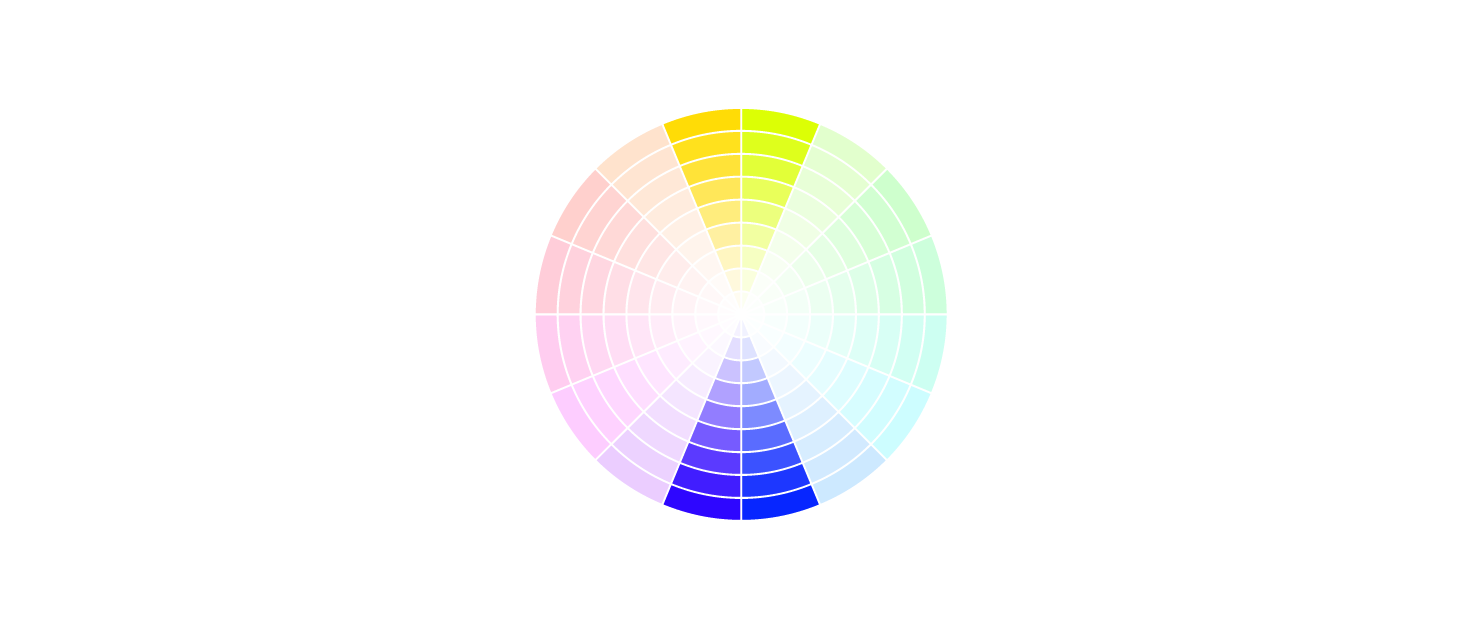
Complementary Colors
We naturally appreciate some associations more than others: opposing colors on the color wheel naturally go well together. Opposite colors are called complementary colors because they suit each other and make each other stand out.
As another example, let's look at the colors used in the Mozilla logo:
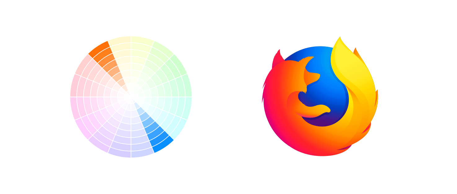
Using complementary colors in a design is a good idea because you know it won't be a mistake; the effect will please the eye!
Analogous Colors
That said, you don't have to solely use complementary colors.
Others that also complement each other are analogous colors. These are next to each other on the chromatic wheel. An example here would be the Red Bull logo.
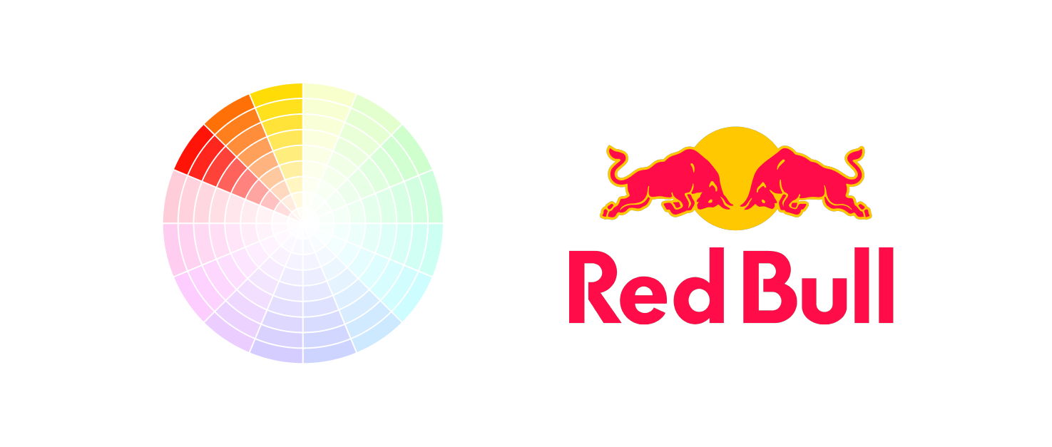
Choose two to four similar colors on the color wheel and work with those!
Rely on Tools to Help You Make the Right Decision
The three analogous or the two complementary colors you choose depend on you; it's ultimately a question of taste, and what they symbolize or evoke.
Here are some tools to help you to experiment:
Adobe Color CC, which provides the precise codes of complementary and analogous colors, as well as other combinations.
ColorHexa, which provides a lot of information on colors and can convert colors from their hexadecimal code to their RGB code;
COLOURlovers, which documents trends in colors.
ColorZilla, which is a browser extension allows you to find the hexadecimal code of a color on any web page.
Let's Recap!
Remember that different colors can have different effects, so choose them based on the feeling you want to convey.
Complementary colors can be found opposite each other on the color wheel and suit each other naturally like purple and yellow.
Analogous colors, the ones that sit next to each other on the color wheel, also go well together.
You've chosen your colors, now it's time to choose the right font. But what exactly is a font, and how do you distinguish between the font, typography, and typeface? Let's move on to the next chapter and find out. :)
