Create Accessible Visual Designs

Now that you understand how people with disabilities interact with technology and are aware of some of the barriers people can encounter on the web, it’s time to start designing more inclusively! In this chapter, we’ll cover typographic choices, color considerations, and look into some characteristics of accessible visuals.
Typography
Before we dive into specific considerations, let’s look at two concepts that are key for accessible typography: legibility and readability.
Legibility refers to how easy it is to identify letters and differentiate them from one another. Some typefaces have letters that look very similar to each other, such as the capital letter O and the number 0, or the lowercase letters g and q. It might make it very difficult to tell certain characters apart. You can often rely on the context of a particular letter for clues. If you see the word “dog,” you know the last character is a g and not a q. But things can get tricky when these characters appear in URLs, passwords, and codes because any character could work in these contexts. Selecting typefaces that don’t have ambiguous characters is critical for legibility. Legible fonts can be especially helpful for users with reading disabilities, but it makes it easier for everyone to read and understand the text.
One way to test a typeface on character ambiguity is to use the Il1 test. Try it for yourself! Pick a few typefaces you’re using and type out the capital letter I, the lowercase letter l, and the number 1 next to each other. Legible fonts will be designed in a way that makes it easier to differentiate these characters. In typefaces with poor legibility, the characters can look virtually identical.
You can go one step further and compare the following characters as well:
B and 8
a and o
g and q
Readability refers to how easy it is to read blocks of text. Have you ever tried to read something but found yourself slowing down, looking away, or stopping? There’s a good chance that poor readability is the culprit! Poor readability can significantly slow down reading speed and increase the effort needed to make it through the text.
Readability and legibility are closely related, but they don’t always go hand in hand. Text can be legible and still have poor readability. Script typefaces are a great example of this. Each character may be easy to identify and differentiate from the others, but reading a paragraph of a script can be difficult. Similarly, text can have poor legibility but still be pleasant and effortless to read, especially if it’s a typeface you’re familiar with and find aesthetically pleasing.
One common misconception is that using sans-serif fonts is more accessible than serif fonts. Although sans-serif fonts have better readability and legibility, it’s an oversimplification. There are plenty of examples of great serif fonts that tend to be more easily readable. It’s more important to consider the readability and legibility rather than whether a typeface is serif or sans-serif.
Let’s look more closely at some important considerations that make text legible and readable.
Apertures and Counters
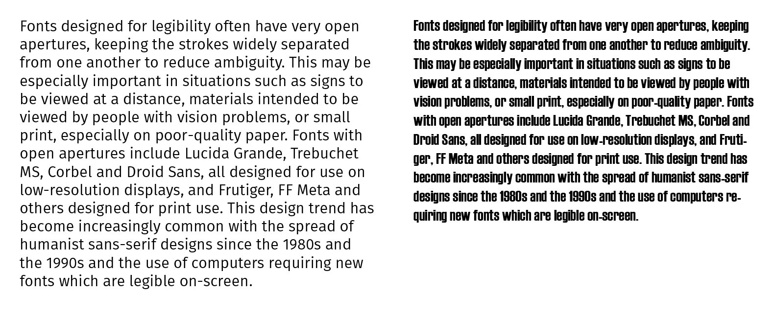
Apertures are partially enclosed space within letters; for example, the negative space in a C. Counters are the fully enclosed spaces within letters. For example, the inside of an O. Larger, more open apertures and counters make letters easier to see and read, improving both legibility and readability.
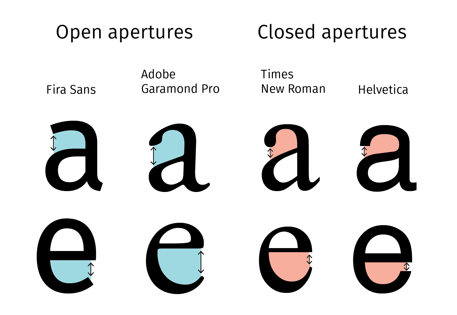
For example, the paragraph on the left is in Fira Sans, which has open apertures and counters. The same paragraph on the right is in Haettenschweiler, which has much tighter apertures and counters. Isn’t it much harder to read?
Stroke Width and Uniform Strokes
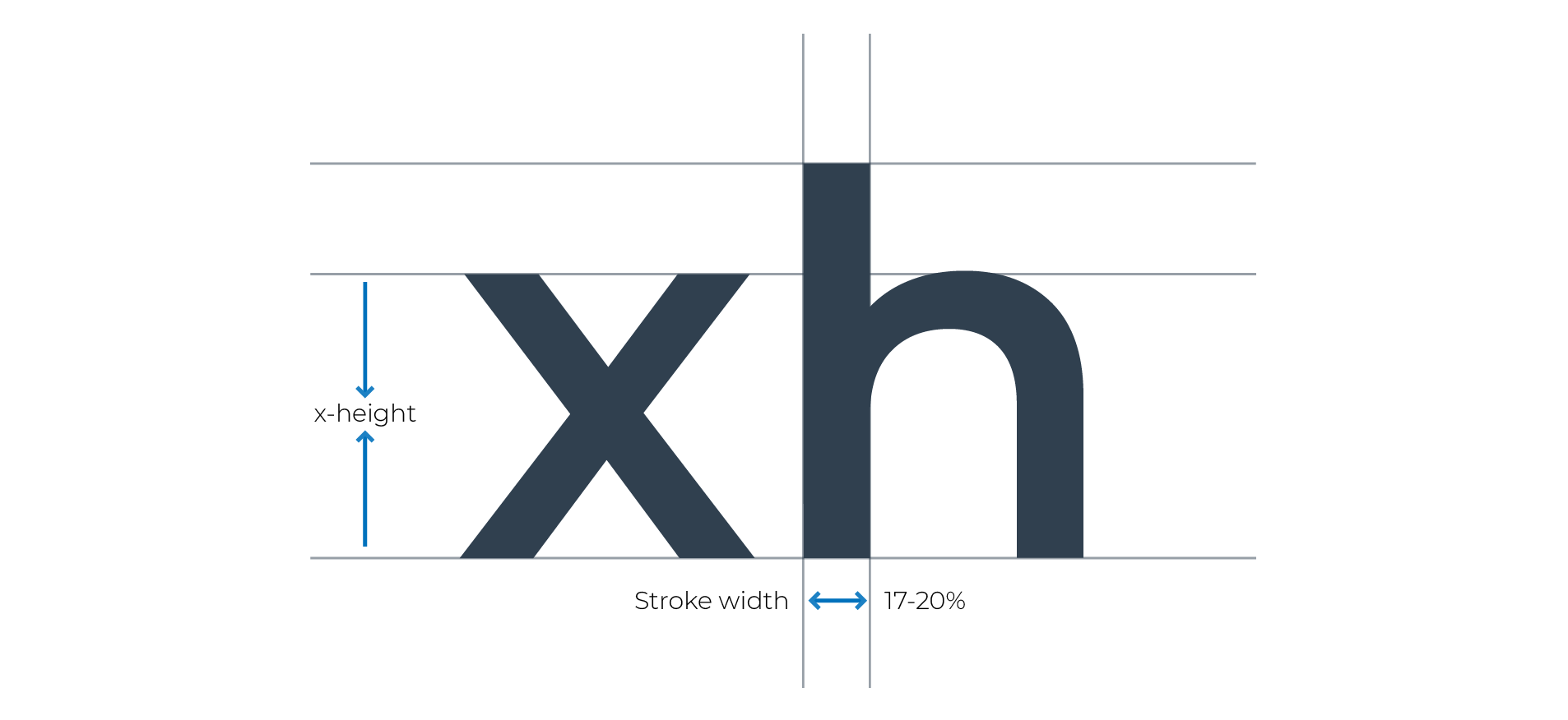
Another aspect of typeface that makes a big difference for readability is stroke-width (the width of lines that make up the letters). More accessible typefaces tend to have medium-heavy strokes. When strokes are too thin, the text becomes difficult to see, especially when the screen size is small or the contrast is low. When strokes are too thick, they tend to crowd the negative spaces, making letters difficult to recognize and read. (If you want to get nerdy about it, you can calculate the ultimate stroke-width! It’s 17%-20% of the x-height, the top of the lowercase letter).
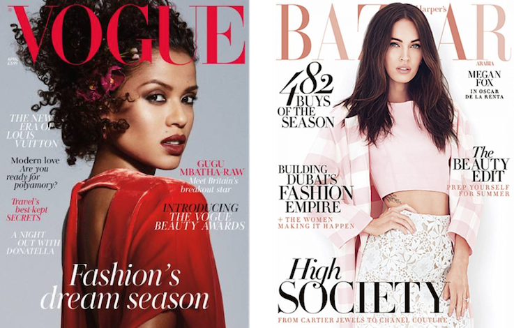
Readable fonts also have strokes that are uniform across the letter. Modern typefaces, which have a stark contrast between thick and thin lines, can look very slick. You’ll often see them splashed across the covers of stylish magazines or in fashion advertisements. Chic as they may be, these typefaces are not designed for large amounts of text and should never be used for entire paragraphs. If you find yourself using modern, or decorative fonts, do so sparingly and stick to words that are familiar and easy to recognize.
If you squint at the images below, you may notice that the thin strokes become almost invisible, especially in contrast with the thick parts of the letters.
Spacing and Rhythm
Tracking is the horizontal space between letters. Too much spacing and it becomes difficult to combine characters into words, not enough spacing, and they become almost impossible to read.
Another issue you could run into is tracking that is too tight. The letters can squeeze together to form new characters.
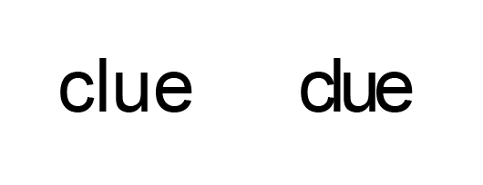
For example, if you take the word clue and tighten up the tracking, the c and l will start to look like a lowercase letter d, and you end up with the word due.
Tracking that’s even, consistent, and creates a uniform vertical rhythm makes reading faster and easier. If the tracking is different from line to line, the reader has to constantly change the rhythm, which can be frustrating and reduce reading speed.
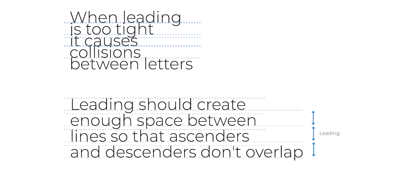
Leading
Leading is the vertical space between lines of text; for example, when you set up a double-spaced page of text, you’re setting the leading to be twice the text size, so the spaces between the lines are the same size as the text. If the leading is too small, the ascenders and descenders of lowercase letters, the parts above and below the line, can overlap. Even in less extreme cases, it can make the text feel crowded and more difficult to read. A good rule of thumb is to make the leading about 1.5 to 2 times the text size.
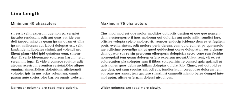
Line Length
Just like most things in typography, you may have noticed there’s a Goldilocks principle. When lines are too short, it forces the reader to jump text lines too often, breaking the reading flow. If the lines are too long, it becomes difficult to keep your place when moving from one line of text to the next. The ideal line length is between 40 and 75 characters.
Heading Hierarchy
Once you’ve selected the typefaces you’d like to work with, you’ll want to think about how to use them to guide the reader through the pages. A heading hierarchy is one of the seemingly simplest, yet most important things you can do to make your content accessible. A good heading hierarchy functions as a map and helps users quickly understand the structure of your content, scan the page, and find the information they’re looking for.
Here are a few pointers to keep in mind:
Stick to one H1 level heading per page. Each page should have one H1 level heading that describes the primary purpose of that page. All the headings that follow should be nested.
Nest headings hierarchically. Don’t skip heading levels; for example, an H2 should always be followed by an H3 (or another H2).
Support the hierarchical structure visually. Use size, font weight, visual accents, etc. to clarify the heading's level. For example, your H1 should be the biggest, most attention- grabbing heading, and subsequent levels should be sufficiently different from one another so that the reader can quickly identify the level and how it fits into the overall structure of the page.
Be consistent. Heading levels should always look the same from page to page.
Color
Designers often find accessibility requirements around color restrictive and worry that they can’t use specific colors or combinations if they want to make their designs accessible. While it’s true that accessibility requirements pose some constraints, they never limit which colors you can use in your palette, only how you use them.
To give you an example, here are two designs that use very similar color schemes:


They both use dreamy pastel shades to create an airy, ethereal feel. In the first image, the colors are used in a way that makes the content inaccessible. The text blends in with the background, and even the larger letters can be difficult to read. In contrast, the second example uses the colors in a way that creates a similar feel without compromising the clarity of the content. The text is separated from the background and is easy to see and read.
Text Contrast
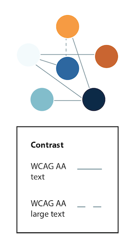
Whatever colors you use in your work, make sure that at least some combinations have high enough contrast. The Web Content Accessibility Guidelines (WCAG) require a contrast ratio between text and background of at least 4.5:1 for regular text, and 3:1 for large (18pt) and bold text (14pt) at level AA. If you want to use some color combinations with low contrast, specify that these shouldn’t be used for text and background.
It’s good practice to indicate how colors can be used accessibly in style guides and design systems.
For example, you can indicate which colors have sufficient contrast with black and white text. Text and background color can always be reversed if you want to use colorful text on a white or black background since the contrast ratio would remain the same.
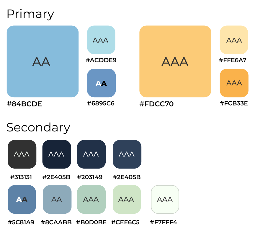
You can also show which colors in your palette can be combined in an accessible way.
Non-Text Contrast
Text isn’t the only thing you should consider when thinking about high contrast. Other important visual information such as icons, interactive controls, and parts of charts and graphs should also be high enough contrast to be visible.
For example, websites often have interactive social media icons that don’t have sufficient contrast.

The WCAG 2.1 minimum contrast ratio requirement for non-text contrast is a 3:1.
Communicating Information With Color
Color can be effective for drawing users’ attention to specific areas on the page, creating eye-catching calls to action, and helping users identify different types of information at a glance. However, color cues are not helpful to users who are blind or perceive color differently. While you shouldn’t shy away from using color, to design inclusively, you need to make sure additional cues are also available.
One of the most common examples of using color to communicate information is by indicating correct information with green, and incorrect information with red.
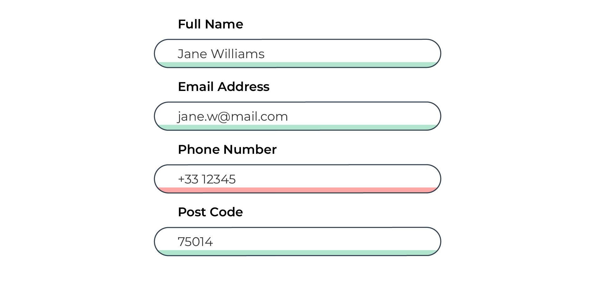
Although the significance of these colors is widespread, difficulty differentiating red and green is also the most common type of colorblindness.
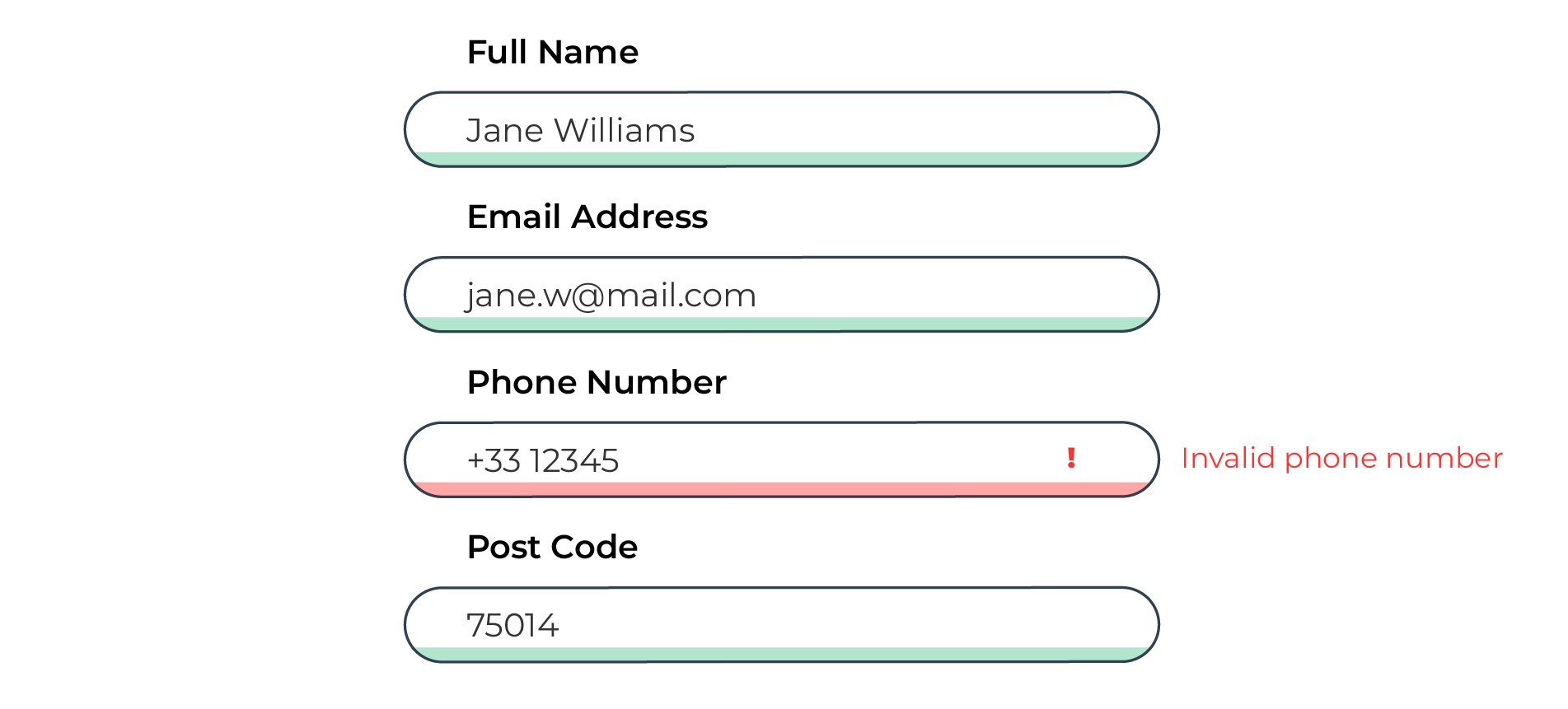
You can still use these colors in places like interactive forms, as they are helpful to many users. But you also need to make sure another type of indicator is available so that users who can’t rely on color information aren’t left behind.
Here is an example that uses a very similar design to the one above. Unlike the first design, which relies only on color, this form also uses an icon and error message to indicate fields that haven’t been filled out correctly and a green check mark when they have.
Location pins are another example. Some map interfaces differentiate between types of businesses by making the pins different colors.
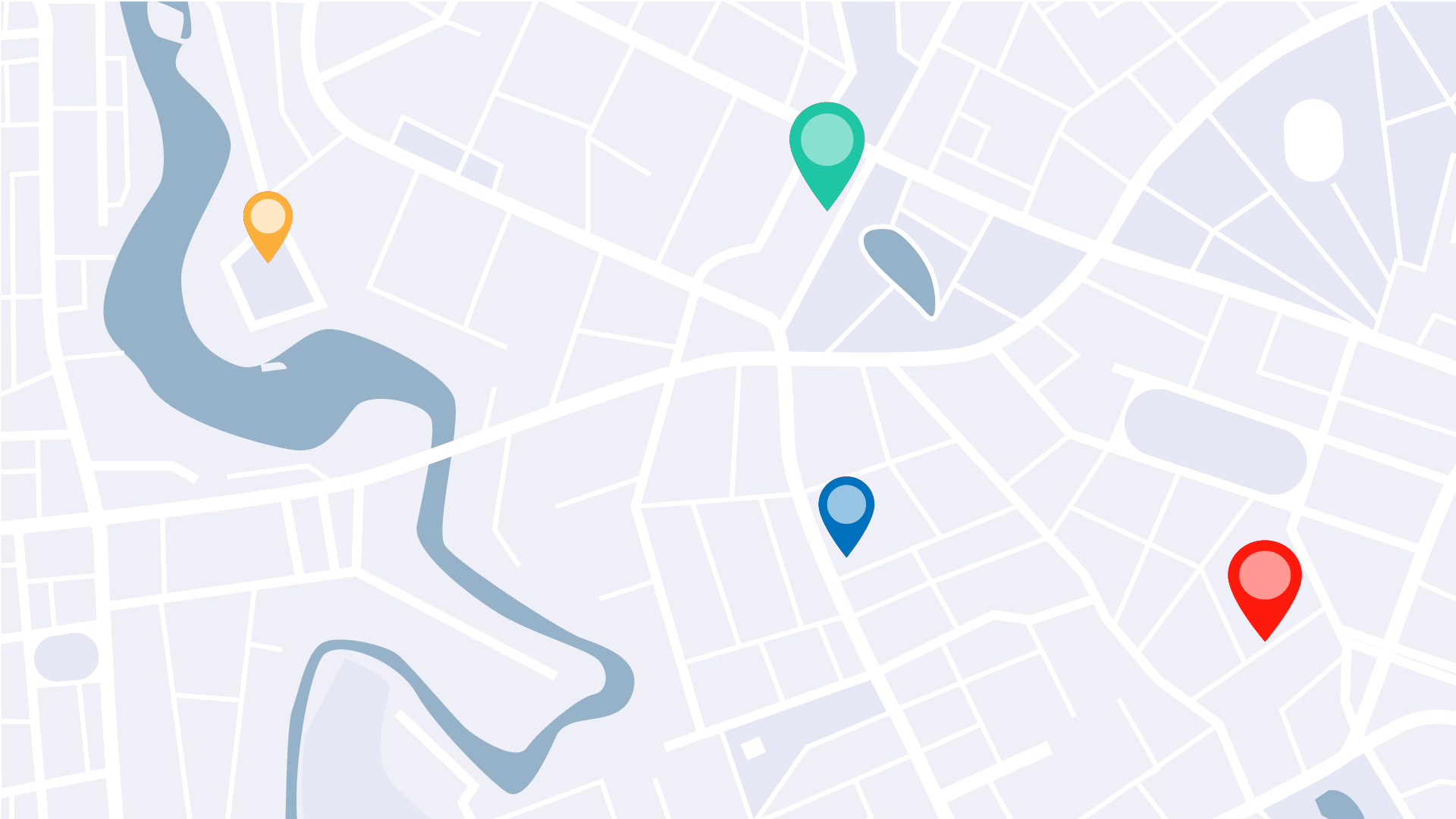
A better approach is to add another differentiator, combining color and shape to communicate the same information.

The last example I’d like to share with you is one you’re likely very familiar with: using color to differentiate links from surrounding text. You’ve probably come across it at some point on Wikipedia.

You’ll notice that if I take color information away, it becomes difficult to know which text links to other articles (making it so much more difficult to fall into those Wikipedia reading rabbit holes).
Often links are underlined, providing a secondary indicator to color. This is a good approach in many cases. But there is actually a pretty good reason for only using color in cases like Wikipedia. There are so many links embedded in the text that if each one was underlined it could hinder the reading flow. So while it would improve the experience for some users, it would also make it much worse for others. There is a special exemption for this in WCAG requirements. If you only use color as a way to differentiate links from surrounding text, you can do so as long as you follow two rules:
Contrast between link text and regular text 3:1 or higher (while making sure that both link and regular text have sufficient contrast with the background). If the contrast is high enough, luminosity becomes a secondary indicator.
Provide a secondary indicator on both hover and focus. It can be a standard underline or something more creative like a custom outline, bold text, etc.
Exercise: Create an Accessible Style Guide
Let’s make an accessible one-page style guide. To get started, you can use this example and template. You can save a copy and fill out the template yourself, or use a different tool, like Illustrator, to create something similar.
For this chapter, fill out the typography and color palette sections, applying what you learned about accessible fonts and contrast. Keep the links and buttons section empty for now; we’ll come back to it in a later chapter.
Let’s Recap!
Legibility is how easily you can recognize letters and tell them apart. Readability is the ease of reading words across a sentence or paragraph.
You can improve legibility and readability by choosing typefaces with open apertures and counters, making sure there is enough space around the text, and have a uniform stroke.
Important visual elements should have enough contrast with the background.
Only use color as a secondary cue for communicating information.
In the next chapter, you'll learn to create accessible multimedia: how to caption your videos and provide effective accessible transcripts.
