Design Your Emails
The email-design process is a maze of constraints and best practices. If you’ve ever read any blogs on the topic, you’ll know that HTML for email comes with certain limitations (we’ll go into more detail on that in the next chapter). Your creativity won’t always be able to run free. However, it’s important to remember that emails are just a stepping-stone on the way to a website. Your main goal when designing an email is usually to gain a client, so the layout of your message should focus on that goal.
A good designer will know how to get around these limitations. You may find yourself tempted, from time to time, to push the boundaries of email. Go for it, but please, test, test, test!
Take the Right Approach to Organizing Information
The basic concept behind email design is that of the inverted pyramid. This journalistic principle proposes that the most important information in an article should appear at the top. The same goes for emails. You’ll always have one key message to communicate to your recipient, and this should be located at the top of your email. This information is the base of your pyramid and should occupy the full width of your email, demanding your reader’s attention.
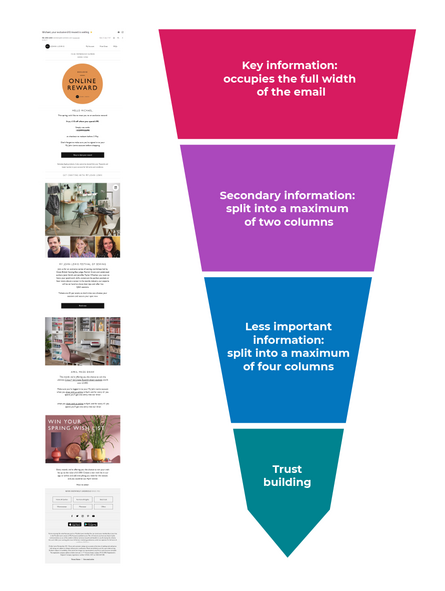
The further you get down your email, the less important the content is. You can start to increase the number of columns, and your reader’s attention may start to wander around the message.
Finally, the bottom of the email should end with the same section in all your messages (or at least all those of the same type). This section should include (for example):
Links to your social media.
Trust building.
Customer service contact information.
Access to the customer’s account.
Terms and conditions.
Unsubscribe link.
Get Into Good Habits
Design for Mobile First
As mentioned earlier, a large proportion of your audience will look at your email on a mobile device, so when planning your design, think about how it will scale to a long, narrow screen. It’s a totally different challenge to design for a desktop view!
That’s not to say the desktop view doesn’t matter: you may find that desktop customers are more likely to buy! Again, it depends on your audience. In any case, desktop viewers certainly are very aware of how your email looks on the bigger screen.
In other words, you have to think about both formats: make sure your design automatically adjusts depending on where your recipient sees it.
One way of doing this is to use an approach called responsive design. The way the email renders adapts to the size of the screen it is being shown on: columns adjust, and images resize to fit automatically.
This means that, even for desktop views, you have to remember some design rules.
Prioritize Information
Yes, this was the title of the last chapter, but there’s no harm in repeating an idea when it’s as important as this :soleil:.
Set the Width
Until recently, there was a rule of thumb that the ideal width for an email was 600 pixels wide, no more, no less. This made sense when emails were read by webmail clients like Gmail, Hotmail, or Outlook, on desktop monitors that only allowed about that much space for an email to be read.
Today the situation is a bit more complicated, and a fixed pixel width is much less relevant. In fact, limiting your email width to just 600 characters can look odd on a widescreen.
Today, most emails still tend to use that old guideline - like the Mankind example from earlier.
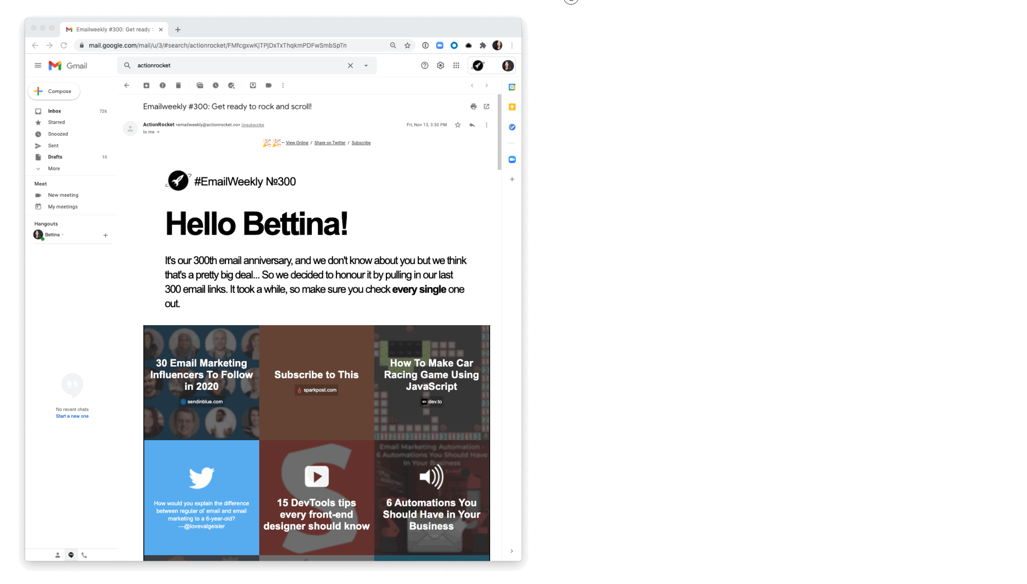
Look at this email from ActionRocket (which offers a weekly roundup of email news) that uses a responsive template to expand (or shrink) according to the available space, from about 300 pixels up to 1600 pixels.
An Initial Call-to-Action in the First 300 Pixels
Your number-one goal is getting your contact to click! It’s an excellent idea to feature a button within the first 300 pixels of your email, ideally visible as soon as the message is opened, without needing to scroll.
Reduce, Reuse, Recycle Ideas
Email design isn’t a one-time task! You’ve almost certainly designed other emails in the past and will design many more in the future. This is why it’s a good idea to recycle.
On the one hand, this puts your contacts on familiar ground. On the other hand, it makes your job easier if you reuse certain elements.
Both your header and footer are elements that can easily be recycled. You could also consider standardizing certain content blocks, such as new product descriptions.
Design Your CTAs
Your call-to-action, or CTA, is one of the most important aspects of your message design. It’s what encourages your reader to click, so your success in hitting your goals hinges on this feature.
A Button Is a Button
While it’s okay sometimes to bend the rules, here’s one that’s worth sticking to. Habit and convention have trained our brains to think that anything that looks like a button should be clickable on a computer or phone screen.
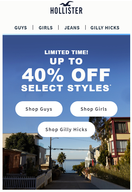
It's easy to see where the three buttons are here! This approach is much better than leaving your reader to guess whether and where there are buttons.
Make It Stand Out
Your CTAs should be clearly visible and identifiable. You can accomplish this by using a color that stands out.
Your email must be readable (and clickable) by visually impaired people or in contexts where readability is affected (e.g., mobile phone screens in bright sunshine).

Easy to Understand
In the last chapter, you saw the importance of using words that signpost what you want the reader to do. The same goes for your graphics. For example, without going over the top, you could use symbols, arrows, and other graphic features to reinforce the meaning of the words.

Prioritize: Primary and Secondary CTAs
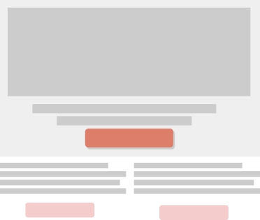
As you saw with the inverted pyramid, the most important parts of your email should be located at the top, occupying more space on the graphic level than the rest of the message.
The same goes for CTAs. A CTA located at the level of your primary content should be more important and visible than everything else.
GIFs and Videos
As you'll see in the next chapter, emails have many more technical limitations than websites. But don’t let this hold you back!
You can use multimedia; it just needs to be approached with caution.
Use Videos
As access to high-speed internet has become more widespread, the use of video has shot up. Regardless of the medium, whether it’s social media or advertising, videos are everywhere. In emails, videos are a good opportunity to engage your readers and make them want to interact.
However, emails with videos are still poorly supported. According to the website CanIEmail, the HTML <video> tag is only supported in 9% of settings, with 39% partially supporting it (in May 2020). You should test the code in different settings before using it.
Use GIFs
GIFs are another story altogether and are supported across the majority of email services. Only the desktop Outlook application on Windows (versions 2007 to 2013) is unable to read them. And even here, it will still display the first frame of the animation.
With a dash of humor, a light-hearted animation in the background, an app demo, or the first seconds of a video, the creative possibilities are endless, thanks to GIFs. Watch out, though – keep it subtle and light. Avoid putting essential information in a GIF; ensure they’re not too long and don’t take too much time to load.
Let’s Recap!
Apply the principle of the inverted pyramid.
Prioritize information.
Use responsive design so that width adapts to the available space.
Put your first call-to-action at the top of your email.
Create real buttons that stand out and are easy to understand.
Differentiate your primary and secondary CTAs.
Consider using GIFs and videos when relevant.
Next, we’ll look into creating the email’s HTML code, an essential phase after the design process.