Specify Types of Props With PropTypes
Discover Prop Typing
PropTypes is one of the most common methods for securing the types of props your components receive.
The type? What does that mean?
If you need a refresher on types, don’t hesitate to revisit the chapter “Reuse Your Components With Props” in the previous course.
When it comes to typing, JavaScript is considered to be “weakly typed”: JS works with dynamic typing and doesn’t ensure any safety, which means that when developers declare a new variable, they do not specify the type. However, the code adapts on the go, and it’s no problem to change the variable type.
In JS, you can do the following:
let myVariable = 42
myVariable = "forty three"
This is not possible in other languages. Typically, in C, you must specify the type when you declare it, and it will not change. This is known as "static" typing. Here, myVariable is an integer :
int myVariable;
myVariable = 42; // No problem here
myVariable = "Forty three"; // This code will not compile!
JavaScript is much more flexible.
But don't celebrate too soon – this flexibility can also be your downfall. ☠️ Indeed, bugs are quick to appear in JavaScript, especially if you’re working as part of a team.
This is why tools exist to help protect you from this, such as PropTypes. 🤩
Install PropTypes
The PropTypes library allows you to declare the type of props you expect to get from your components and trigger a warning if they don’t match. Practical, isn’t it?
As usual, to install the PropTypes library, launch the command yarn add prop-types .
Let’s put propTypes into practice in our Shiny Agency app!
Start by coding the card base on the /freelancers page.
In the /components folder, create a new folder called /Card , in which you can create an index.jsx file. Into this, paste the following code:
function Card({ label, title, picture }) {
   return (
      <div style={{ display: 'flex', flexDirection: 'column', padding: 15 }}>
         <span>{label}</span>
         <img src={picture} alt="freelancer" height={80} width={80} />
         <span>{title}</span>
      </div>
      )
   }

export default Card
This component gets three props: label , title , and picture . You’ll also notice a few style properties so everything is easier to see.
Let’s use the cards in the Freelancers/index.jsx file. As the display data isn’t there yet (we’ll do it in the next part), create a table of objects and declare it in /pages/Freelancers/index.jsx :
import DefaultPicture from '../../assets/profile.png'

const freelancerProfiles = [
   {
      name: 'Jane Doe',
      jobTitle: 'Devops',
      picture: DefaultPicture,
   },
   {
      name: 'John Doe',
      jobTitle: 'Frontend developer',
      picture: DefaultPicture,
   },
   {
      name: 'Jean Bug',
      jobTitle: 'Fullstack Developer',
      picture: DefaultPicture,
   },
]
We’re using a standard profile picture that we’ve put in a folder named /assets . We can map this table to render the Card component (if you’re unsure how to do this, read “Increase Your Efficiency Using Lists and Conditional Rendering” from the previous course):
function Freelancers() {
   return (
      <div>
         <h1>Freelancers 👩·💻👨·💻👩·💻</h1>
         {freelancerProfiles.map((profile, index) => (
             <Card
               key={`${profile.name}-${index}`}
               label={profile.jobTitle}
               picture={profile.picture}
               title={profile.name}
            />
         ))}
      </div>
   )
}
You now have everything you need, so let’s secure the Card props with PropTypes! 💪
Card gets three props: label , title , and picture . We’re going to import PropTypes from the library and use Card.propTypes to specify the type for each of the properties.
import PropTypes from 'prop-types'

function Card({ label, title, picture }) {
   return (
      <div style={{ display: 'flex', flexDirection: 'column', padding: 15 }}>
         <span>{label}</span>
         <img src={picture} alt="freelancer" height={80} width={80} />
         <span>{title}</span>
      </div>
   )
}
Card.propTypes = {
   label: PropTypes.string,
   title: PropTypes.string,
   picture: PropTypes.string,
}

export default Card
Why not try to pass a prop that is not a string type, just to see? In freelances/index.jsx :
{freelancerProfiles.map((profile, index) => (
   <Card
      key={`${profile.name}-${index}`}
      label={profile.jobTitle}
      picture={profile.picture}
      title={42}
   />
))}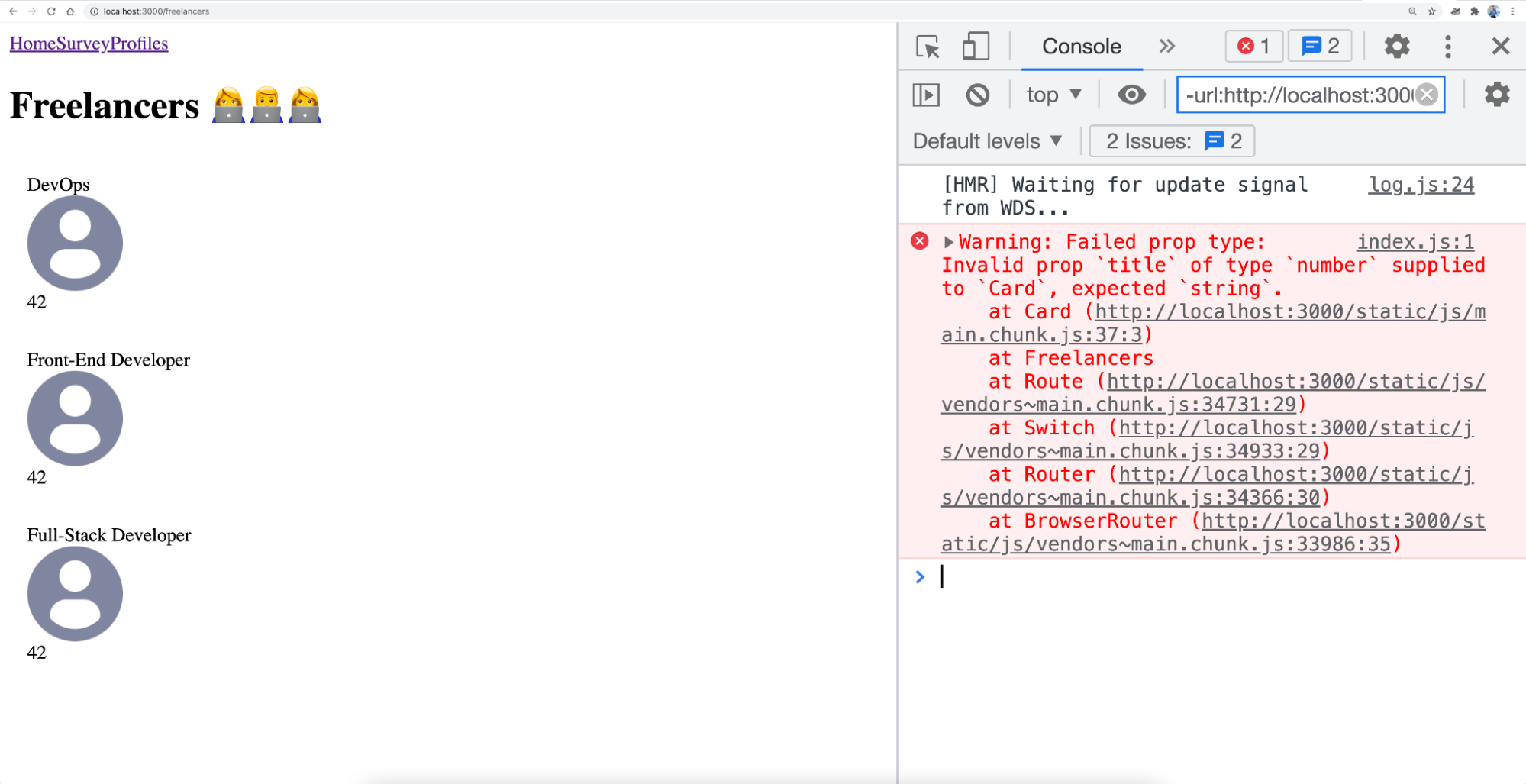
Well done! You’ve just secured your Card component with the help of PropTypes. 🎉
But that’s not all you can do: you can even specify if a prop is required or not!
Require a Prop
It’s easy to specify that a prop is required for the app to work properly. To do this, add isRequired after declaring the type.
For example, still for Card , if you do the following:
Card.propTypes = {
   label: PropTypes.string,
   title: PropTypes.string.isRequired,
   picture: PropTypes.string
}
And fail to declare the title prop, you get:
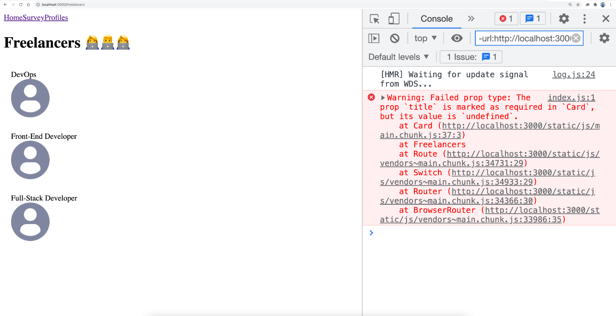
And there you have it! You’ve succeeded in requiring a pop with .isRequired !
There's one final thing you need to learn about PropTypes: how to define a default prop.
Define Default Props
If you’ve taken the previous course, you’ve already seen how to define default props with destructuring. Now let’s look at how to do this more formally by using defaultProps . In the previous example, we could have also declared a default prop rather than triggering an error because of a missing property (when we had specified isRequired ).
It is possible to directly assign a value to title in the destructuring, like here:
function Card({ label, title = 'My default title', picture }) However, this syntax would still trigger a propType error. In this case, the best method is to use defaultProps . Declare an object Card.defaultProps just below Card.propTypes :
Card.defaultProps = {
   title: 'My default title’,
}Give It a Go!

Now that you’ve learned how to use PropTypes to secure your app, it's time to put what you’ve learned into practice. 💪
To do this, you’ll find the code for starting the exercise on branch P1C4-begin . You should:
Add
isRequiredto all of theCardprops.Specify a default prop for
title,label, andpicture.
The default props for title and label are an empty string. The default prop for picture is DefaultPicture , which we’ve used in this chapter. You can delete any props that aren’t useful.
In future, type all of your component props in the app.
As always, you’ll find the solution on branch P1C4-solution .
Let’s Recap!
JavaScript is considered to be weakly typed: variable types are defined dynamically and on the go, depending on the values assigned, and can change at any time (no type safety).
The
prop-typeslibrary allows you to secure your props by declaring a type for each.You can require a prop in a component with
isRequired.To avoid errors, define a default property with
defaultProps.
The app base is starting to look pretty solid. 💪 You must have noticed, though – there’s no style. Don't worry, we’ll take care of that in the next chapter with styled-components. 💅
